
|
|
#91
|
||||
|
||||
|
معماری If Wright’s Falling Water Were a Tree House … 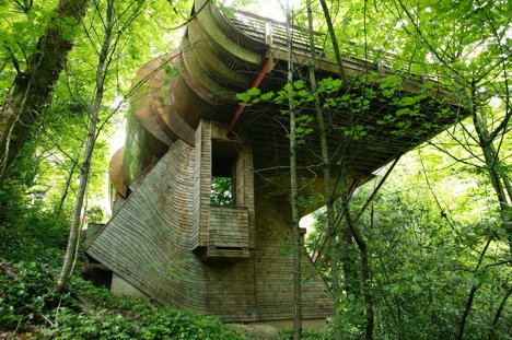 Fallingwater, the legendary architectural masterpiece of Frank Lloyd Wright, famously includes elements of its natural surroundings. Specifically, the house integrates the waterfall on top of which it was built. Like Fallingwater, this stunning home in Portland, Oregon celebrates the natural setting in which it exists. 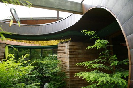 (all images via: Robert Harvey Oshatz) Architect Robert Harvey Oshatz conceived of the design when his client declared that he wanted a house which would not only be in harmony with its environment, but also be a physical representation of music. 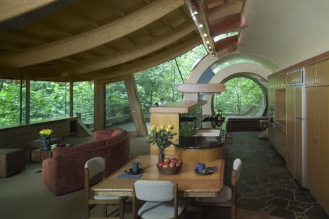 The home’s lot includes a very steep slope, which allows the main floor to sit on the level of the tree canopy. Surrounding trees lovingly brush their leaves up against the gentle curves of the home’s levels. 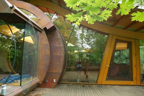 Echoing the compelling natural flow of Fallingwater, the Portland house features vast uninterrupted walls of glass and organic shapes throughout. 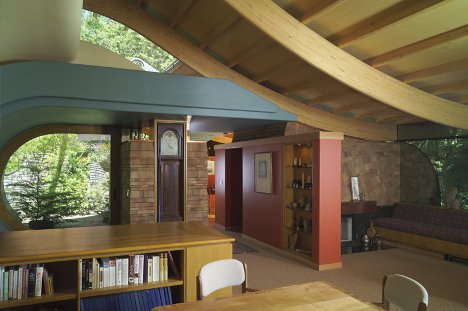 Walls, floors and ceilings are made of natural wood, reinforcing yet again the feeling of being in a highly sophisticated tree house. Generous use of natural stone and curved shapes add fascinating nature-like elements to the impressive interior. 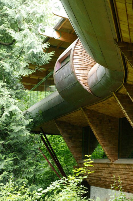 Overall, the home took seven years to go from concept to completion. The care and thought that the architect obviously put into the realization of the client’s wishes is evident in every facet of this truly poetic home. 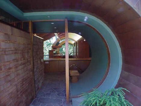 Although the photographs are beyond impressive, according to the architect they do the property no justice. To really enjoy this unusual home, he says, one has to walk through it and take in every feature first-hand. Want More? Click for Great Related Content on WebUrbanist:  Custom homes come in all shapes and sizes, but few stand out so much as these unique examples of residential architecture. They are, however, anything but cheap. 12 Comments - Click Here to Read More »» 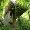 Wonderful photos of a WOWSA home in a forest canopy. Created by architect Robert Oshatz, this cool treehouse could turn even the Swiss Family Robinson green with envy. 9 Comments - Click Here to Read More »»  Tree houses aren't just for kids anymore. Here are 15 of the coolest tree houses in the world, from a 6,000 sq ft tree house to a suspended 'nest' tree house. 32 Comments - Click Here to Read More »» مطالب مرتبط با معماری اخرین اخبار و مطالب مرتبط با معماری را از آدرس http://p30city.net/search.php?do=fin...&starteronly=1 مشاهده کنید |
| جای تبلیغات شما اینجا خالیست با ما تماس بگیرید | |
|
|
|
|
#92
|
||||
|
||||
|
معماری Flame Fame: 12 Red Hot Designer Fire Stations 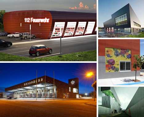 When it comes to fire stations, simplicity and usability are foremost but that doesn’t mean form has to take a back seat to function. These 12 hot designer fire stations are hook & ladder leaders in more ways than one, combining WYSIWYG practicality with livability, economy and style. Brandweer, Weert, The Netherlands 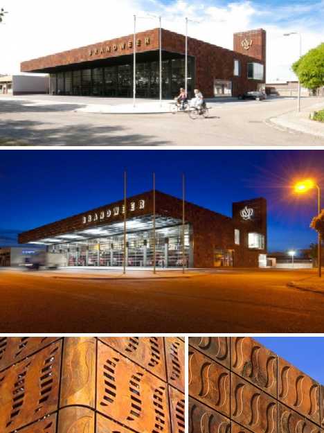 By day or by night, the Weert Fire Station designed by BDG Architects displays a cool modernist vibe tempered by the use of cast steel earthtone panels on its exterior walls. The stylized “fire” patterns embossed into the panels age naturally under the influence of the weather but their rusty hues manage to evoke the image of smoldering embers. 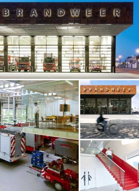 Inside, carefully considered space management and a conscious effort to introduce exterior light results in a comfortable, livable area that minimizes the need for energy-intensive artificial lighting. Translucent doors on the fire engine bays invite outside observers to view the station’s workings while contributing to the refreshingly light atmosphere within and throughout the structure. Fire Stations Leipzig, Germany 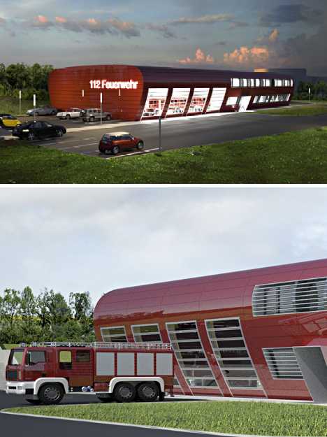 When Tagebau Architekten + Designer were invited to submit their design for a trio of identical feuerwehr (fire stations) in Leipzig, Germany, they focused on keeping costs down through economies of scale. The result was the sleek, modern structure above that resembles a cross section of an airfoil. An extension of the outer walls on one end of the building creates a sheltered outdoor space where station staff can congregate and interact. 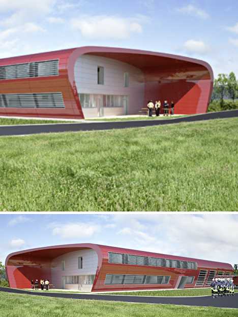 Another important consideration was the need for the projected stations to be environmentally friendly. By integrating the 4 engine bays smoothly into the building’s structure, thermal transmission through the exterior skin is minimized without affecting the firefighters’ need to access the engines quickly and conveniently. “Ave Fenix” Fire Station, Mexico City 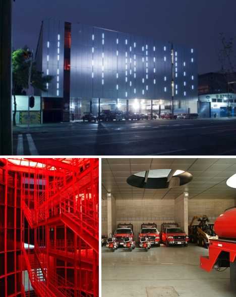 The Ave Fenix Fire Station by BGP Arquitectura was designed as a high boxlike shape that “almost disappears after the facade.” The use of complementary colors and materials combined with a plethora of slit-like windows that soften the structure’s shape at night help the station blend in with the surrounding urban scene. 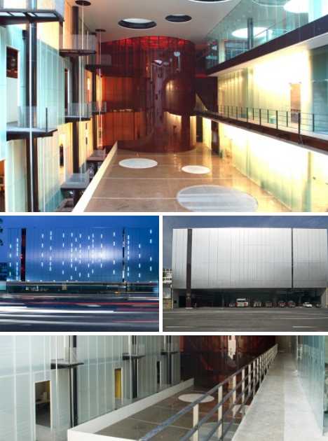 Inside, the designers have taken full advantage of the “big box” plan so as to create a sense of brightness and openness, cancelling out any claustrophobic impressions that the lack of large windows may possibly engender. Vitra Fire Station, Weil am Rhein, Germany 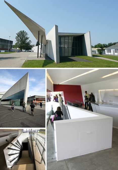 Iraqi-British architect Zaha Hadid kicked off her stellar career in a big way with the Vitra Fire Station in Weil am Rhein, Germany. Four years in the making, the station was competed 10 years before Hadid was awarded the prestigious Pritzker Architecture Prize in 2004. 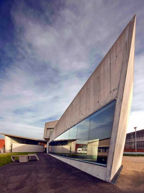 The Vitra Fire Station gives the appearance of a bird in flight from afar. Closer in, one can see the structure of the building formed from a series of sharply angled flat planes that come together to create a stunning three-dimensional interior space. Ironically, the impetus for this stunning station was a 1981 fire that caused extensive damage to the Vitra design campus in Weil am Rhein. The Vitra Fire Station’s true purpose is to preclude the possibility of such a destructive fire occurring in the future. Fire Station in Porto Santo, Madeira, Portugal  Luís Banazol’s entry in a design competition for a proposed fire station in Porto Santo, Madeira, Portugal emphasizes ease of construction taking into account a site with irregular geometry situated on a small slope. Though steel and concrete are the materials of choice, Banazol’s design appears light, airy and open while retaining ease of access and superior functionality. 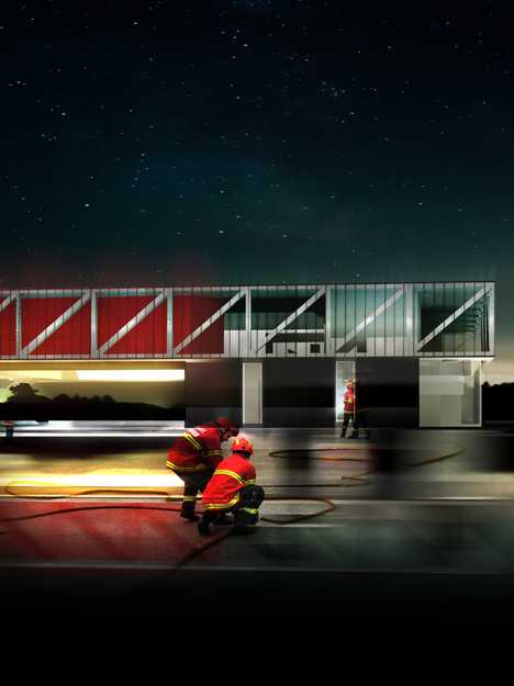 The proposed fire station is actually larger than it appears, consisting of a two-story above ground building with large open areas and an integral basement. The size of the building’s component features was dictated by specifications suggested by Portugal’s National Fire Service, challenging Banazol to create a distinctive design within very narrow parameters – a challenge which he seems to have met admirably. Porte Pouchet Fire Station + Municipal Motor Transport, Paris, France 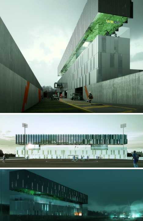 French architects Jean-Marc Ibos and Myrto Vitart have a soft spot for firefighters – how else to explain the Porte Pouchet Fire Station + Municipal Motor Transport in Paris, France? The post-modernist multi-level structure includes a restaurant and a glass-fenced terrace with a running track while just outside, a regulation-sized soccer field offers a grassy expanse for practicing The Beautiful Game. 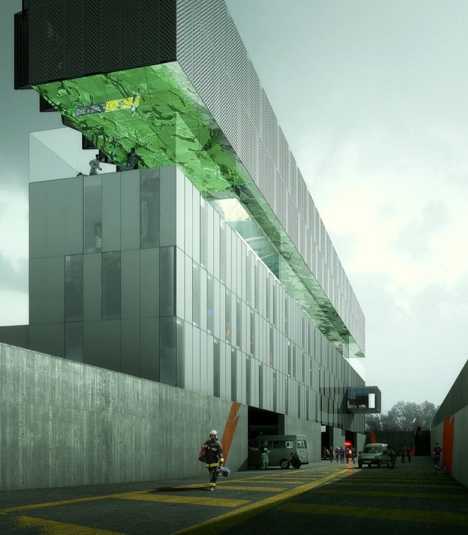 It’s not ALL fun & games for the firefighters at Porte Pouchet, however. Interior space includes bedrooms for up to 50 firemen, workshops and administrative offices. One singular design feature stands out: the terrace ceiling is made up of a mirror-polished sheet of stainless steel perforated by acoustic insulation. The design acts to trap noise from the road outside and prevent it from reflecting into the building below. Fire Station 18, Oakland, California 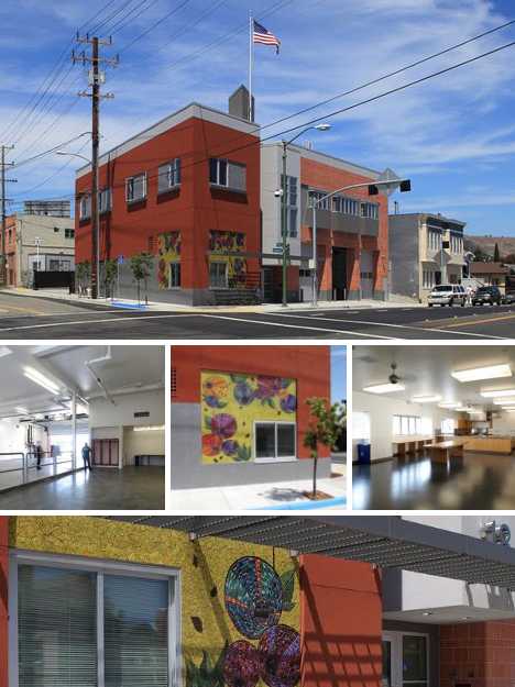 The Oakland Fire Department’s Fire Station 18 may look red thanks to its brick walls but it’s actually green, inside and out. Designed by Shah Kawasaki Architects to be an environmentally sound and toxin-free replacement for a demolished traditional fire station, Fire Station 18 was built with sustainable materials and features x natural ventilation system and a radiant-heated floor. These efforts paid off when the completed station was awarded LEED Gold status. 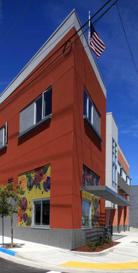 Fire Station was not only designed to be green, it’s environmentally friendly in its daily functions as well. features include a solar hot water heater, a highly efficient HVAC system, denim insulation and cool roofing materials. Community involvement was arranged by contracting out the building’s outside wall decor to a public art project. Fire Station, Radebeul, Germany 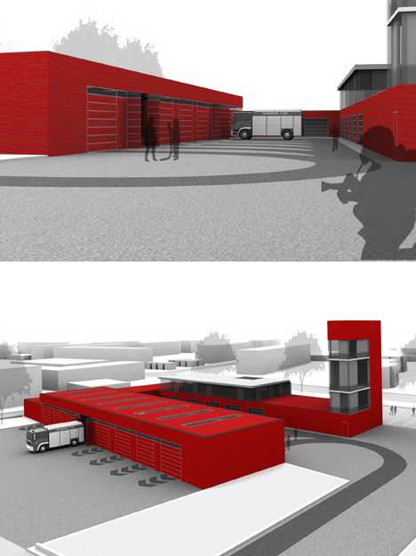 Tagebau Architekten + Designer’s proposal for a fire station in Radebeul, a suburb of Dresden, Germany, was designed on a clean slate. It looks like it’s made from clean slate as well: slab sides and an ultra-clean profile speaks of no-frills, bare bones modern aesthetics. 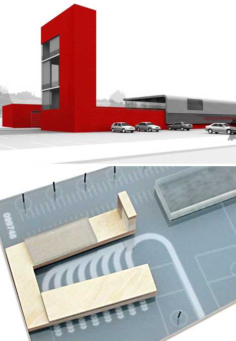 It may be unadorned but Tagenau’s fire station is anything but inefficient. The structure assumes the form of an open-ended courtyard to facilitate community use, while the engine exits are positioned so that the bulk of the building blocks sound from reaching a nearby housing development. Monaghan Fire Station, Monaghan, Ireland 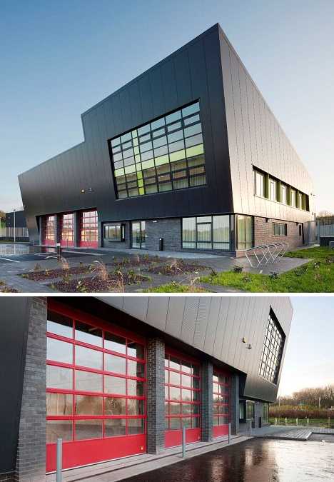 Designed by Van Dijk International, the Monaghan Fire Station features a noticeably tilted front façade “expressing the readiness of the fire brigade to respond quickly and efficiently to an emergency.” Yellow accents on the main windows and red framed engine bay doors contrast with the building’s deep gray brick and cladding while evoking the colors traditionally associated with firefighting. 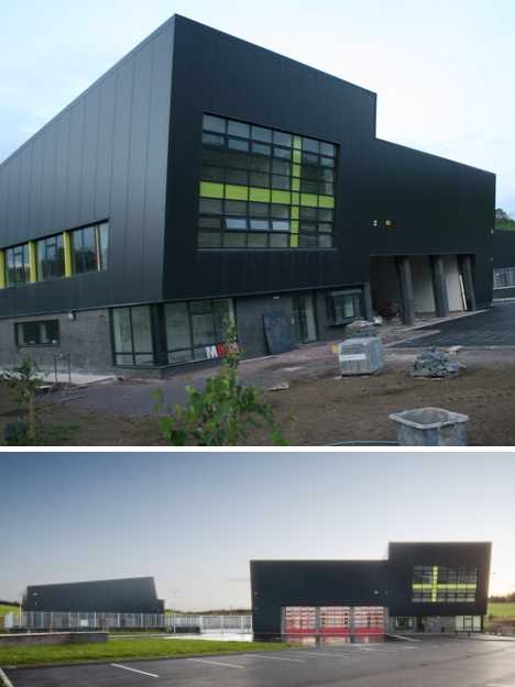 The station’s design incorporates 6 dedicated vehicle bays, a drill tower for training, a CCTV system, workshop areas and a canopy area for smokers. Yes, smokers… well, it’s not as if they’re going to start a fire or anything. Clovis Fire Station No.5, Clovis, California  Completed in 2007, Clovis Fire Station No.5 was designed by Don Dommer Associates and is a triumph of sustainable design. Its construction involved the extensive use of recycled and low-pollutant materials while natural lighting was maximized through the use of clerestory lighting, shaded windows and a skylight over the front entry. 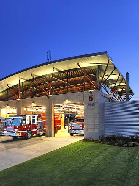 The 10,500 square foot station houses a crew of 6 and features a conference room, kitchen & dining area, a day room, fitness facilities and an 80-ft. apparatus bay. An open truss roof system supports a gently arching steel roof sheltering the three-bay engine and service garage. Fire and Rescue Services Building, Libourne, France  Designed by Atelier des Architectes Mazières and Agence Ragueneau et Roux and completed in 2009, the Fire and Rescue Services Building in Libourne, France, is made up of two complementary structures: a silver-colored technical structure housing the firefighters’ living quarters and equipment and a mainly red administration block containing offices and training facilities. A simple, monolithic fire tower gives the station its identity as well as serving for training purposes. 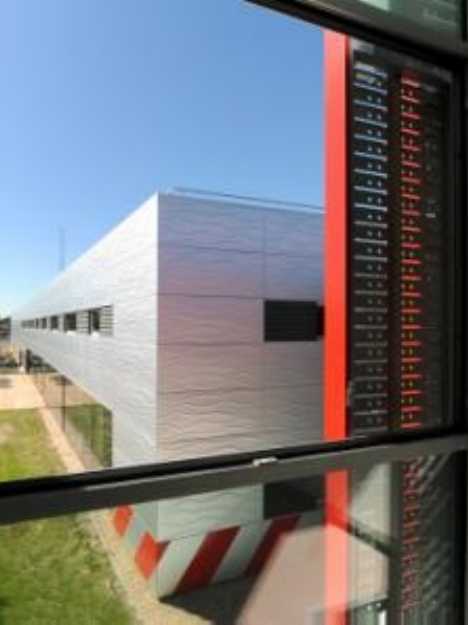 As the facility was conceived as being environmentally friendly both during and after construction, heavy use was made of 100% recyclable Aluzinc which is steel clad with a weather-resistant aluminum-zinc alloy. The Aluzinc panels making up the exterior walls are stamped with a wave pattern, meant to symbolize the importance of water to firefighters and firefighting. Bergen Brannstasjon, Bergen, Norway 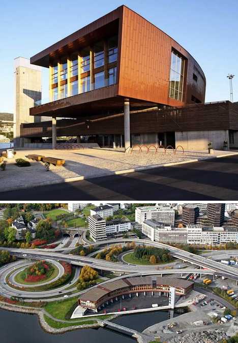 The sweeping layout of the Bergen Brannstasjon (fire station) curves inwardly against a small lake highlighted by a flying bridge and an asymmetrically placed drill tower. The design, by Oslo-based architects Stein Halvorsen Sivilarkitekter, strives for sustainability while adding one more appealing public component to Bergen’s vibrant lakefront area.  What’s a fire station without a fire pole? The Bergen Brannstasjon’s fire pole has also undergone the designer treatment. Retaining its uncompromising functionality, the pole is surrounded by varying textured materials and open views to the outside that act to bring light into the building during the day.  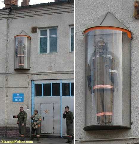 “In case of emergency, break glass”… this unorthodox fire station located somewhere in Eastern Europe goes one further by putting a fireman (a dummy, we presume) in a glass bubble protruding out from the station’s upper level. It seems a bit too far away for someone at street level to break the glass – perhaps that’s the intention. Want More? Click for Great Related Content on WebUrbanist:  These 14 subway stations aren't dark and dank, they're bright and modern, filled with murals, chandeliers, colorful accents and unexpected materials. 18 Comments - Click Here to Read More »»  When you're a firefighter, practice makes perfect... but where? Firefighters hone their very cool skills in custom-designed imitation buildings like these. 1 Comment - Click Here to Read More »»  The age of the railroad may be over, but the marks of these powerful transport systems are evident everywhere you go - as well as abandoned train and subway stations. 11 Comments - Click Here to Read More »» مطالب مرتبط با معماری اخرین اخبار و مطالب مرتبط با معماری را از آدرس http://p30city.net/search.php?do=fin...&starteronly=1 مشاهده کنید |
|
#93
|
||||
|
||||
|
معماری Housing for the Homeless: 14 Smart & Sensitive Solutions 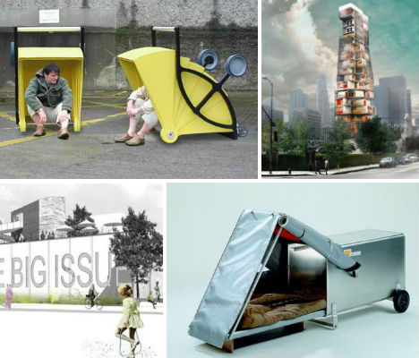 City officials spend a lot of time and energy worrying about how to keep homeless people off public furniture and out of certain common areas, when they should be considering how to better manage the issue of homelessness in general. One area of focus is homeless housing, whether simply meeting the immediate needs of people who live on the streets or providing a more long-term, forward-thinking transitional living spaces. These 14 designs for homeless housing provoke thought as to how we can meet the needs of disadvantaged people living in our own communities, and ensure that the situation is only temporary. Hopetel: Transitional High-Rise Housing 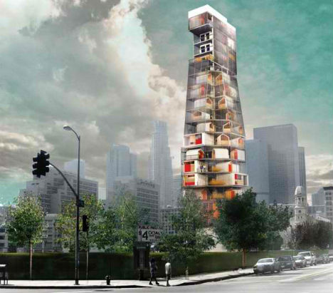 (images via: evolo.us) Homelessness is on the rise, and millions of people across the world do not have a safe, dry place to sleep at night, let alone to perform basic tasks of personal hygiene or prepare themselves for potential employment. The ‘Hopetel’ proposes a transient solution for the waves of newly homeless people who have lost their homes due to foreclosure, providing a stable environment while they attempt to get back on their feet. The skyscraper includes compact dwelling units as well as shared amenities like laundry, storage, showers and kitchen facilities. It’s organized in a way that promotes social interaction between its residents, allowing these people to see that they are not alone. Mobile Homeless Shelter by Paul Elkin 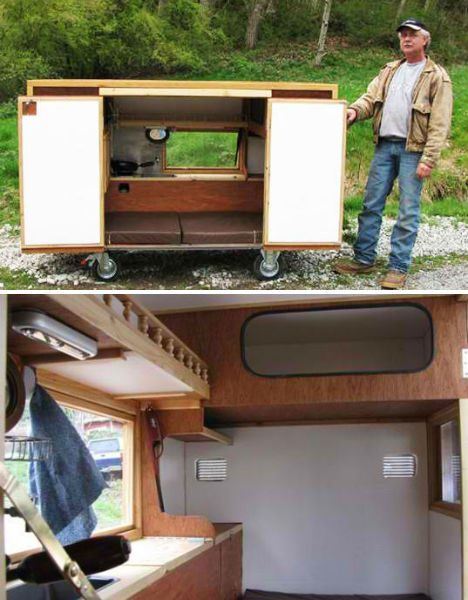 (images via: paul elkin) Portable and water-tight, this concept for homeless housing by Paul Elkin could meet the demands of a certain segment of the homeless population that prefers to remain transient. Resembling an extremely compact version of an RV, this low-impact structure contains fold-away furniture, a mattress, a toilet, and even a kitchen. Theoretically it could be built at a very low cost, eliminating the need to sleep out in the open. WheelLY Recycled Homeless Shelter by Zo-Loft Architecture & Design 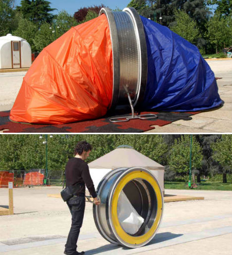 (images via: zo-loft) Portable and temporary, this unusual-looking design by Italian firm Zo-Loft provides a safe storage space for one’s belongings during the day, and expands into a tent at night. The ‘WheelLY’ is made of a rolling aluminum frame fitted with two polyester tents made of recyclable or recycled materials. The rolling design enables it to hold up to 250 pounds of personal items, and the push-handle also functions as a brake. Back on Track by Sarah Crowley 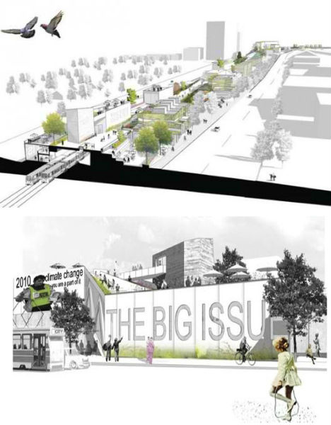 (images via: tesseract) Winner of a competition by Tesseract Collective, ‘Back on Track’ is a comprehensive proposal for homeless rehabilitation that involves not just housing but also community and improving long-term prospects. Going beyond just the requirements for immediate survival, ‘Back on Track’ is designed to be located along a strip of railway in designer Sarah Crowley’s town of Melbourne, Australia. Appropriating an under-used urban space that can be integrated into the surrounding city, the design includes a series of public programs that provide jobs and activities for the ‘formerly homeless’ that would live there. Tin Man No.11 by Kacey Wong 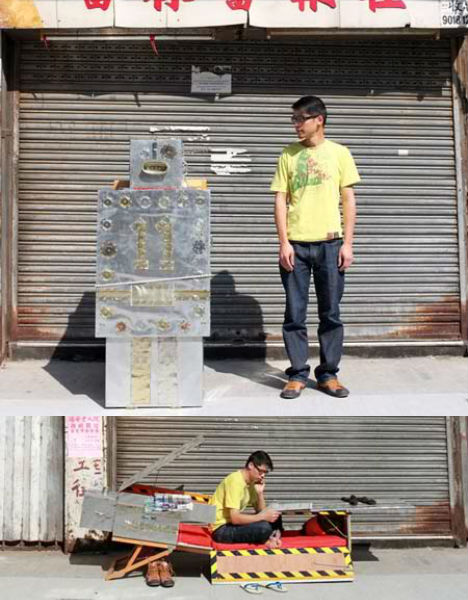 (images via: dezeen) Fanciful, but definitely fun, the Tin Man No.11 design by Kacey Wong takes a less serious look at how portable, wheeled trolleys could provide a safe and relatively comfortable home base for people who live on the streets. “It will not only serve as a shelter for the homeless but also decorate the city street, in a way,” says Wong of the robot-shaped design. The trolley opens to reveal a bed, desk and chair. Wong came up with the design after doing a field study on homeless people in Hong Kong, finding that many people do have jobs, but due to the high cost of living in the city, are forced to live on the streets near their place of employment. Cardborigami: Folding Portable Homeless Shelter 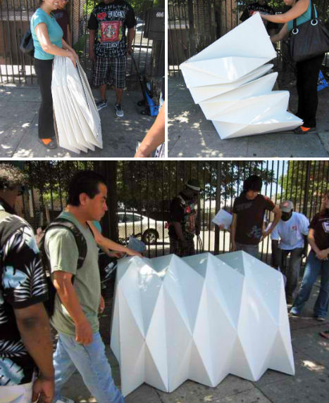 (images via: inhabitat) This portable emergency shelter was designed based on the principles of origami. Architect Tina Hovsepian created the Cardborigami shelter from recycled cardboard; it starts out as a flat package and expands into a sort of paper tent. The material was chosen because it is inexpensive, lightweight, sustainable and naturally insulated. Hovsepian plans to refine the design to make it waterproof, fire-retardant and more comfortable. Sleepbox by Arch Group 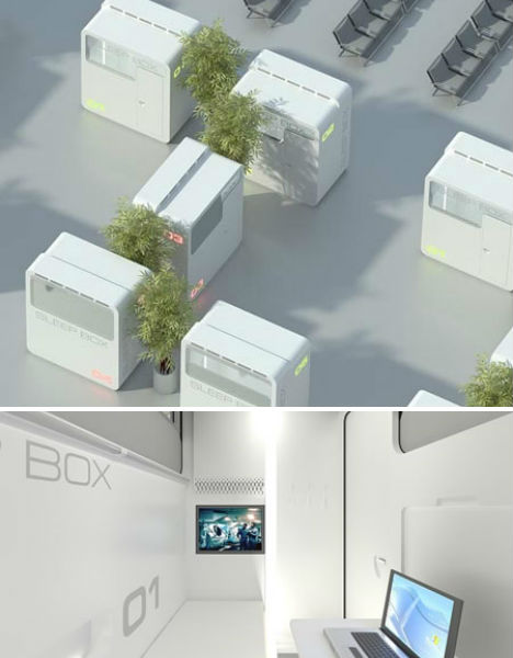 (images via: dezeen) The Sleepbox was actually designed with the intention of providing a compact space to take a nap, in environments like airports, but the design could easily be adapted for homeless housing as well. Russian architects Arch Group envision the Sleepbox as a unit that could be rented for a period of time between fifteen minutes and a few hours, with bedding that would be automatically changed between users; it would be particularly useful for layovers that would normally result in travelers snoozing in uncomfortable chairs. Imagine if these units could be placed in cities, perhaps sponsored by the local community, for people who don’t have roofs over their heads. Home Dome, Made of Packing Peanuts 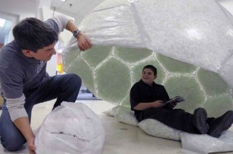 (images via: green building elements) Designed by a 12-year-old boy, the Home Dome makes use of a waste material that happens to provide a lot of insulation from the weather. For his entry in the Design Squad Trash to Treasure competition, Max Wallack won $10,000 and a Dell laptop computer for the structure, which is made of discarded plastic bags filled with styrofoam packing peanuts. Shelter Cart by Zo-Loft Architecture & Design 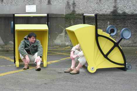 (images via: treehugger) Many homeless people gather discarded materials that have value, like aluminum cans, in bags or shopping carts in order to make a little bit of money. Designers Barry Sheehan and Gregor Timlin re-imagined the potential uses of that cart, creating a large, highly visible yellow push-cart that also functions as a shelter. The Shelter Cart – a submission in the 2006 DesignBoom social awareness competition – is not intended as a definitive answer to homelessness, but rather a way to raise awareness about the issue. Pump and Jump 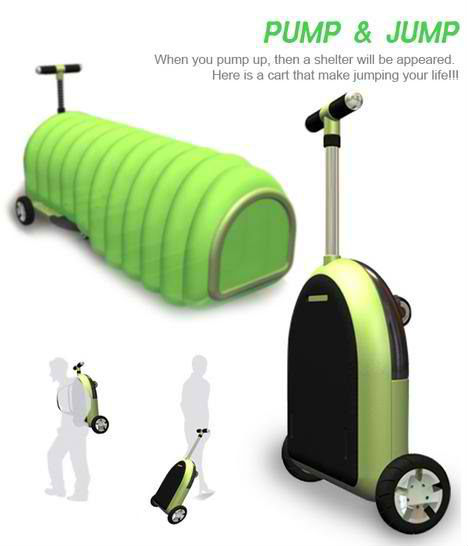 (images via: design boom) Another idea that considers the need for many homeless people to push their personal items or gathered valuables around in a cart is the Pump and Jump. Designers Jeong-Yun Heo, Seong-Ho Kim and Chung Lee explain, “It’s a cart for a homeless who collect recycled things. We are have two concepts for the cart. First is pumping Air, second is fixing the box on the cart. A Homeless can rest in the shelter and store collections such as bottles, sheets of paper, cardboards, etc.” Instant Housing by Urban Nomads 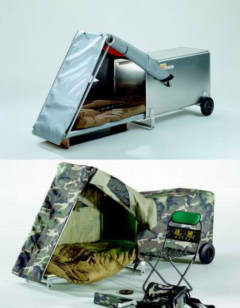 (images via: design buzz) Tiny mobile homes that can easily be carried around by a single person, these Instant Housing Shelters by Urban Nomads consist of a metal container with a pop-out tent-like structure, fitted with wheels. The housing unit contains a retractable padded bed, a first aid kit, mirror, whistle, multi-tool, flashlight and a plastic hood with a viewing window. Affordable and easily transportable, the units could also be used for emergency housing in the event of a disaster, or recreational camping. Homeless Health Care Clinic Made of Shipping Containers 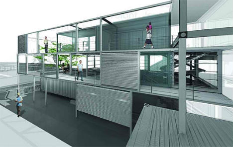 (images via: inhabitat) Homeless people need much more than shelters and even community support – they need health care, too. This concept by Co-Tain provides a simple health clinic made of shipping containers. Designed for the Paramore district of downtown Orlando, Florida, the Homeless Health Care Clinic is inexpensive to build, and sustainable. Shelter Home for the Homeless by Javier Larraz 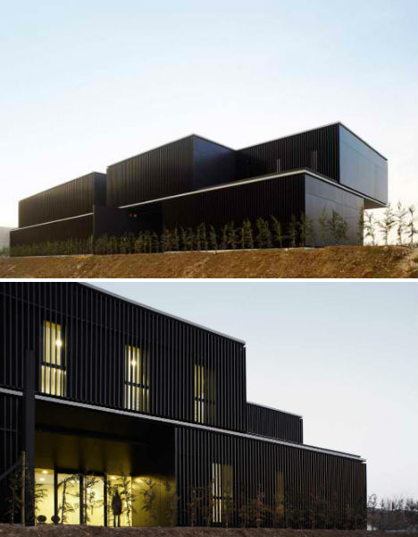 (images via: archdaily) The Shelter Home for the Homeless also considers more than just putting a roof over the heads of people who don’t have one of their own. It aims to improve their quality of life, with a community that emphasizes social interaction. The shared spaces in this sleek design include leisure rooms and spaces for occupational workshops. Mini Capsule Hotel by Atelier Van Lieshout 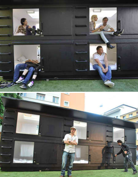 (images via: dezeen) Like the SleepBox, the Mini Capsule Hotel was not designed as a solution for homeless housing, but it could be adapted for such a use. Atelier Van Lieshout created the six-bed dorm-style hotel for an outdoor installation at Design Miami in 2009. Its original purpose, in fact, was almost on the other end of the spectrum: the designers describe it as “a send up of the corporate VIP lounge/oasis” functioning as a place to crash during or after a party. Brad Pitt reportedly bought it for his private beach. But such capsule hotels could have a much more practical use in urban environments. Want More? Click for Great Related Content on WebUrbanist:  Regardless of your view of street dwellers or opinion regarding the best solutions to these problems, suspend your judgment for a moment to take in these extremely cool designs! 63 Comments - Click Here to Read More »»  What Does It Mean to Be Homeless?An estimated 100 million people worldwide are "homeless" ... but what is homelessness? 24 Comments - Click Here to Read More »»  More and more designers are developing nomadic alternatives to traditional models of static urban living. 37 Comments - Click Here to Read More »» مطالب مرتبط با معماری اخرین اخبار و مطالب مرتبط با معماری را از آدرس http://p30city.net/search.php?do=fin...&starteronly=1 مشاهده کنید |
|
#94
|
||||
|
||||
|
معماری Manifest Destiny! Parasite Cabin Clings to San Francisco Wall 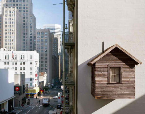 Jarringly out of place, a tiny, rustic cabin clings to the wall of an urban high-rise in the unlikely location of San Francisco, California. The cabin, which is fitted with a rocking chair and even a real, working wood stove, occupies one of the only remaining places in the heart of this cramped city to add a new structure. 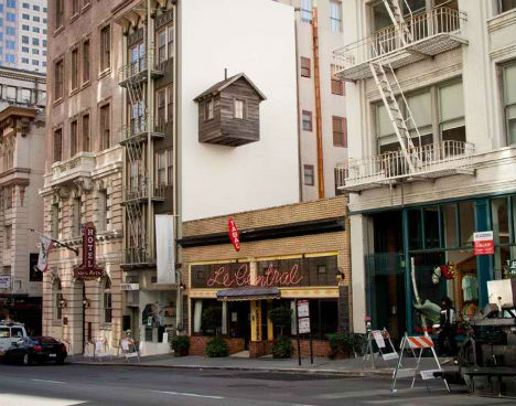 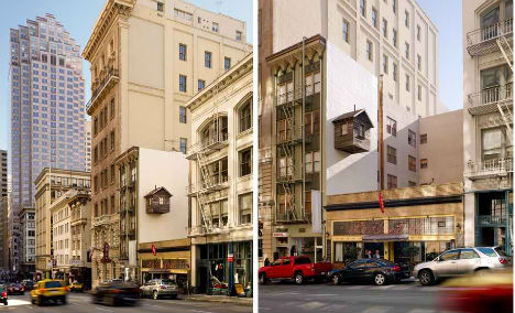 Entitled ‘Manifest Destiny!’, the installation by artist Mark Reigelman is intentionally absurd and incongruous. Affixed like a parasite to the existing infrastructure, the cabin seems to hang rather precariously from the Hotel des Arts above the Restaurant Le Central. The installation will remain in place – allowed to change and weather as a real cabin would – until October 2012. 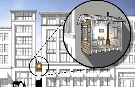 While the project seems to comment on the overpopulated nature of urban environments, the bigger message is about “the romantic spirit of Western myth” and the arrogance of westward expansion in the 19th century. San Francisco is not a welcoming new territory to be claimed, nor was the American west before pioneers began pushing their way into land that already belonged to other people. 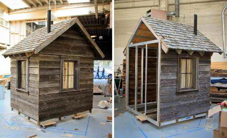 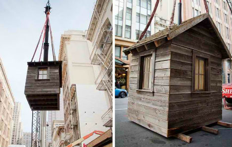 “Manifest Destiny! is about intrepidly claiming and occupying space regardless of hazard, existing occupants, inconvenience, daunting odds, or common sense. Manifest Destiny! is single-minded in its objective: move west, claim territory, build a home. Manifest Destiny! is about sacrificing everything for the outside chance of a better future. Manifest Destiny! is resolute.” Want More? Click for Great Related Content on WebUrbanist:  San Francisco has a rich history and culture that spans a diverse set of groups time periods. 10 Comments - Click Here to Read More »»  The architecture firm Fantastic Norway designs a very remote mountain getaway cabin that's sloped to allow winter sports on top, like skiing and sledding. Click Here to Read More »»  This upcoming public art installation at the Brisbane Airport will put the soothing power of flowing water on display for harried travelers and drivers. 1 Comment - Click Here to Read More »» مطالب مرتبط با معماری اخرین اخبار و مطالب مرتبط با معماری را از آدرس http://p30city.net/search.php?do=fin...&starteronly=1 مشاهده کنید |
|
#95
|
||||
|
||||
|
معماری Right Hear, Right Now: 8 Terrific Techy Devices for the Deaf 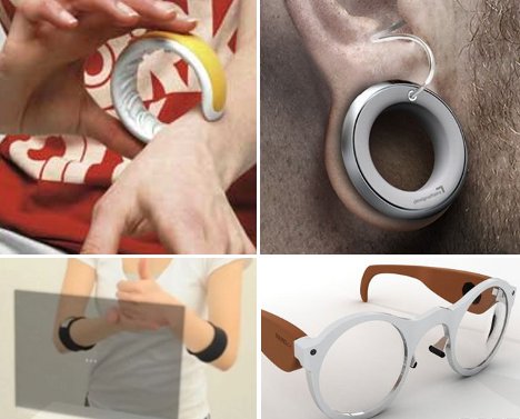 Technology to improve the lives of handicapped people has brought us all kinds of incredible objects. From bionic body parts to inventive gadgets for the blind, inventors have been hard at work leveling the playing field for all humans. These devices for the deaf and hard of hearing help hearing impaired people communicate with the hearing world and keep up with all of the most important things in life. Deafinite Style  Aimed at a youngish clientele, the Deafinite Style hearing aid provides a uniquely stylish way to augment hearing that was either damaged by loud noises or impaired from birth. The jewelry-style earpiece was designed by German firm DesignAffairs Studio and uses a wearer’s stretched earlobe piercings to hold the body of the hearing aid. Perhaps it would only appeal to a small segment of the hearing impaired population, but to those who resist hearing aids because of their ugly, utilitarian appearance this invention could be a perfect match. Tactile Sound Alerts 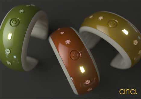 Most of us in the hearing world take for granted the fact that we can hear a variety of events taking place around us. The Aria is an attractive bracelet with a hidden function: it lets the wearer know when certain aural events are going on. The bracelet has little plastic nubs on the inside that rub against the wearer’s wrist to alert him or her to a ringing phone, a baby monitor, a doorbell, emergency sirens, an alarm clock, or a smoke alarm. Associated lights indicate which sound has activated the bracelet, letting the wearer direct his or her attention to the appropriate place. Speak Easy Phone 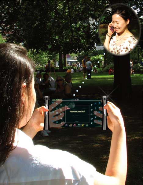 Before the proliferation of text messaging, many hearing impaired people had to rely on relay calls in order to communicate via phone. These calls can be uncomfortable for both parties since there is a third party listening in and translating between typed words and text. Designer Suhyun Kim took the relay operator out of the equation with her Visual Sound phone concept. The deaf user types her end of the conversation into the phone and the phone itself translates the text into speech. Those who already use text messaging or email to communicate wouldn’t get much use out of this invention, but older people who are not as comfortable with those options may find that this is an easier-to-grasp option. Theater Translator 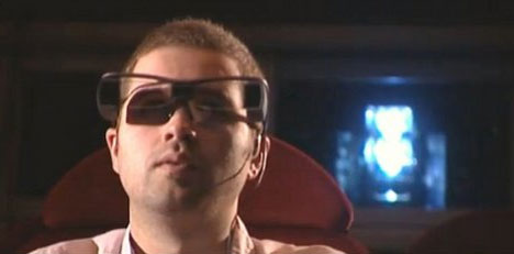 Have you ever thought about how hearing impaired people see movies in the theater? There are screenings with captions at many theaters, but they are often scheduled at inconvenient times. These captioning glasses, being developed by Sony, will let hearing impaired movie-goers see captions for movies while everyone else in the theater watches a caption-free showing. The text for the movie will be transmitted directly to the glasses, which will be available for rent at theaters soon. Seeing the Signs  For those who use primarily sign language to communicate with the world, getting a message across to someone who does not know sign language can be a frustrating endeavor. The Gestics system, envisioned by designer Luise Pescheck, is a portable sign language translator that can be used anywhere to turn sign language into text. Bands worn on the wrists of the signer detect muscle movements and “read” the signs being formed. The words are transmitted to the user’s iPhone and displayed on a projected screen. The screen, of course, is not part of the current generation of iPhones, so this concept is still a long way from becoming reality…if it ever does. Watch Where You Touch 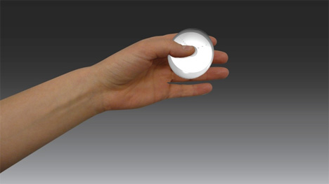 People who are not only deaf but blind as well have double the obstacles when it comes to communicating with the world. This timepiece concept is meant to help deaf/blind people keep in touch with reality by providing the current time via a series of raised dots on its surface. Small dots arranged in lines take the place of a clock’s hands, pushing up against a thin membrane in positions that indicate the time – just in the way that a traditional clock would. The Helen Keller Watch concept was designed by students Andrea Seitner and Katharina Unger. Hidden Translations 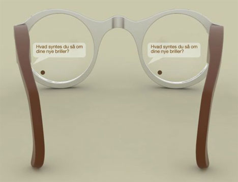 While some hearing impaired people avoid hearing aids out of embarrassment, technology is making it easier and easier to disguise a hearing problem. The Babelfisk concept, designed by Mads Hindhede, is a pair of glasses equipped with internal electronics that turn spoken words into speech bubbles right in front of the wearer’s eyes. Twin projectors place the speech bubbles directly onto the glasses’ lenses. Conversations would be simple to follow and participate in thanks to real-time, inconspicuous captioning. It may be a little alarming to see someone’s eyes darting around while they read rapidly changing text, though. Show and Tell  Sign language interpreters are not exactly hard to find, but when there is not one around and a deaf person needs to communicate with hearing people via sign language, this awesome system would be priceless. The Texting Glove, invented by a group of Google developers, senses the signs being formed by the wearer’s hand and translates them into text through an Android phone. The promising technology might have all of those professional sign language interpreters fearing for their jobs in the near future. Want More? Click for Great Related Content on WebUrbanist:  The blind can now navigate, read, create art and solve puzzles much more easily with incredible gadgets and technology using sound, vibrations and texture. 5 Comments - Click Here to Read More »»  Robotics holds almost limitless possibilities for our future. These 10 recent advances in robot technology show us just how far we have already come. 2 Comments - Click Here to Read More »»  Prosthetic technology has come a very long way. These incredible designs are at the cutting edge of the field and are changing the lives of amputees. Click Here to Read More »» مطالب مرتبط با معماری اخرین اخبار و مطالب مرتبط با معماری را از آدرس http://p30city.net/search.php?do=fin...&starteronly=1 مشاهده کنید |
|
#96
|
||||
|
||||
|
معماری Paper Architecture: Intricate 3D Sculptures by Ingrid Siliakus 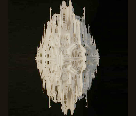 From flat sheets of paper, entire cities emerge, rich in unexpected details like balconies, tiny windows and even little people. Dutch artist Ingrid Siliakus uses an initial 90-degree fold to give her miniature cityscapes depth and dimension, with an end result that is reminiscent of pop-up books. 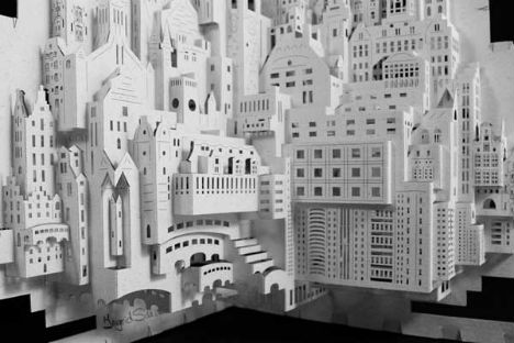 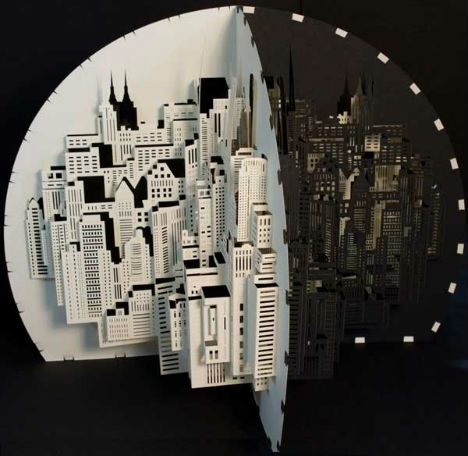 Under Siliakus’ skilled hand, paper ranging from thin sheets to hefty card stock assemble into complex staircases, arches and spires. She specializes in the works of master architects, including Gaudi’s iconic Sagrada Familia of Barcelona. 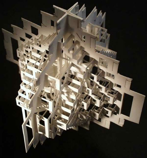  Before reaching a final product for each piece, the Amsterdam-based paper artist creates an astonishing 20-30 prototypes. She adds layer after layer of folded and cut paper to the design until she is satisfied with the look. 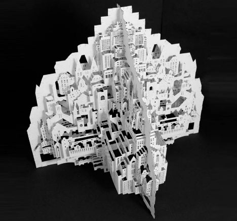 “Working with paper forces me to be humble, since this medium has a character of its own that asks for cooperation. It is a challenge to find this cooperation with each separate paper brand I work with. Working with paper the way I do, namely by means of cutting and folding creating paper sculptures, asks of me to work with meditative precision. Paper architecture does not bare haste, it is its enemy; one moment of loss of concentration, can lead to failure of a piece…” 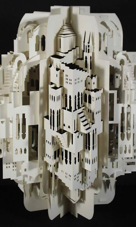 “…I experience an ultimate satisfaction at the critic moment when the paper, with a silenced sigh, surrenders and becomes a blade-sharp crease. The sound of the paper, which guides this surrendering, to me is incomparable…” Want More? Click for Great Related Content on WebUrbanist:  Cutting, scoring, folding and gluing, these 14 masters of paper art transform their delicate medium into collages, sculptures, illustrations and installations. 5 Comments - Click Here to Read More »»  Paper artist Laura Cooperman creates delicate, intricate landscapes inspired by the architecture she has seen in her travels to places like Beijing. 3 Comments - Click Here to Read More »»  These large-scale paper tapestries are more than just two-dimensional cutouts. They are delicate, intricate artworks with a nature-loving flair. 7 Comments - Click Here to Read More »» مطالب مرتبط با معماری اخرین اخبار و مطالب مرتبط با معماری را از آدرس http://p30city.net/search.php?do=fin...&starteronly=1 مشاهده کنید |
|
#97
|
||||
|
||||
|
معماری Augmented Reality: Awesome 3D Hand-Held Architecture  In a weak world economy where everyone is trying to be conservative with cash, new architectural projects go unbuilt more often than not. That doesn’t stop architects from designing incredible structures, though – it only means that they have to come up with slightly more creative ways of sharing them with the world. The Dutch postal service and the Netherlands Institute of Architecture joined forces to bring amazing architecture to the world via augmented reality. 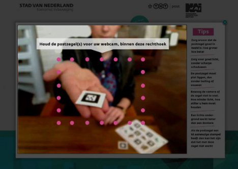 The cooperative project aimed to present the public with architecture that would never see the light of day in the real world but still deserved to be admired. Working with Dutch advertising agency Gummo, the Netherlands Institute of Architecture and Dutch postal service created a very unusual sheet of stamps. 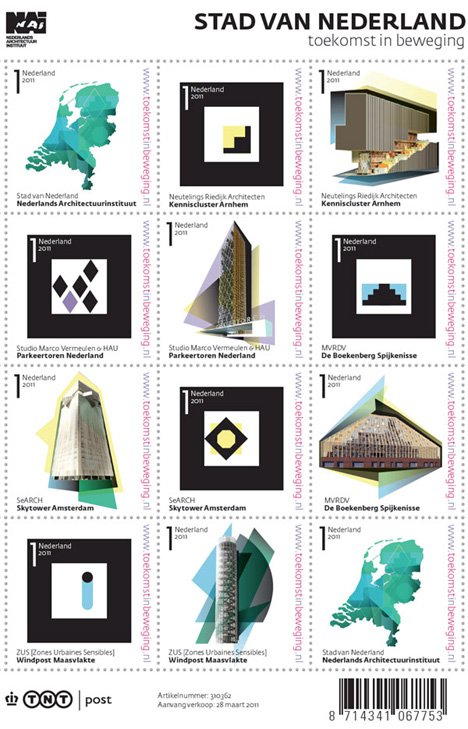 Some of the stamps display pictures of unbuilt but visionary architecture. Others contain QR codes that actually bring the structures to life. Holding one of the QR code stamps up to a webcam while visiting the project website makes one of the revolutionary buildings come to life right in the palm of your hand. The project is a perfect example of how technology can help us overcome problems in new and unexpected ways. These wonderful buildings may not be able to find a budget in real life, but putting them into the hands – literally – of architecture enthusiasts gives them a chance to be seen and to provide inspiration. Want More? Click for Great Related Content on WebUrbanist:  Want to do some serious graffiti art but don't want to do jail time? This cool iPhone app lets you beautify your world with spray paint in augmented reality. 1 Comment - Click Here to Read More »»  SimCity gets real in this fun 3D printing project that brings the virtual buildings to life. Who's up for playing Godzilla? 1 Comment - Click Here to Read More »»  Buildings split down the middle, sprout slides, bend over in strange ways and send stairs into the sky in these fantasy architectural designs by Victor Enrich. 1 Comment - Click Here to Read More »» مطالب مرتبط با معماری اخرین اخبار و مطالب مرتبط با معماری را از آدرس http://p30city.net/search.php?do=fin...&starteronly=1 مشاهده کنید |
|
#98
|
||||
|
||||
|
معماری Incarnate: Skull Carved from Outdated Computer Books 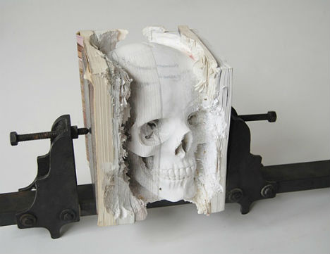 Artist Maskull Lasserre specializes in transforming ordinary objects into amazingly intricate, often somewhat unsettling works of art. His most recent work, ‘Incarnate (Three Degrees of Certainty II), conjures a highly realistic anatomic model of a skull from a stack of outdated software manuals. 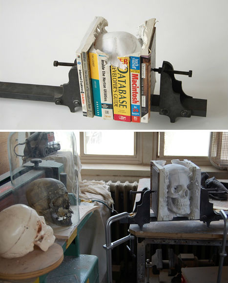 Lasserre used drills and hand tools to carefully chisel out areas of the compressed pages, carving out the skull as if it had been hiding in the books all along. It’s an interesting metaphor for the uselessness of the books, which no longer have any real value. 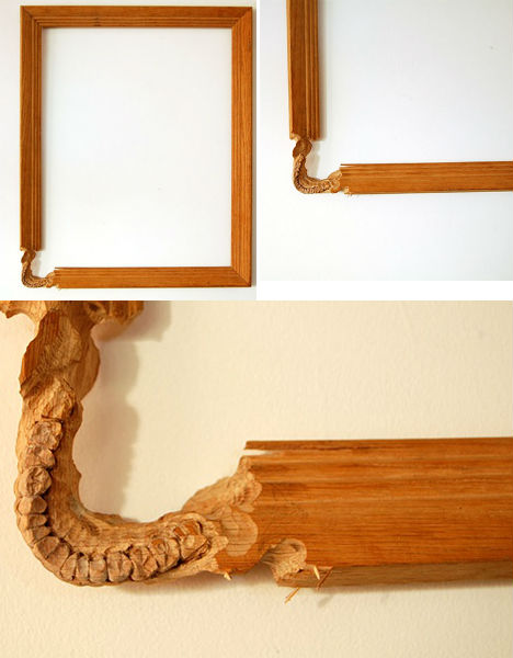  The artist’s previous projects include ‘Secret Carpentry’, in which the skeleton of a snake was carved out of a wooden axe handle – each tiny vertebrae smooth and distinct – as well as ‘Oracle’, a wooden picture frame with a corner chiseled into a child’s bottom teeth. 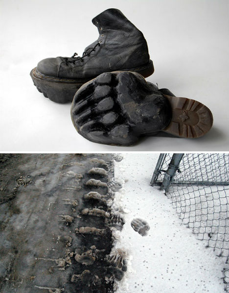 Another project, ‘Outliers’, involved reproducing animal tracks onto the rubber soles of shoes that were then worn to leave highly unlikely prints all over urban areas in the cities of Montreal, Ottawa, Boston and New York. See more of Lasserre’s work at his website. Want More? Click for Great Related Content on WebUrbanist:  Encyclopedias in English and Chinese are eroded into landscapes by artist Guy Laramee, in a narrative about a dystopian vision of the 23rd century. 4 Comments - Click Here to Read More »»  A 7-story spiraling 'Tower of Babel' in downtown Buenos Aires is made of 30,000 donated books in all languages. 7 Comments - Click Here to Read More »»  Peek into the astonishing collection of a miniature book enthusiast who may have the littlest huge library in the entire world. 3 Comments - Click Here to Read More »» مطالب مرتبط با معماری اخرین اخبار و مطالب مرتبط با معماری را از آدرس http://p30city.net/search.php?do=fin...&starteronly=1 مشاهده کنید |
|
#99
|
||||
|
||||
|
معماری Musical Coca-Cola Beatbox for the 2012 Olympics in London 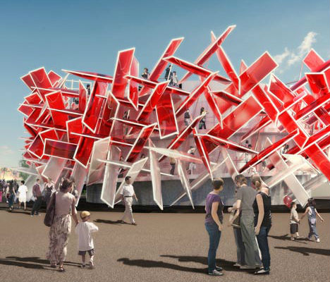 Bold and interactive, the Coca-Cola Beatbox by London architects Pernilla & Asif will beckon visitors inside to play music and gaze out at the London 2012 Olympic Park. The eye-catching red-and-white pavilion can actually be played like a musical instrument by interacting with sounds imbedded into the architecture itself. 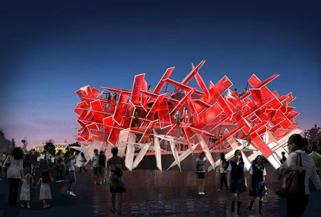 The design was inspired by Coca-Cola’s ‘Move the Beat’ campaign, which aims to interest teens in the Olympics through a combination of music and sports. Visitors to the pavilion will be able to create their own tunes by remixing sounds that were recorded from various Olympic sports by music producer Mark Ronson. 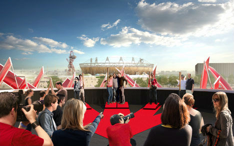 The Coca-Cola Beatbox will be covered in ETFE plastic pillows that are sensitive to touch and movement. Once visitors make their way up the spiraling staircase that runs through the pavilion, they’ll be rewarded with panoramic views. 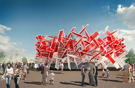 “We have sought out some of the most innovative engineers in the UK to work with us to realise our vision – a ‘building with a beat’,” say the architects. “The Coca-Cola Beatbox will be a sensory experience that fuses design, music, sport and architecture. It will be something that people have never seen or heard before!” Want More? Click for Great Related Content on WebUrbanist:  Visiting London in 2012? You've got a once-in-a-lifetime chance to stay in a temporary boat-shaped hotel perched on the roof of the Southbank Centre. 7 Comments - Click Here to Read More »»  Perched atop the Southbank Centre, a riverboat-shaped apartment called 'A Room for London' will offer lucky guests amazing views of the Summer Olympics in 2012. 1 Comment - Click Here to Read More »»  If things really go better with Coke and better means bigger, these 10 international giant Coca-Cola cans prove size really does matter! 1 Comment - Click Here to Read More »» مطالب مرتبط با معماری اخرین اخبار و مطالب مرتبط با معماری را از آدرس http://p30city.net/search.php?do=fin...&starteronly=1 مشاهده کنید |
|
#100
|
||||
|
||||
|
معماری A Cookbook You Can Actually Cook… And Eat 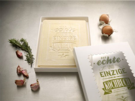 Imagine reading a recipe, mixing up your ingredients, placing the recipe page in a pan with some tomato sauce and cheese, baking it and then consuming it with relish. It’s not a likely scenario unless you have pica, a disorder that causes people to eat non-food substances like paper – or you’ve gotten your hands onto ‘The Real Cookbook’ by Korefe.  Reminiscent of British artist Anna Garforth’s edible typography, which consists of cookies carefully cut into typographic works of art, the cookbook is made of sheets of fresh pasta printed with recipes in German. Each sheet is designed like a poster, both informative and beautiful to look at.   Once the recipe is put together, the sheet of pasta is placed on top, creating a classic lasagna.  The Real Cookbook was designed as a special project for a large publishing house, and is not available for sale, but if you’re crafty you could possibly DIY your own version with a large stamp and just-slightly-defrosted frozen sheets of pasta. Want More? Click for Great Related Content on WebUrbanist:  Text is used as the medium of choice to illustrate urban cityscapes in these typographic works of art, with some translating architectural styles into typeface. 7 Comments - Click Here to Read More »»  SimCity gets real in this fun 3D printing project that brings the virtual buildings to life. Who's up for playing Godzilla? 4 Comments - Click Here to Read More »»  Working seven days a week, artist Kim Rugg spends five months cutting the letters out of the front page of a newspaper and rearranging them alphabetically. 3 Comments - Click Here to Read More »» مطالب مرتبط با معماری اخرین اخبار و مطالب مرتبط با معماری را از آدرس http://p30city.net/search.php?do=fin...&starteronly=1 مشاهده کنید |
 |
| کاربران در حال دیدن موضوع: 1 نفر (0 عضو و 1 مهمان) | |
|
|
اکنون ساعت 12:18 AM برپایه ساعت جهانی (GMT - گرینویچ) +3.5 می باشد.


 حالت خطی

