
|
|
#101
|
||||
|
||||
|
معماری Hip Potty Musts: 15 Concept Designer Toilet Brushes 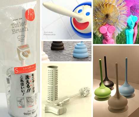 From the outhouse to the White House, the best toilet brushes never bristle when it comes to cleaning the latrine. Combining carefully engineered ergonomics and sometimes surprising style to produce spotless results where it counts the most, these 15 concept designer toilet brushes won’t drop the ball when you drop a deuce. Ballo “Dancing” Toilet Brush 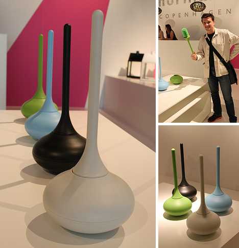 The Ballo Toilet Brush was designed for Normann Copenhagen by Jozeph Forakis, an alumnus of Domus Academy in Milan and the Rhode Island School of Design. As the latter was where the members of Talking Heads first met, it’s really no surprise Ballo (which means “dancing” in Italian) merrily wobbles around the bathroom thanks to its atypically rounded base. Big suit not included. 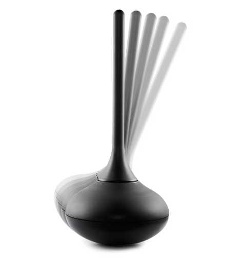 “Ballo is a different, amusing and happy toilet brush,” states Forakis, who’s undoubtedly the first to describe a toilet brush as being happy. Forakis goes on to describe Ballo as “a funny but functional product that creates pleasure and gives an experience in people’s daily lives.” Having a toilet brush & holder dance around the bathroom whilst one answers the call of nature would be a very special experience indeed. Skull Head Toilet Brush Set  You don’t have to be One-Eyed Willie to own the Skull Head Toilet Brush Set but no Goonie geek worth his doubloons would be caught without one. The set includes a “life sized skull” and the matching handle (topped with a voodoo-mini-skull) detaches so replacing a worn-out toilet brush is as easy as plundering an unarmed merchant frigate. Arrr, scrub those decks AND the toilet, ye scurvy dog! Pinocchio Toilet Brush  Pants on fire? Yes please! Pinocchio must’ve really told a whopper to get himself in this sort of fix. Designed with a red, blue or green hat for a base, the Pinocchio Toilet Brush “nose” just what to do when unsightly stains rear their ugly head… and that’s the truth. 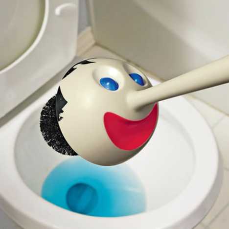 Anthropomorphic products are appealing to some, off-putting to others and the Pinocchio Toilet Brush is definitely one of those love-it-or-hate-it items. “If there is such a cute restroom brush,” suggests the sales copy at the Japanese product page, “the cleaning seems to become fun.” Oh really? Methinks some noses may be growing at a certain ad agency. Clean as a Whistle Bathroom Brush 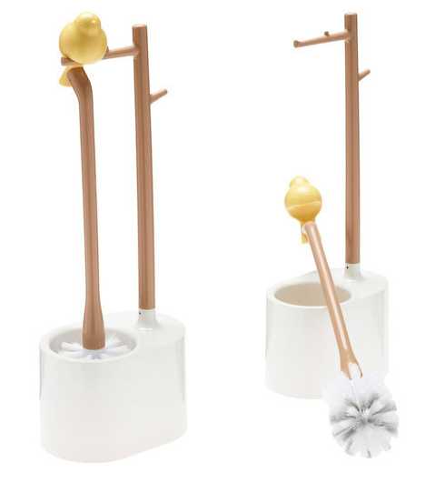 The Clean as a Whistle Bathroom Brush adds a dash of pastoral charm to any bathroom. Modeled after a songbird sitting prettily on a tree branch, the design employs a second faux branch to act as a hanger for the handle thus suspending the toilet brush and keeping the brush head high & dry. Ideal for those social media addicts (and you know who you are) who can’t resist “tweeting” anywhere and anytime. FRAGILE Toilette Brush 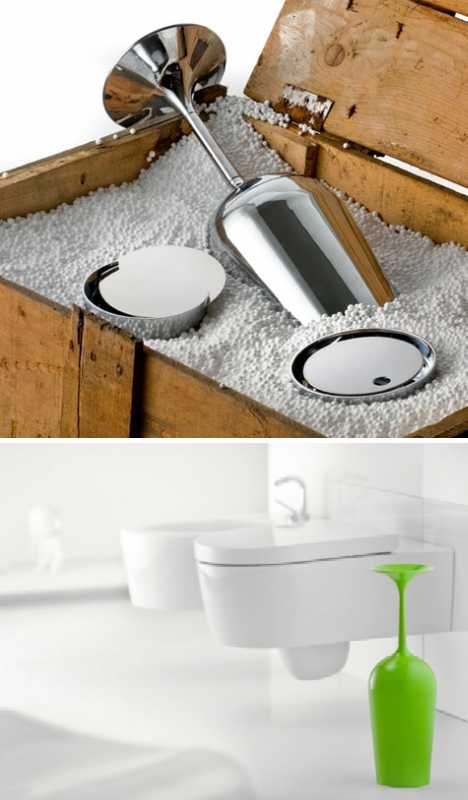 One doesn’t usually associate bathroom cleaning supplies with fine wine but Antonio Gardoni isn’t your usual designer. His FRAGILE Toilette Brush cleverly masks a functional toilet brush within a plastic shell modeled after an upside-down wine glass. Of course, should you overindulge on the bubbly and find yourself driving the porcelain bus, a wine glass is probably the LAST thing you want to see. 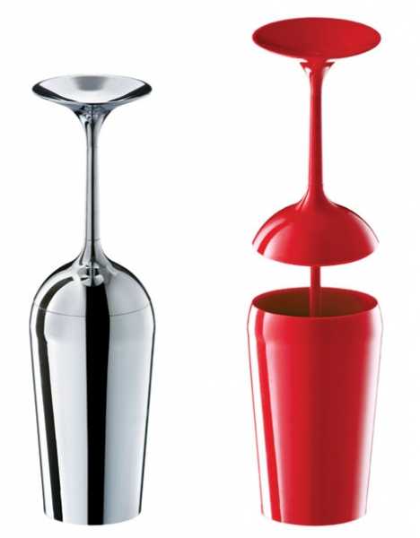 FRAGILE is one of Gardoni’s “5 Collection”, designed to “transform an ordinary bathroom ‘visit’ into an unforgettable experience!” Fine, but what if you’re drinking to forget? Istanbul WC Brush Holder 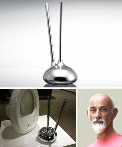 The Istanbul (not Constantinople) WC Brush Holder is one heavy hitter: 4.13kg or 9.1 pounds to be exact. Designed by London-based industrial designer Ross Lovegrove for the Turkish brand VITRA, the WC Brush Holder exhibits a smooth, rounded shape that works well with today’s organic inspired appliances. KaKaK Toilet Brush 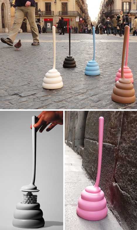 There’s not much that can be said about the KaKaK Toilet Brush besides the fact it was designed in 2012 by Jordi Pla of Jordi Pla Studio S.L for Homewood International of Taiwan. Then again, one might say the design speaks for itself and any description would be redundant… not to mention repugnant. 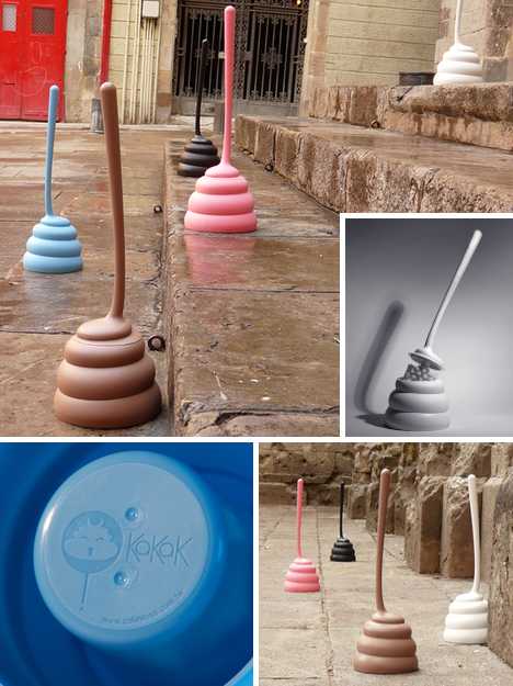 The KaKaK Toilet Brush comes in your choice of black, white, blue, pink and brown (of course). Made from molded polypropylene, the in-your-face design makes sure you make no mistake when fumbling for your toothbrush after not getting enough sleep the previous night. Mahogany Skittle Brush 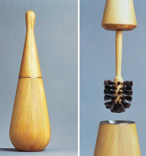 Nina Tolstrup of Studiomama exercises her creative muse by repurposing wood. The Skittle Brush is just one example. Named and designed after Skittles, the old European sport ancestral to bowling, this sleek and slender organically curved toilet brush allows you to strike and stains, sparing no messes. Alessi Merdolino Toilet Brush 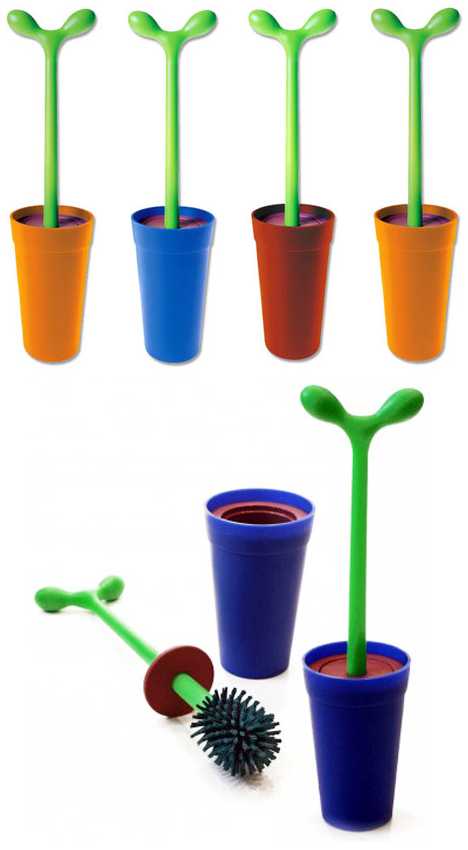 We’re not sure if it’s intentional or not but the Merdolino Toilet Brush from Alessi seems to be named after “merde”, the French word for poop. Designed by Stefano Giovannoni in 1993, Merdolino turns the humble toilet brush from a utilitarian object to a decorative accessory. 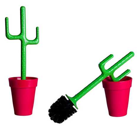 A subtle variation on Merdolino sees the budding branch replaced by a slender Saguaro. Now if only they could replace the brush head’s bristles with real cactus thorns. Mesquiteolino, anyone? Rock Star Toilet Brush Holder 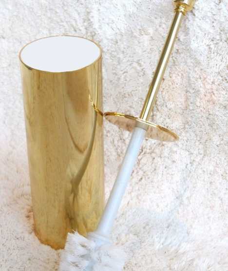 Those “pot of gold” jokes you’ve been saving up? Let ‘em rip, ’cause the $525 Rock Star Toilet Brush Holder has entered the building! Designer Windisch Nameek plated an otherwise unremarkable toilet brush handle and cylindrical holder in 24-karat gold for the very commonsensical reason that pure gold won’t corrode, pit or tarnish. Which raises the question… if you can afford $525 for a freakin’ toilet brush, why not just gold-plate your toilet so you’ll never need to use one? Afro Collection Toilet Brushes 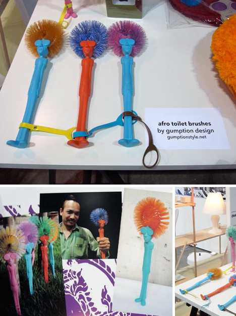 Gumption Design is based in Thailand, and that’s as far as we’ll go lest Spike Lee sees these so-called Afro Brushes and fires off another errant tweet. According to GD’s sales copy, what we have here is “a brush with a 70s afro look, the handle of the brush is in the form of a cool ‘hippy’” See, only cool hippies need be offended. 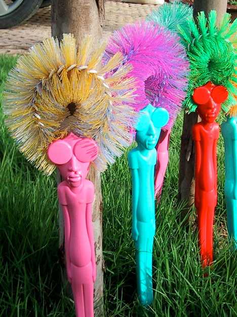 If you can get past the, ahem, distinctive design of the handle, what you’ve got here is a fun & funky… no, that’s not right. OK, these day-glo plastic psychedelic toilet brushes add a little color… forget it, we give up, gonna quit while we’re a head. Doh! Kleinkindsichere WC-Bürste 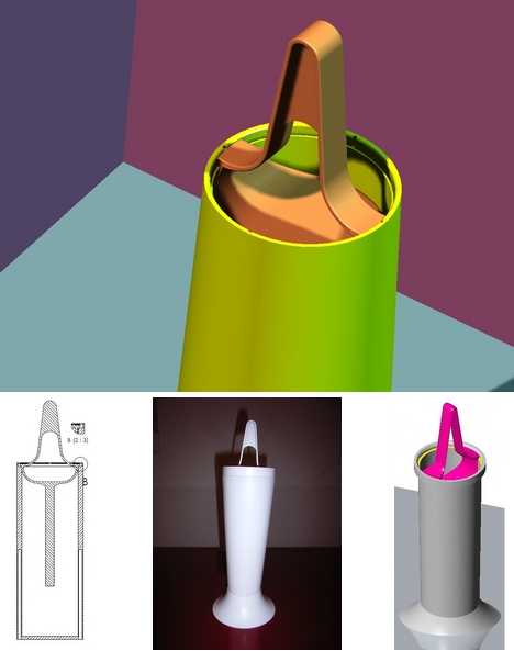 Also known as the Child-Proof Toilet Brush, the Kleinkindsichere WC-Bürste is an idea whose time has come – just like curious toddlers who can come into any room at any time and get into a heapin’ helpin’ of toilet brush-related trouble. Then there are the dogs who see “toilet brush” and think “big white bone!” German designer Peter Praktisch has a solution, one that will be very familiar to anyone who’s tried to remove a child-proof cap off a bottle of pills. Of course, if you have trouble with those than your bathroom will reflect it. WC7 Electric Toilet Brush 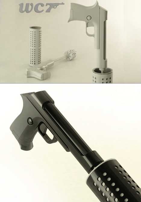 Does your toilet’s criminally encrusted condition call for a special kind of cleaning agent? Then call on WC7, the electric toilet brush whose orders are “shoot to clean.” Designed by Francesco Castiglione Morelli with Annamaria Carelli, this is one polishing potty pistol that will leave even the most evilly stained commode shaken AND stirred. Lock (the bathroom door) and load! 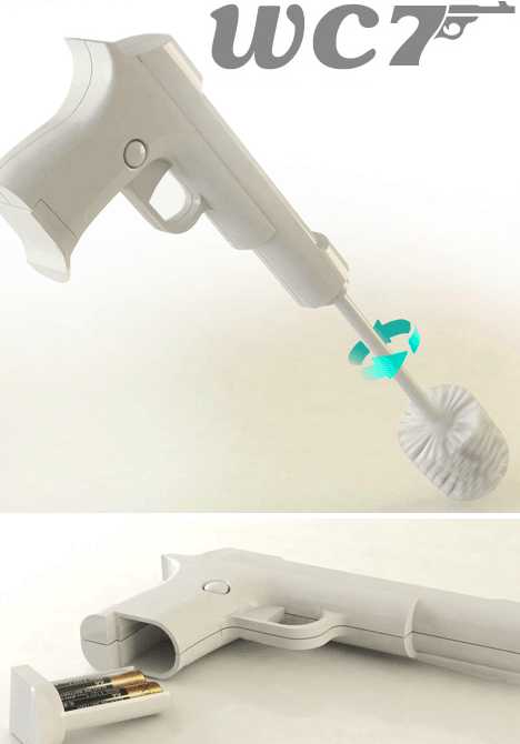 The WC7 packs a pair of AA batteries in the brush’s handle. Once installed, take careful aim and pull the trigger… the spinning brush head will eradicate those stains faster than Don Corleone erases his competition. Now there’s an offer nobody can refuse. DIY Self-Disinfecting Toilet Brush 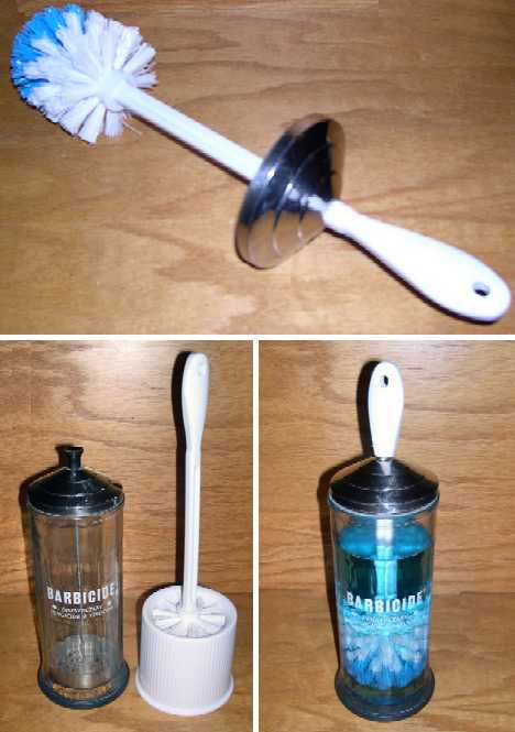 Designer toilet brush? Why ask why when you can DIY! The clever lads at MAKE Projects combined a classic barbershop glass Barbasol container with a standard toilet brush to create this awesome self-disinfecting toilet brush & holder that ends up being much more than just the sum of its parts. Er, you might not want to store your combs in there once it’s been re-purposed and used, though. THE Toilet Brush 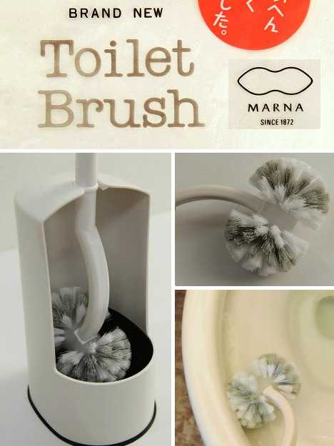 It takes a pair of big brass ones to dub your new toilet brush “Toilet Brush,” as if any and all other such devices are suddenly, hopelessly irrelevant, and Japanese housewares company Marna seems to have ‘em. Their new & improved product has been re-designed from handle to holder to be THE best toilet brush EVAR… and give Marna some credit for not calling it that. 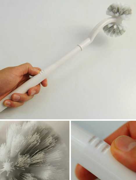 How does Marna know their brand new Toilet Brush will please their target market of finicky Japanese housewives? They asked them, of course: the company brought in 200 average housewives and asked them how the humble toilet brush could be improved. It was a smart move and besides, who’s gonna tell 200 housewives they’re wrong? 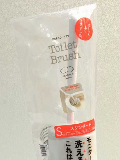 Suggestions ranged from incising grooves on the handle to help secure the grip, using both hard and soft bristles on the brush, and engineering a floating holder design that keeps the brush head high & dry between uses. Now if only they could re-design the toilet itself so toilet brushes aren’t necessary, suggested one Marna employee just before he was, er, canned. Want More? Click for Great Related Content on WebUrbanist:  Artist Anastassia Elias creates captivating little worlds with the most mundane of materials: toilet paper rolls. 3 Comments - Click Here to Read More »»  These 15 cool concept toothpick holders display your wee wooden weapons to best advantage while adding a designer dash to any kitchen, bar or chicken wing cafe. 1 Comment - Click Here to Read More »»  What do super heroes and villains do when nobody's looking? Photographer Ian Pool gives us a glimpse with this fantasy photo series. 9 Comments - Click Here to Read More »» مطالب مرتبط با معماری اخرین اخبار و مطالب مرتبط با معماری را از آدرس http://p30city.net/search.php?do=fin...&starteronly=1 مشاهده کنید |
| جای تبلیغات شما اینجا خالیست با ما تماس بگیرید | |
|
|
|
|
#102
|
||||
|
||||
|
معماری Surreal Art Spaces: 15 Stunning Gallery Transformations 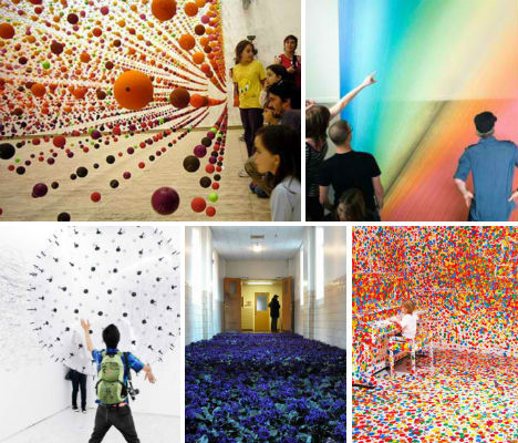 What better way to immerse yourself in an artist’s work than to walk into a space that has been altered in amazing and unexpected ways? Installation art transforms galleries and other spaces from blank canvases to full-scale, interactive and often surreal environments. These 15 installations range from pristine spaces obliterated by children armed with colorful stickers to complex matrices of metal hangers that jangle with the movement of forty finches. Suspended Bouncy Balls by Nike Savvas 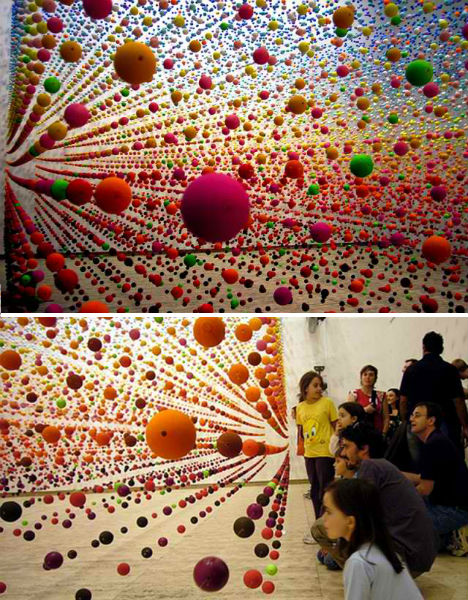 (images via: this is colossal) Thousands of balls seemed to hover in midair for the eye-popping installation ‘Atomic: Full of Love, Full of Wonder’ by artist Nike Savvas at the Australian Centre for Contemporary Art in Melbourne. Not only did the installation create a disorienting field of color, but air movement from a fan caused the balls to gently bounce and sway. From Here to Ear by Celeste Boursier-Mougenot 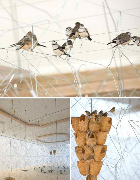 (images via: lost at e minor) Hundreds of interconnected metal hangers provided an unusual perch for 40 finches in an installation called From Here to Ear (v.13) by artist Céleste Boursier-Mougenot at the Queensland Gallery of Modern Art in 2011. The installation was one of sound as well as visuals, as the movements of the birds caused the hangers to clink together. Analog Interactive Installation by Karina Smigla-Bobinski 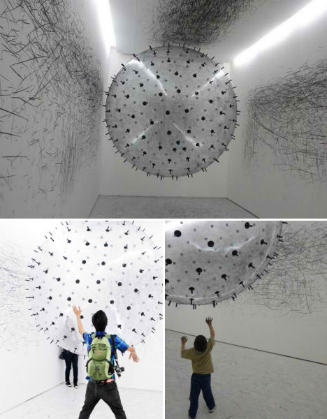 (images via: this is colossal) A giant helium-filled bubble covered in dozens of charcoal nubs was bounced and flung around a white gallery space to create abstract markings on the walls and ceiling in ‘ADA – Analog Interactive Installation’, a sculpture by artist Karina Smigla-Bobinski. Eventually, after the participation of hundreds of visitors, the sculpture deflated and the walls were left nearly solid black. Thousands of Flowers in a Mental Health Center 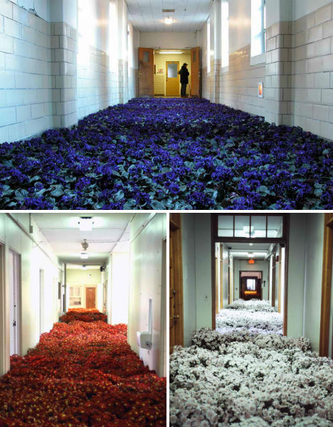 (images via: this is colossal) A deteriorating mental health center in Massachusetts was a worn and rather sad place after 90 years of service to the local community. As the building was set to be demolished, artist Anna Schuleit set out to memorialize the building with “a respectful infusion of hope”. The resulting installation, called Bloom, filled the center with nearly 28,000 potted flowers. The public was invited for a four-day viewing. Read an interview with the artist at This is Colossal. Bouncing Tennis Balls by Ana Soler 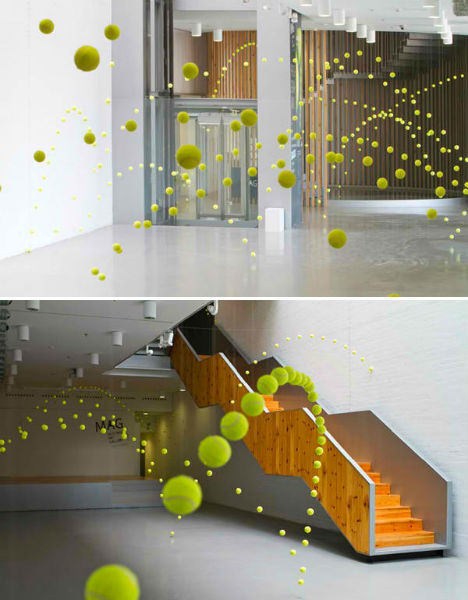 (images via: collabcubed) At first, these images appear to be multiple exposure photographs in which the motion of a ball has been captured in its arcs across gallery surfaces. But it’s actual an installation, with hundreds of tennis balls hanging from strings to effectively capture a sense of movement. The work, by Spanish artist Ana Soler, was displayed at the Mustang Art Gallery in Alicante, Spain. Cause & Effect by Do Ho Suh 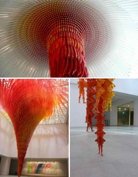 (images via: the stranger) Amazingly precise spirals in varying shades of orange and red create a fiery-looking vortex at Western Washington University. Look closer and you’ll see that the installation, by Korean artist Do Ho Suh, is actual made up of thousands of tiny men. Says the artist, “The work is an attempt to decipher the boundaries between a single identity and a larger group, and how the two conditions coexist.” Massimal by Design Office Takebayashi Scroggin 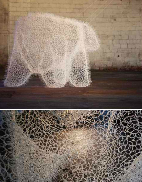 (images via: design boom) The ghost of some kind of massive animal lurks in a warehouse in this installation by New York Design Office Takebayashi Scroggin, created for the 2011 Beau Arts Festival. Entitled “massimal”, which the firm describes as “design objects that serve as prototypes to examine how physical form can engage the public realm,” the work is made of 20,000 white zip ties. Suspended Dandelions by Regine Ramseier 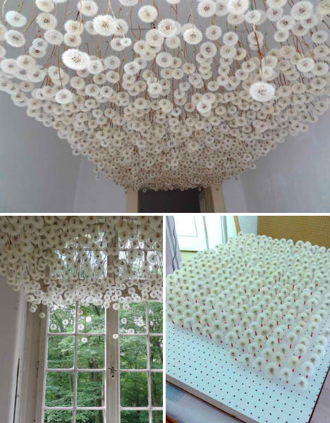 (images via: lustik) Two thousand dandelions were painstakingly plucked, sprayed with adhesive and loaded into a custom-made wooden transporter so they could be brought to a gallery and hung from the ceiling in a surreal installation by Regine Ramseier. The work was created as part of ArToll Summer Lab 2011. Field of Steel by Zadok Ben David 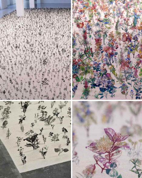 (images via: collabcubed) An artificial meadow covers the floor of Artclub 1563 in Seoul, South Korea in this art installation by Zadok Ben David. The work, entitled ‘Blackfield’, changes as you walk from one side of the room to the other. 12,000 botanical specimens modeled on textbook illustrations were cut from steel and imbedded in a layer of sand. All black on one side, the tiny plants are revealed in full color from the alternative perspective. Melting Woman by A.F. Vandervorst 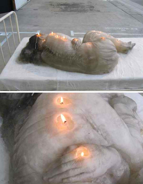 (images via: af vandervorst) A woman melted before viewers’ eyes at the Arnhem Mode Biennale in 2011. The installation, by artist A.F. Vandervorst, was comprised of a wax sculpture imbedded with wicks that slowly eroded the woman’s body, drastically altering the shape of the work within hours. The Obliteration Room by Yayoi Kusama 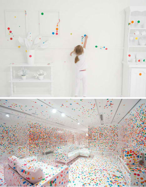 (images via: queensland gallery of modern art) A pristine room, with every surface painted a stark shade of white, was completely covered in a chaotic jumble of colored stickers for Yayoi Kusama’s installation, The Obliteration Room. Constructed at the Queensland Gallery of Modern Art, the installation gave the room over to thousands of sticker-armed children over a period of two weeks. By the end of the installation, the white surfaces were barely visible. Post-It Structures by Yo Shimada 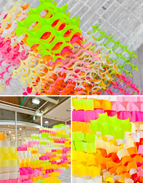 (images via: design boom) Entire architectural structures were built from nothing more than 30,000 brightly colored post-it notes in an installation called ‘Post-It Structures’ by Yo Shimada of Tato Architects. Installed at the Artzone Gallery in Kyoto, Japan, the structures were created by sticking the notes to each other so that they created cell-like shapes. Forever Bicycles by Ai Weiwei 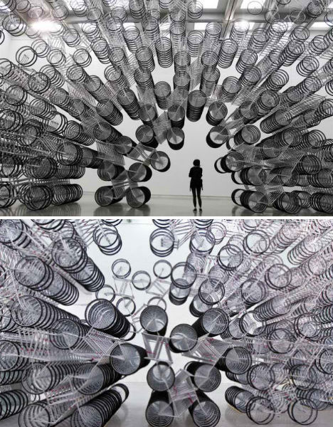 (images via: inhabitat) 1,200 bicycles were welded together into a gigantic, glittering cavern by Chinese artist Ai Weiwei. ‘Forever Bicycles’ was located at the center of the show ‘Absent’ at the Taipei Fine Arts Museum, the title of the exhibit referring to the dissident artist’s political detention. Plexus 5 by Gabriel Dawe 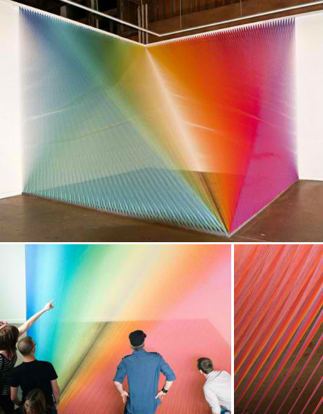 (images via: gabriel dawe) It looks like an optical illusion – a rainbow created by light and water, perhaps. But Plexus 5 is actually an installation of colored strings, attached to the walls and floor of the Pump Project Art Complex in Austin, Texas. Artist Gabriel Dawe is known for his often-complex string art installations. Field Guide Butterflies by Eiji Watanabe 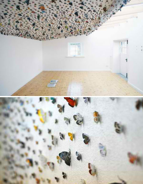 (images via: this is colossal) Thousands of butterflies were freed from the pages of field guides and ‘let loose’ on gallery surfaces in ‘A Butterfly’s Eye View’ by artist Eiji Watanabe. The insects were carefully cut from the books and pinned to the walls and ceilings, with the cast-off books left, like cocoons, on tables within each room. Want More? Click for Great Related Content on WebUrbanist:  Most artists try to make their art as accessible as possible. This photographer chose to submerge his photos 100 feet beneath the surface of the ocean. 2 Comments - Click Here to Read More »»  Melbourne street artist TigTab uses stencils to create light graffiti as you've never seen it before - crisp and still yet dynamic and otherworldly. 2 Comments - Click Here to Read More »» 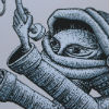 Comic book artist and muralist Phlegm makes the streets of England look like pages from an illustrated book, telling a story with giant black-and-white images. 4 Comments - Click Here to Read More »» مطالب مرتبط با معماری اخرین اخبار و مطالب مرتبط با معماری را از آدرس http://p30city.net/search.php?do=fin...&starteronly=1 مشاهده کنید |
|
#103
|
||||
|
||||
|
معماری Squint to See: Almost-Abstract Aerial Photography Series  Have you ever looked out of an airplane window and been completely mesmerized by the world below? From way up there in the sky, the world looks completely different and wonderfully abstract. Objects take on a kind of magical quality when viewed from this unusual perspective…and that’s exactly what drove photographer Alex MacLean to get a pilot’s license and take to the sky. 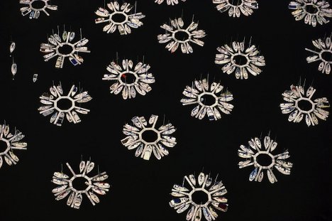  (all images via: My Modern Met) While taking a community planning course in the midst of his architecture degree program, Alex MacLean was introduced to aerial photography. This introduction would turn out to be a fateful one.   After graduation, MacLean earned his pilot’s license and began flying on his own. From his unique vantage point, he began to see patterns emerging in the most mundane places. He started shooting pictures of those patterns through his airplane’s window.    From tidy rows of airplanes to claustrophobic mish-mashes of old cars, MacLean’s lens captures some of the most unforgettable aerial photography ever. 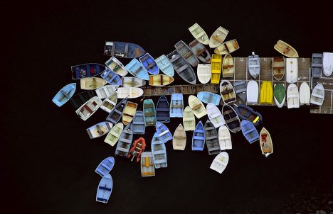  The items in the photos are removed from their ordinary contexts and framed in an entirely new way, giving them previously-unexplored qualities and making them seem extraordinary.   Some of the scenes inspire curiosity – others are simply baffling. Why so many RVs in one place? How are the tightly-packed cars going to move? Do the people at the beach realize they are being watched?   Like a flying Google Street View camera, MacLean’s lens captures the everyday-turned-extraordinary. When you step back from the daily shuffle, things seem more orderly, even more meaningful. There are unexpected patterns and order in everything.  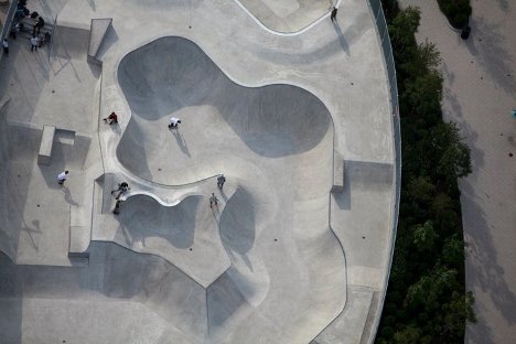  In a way, these photographs are humbling reminders of just how much happens in the world that is outside of our personal bubbles. Sometimes it is neat and tidy, other times it is chaotic and puzzling. But there is so much out there to see.   Taking this line of thinking one step further, perhaps everything in life looks different from further away. Maybe we can count these pattern-filled portraits as a lesson in stepping back to gain a new perspective. Want More? Click for Great Related Content on WebUrbanist:  Life has changed dramatically since World War II, but this photo series by Patrick Elie shows how much Normandy has miraculously stayed the same. 5 Comments - Click Here to Read More »»  What would you think if the city started photographing you? No, not with CCTV, but with graffiti. This fun project appears to do just that. 13 Comments - Click Here to Read More »»  Insects often make interesting photography subjects, but these insect photos are a little different: the photographer poses the bugs in hilarious tableaus. 3 Comments - Click Here to Read More »» مطالب مرتبط با معماری اخرین اخبار و مطالب مرتبط با معماری را از آدرس http://p30city.net/search.php?do=fin...&starteronly=1 مشاهده کنید |
|
#104
|
||||
|
||||
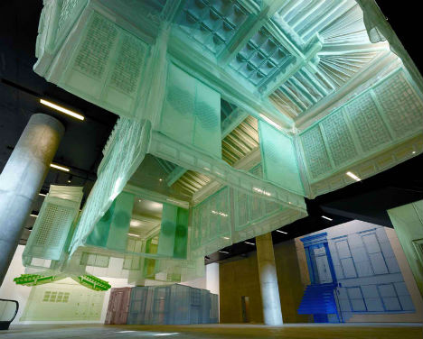
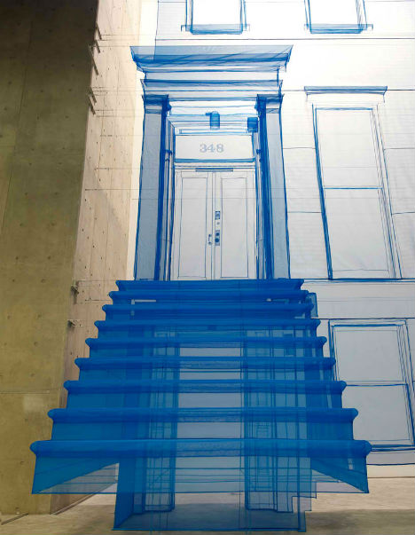
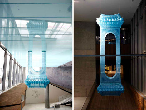
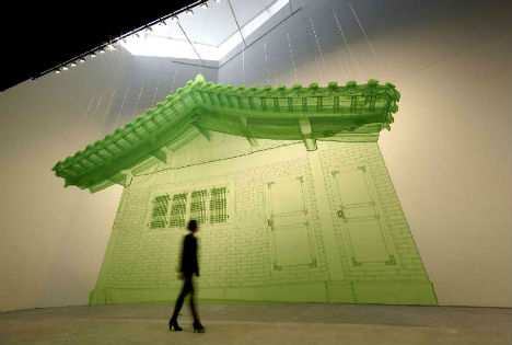
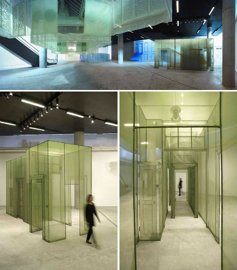
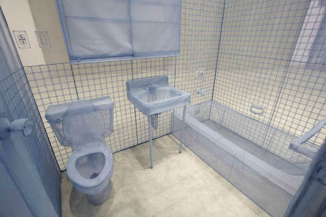
معماری Home Within Home: Architectural Fabric Art Installations ویرایش توسط مهدی : 04-06-2012 در ساعت 01:47 PM |
|
#105
|
||||
|
||||
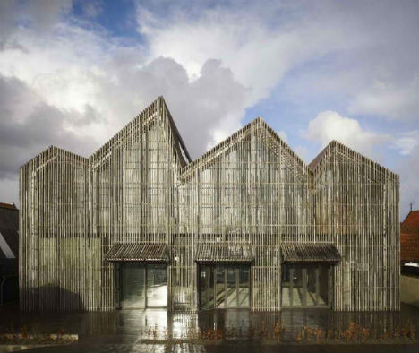
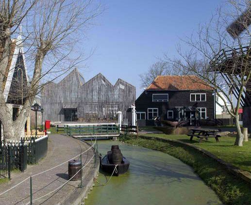
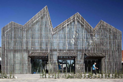
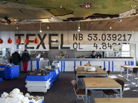
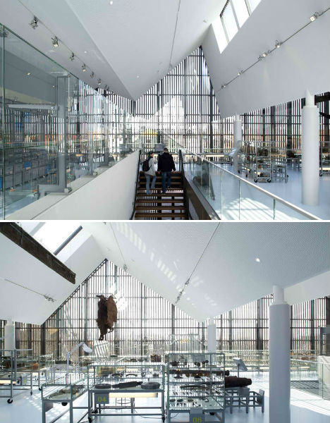
معماری Maritime Museum Mimics Village Shapes & Ocean Waves ویرایش توسط مهدی : 04-06-2012 در ساعت 01:44 PM |
|
#106
|
||||
|
||||
|
معماری Walky Talky: 12 Concept Mobile Phone Telephone Booths 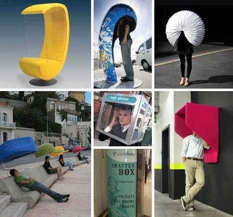 Classic static telephone booths are slowly fading from the urban landscape but talking on the phone has never been more popular. These 12 concept mobile phone telephone booths attempt to recapture the personal isolation those old public phones provided while enhancing the experience of conversing in the city. Portable Cellular Phone Booth 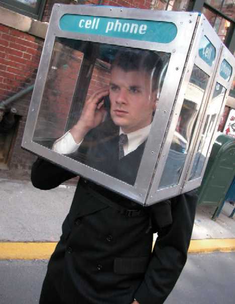 No discussion of portable cellular phone booths would be complete without the Portable Cellular Phone Booth, a one-off “sculpture” crafted from stainless steel, aluminum and polycarbonate. Though it dates from 2002, Rodrigues’ art object perfectly captures that pivotal moment in societal history when mobile phones began to nose landlines out of the picture.  Measuring 16″ X 24″ X 36″, the device collapses down to flat-pack dimensions and can be worn on the user’s back much like a backpack or rucksack, only harder and heavier. When a call comes in, simply unfold and insert one’s head – and try to ignore the amused, bemused and confused stares of onlookers. Silence Chair 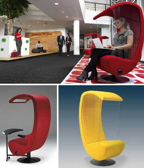 The Silence Chair from Finnish designer Antti Evävaara offers mobile phone users a comfortable personal space within which to chat. At the same time, the chair’s safety glass side panels ensure the sound of the conversation doesn’t intrude upon others. 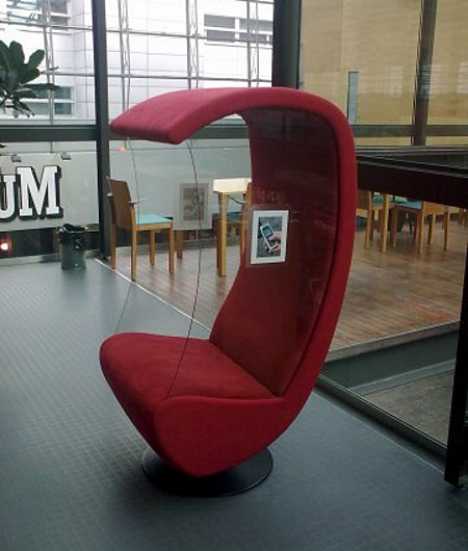 Available in up to 67 different colors spread across a range of 6 different styles, the Silence Chair is designed for use in airports, lobbies, lounges, meeting rooms and libraries – the latter is the scene of the image above. Note the sticker on the side glass indicating the suggested use as a cell phone communication station. Hush Cone 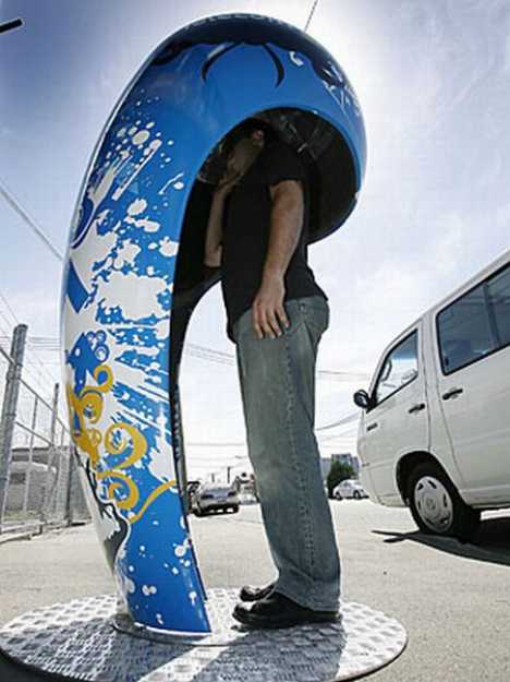 The Hush Cone, designed by Miles Thornley of Brown Kiwi, re-imagines the classic outdoor public phone booth for 21st century modes of mobile communication. While dispensing with the pricey wiring and the landline phone of old, the organically shaped fiberglass booth maintains the sense of visual and acoustic privacy that mobile phone users often find missing in urban environs. The Cell Atlantic CellBooth 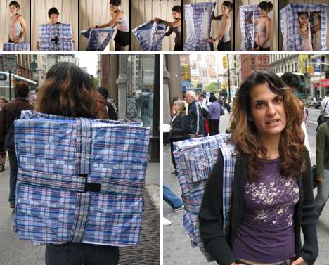 The Cell Atlantic CellBooth (the name is a throwback to the good old days of Bell Labs) from artist Jenny L Chowdhury takes Nick Rodrigues’ personal phone booth concept and lightens it up a little. Like Rodrigues’ blocky booth, the Cell Atlantic CellBooth is worn knocked-down on one’s back but easily unfolds when a call needs to be made or taken. 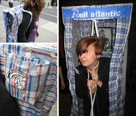 The insta-booth employs so-called “Third World Samsonite”, that plaid, stiff & shiny pseudo-fabric usually seen lining wheeled pushcarts sold from dollar stores. The fabric is light, tough and resists water in case the user’s caught outdoors in stormy weather. The Veasyble 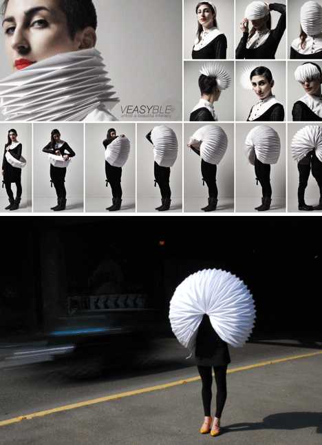 Phone booth meets fashion? The Veasyble (with the emphasis on the “easy”) designed by Gloria Pizzilli, Arianna Petrakis, Ilaria Pacini and Adele Bacci appears to be an attempt to make the accordion cool again, assuming the accordion was ever cool that is. Combine it with Pac-Man and you’ve got a polyethylene, paper and fabric isolation chamber than can be shared by two in a pinch… ouch! Prooff PhoneBox 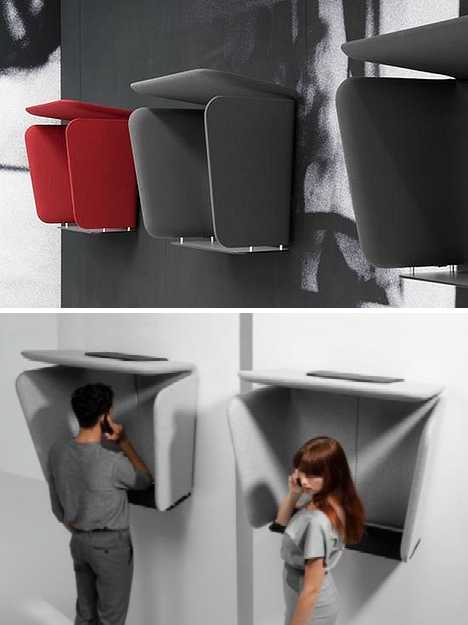 You can knock down the traditional wall of telephone booths lining the walls of busy train stations, airports and the like but travelers still need a place to make their mobile phone calls. Enter Mathieu Gabiot’s Prooff PhoneBox, a truncated version of the old-style full length booth that serves basically the same purpose: providing a sound-sheltered environment where one can hear and be heard. 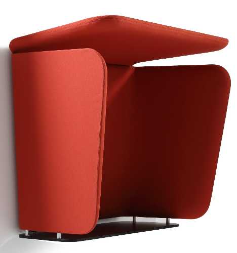 Described by its makers as an “Acoustic Mobile Phone Booth”, the Prooff PhoneBox can be mounted singly or in ranks depending on the site and situation. It economical design focuses on the small space around the caller’s head: that’s where the speaking and listening goes on, after all. Pentaphone Isolation Space 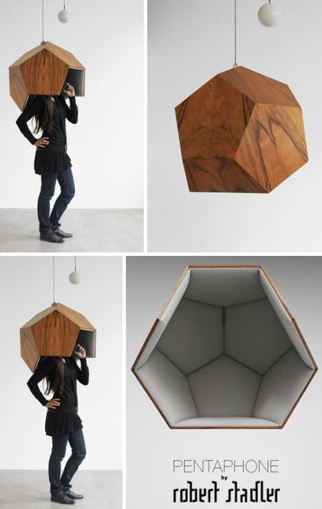 Austrian designer Robert Stadler conceived the Pentaphone as a vertically adjustable isolation space that doubles as an intriguing piece of indoor furniture. Crafted from stained and varnished wood panels lined with acoustically absorbent foam, the Pentaphone may look more than a little sci-fi but why not? It’s hard to get any quieter than being in outer space. Corniche des Chapeaux 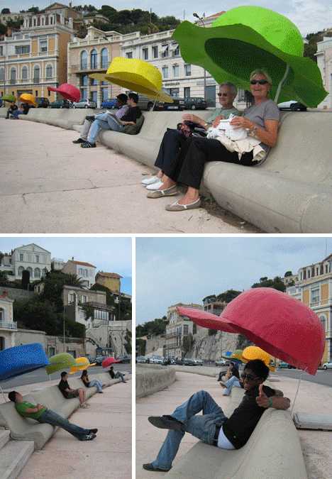 Is it a stretch to call Corniche des Chapeaux a mobile phone booth? Perhaps, but let’s just keep it under our oversized hats, shall we? This collaboration between artist/designers Benedetto Bufalino and Victor Vieillard saw a series of colorful hats line the waterfront of Marseille, France, in June of 2007. 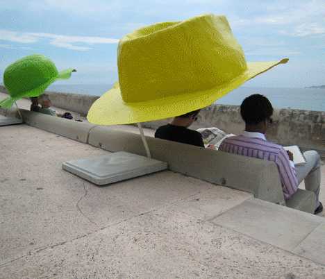 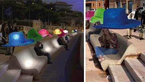 Besides serving as cozy, convenient spaces for mobile phone communication, the hats functioned as sunshades during the day and reading spaces by night thanks to integrated lighting. The Mobile Phone Booth 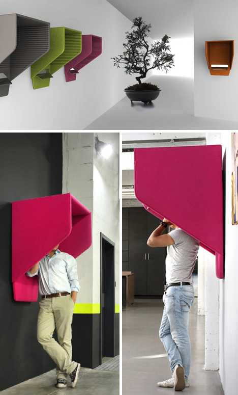 Designer Alain Gilles has come up with the Mobile Phone Booth, a wall-mounted personal space similar in many ways to the Prooff PhoneBox. The Mobile Phone Booth is larger, however, and includes an integral inner shelf to rest one’s communication device of choice… or one’s arm. CellZone Cell Phone Booth  The CellZone “Bring Your Own Phone” Cell Phone Booth from Salemi Industries looks a lot like the traditional telephone booth it’s meant to replace. Coincidence? We think not – and neither does US Cellular, who’ve seen fit to install a few CellZones (renamed “Chatter Box”) at US Cellular Stadium… where else? 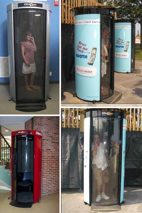 The cylindrical, transparent-doored booths look a little like those message capsules used in pneumatic tube delivery systems but not to fear: you won’t end up like a Futurama character should you step inside one. On the contrary, you’ll stay put but your mobile phone messages will do the traveling for you. PARCS Phone Booth 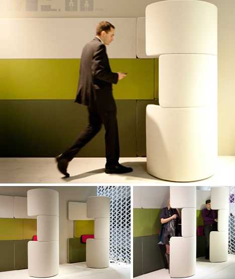 The PARCS Phone Booth is a mobile office partition designed by PearsonLloyd. Functioning as an acoustically and visually shielded private space within public areas, the PARCS Phone Booth creates a head-to-toe sonic cocoon that offers silence to both the user and those who work nearby. The Cone of Silence 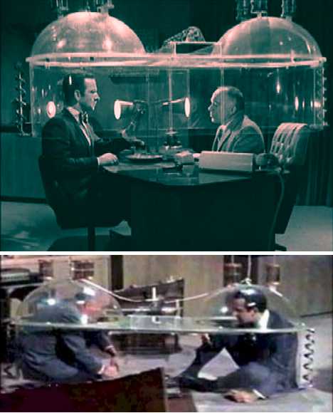 Designers of mobile phone booths have shown they’re long on creativity but short on practicality – a forgivable foible, as the concept of creating space for mobile conversations is mainly untested in the real world… or is it? The classic 1960s spy comedy Get Smart featured the Cone of Silence, an awkward and ineffective acrylic double-bubble affair meant to conceal top-secret conversations between Maxwell Smart and the Chief of CONTROL.  The flawed device was also available in a portable version for two and the “Umbrella of Silence” for groups. An idea ahead of its time? Perhaps, and not the show’s only one… Agent 86′s preferred mode of mobile communication was his shoe. “Smart phone” indeed. Want More? Click for Great Related Content on WebUrbanist:  With how incorporated phones are in our lives, it's strange to think how quickly they've risen from landlines, to car phones, to smarter than our old computer. 3 Comments - Click Here to Read More »»  A groundbreaking cost-cutting, energy-saving program in Germany called Dial4Light requires pedestrians to activate street lights using their cell phones. 5 Comments - Click Here to Read More »»  Ever wonder how your phone's signal stays so clear even when you're not within sight of a tower? Cellular towers are really hiding in plain sight all around us. 6 Comments - Click Here to Read More »» مطالب مرتبط با معماری اخرین اخبار و مطالب مرتبط با معماری را از آدرس http://p30city.net/search.php?do=fin...&starteronly=1 مشاهده کنید |
|
#107
|
||||
|
||||
|
معماری Container Urbanism: Reclaimed Pop-Up Structures 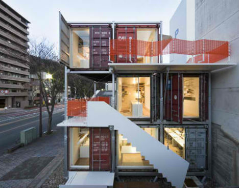 When urban populations outgrow the pace of new construction, and suitable homes and offices spaces are difficult to find, what are property hunters to do? Perhaps more of them will start coming up with novel temporary solutions like this: a temporary, movable office made from shipping containers by Daiken-Met Architects. 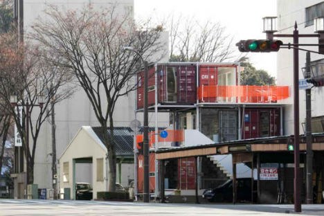 The architecture firm had a difficult time finding leasable space in the city of Gifu, Japan. So they designed this three-story structure, which is made from seven 20-foot shipping containers connected using a steel frame system. The frame made it easier to stack the containers, and also provides balcony space, which can be hard to come by in urban areas. 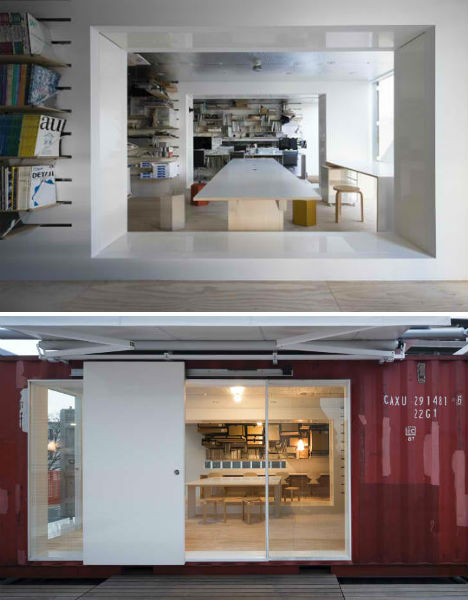 Daiken-Met architects told Inhabitat, “In the local city, we are facing various problems such as decreasing population, increasing vacant land, on the other hand it is difficult to make a rental contract for small buildings.” 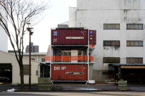 As Pop Up City notes, Sugoroku Office doesn’t just represent a new form of eco-friendly architecture, it’s a new sort of urbanism altogether. The architects obtained a short-term rental contract for a small plot of land that stipulates removal and reconstruction every few years. Want More? Click for Great Related Content on WebUrbanist:  Not all steel shipping container architecture is about building a dream home. These clever designs use cargo containers for community and emergency housing. 6 Comments - Click Here to Read More »»  After seeing the success of other shipping container construction projects, schools and hotels are getting in on the money- and time-saving cargotecture method. 2 Comments - Click Here to Read More »»  Shipping container homes are the perfect blend of modern architecture and sensible green building. Buy your own used cargo container on sale and start building today! 10 Comments - Click Here to Read More »» مطالب مرتبط با معماری اخرین اخبار و مطالب مرتبط با معماری را از آدرس http://p30city.net/search.php?do=fin...&starteronly=1 مشاهده کنید |
|
#108
|
||||
|
||||
|
معماری Suspended Grass Figures Grow in Galleries 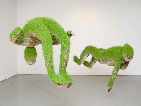 The figures seem to float on air, hanging in unnatural positions, their limbs dangling. Made of a compacted growing medium, these sculptures by Mathilde Roussel are planted with grass seeds and allowed to transform over time, the grass sprouting and growing. 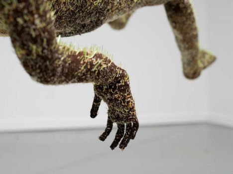 The French artist’s ‘Lifes of Grass’ series is pictured here at the Cheekwood Botanical Garden and Museum of Art in Nashville, Tennessee. The sculptures are formed using a metal frame, soil and wheat grass. 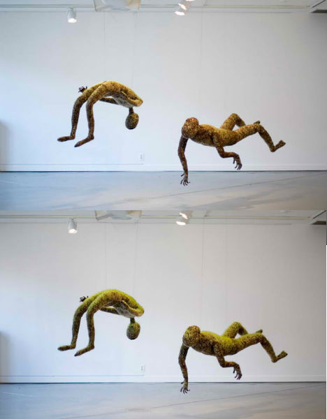 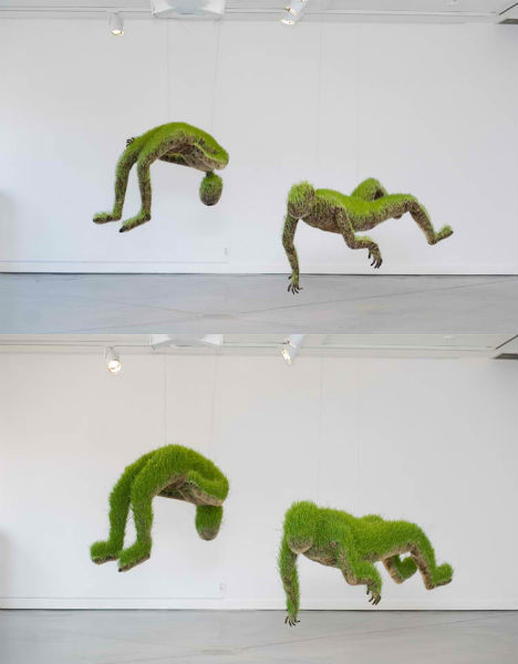 The artist explains that she aims to show viewers, through the sculptures, that the food we eat and the way that it is grown and transported has an impact on us all. “The natural world, ingested as food becomes a component of human being. Through these anthropomorphic and organic sculptures made of soil and wheat grass seeds, I strive to show that food, it’s origin, it’s transport, has an impact on us beyond it’s taste.”  “The power inside it affects every organ of our body. Observing nature and being aware of what and how we eat makes us more sensitive to food cycles in the world – of abundance, of famine – and allows us to be physically, intellectually and spiritually connected to a global reality.” Want More? Click for Great Related Content on WebUrbanist:  Here are seven examples of green creativity that involve alternative uses of natural materials. 32 Comments - Click Here to Read More »»  Artists unroll a vast, 1,400-foot carpet of living grass through the streets of a French village to celebrate its long-running program of arts and nature trails. 2 Comments - Click Here to Read More »»  From the iconic Guggenheim Bilbao to lesser-known museums in far-flung locales, all 12 of these museum designs stand out for their beauty and brilliance. 4 Comments - Click Here to Read More »» مطالب مرتبط با معماری اخرین اخبار و مطالب مرتبط با معماری را از آدرس http://p30city.net/search.php?do=fin...&starteronly=1 مشاهده کنید |
|
#109
|
||||
|
||||
|
معماری Material World: 8 Substances That will Shape the Future 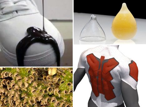 Advancements in science and technology have opened up a whole new world of possibilities in material science. Our future world won’t be made up of the same materials we are used to seeing today – it will be full of fascinating new stuff that can do truly incredible things.  Cell phone towers are generally big and unsightly, but since we want to be perpetually connected they seem to be a necessity…for now. The Spray-On Antenna System from ChamTech can turn just about any surface into an antenna. In the coming decades, ugly cell phone towers could easily give way to nearly unnoticeable antennae that take the form of buildings, trees or billboard poles painted with this amazing spray. 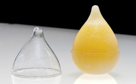 Food packaging is meant to keep our foods fresh and sanitary, but it is a leading source of waste in the world’s landfills. What if our packaged foods came in edible wrappers, just like fruits and vegetables do? Wikicells are edible food packaging invented by a Harvard professor who wants to turn the packaging industry on its head. The concept involves a very thin biodegradable shell surrounding a more robust edible shell, inside of which would sit the food or beverage. The thin shell could be removed and composted, then the thicker shell could be eaten along with the food inside or composted as well – and just like that, plastic food packaging could become obsolete.  If you find yourself constantly spilling food on your clothes or dropping your phone in the toilet, NeverWet is one of those futuristic products you’ll want to stock up on as soon as possible. It’s a superhydrophobic spray that causes liquids, ice, dirt, bacteria and basically everything else to simply roll right off of treated surfaces. It keeps clothes and shoes clean, but that’s not the limit of NeverWet’s talents. It can also keep house siding clean, prevent rust on outdoor equipment and keep bathrooms free of bacteria. 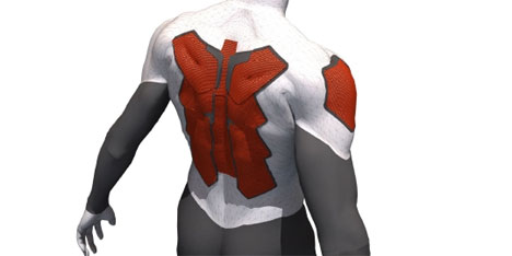 Protecting yourself from daily bumps and bruises will be easier in the future when all of your clothes are made of Deflexion. This futuristic material is light and flexible like regular fabric ordinarily, but when hit with an impact it suddenly becomes as tough as body armor. If a rogue baseball comes flying at you during a game, for example, the fabric instantly hardens at the point of impact to protect you from the force. Then just as quickly, it goes back to being regular, flexible fabric. 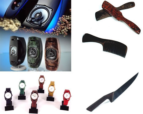 Petroleum-based plastics are used in so many of the products we enjoy every day, but they are not at all healthy for the planet. A new type of plastic-like material called Arboform could be used in the same ways as traditional plastics but with a much lower environmental impact. Arboform is made of waste products left over from the production of paper mixed with natural resins. It’s just as durable and versatile as petroleum-based plastics but it’s biodegradable and recyclable. 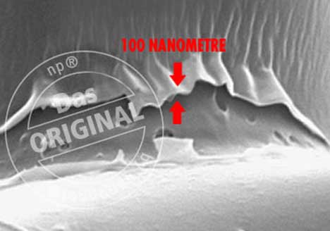 Spray-on liquid glass has been available in Germany and the UK for a few years, but it still hasn’t gained worldwide popularity. At first this seems puzzling, since the ultra-thin silicon dioxide coating could do everything from making clothing stain-proof to keeping restaurant and hospital surfaces sterile for months. But perhaps one reason that this product is not yet in every home in the developed world is that it makes cleaning products nearly obsolete. This impressive quality may be enough to keep some stores from agreeing to stock it since one bottle of liquid glass could keep surfaces protected for up to a year. 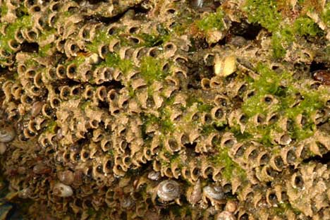 The unusual structure above is home to a colony of sandcastle worms, a type of marine worm that secretes glue to build complex underwater structures. A synthetic version of this glue could one day take the place of metal rods and pins in people who experience severe bone breaks. Rather than pinning the pieces of bone back together, doctors could use this biological glue to hold the shards in shape and let them mend. 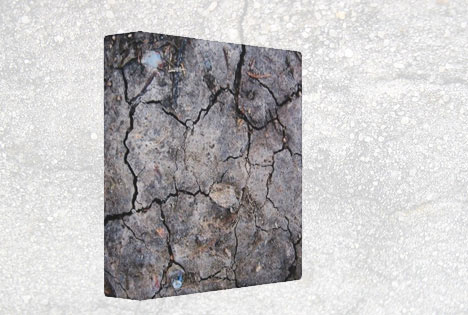 Cracks in sidewalks, streets and concrete buildings are not just unsightly; they’re downright dangerous. One proposed solution is to do away with repair crews in favor of self-healing concrete. There are several types under development, but this one is called BacillaFilla after the type of bacteria used to “grow” new concrete in cracks. Using quorum sensing to figure out when they reach the bottom of a crack, the bacteria form quick and sturdy repairs that can prolong the life of the damaged concrete. Want More? Click for Great Related Content on WebUrbanist:  Why settle for traditional counter and surface materials when you could have illuminated gemstones, sea grass in clear resin or bright, fun Missoni patterns? 10 Comments - Click Here to Read More »»  What would it take to get you to see a well-known building material in a new light? 11 Comments - Click Here to Read More »»  Few machines have revolutionized the way we live like the household washing machine. How will we wash clothes in the future? Maybe in some of these machines... 1 Comment - Click Here to Read More »» مطالب مرتبط با معماری اخرین اخبار و مطالب مرتبط با معماری را از آدرس http://p30city.net/search.php?do=fin...&starteronly=1 مشاهده کنید |
|
#110
|
||||
|
||||
|
معماری Under 400 SF: New Modular Micro-Apartments for NYC [ By WebUrbanist in Architecture & Houses & Residential. ]  With New York City’s inexorable growth, 1980s legislation barring the creation of 400 square-foot, one-to-two-person apartments has been lifted. And the results are in: award-winning compact units ranging from 250 to 330 square feet each have arrived. 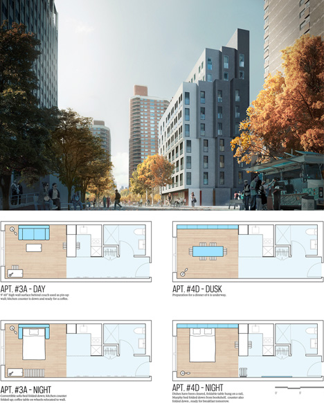 The solutions, sans traditional square-footage restrictions, involve both production and living innovations. They make the most of modular components and prefabrication, on the one hand, and utilize adaptable floor plans, copious common spaces and expansive rooftop decks to extend livable areas on the other. 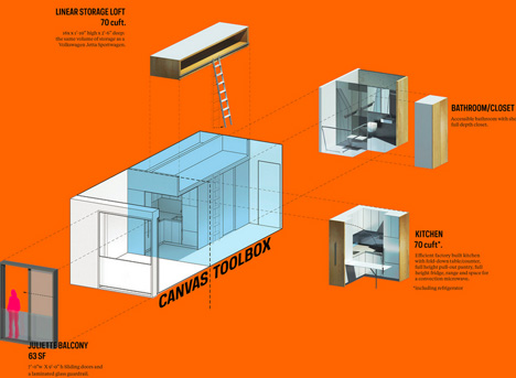 Anyone who has spent time in ultra-dense yet highly-organized cities like Hong Kong, Tokyo or London knows that every square foot counts in terms of cost savings, and the less you have, the more you need to creatively make use of what is there.  Per NYC.gov and CBS New York and via ArchDaily,“Succeeding 33 international proposals and providing an innovative housing model for New York City’s micro-apartments, a team consisting of Monadnock Development LLC, Actors Fund Housing Development Corporation and nARCHITECTS was selected as winner of the adAPT NYC competition. Construction on the pilot project will begin by the end of the year and residents are expected to move in by 2015.” Want More? Click for Great Related Content on WebUrbanist:  Not all steel shipping container architecture is about building a dream home. These clever designs use cargo containers for community and emergency housing. Click Here to Read More »»  Got low expectations and an income to match? China's booming cities are converting surplus cargo containers into cheap apartments for tenants just like you! Click Here to Read More »»       [ By WebUrbanist in Architecture & Houses & Residential. ] [ WebUrbanist | Archives | Galleries | Privacy | TOS ] مطالب مرتبط با معماری اخرین اخبار و مطالب مرتبط با معماری را از آدرس http://p30city.net/search.php?do=fin...&starteronly=1 مشاهده کنید |
 |
| کاربران در حال دیدن موضوع: 1 نفر (0 عضو و 1 مهمان) | |
|
|
اکنون ساعت 01:44 PM برپایه ساعت جهانی (GMT - گرینویچ) +3.5 می باشد.



 حالت خطی

