
|
|
#111
|
||||
|
||||
|
معماری Earthscraper: Inverted Pyramid Spans 1000 Vertical Feet [ By WebUrbanist in Architecture & Public & Institutional. ] 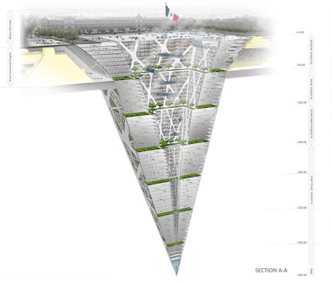 Skyscrapers are the traditional small-footprint solution for growing square footage in big cities, but what are developers to do in growing places like Mexico City where new building construction is limited to just ten stories tall? 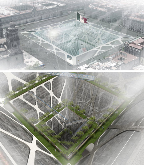 The only option, of course, is to reverse direction: build down instead of up. This his earth-scraper design by BKNR Arquitectura features a cental lightwell that doubles as a layered park, bringing illumination, ventilation and living greenery into the depths of the building. 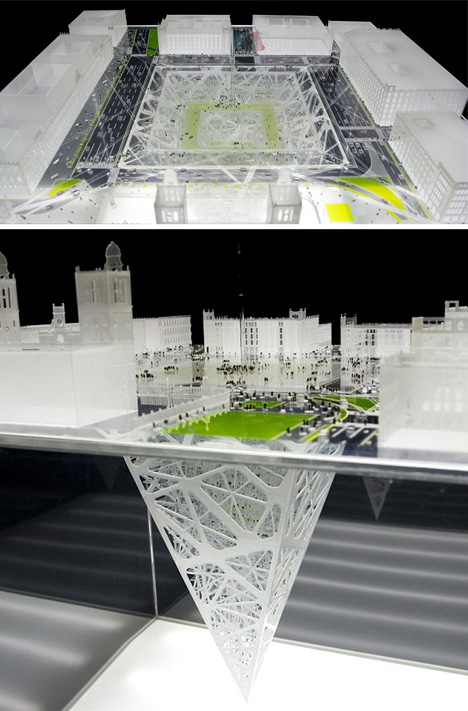 Since the ‘base’ of the structure is an open void rather than a filled volume, the existing city square is maintained – it becomes a transparent platform, effectively, adding dimension without subtracting functionality. This configuration provides not only a window to the world below that you can also walk on, still also allows for public gatherings, music festivals, open exhibitions, marches and parades. 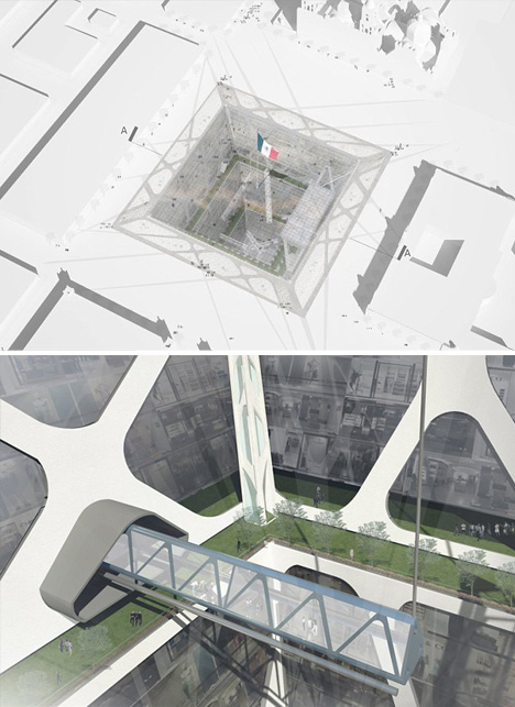 Below, the extensive building has multiple floors each of housing, shopping and office spaces, all arrayed around the exterior with views that face in rather than out – another inversion of expectations and conventions. Want More? Click for Great Related Content on WebUrbanist:  A new public library in the Netherlands by MVRDV flouts the conventional wisdom of keeping books in the dark, placing them under a glass pyramid-shaped envelope. Click Here to Read More »»  Concept designs from far-fetched futurists have toyed with the idea for years, but one firm has finally made the vision a reality: towers extensively populated with trees. Click Here to Read More »»       [ By WebUrbanist in Architecture & Public & Institutional. ] [ WebUrbanist | Archives | Galleries | Privacy | TOS ] مطالب مرتبط با معماری اخرین اخبار و مطالب مرتبط با معماری را از آدرس http://p30city.net/search.php?do=fin...&starteronly=1 مشاهده کنید |
| جای تبلیغات شما اینجا خالیست با ما تماس بگیرید | |
|
|
|
|
#112
|
||||
|
||||
|
معماری Alternative Landmarks: 12 Monuments As They Almost Were [ By Steph in Architecture & Public & Institutional. ] 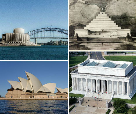 The Sydney Opera House might have been little more than a squat concrete building resembling a factory, and a visit to the statue of Abraham Lincoln at the Lincoln Memorial could have required scaling a massive stepped pyramid. Ranging from close second-place finishes in design competitions to proposals that were little more than pipe dreams, these alternative designs for 12 major iconic landmarks around the world represent radical departures from the monuments we’re accustomed to. Sydney Opera House 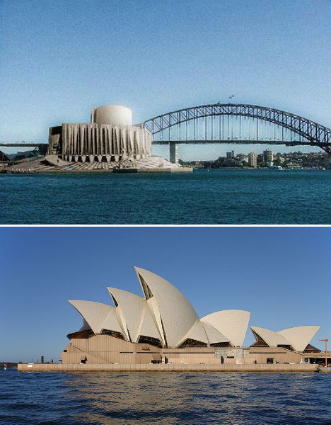 (images via: new world wonders, wikimedia commons) The Sydney Opera House is one of the most recognizable buildings in the world, with a dramatic series of vaults rising from the ground along Sydney Harbour. But Danish architect Jørn Utzon’s now-iconic design was controversial when it was first proposed in 1957, and the design that came in second place may have been more palatable to the public. American architect Joseph Marzella’s design was rather industrial in its appearance, but didn’t seem quite so out there. It’s hard to imagine the magnificent performing arts venue looking so squat and dull. Triumphal Elephant in Place of Paris’ Arc de Triomphe  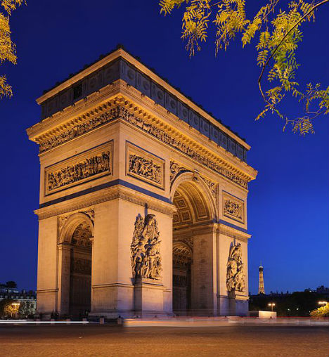  (images via: wikimedia commons) In place of one of Paris’ most famous monuments, the Arc de Triomphe, could have been a three-story elephant monument with a spiral staircase in the underbelly leading to the pinnacle. 18th century architect Charles Ribart offered this monument for the Champs Élysées, complete with a cross-sectional drawing showing the intricate rooms within, but was turned down by the French government. This isn’t even the only massive, ridiculous elephant statue envisioned for Paris. Originally conceived by Napoleon, the imposing Elephant of the Bastille (third photo) was meant to be cast of bronze and placed in Paris’ Place de la Bastille on the site of the old Bastille prison, which was the birthplace of the French Revolution. A stairway set into the legs would give access to the top, and the base would be surrounded by a fountain. However, only a plaster model was built, as memorialized by Victor Hugo in the novel Les Miserables, and eventually the July Column took its place. Unbuilt Design for the Golden Gate Bridge 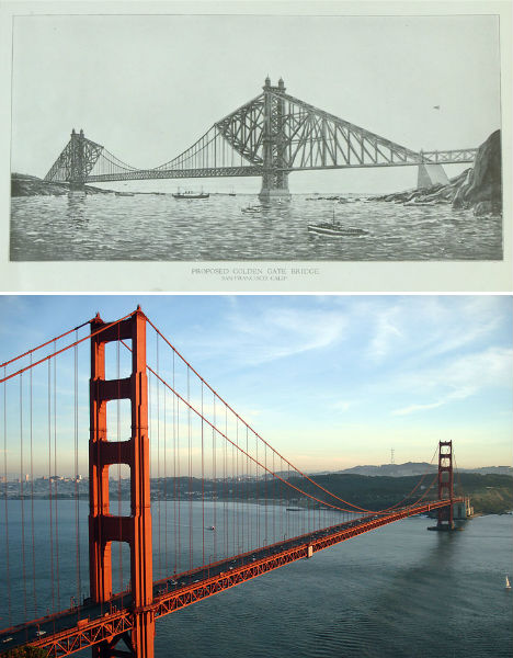 (images via: pbs newshour, wikimedia commons) Now 76 years old, the Golden Gate Bridge is an iconic symbol of San Francisco, coated in literally millions of gallons of orange paint. The Art Deco-style bridge is one of the longest suspension bridges in the world, beating many experts’ predictions that it wouldn’t last against gale-force winds in the straight where the San Francisco Bay opens to the Pacific Ocean. But this wasn’t engineer Joseph Strauss’ first design. The original proposal is markedly different, with a heavier look combining cantilevered and suspension designs. It was rejected by the planning committee. Lincoln Memorial Pyramid 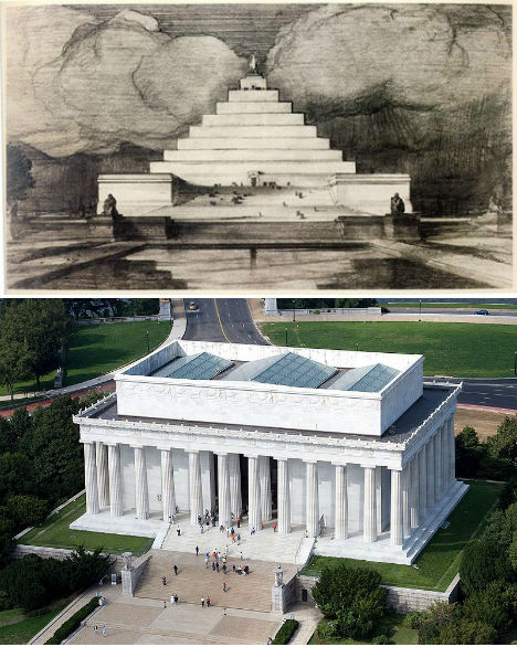 (images via: i own the world, wikimedia commons) Highlighted at Unbuilt Washington, an exhibition at the National Building Museum in Washington D.C., John Russell Pope’s Lincoln Memorial Proposal replaces the columned rectangular building honoring the 16th president with a pyramid. Anyone who wanted to get up close to Abraham Lincoln’s statue would have had to climb that entire thing to reach it. Some historians believe that this proposal was ridiculous on purpose; Pope wasn’t a fan of the swampy location chosen for the memorial, and may have created this and other absurd designs in an effort to encourage the committee to seek a new setting. Pope went on to successfully design the Jefferson Memorial. Pyramid Necropolis for London’s Primrose Hill 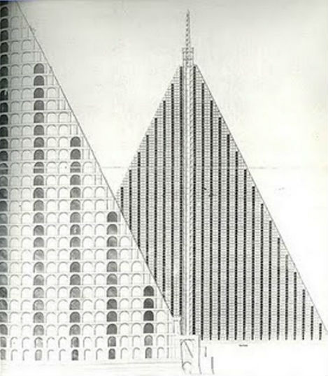 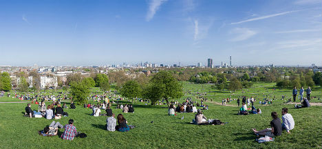 (images via: andrew gough, wikimedia commons) Infused in the Victorian preoccupation with melancholy and inspired by the Egyptian spoils of traveler and tomb-raider Giovanni Battista Belzoni, London architect Thomas Wilson proposed a massive, 15-acre pyramid-shaped necropolis for the city’s Primrose Hill. The granite pyramid would have towered into the air with 94 tiers of tombs in honeycomb shapes and a base measuring 18 acres, casting a gargantuan shadow over the hill many Londoners use for picnics and looking out over the city. Churchyards were so crowded at the time, that graves were bursting out of the ground – but concerns about what to do with London’s dead weren’t enough to convince the public that a necropolis was a good idea. White House Alterations for President Harrison 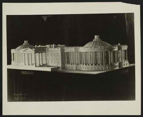  (images via: loc.gov, wikimedia commons) While he’s not nearly as forgettable as his grandfather, ninth United States President William Henry Harrison – who died after just 32 days in office – many Americans will struggle to recall any of twenty-third President Benjamin Harrison’s achievements during his tenure in the White House. However, Harrison could have made quite a mark. The first President to reside in the White House after it was wired for electricity, Harrison and his First Lady, Caroline Harrison, proposed significant changes to the complex that were never carried out. However, ten years later, Theodore Roosevelt made plenty of changes of his own, including the addition of the West Wing. Next Page: Alternative Landmarks 12 Monuments As They Almost Were Want More? Click for Great Related Content on WebUrbanist:  From around the world, here are twelve of the most memorable, unique and extraordinary war monuments and memorials in military history. Click Here to Read More »»  These architectural monuments pay tribute to a variety of subjects, conveying emotion with abstract and creative three-dimensional objects and spaces. Click Here to Read More »»       [ By Steph in Architecture & Public & Institutional. ] [ WebUrbanist | Archives | Galleries | Privacy | TOS ] مطالب مرتبط با معماری اخرین اخبار و مطالب مرتبط با معماری را از آدرس http://p30city.net/search.php?do=fin...&starteronly=1 مشاهده کنید |
|
#113
|
||||
|
||||
|
معماری Scooped: 12 Chilled Out Abandoned Ice Cream Stands [ By Steve in Abandoned Places & Architecture. ] 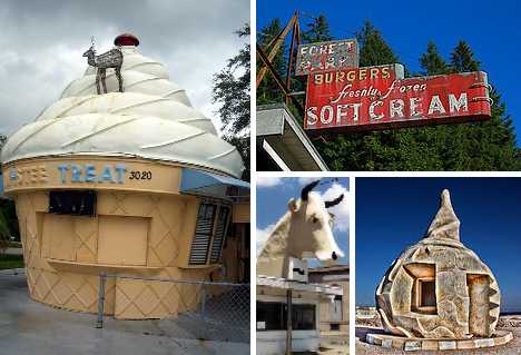 Cone in 60 seconds? Though these 12 cool abandoned ice cream stands thought they could take a licking and keep on ticking, they ended up just being licked. Twistee Treat Retreat 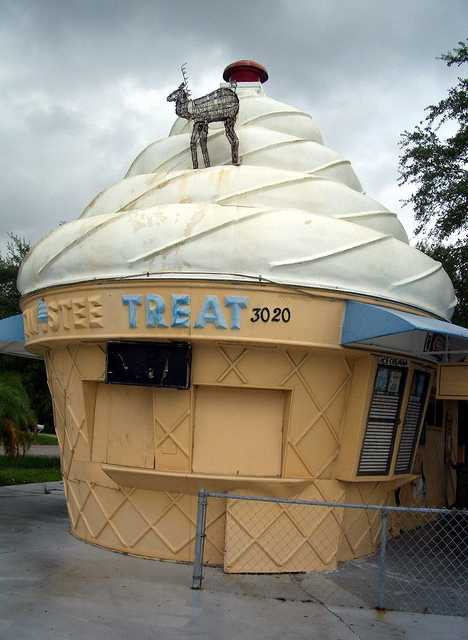 Around 90 fiberglass Twistee Treat buildings were produced from 1983 until 1990, when the original company filed for bankruptcy, and about half the distinctive, cone-shaped buildings remain standing. Above is an abandoned Twistee Treat in Sarasota, Florida, captured in September of 2005 by Flickr user Telstar Logistics. 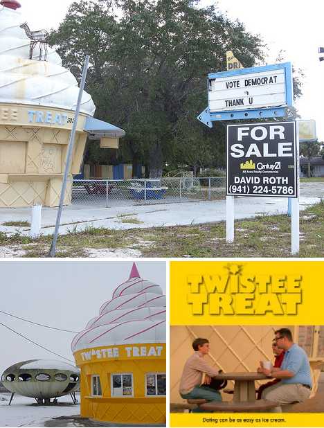 Designed by Robert G. Skiller, many of the 28 ft tall and 20 ft wide buildings have been painted in a wide variety of colors; others don’t even sell ice cream anymore. Due to their unique visual appeal, abandoned Twistee Treat buildings often exist in an odd architectural limbo between being quickly re-opened/re-purposed or (thanks to their light, unit construction) transported someplace where someone’s opening a new ice cream shop – it’s free advertising from the get-go, without the expense of a sign! Ice Of The Beholder 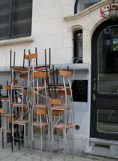 German Photographer/artist Sarah Ortmeyer‘s first solo show, “Sad Eis” (Sad Ice), included the above evocative snap of the closed Lasso Laden ice cream shop. Would it not have been easier to simply leave the shop’s seats inside and locked up instead of chained together outside, vulnerable to the vagaries of vagrants? Only Ortmeyer knows for sure, and she’s keeping that scoop to herself. Ore-gone 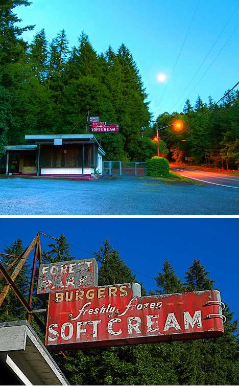 Flickr user Swedotorp picked the perfect days (June 14th and 15th of 2008) to immortalize the abandoned Forest Park ice cream stand in all its faded glory. Located near Portland, Oregon, the stand would seem to be the right business in the right place at the right time. Unfortunately, the aged elegance of the mid-century style paint & neon signage indicates this stand’s time has long since melted away. 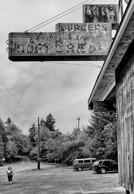 Flickr user Darren Sethe stopped at the abandoned Forest Park ice cream shop four years later in 2012 but not much had changed, barring the loss of a few more flakes of paint from the ancient sign. Sethe’s stark monochrome treatment seems to add a dash of timelessness to the ice cream-less scene. The Other Meltdown 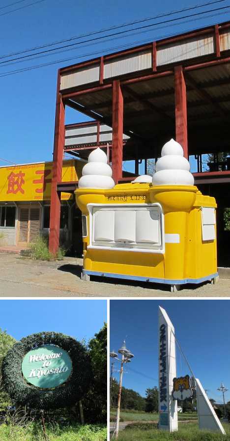 Kiyosato, Japan was a popular travel and tourism destination whose prospects weren’t improved by the 2011 Great East Japan Earthquake and the subsequent Fukushima Daiichi Nuclear Plant accident. Among the area’s attractions was the now-abandoned One Happy Park, explored and recorded in September 2011 by urban explorers from Spike Japan. The abandoned park exudes an unfortunate and uneasy aura epitomized by the not-so-merry Merry Land ice cream kiosk just outside a ramen restaurant. Next Page: Scooped 12 Chilled Out Abandoned Ice Cream Stands Want More? Click for Great Related Content on WebUrbanist:  In some cases disaster strikes. In others, changing technologies render old designs obsolete, leaving majestic airplanes and giant steamers to rust and gather dust. Click Here to Read More »»  Some of the most haunting abandonments are those that were once used to entertain and educate - filled with vast once-vibrant gathering and learning spaces. Click Here to Read More »»       [ By Steve in Abandoned Places & Architecture. ] [ WebUrbanist | Archives | Galleries | Privacy | TOS ] مطالب مرتبط با معماری اخرین اخبار و مطالب مرتبط با معماری را از آدرس http://p30city.net/search.php?do=fin...&starteronly=1 مشاهده کنید |
|
#114
|
||||
|
||||
|
معماری Under 400 SF: New Modular Micro-Apartments for NYC [ By WebUrbanist in Architecture & Houses & Residential. ] 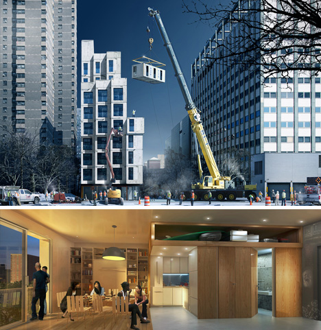 With New York City’s inexorable growth, 1980s legislation barring the creation of 400 square-foot, one-to-two-person apartments has been lifted. And the results are in: award-winning compact units ranging from 250 to 330 square feet each have arrived. 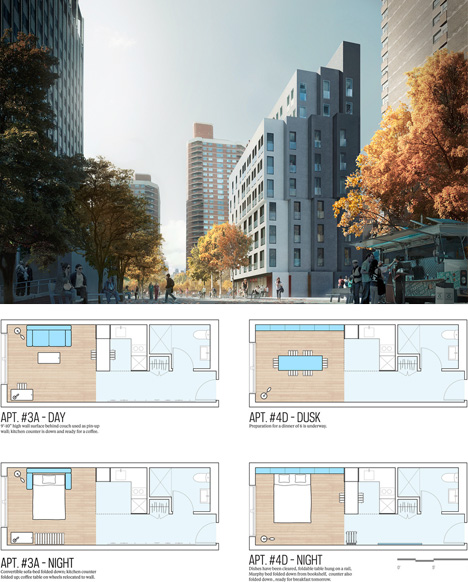 The solutions, sans traditional square-footage restrictions, involve both production and living innovations. They make the most of modular components and prefabrication, on the one hand, and utilize adaptable floor plans, copious common spaces and expansive rooftop decks to extend livable areas on the other. 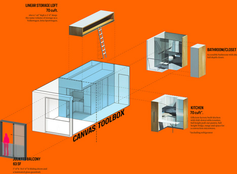 Anyone who has spent time in ultra-dense yet highly-organized cities like Hong Kong, Tokyo or London knows that every square foot counts in terms of cost savings, and the less you have, the more you need to creatively make use of what is there.  Per NYC.gov and CBS New York and via ArchDaily,“Succeeding 33 international proposals and providing an innovative housing model for New York City’s micro-apartments, a team consisting of Monadnock Development LLC, Actors Fund Housing Development Corporation and nARCHITECTS was selected as winner of the adAPT NYC competition. Construction on the pilot project will begin by the end of the year and residents are expected to move in by 2015.” Want More? Click for Great Related Content on WebUrbanist:  Not all steel shipping container architecture is about building a dream home. These clever designs use cargo containers for community and emergency housing. Click Here to Read More »»  Got low expectations and an income to match? China's booming cities are converting surplus cargo containers into cheap apartments for tenants just like you! Click Here to Read More »»       [ By WebUrbanist in Architecture & Houses & Residential. ] [ WebUrbanist | Archives | Galleries | Privacy | TOS ] مطالب مرتبط با معماری اخرین اخبار و مطالب مرتبط با معماری را از آدرس http://p30city.net/search.php?do=fin...&starteronly=1 مشاهده کنید |
 |
| کاربران در حال دیدن موضوع: 3 نفر (0 عضو و 3 مهمان) | |
|
|
اکنون ساعت 04:17 AM برپایه ساعت جهانی (GMT - گرینویچ) +3.5 می باشد.


 حالت خطی

