
|
|
#21
|
||||
|
||||
|
معماری Signs of the Times: 13 Architectural Signage Designs 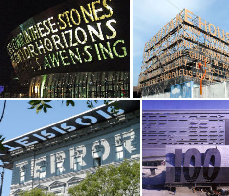 Signs aren’t always an afterthought – sometimes they’re integral to the design of the building itself, carved in towering letters right into the facade or even serving as structural support. The marriage between typography and architecture is particularly eye-catching in these 13 examples, where the graphic beauty of type and, at times, moving lines of poetry add another layer of identity and emotional connection to built environments. Wales Millennium Center, Cardiff, Wales 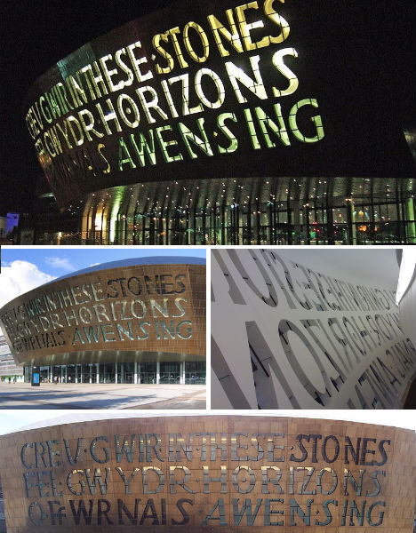 (images via: wikimedia commons) ‘In These Stones, Horizons Sing’. Written in both Welsh and English, this sentence makes a bold statement on the facade of the Wales Millennium Center in Cardiff, an arts center that holds performances of opera, ballet, dance, comedy and musicals. The inscription was written by Welsh poet Gwyneth Lewis, who wanted the words to reflect the architecture of the building. “The strata of the slate frontage of the Wales Millennium Centre reminded me of the horizons just beyond Penarth Head … The stones inside the theatre literally sing with opera, musicals and orchestral music, and I wanted to convey the sense of an international space created by the art of music.” Minnaert Building, Utrecht University, Utrecht, Netherlands 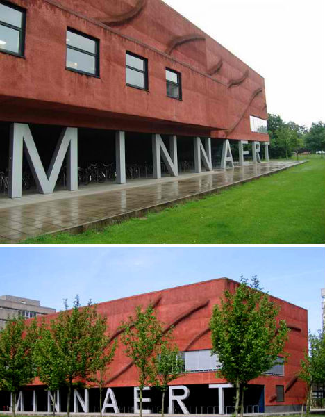 (images via: architravel) The Minnaert Building, designed by Neutelings Riedijk and added to Utrecht University in 1997, uses the letters in ‘Minnaert’ to form columns, making them essential structural supports for the section of the building that juts out over a bicycle parking area. Fukutake House, Megijima Island, Japan 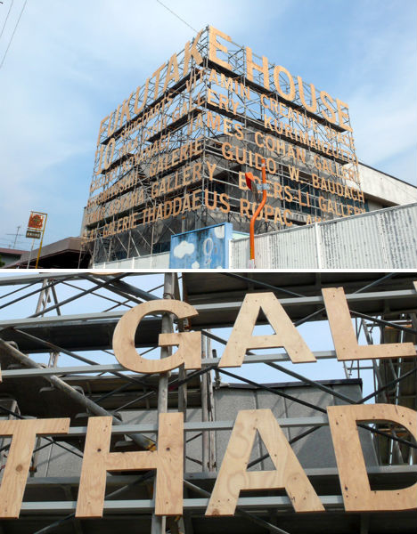 (images via: heartfish) Fukutake House, a project started by seven of Japan’s leading art galleries, brings art to rural communities that tend to be isolated from it. Occupying a new location each year, Fukutake House reinvents itself annually, but its 2010 incarnation was more stunning than ever with a typographic installation covering the facade of the elementary school that the festival temporarily occupied. University of Toronto Graduate Housing, Toronto, Canada 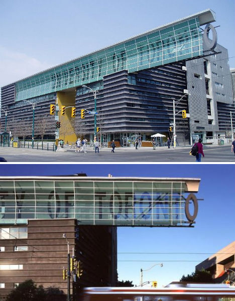 (images via: wikimedia commons, morphopedia) Text is embedded into the design of the Graduate Housing building at the University of Toronto, with massive letters shielded by a glass and steel screen, the ‘O’ seeming to hang precariously from a ledge. The structure is one of the more important works designed by Pritzker-Prize-winning architect Thom Mayne. Lentos Museum of Modern Art, Linz, Austria 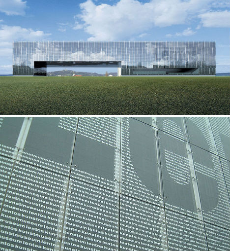 (images via: houseofcassette.com, sendung) With a transparent glass casing covered in words, not to mention the huge ‘LENTOS’ built right into the facade, the typographic elements of the Lentos Museum of Modern Art are integral, yet subtle: you don’t even notice the letters all over the exterior until you get close. It’s a fitting aesthetic element for an museum that displays, among many other works of art, typographic design. House of Terror, Budapest, Hungary 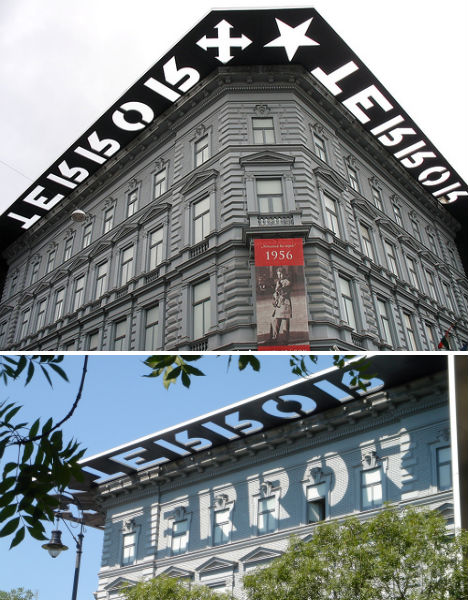 (images via: milgrammer, david hand) Though it may seem a bit sensationalistic, the word ‘TERROR’, which features prominently on the building’s overhanging roof, is a fitting name for a building with a horrifying history that is unfortunately all too real. Budapest’s House of Terror occupies 60 Andrassy Street, a building that was once leased by Hungarian Nazis and also housed two Communist organizations. All three used the basement as a torture chamber, and many people died there. When the sun hits it just right, the cutout in the metal overhang casts a sobering reminder of the building’s history upon its facade. New Jersey Performing Arts Center, Newark, New Jersey 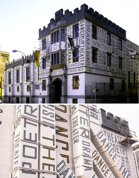 (images via: wallpaper magazine, walker art) Designer Paula Scher of New York’s Pentagram started out creating bold typographic album covers in the 1970s, so it’s no wonder that, tasked with redesigning an architectural facade, she focused on “architecture as graphic design”. Scher dreamed up the transformation of this 1940s building for the New Jersey Performing Arts Center, painting words like ‘music’, ‘theater’, ‘dance’ and ‘poetry’ on everything from the brick itself to the air conditioning ducts. Caltrans District 7 Headquarters, Los Angeles, California 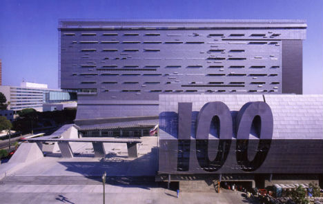 (images via: the city review) Architect Thom Mayne’s firm Morphosis, which designed the University of Toronto Graduate Student Housing building above, also tackled the Caltrans District 7 Headquarters building in Los Angeles. Says the firm, “The large cantilevered light-bar connects the structure to First Street, and the forty-foot, forward-canted super-graphic “100” marks the South Main Street entrance. This layered sign, with its nod to Chandleresque L.A.’s Hollywood sign, denotes the building as an urban landmark.” Museum of Modern Art, Queens, New York 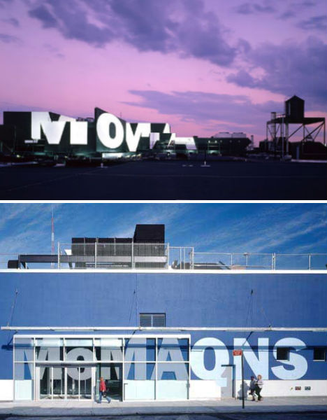 (images via: chi-athenaeum, cooperrobertson.com) One could almost say they can tell this building is the Museum of Modern Art from a mile away. Architects Cooper, Robertson & Partners won a 2003 American Architecture Award after they expanded a former factory in Long Island City into a satellite facility for MoMA. The firm not only emblazoned the museum’s logo upon the facade, but put it in lights on the roof. The Cooper Union, New York 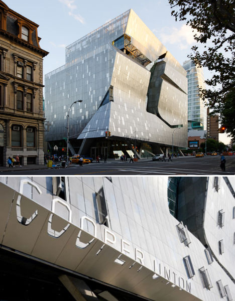 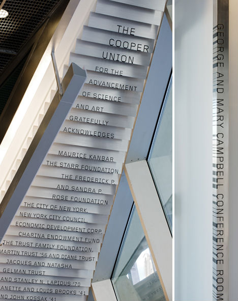 (images via: pentagram) The Morphosis-designed Cooper Union academic building in New York’s East Village is so visually engaging, it’s easy to overlook the details – but the details, in this case, are just as interesting as the building itself (especially for typography geeks). Designer Abbott Miller took inspiration from the font used for the sign on the original 1859 Cooper Union building to create a modern cutout sign on the new building. The font was also carried into the interior, descending down the underside of a stairway and even spotted on the vertical corner guards of the classroom doors. Fairmont Pacific Rim Hotel, Vancouver, Canada 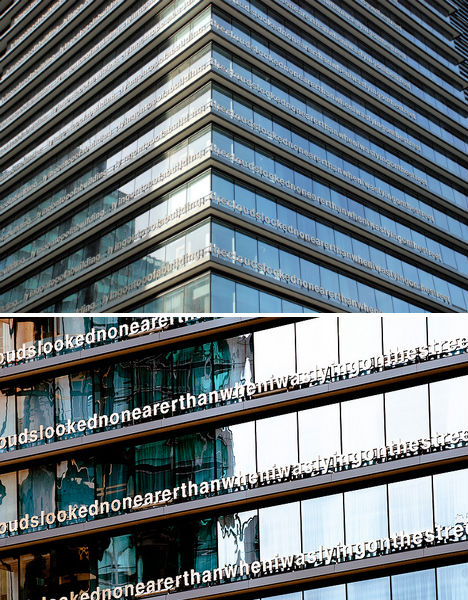 (images via: beyond robson, kennymatic) Don’t be surprised if you see tourists gawking at the Fairmont Pacific Rim Hotel in Vancouver. There’s just trying to read the lowercase text that wraps around each level of the building. Designed by British artist Liam Gillick, the installation reads, “lying on top of a building, the clouds looked no nearer than when I was lying in the street.” Seattle Art Museum, Seattle, Washington 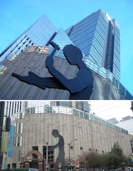 (images via: nimbu, antonio ce) Let’s hope that the Seattle Art Museum never leaves its current Robert Venturi-designed facility on First Avenue; its name is carved right into the facade. Unidentified Building, San Francisco, California 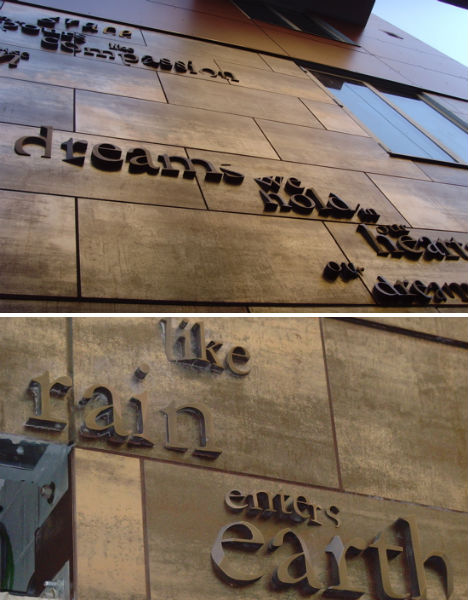 (images via: typophile) A typography-loving passerby captured these shots of an unnamed apartment building in San Francisco, where eye-catching text clings to the surface, seemingly sinking in at some points. The bits that can be read include “dreams we hold in our hearts” and “like rain enters earth.” Want More? Click for Great Related Content on WebUrbanist:  However, refection on life is a prerequisite for living, and the cultural, political and commercial symbols of our times are well worth rethinking on a regular basis. 38 Comments - Click Here to Read More »»  Shipping containers are becoming ever-more-popular sources of design inspiration in new architectural designs, from personal residences to big commercial building plans. 5 Comments - Click Here to Read More »»  All around the world, slides are coming in from the playground and taking up residence in homes, offices and even art museums, adding some fun to everyday life. 3 Comments - Click Here to Read More »» مطالب مرتبط با معماری اخرین اخبار و مطالب مرتبط با معماری را از آدرس http://p30city.net/search.php?do=fin...&starteronly=1 مشاهده کنید |
| جای تبلیغات شما اینجا خالیست با ما تماس بگیرید | |
|
|
|
|
#22
|
||||
|
||||
|
معماری ‘BUMPS In Beijing’: Breaking Free From Drab Slabs 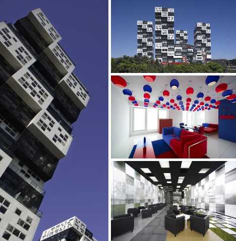 Call it “urban jungle lite.” BUMPS In Beijing is a 5-building, mixed residential and commercial apartment complex located in the Chinese capital’s prestigious Chaoyang District. Japanese architect Keiichiro Sako’s neo-Metabolist “bumpy” design is a stylistic break from slab-sided traditional urban towers, providing optimum sunshine and breezy terraces that brighten up Beijing’s increasingly cramped skyline. Smokin’ Stacks 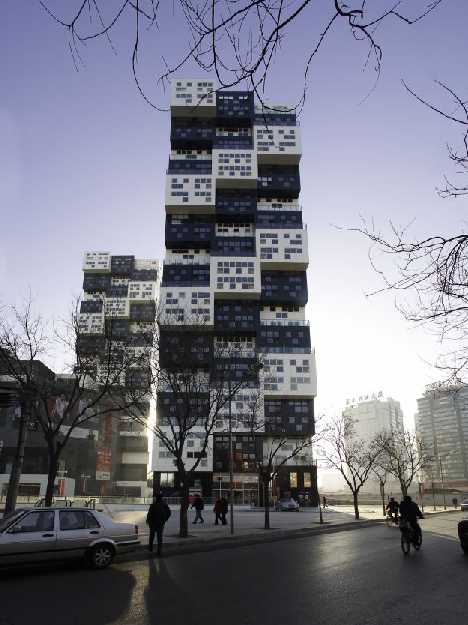 “BUMPS in Beijing”, a mixed-use, 5-building complex designed by Japanese architect Keiichiro Sako of SAKO Architects, is located in southwest Beijing’s desirable Chaoyang District. 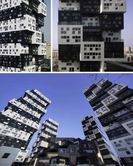 Even among a host of new and exciting highrise developments, BUMPS stands out – literally – thanks to its unusual stacked, staggered and yes: “bumpy” appearance. 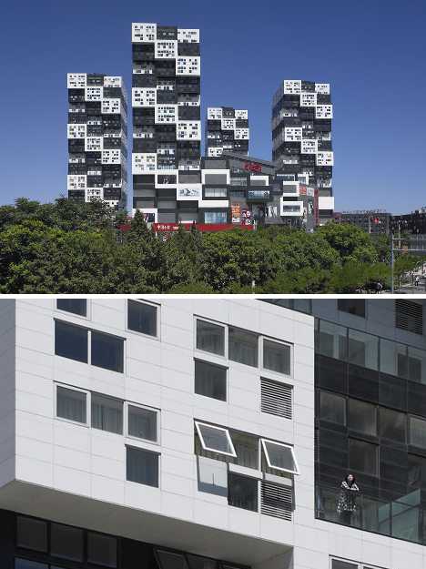 BUMPS consists of four residential apartment buildings, each standing 80 meters (262.5 ft) tall and set at the corners of an imaginary square. The fifth member of the complex is a centrally located 6-story commercial building with a restaurant occupying most of the top floor. 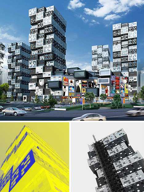 Right off the bat, BUMPS breaks with tradition by rotating the buildings’ footprints 45 degrees from the north-south axis. While seemingly unremarkable, one must consider that in Beijing almost all large buildings are oriented with a north-south plan. As Beijing is located north of the Earth’s equator, this means windows looking out of the north sides of these buildings will almost never catch direct sunlight. Setback To Where You Once Belonged 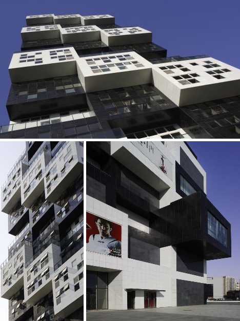 Sako’s design for BUMPS was predicated on “daylighting” – introducing as much natural light as possible into each apartment unit regardless of its position in the complex. The 45 degree twist immediately doubled the sunlit facings. More ambitious was the staggered look of the individual apartment units and the visual effect the style imparted to the buildings as a whole. 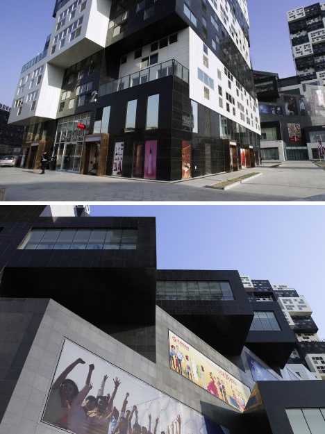 Looking at one of the towers, one can count 14 stories. Not so fast: each unit is made up of one white and one black module, with the upper section set back 2 meters (6.56 ft) from the lower. This allows each unit to offer not only an upstairs and downstairs, but an outdoor terrace as well. 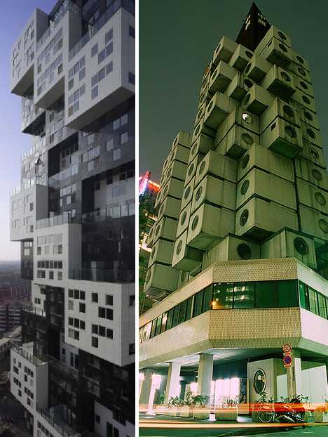 Repeated over the entire length, breadth and height of each tower, the series of setbacks gives the whole a unique modular appearance reminiscent of Tokyo’s famous Nakagin Capsule Tower (above, right) which actually WAS built from individual modules. Let There Be Light! 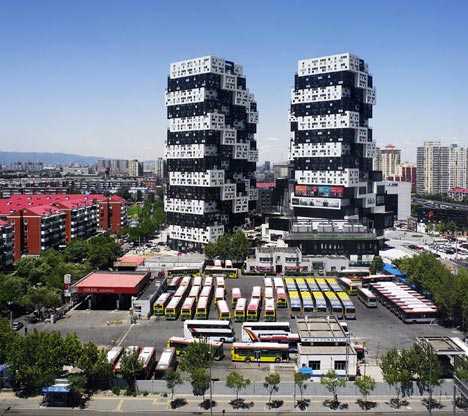 The bumpy, blocky, Jenga-esque facades of the BUMPS complex with their interspersed rectangular modules remind some of stacked black & white shipping containers, though nothing so bare-bones basic would have a chance of being approved for Chaoyang. In contrast to some other neighborhoods in overcrowded Beijing, Chaoyang today boasts wide green belts, mature trees and widely separated highrise buildings. On the other hand, what’s the deal with the bus parking lot? 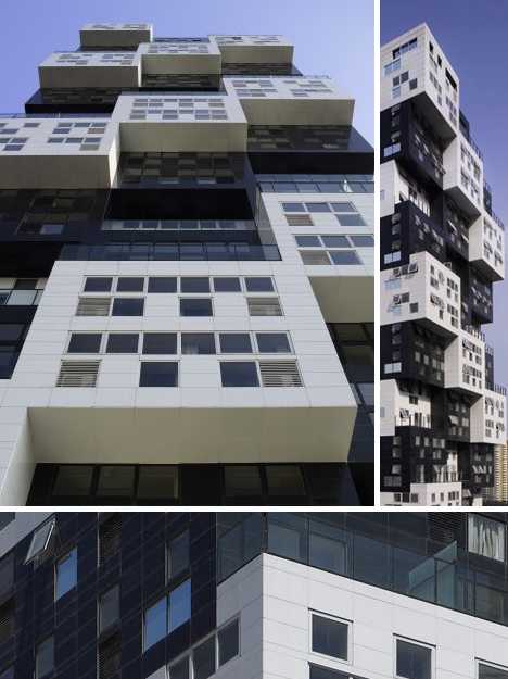 BUMPS lets in light through hundreds of 1-meter (3.28 ft) square windows. It remains to be seen if interior brightness levels will vary much from other designs offering floor-to-ceiling picture windows but it can be said, at least, that the wealth of identical square apertures add to the complex’s overall design aesthetic. 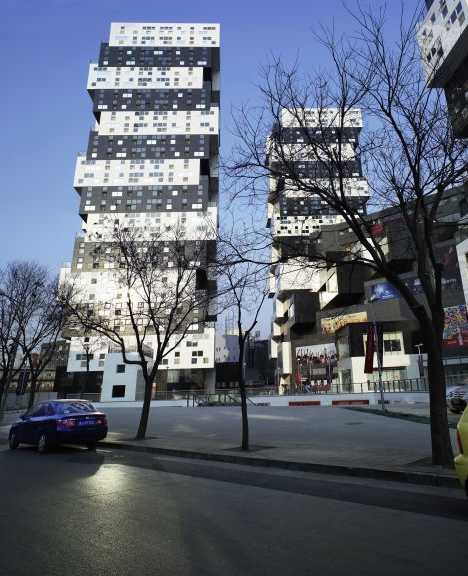 The total area of BUMPS is 103,218 square meters (1,111,065 sq ft), which befits its status as a landmark development Beijing urban planners are hoping will attract further projects to this part of Chaoyang. As always, the possibility remains that pressure from well-connected real estate moguls will result in overbuilding but at present, BUMPS literally stands alone as an urban island bathed in sunlight. Inside Job 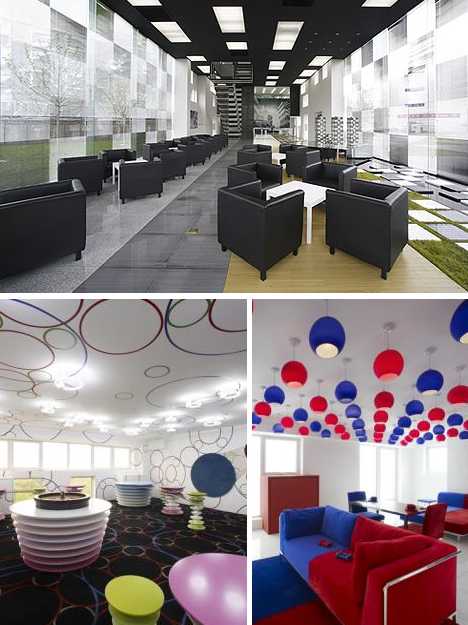 Construction on BUMPS began in 2006 and by late 2008 the complex was ready to welcome its first residents. If these interior images are any indication, BUMPS offers an abundance of linear space with very few obstructions or obtrusive load-bearing walls. Daylight entering through southeast and southwest facing windows penetrates all the way to the opposite sides, potentially saving on interior lighting costs over time. 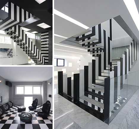 Staircases linking upper and lower halves of the units are distinctive in their own right, formed from U-shaped segments in alternating black and white that make up the stair treads and the handrails. 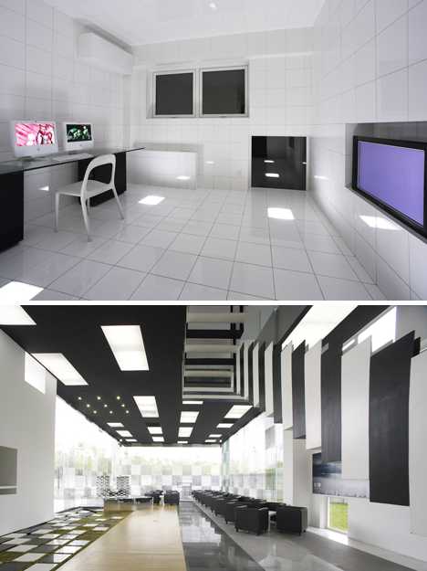 On the downside, some residents may feel put off by the long inside walls and complete lack of any curved surfaces. Sometimes, efforts to increase a sense of spaciousness can impart a feeling of smallness from the perspective of the beholder. Reactions of anxiety, even alienation, have bedeviled urban planners since the first modern highrise apartment blocks were built in the early 1950s. 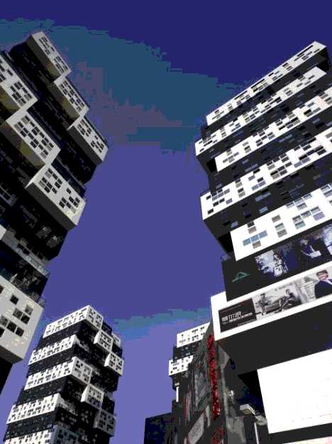 Only time will tell if BUMPS In Beijing will succeed on an emotional level the way it has as a pure design on paper. New kid on the block? We kid you not! Want More? Click for Great Related Content on WebUrbanist:  And you thought the Leaning Tower of Pisa was the most steeply tilted structure in the world? Guess again: that world record was broke by another building. Click Here to Read More »»  Some of the most amazing photography doesn't use a camera at all. These incredible images were produced using ancient methods - no lenses required. 31 Comments - Click Here to Read More »»  Is the "new sport" of pomparkour for real? The video showing insane jumps with ladders is an ad for an energy drink, but shows some interesting feats. 2 Comments - Click Here to Read More »» مطالب مرتبط با معماری اخرین اخبار و مطالب مرتبط با معماری را از آدرس http://p30city.net/search.php?do=fin...&starteronly=1 مشاهده کنید |
|
#23
|
||||
|
||||
|
معماری Archi-TYPE: 14 Buildings & Cities Made of Text 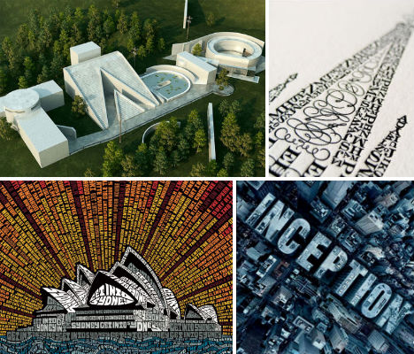 The right minimalist sans-serif or swooping, elegant script typeface can be just as expressive as the words it spells out, and can sometimes even stand in for brushstrokes of paint and other illustrative media. Just as typography is sometimes used as a bold graphic element in architecture, it can also be used as the building blocks to create imaginative structures and cityscapes. Typography Sydney Opera House 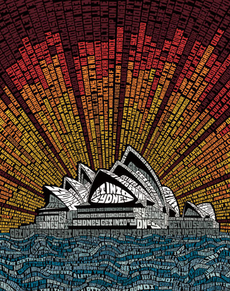 (image via: we love typography) This tourism ad for the city of Sydney, Australia extolls the virtues of the area in the form of a typographic illustration of the Sydney Opera House. The text reads, among many other things, “Dine on kangaroo”, “Cuddle a koala” and “Surf at Bondi.” Tadao by Chris Labrooy 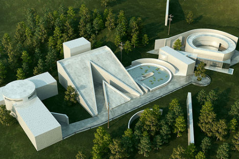 (image via: chris labrooy) 3D designer Chris Labrooy based an unusual (and awesome) set of typographic illustrations on the styles of his favorite architects, including Tadao Ando. Ando’s solid yet place-sensitive structures, often made of concrete, inspired the perfect basis for an imagined complex that looks as if it could really have been designed by the architect. It bears a notable resemblance to Ando’s Westin Awaji Island Hotel. Letterpress Tower by Cameron Moll 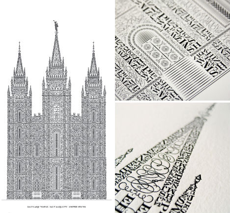 (image via: cameron moll) Crafted character by character in the shape of the Salt Lake Temple, designer Cameron Moll’s letterpress tower took hundreds of hours to create. The beautiful architectural qualities of the letterpress medium itself pay fitting tribute to a painstaking process, with letters and typefaces chosen by shape for each portion of the design. Urban Typography 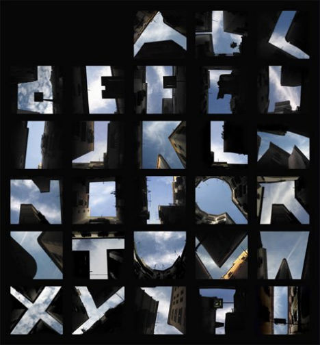 (image via: thoughtbucket) A German photographer saw more than just roof lines and blue sky when gazing up at buildings; these imaginative letters were made with creative cropping. Bauhaus by Chris Labrooy 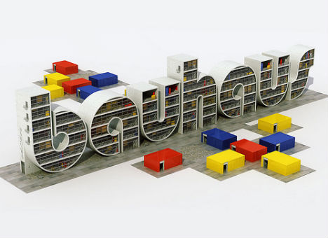 (image via: chris labrooy) In this design Chris Labrooy has captured the essence of German Modernism – both the architectural style and the typeface it inspired. One can almost imagine this concept coming to life as a real building complex, standing in tribute of minimalism and clean lines. Inception 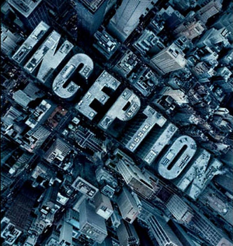 (image via: filmofilia) One place where architecture and typography notably came together was in this poster for the movie Inception, in which dream architecture unlimited by the laws of physics played a starring role. Toyo by Chris Labrooy 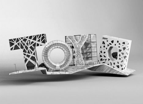 (image via: chris labrooy) If there’s one thing you can say about architect Toyo Ito’s innovative designs, it’s ‘expect the unexpected’: Ito is known for sheathing his buildings in unusual, textural facades, often in white. This interpretation of Ito’s work by Chris Labrooy captures some of Ito’s best-known works including the Tod’s Omotesando building in Tokyo and the Mikimoto building. Type City 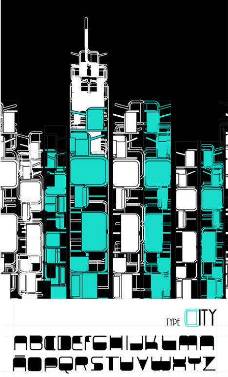 (image via: jemmjemm) Artist Helen Parada of El Salvador crafted an urban scene using nothing but letters in a heavy, rounded typeface for this digital illustration. Colosseum Made of Words 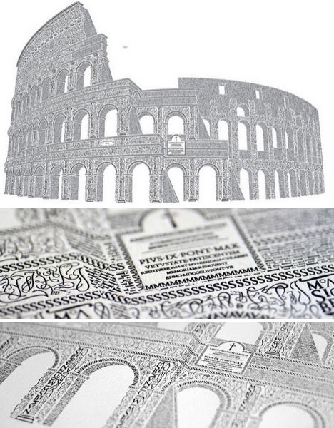 (image via: cameron moll) Inspired by the work of master calligrapher M. Giovambattista Palatino and an anniversary trip to Rome, typography artist Cameron Moll spent a full year hand-crafting this incredibly detailed illustration of the Colosseum using characters from the Goudy Trajan and Bembo Pro typefaces. Frank by Chris Labrooy  (image via: chris labrooy) Is there any question as to the identify of the architect to whom this piece pays homage? Even if you’re not personally familiar with Frank Gehry’s oeuvre, the shiny, curving metallic facades should give it away. City of Text 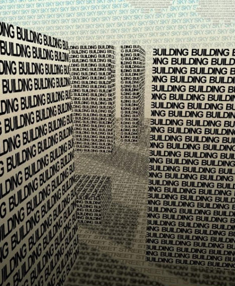 (image via: pxleyes) Artist David M.L. of Spain crafted a city block out of the words ‘building’, ‘street’, ‘shadow’, ‘sky’ and ‘cloud’ in this clever typographic illustration. BMW Zebra Crossing Ad 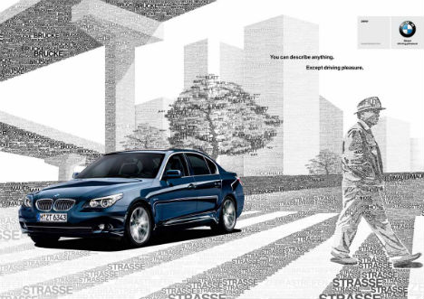 (image via: ads of the world) BMW went with the same idea for this ‘Zebra Crossing’ ad, which forms the cityscape with words. The tagline of the ad is, “You can describe anything. Except driving pleasure.” Helvetica by Chris Labrooy 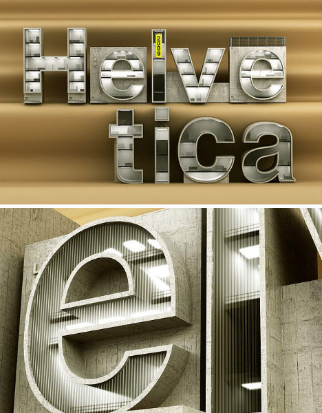 (images via: chris labrooy) Chris Labrooy shifted his focus from interpreting architectural styles with typography, to turning a typeface into architecture. Helvetica, perhaps the most beloved typeface of typography enthusiasts thanks to its elegant simplicity, is fittingly cool and modern when translated to a series of imaginary buildings. Google Maps Typography 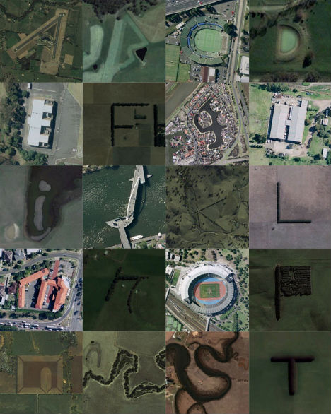 (images via: rhett dashwood) Creative director Rhett Dashwood spent several months searching Google Maps to find architecture, farms and natural land features that form the letters of the alphabet. See all 26 letters and get the links to the locations at Rhett Dashwood’s website. Want More? Click for Great Related Content on WebUrbanist:  These art projects all bring the charm of typography into the physical world. From sculptures to toys, these are some of the loveliest physical typography art. 4 Comments - Click Here to Read More »»  A lot can be said with the font that one chooses for a project. These amazing character sets are far from the usual plain black letters we're all so used to. 1 Comment - Click Here to Read More »»  Far from a postscript, the signage in these 13 structures serve as integral parts of each design, covering entire facades or standing hundreds of feet tall. Click Here to Read More »» مطالب مرتبط با معماری اخرین اخبار و مطالب مرتبط با معماری را از آدرس http://p30city.net/search.php?do=fin...&starteronly=1 مشاهده کنید |
|
#24
|
||||
|
||||
|
معماری Eccentric Hideaway: Secret English Underwater Billiards Room 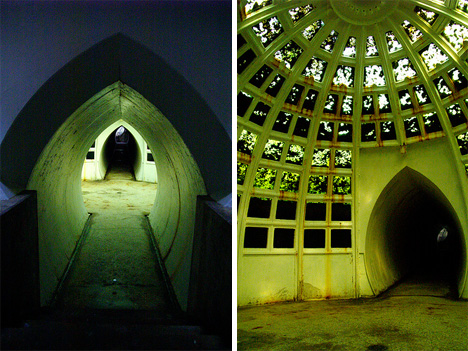 Urban explorers know that it isn’t typically the readily-visible locations that hold the most intrigue; it is the hidden places unknown to most of the world. The places that most of us will never visit (and may never even realize exist) are the most beautiful, interesting and worthy of our wonder. This particular hidden place sits beneath a man-made lake next to the massive estate of a late mining magnate…and even some of its closest neighbors have no idea it exists. 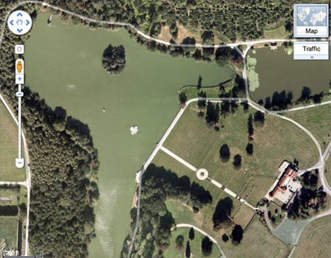 (image via: Gizmodo) In the late 19th century, wealthy English businesspeople began to dot the countryside with extravagant homes. Not content to simply show off their wealth with mansions, however, they built accompanying towers and other displays that made the owners’ financial worth clear to all passers-by. Most of these displays served no practical purpose. Mining industry tycoon Whitaker Wright bucked the trend by creating a project that was invisible to all but those who were invited to enjoy it. 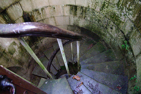 (image via: CyberGibbons) Wright’s indulgence was an underwater billiards room and fish-watching conservatory built in the middle of a man-made lake on his property in Goldalming, Surrey. Accessed through a small wooden door, a spiral staircase and a short underwater tunnel boat ride, the room is well and truly secret to anyone who is not in the know. In fact, it has become something of a local legend; stories of the underwater room have been passed down through generations but many believe that the tales are pure fiction. 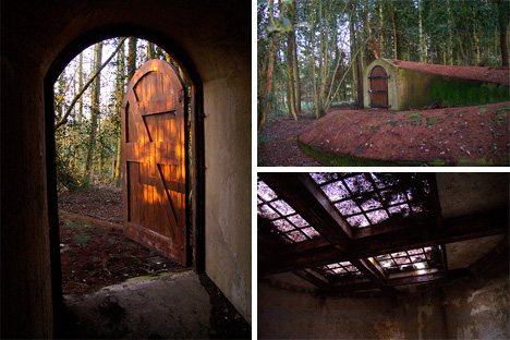 (images via: CyberGibbons) After the property’s original owner was convicted of fraud, he killed himself with a cyanide capsule and Witley Park fell into the hands of Lord Pirrie, the builder of the ill-fated Titanic. Escaping death on his own creation thanks to an illness that kept him at home, Pirrie owned the home for around 15 years before his own death from pneumonia. Since then, Witley Park has been used as a conference center and meeting room, even after the original mansion burned down in 1952. The underwater billiards room has been accessible to many, but today it is blocked off and guarded with a security system. 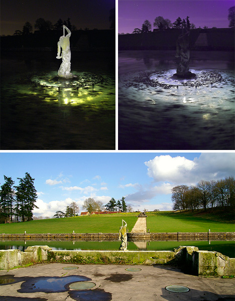 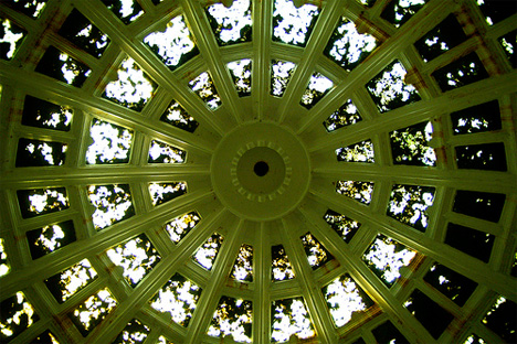 (images via: CyberGibbons) Still, some urban explorers have been able to gain access to this incredible secret room. In the photos above, the glass dome is lit from the inside, providing an eerie glow to the water and the statue that sits atop the dome. From inside the dome, the glass panes are nearly entirely obscured by sediment and algae, making it difficult to imagine how stunning the view once must have been. 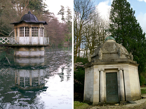 (images via: CyberGibbons) On the other hand, the decay and neglect that have changed the hidden rooms and tunnels have given them a wonderful sense of mystery. The fact that the underwater billiards room has been steeped in mystery for decades only serves to make it more fascinating. Sadly, the property’s current owner is not likely to give permission to explore the property today, but plenty of previous visitors have shared their photos online of this incredible place. (Special thanks to Andrew for the use of his spectacular photos of Witley Park) Want More? Click for Great Related Content on WebUrbanist:  In some cases the discovery of a secret room is a wonderful find but it can also be a twisted nightmare. 46 Comments - Click Here to Read More »»  Hidden rooms and secret passageways are no longer only found in ancient castles and fantasy books. Beautifully subtle hideaways can now be purchased by anyone. 3 Comments - Click Here to Read More »»  Secret rooms and hidden passages in homes are all the rage in architecture today. But the practice of sneaking around in concealed places has deep, dark roots. 15 Comments - Click Here to Read More »» مطالب مرتبط با معماری اخرین اخبار و مطالب مرتبط با معماری را از آدرس http://p30city.net/search.php?do=fin...&starteronly=1 مشاهده کنید |
|
#25
|
||||
|
||||
|
معماری Spiraling Tower of Babel Made of Books in Buenos Aires 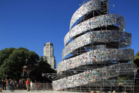 Seven stories tall, this Tower of Babel is no long-lost artifact from biblical times but rather an artistic tribute to the city of Buenos Aires’ new designation as ‘World Book Capital 2011′. The 82-foot-tower is made of 30,000 books donated by readers, libraries and 50 embassies, and includes books written in virtually every language in existence. Artist Marta Minujin, a Buenos Aires native known for bizarre mattress sculptures and performance art events she calls “happenings”, designed the tower and installed it on a public street with the help of volunteers. The sculpture will be disassembled on May 28th, and the books will be given away to the public. 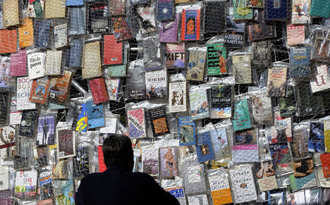 As visitors ascend to the top of the tower, gazing at everything from Japanese children’s books to Spanish poetry, they hear Minujin’s recorded voice reciting the word ‘book’ in various languages. The artist says that, like the fabled mission of the original Tower of Babel, her mission is to unite all people, adding “I don’t know why we have to have different languages.” 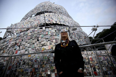 “Building this tower has been a miraculous experience,” Minujin told Reuters Television as she stood before the structure. “A hundred years from now, people will say ‘there was a Tower of Babel in Argentina … and it didn’t need translation because art needs no translation.’” Want More? Click for Great Related Content on WebUrbanist:  Photographer Carlos Aires experiments with racy laser-cut vinyl art in a series called "Love is in the Air". 3 Comments - Click Here to Read More »»  Artist Jacqueline Rush Lee takes papercraft to a new dimension with stunning, organic book art crafted from lovingly handled used books. 4 Comments - Click Here to Read More »»  These 12 sculptures, paintings, installations and even entire buildings take discarded books and give them new meaning and value. 2 Comments - Click Here to Read More »» مطالب مرتبط با معماری اخرین اخبار و مطالب مرتبط با معماری را از آدرس http://p30city.net/search.php?do=fin...&starteronly=1 مشاهده کنید |
|
#26
|
||||
|
||||
|
معماری Living In A Box: China’s Shipping Container Apartments 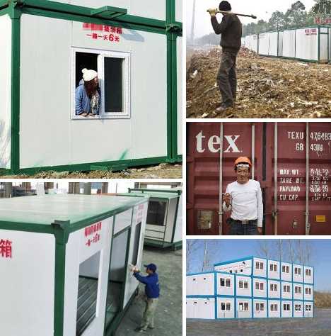 All across China, millions of migrant workers are on the move, looking for jobs and – once they’ve found them – places to live. At the same time, China’s booming economy has generated a vast surplus of metal shipping containers. Savvy city authorities are finding that converting these cargo containers into cheap, basic apartments uses up extra containers while satisfying tenants with low expectations and incomes to match. Fueling an Economic Engine 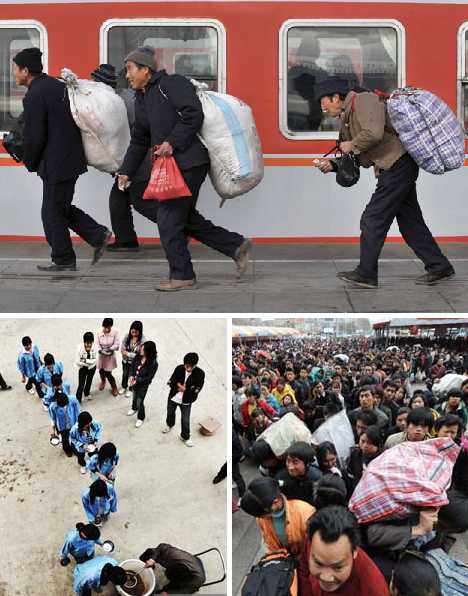 China’s amazing economic boom has mainly been powered by cheap labor. Rural villagers escaping endemic poverty exacerbated by the closing of inefficient state-owned industries flock by the tens of millions to so-called “factories without chimneys”: mainly coastal cities desperate for cheap labor.  Current estimates peg China’s “floating” population of migrant workers at around 120 million, a sobering figure that is growing at the rate of 13 million people per year and could hit 400 million by 2025. Already China’s overheated construction industry is having trouble providing homes for its upwardly mobile citizens. Rising demand for housing leads inexorably to rising prices for housing, and migrant workers often arrive in urban centers with little more than the shirts on their backs. Some will live anywhere – like a group of 10 living in a public toilet (above, top). What to do? 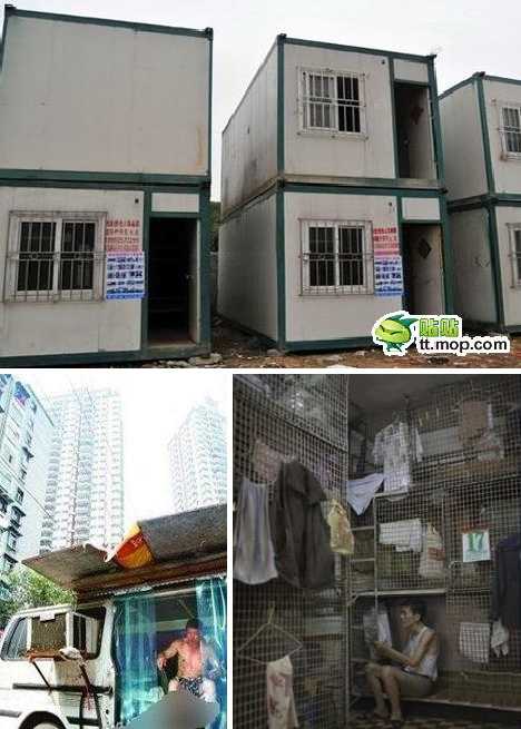 One solution seized upon in the coastal cities revolves around steel shipping containers. It’s rather elegant, in a way: faced with an oversupply of cargo containers and homeless workers, why not turn the former into homes for the latter? Above are some so-called “snail houses” in the city of Foshan. Steel Hives for Worker Bees 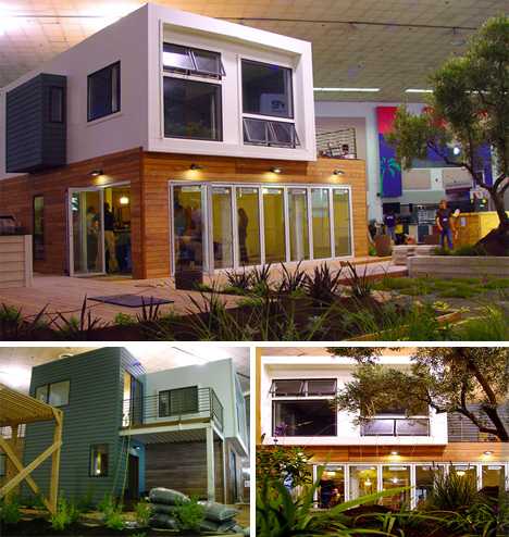 Shipping containers have been successfully converted into homes, offices, hotels and more – often the conversions are so elaborate you’d never know the structures’ origins. All well and good, but China’s situation demands quick, cheap fixes. 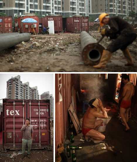 Consider the plight of a migrant worker from a rural village without electricity, plumbing or a roof that doesn’t leak. Even the most basic converted cargo container would seem like a palace while costing a pittance. 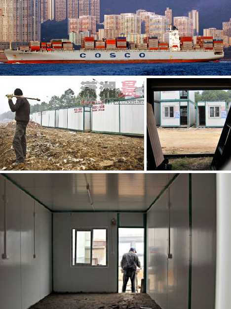 Cargo container communities have been springing up all across China’s manufacturing centers, beginning with port cities where surplus shipping containers are cheap and abundant. The success of these converted containers as cheap housing has resulted in cities located inland to import the containers and build housing complexes with them. A perfect example is Chengdu, a city of about 11 million that is the capital of Sichuan province in Southwest China. 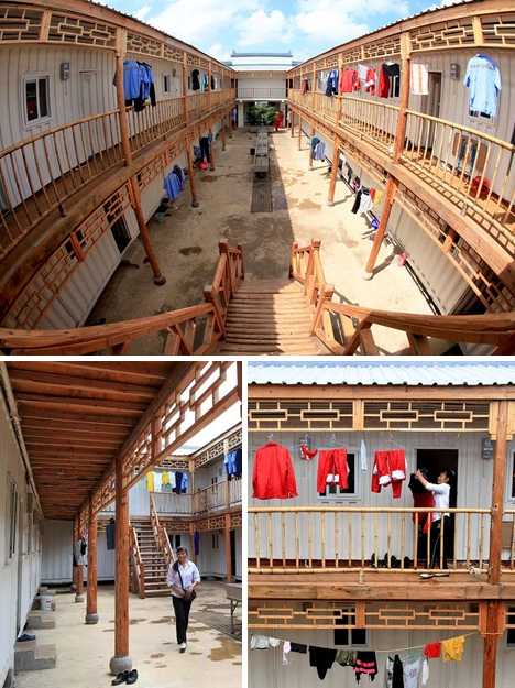 Lured by lower land costs and much-improved infrastructure, companies are setting up shop in Chengdu and migrant workers are answering the call for laborers. Generally, male migrants work in construction while females are hired to work in factories requiring repetitive small-scale assembly and piecework. The hours are long, the pay is low, and housing is at a premium… bring in the container apartments! Chengdu, Can Do! 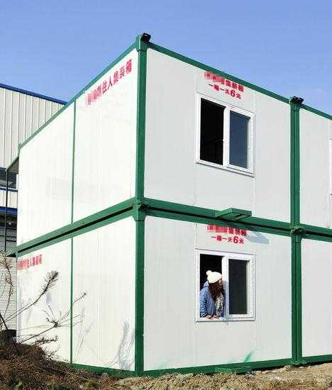 The cargo container apartment complex highlighted here was one of Chengdu’s first, set up in late 2010 along the Qingpai Dadao (Qingpi Avenue) in Chengdu’s central Wenjiang district. The complex is made up of standard-issue 3m x 6m (roughly 10 by 20 ft) steel shipping containers that weigh 2.6 tons each. 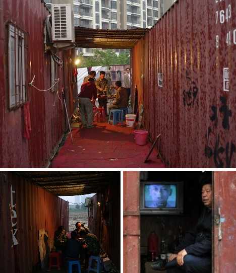 Each container is cleaned, openings for a door and 2 windows are cut, floors are tiled and both exterior and interior walls are painted. 5 cm (2 inches) of fire-resistant insulation is sandwiched between the walls to help preserve heat and reduce noise. “With a lot of people in the apartment, it’s not cold,” explained worker Yong Jianwei. “And it’s so close to our work site which makes it very convenient.” 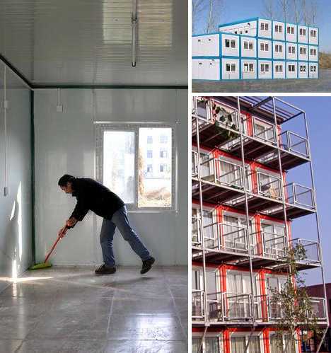 The units do have some creature comforts such as fluorescent lighting, electrical wiring and fittings for air conditioners. Openings are drilled for telephone cords though many tenants use inexpensive cell phones. Some units consist of two containers stacked one atop the other and feature an upstairs balcony. 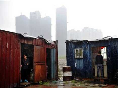 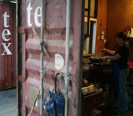 As for water and plumbing, remember that while not all of China’s rural villages are without modern household conveniences and facilities, usually the poorest villagers become migrants in the hopes of building a better life. Basic bathroom facilities (including a shower) are built behind the rear portions of the containers and small kitchens are fitted into a corner of the first floor. Still sound kinda rough? Be aware that even among container homes there’s a hierarchy – the “homes” above in Fuzhou are part of a group of 13 that really scrape the bottom of the barrel. New Blocks on the Block 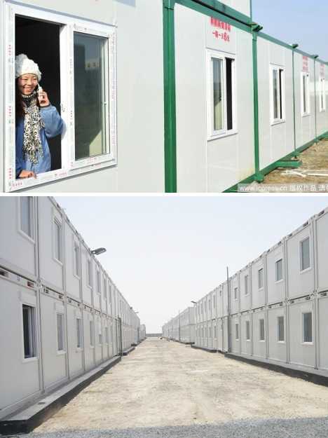 As well as being modular, the apartment units are portable using much the same equipment as is used to move actual cargo containers at China’s busy docks. The complex in Wenjiang, for example, was situated within steps of a new highrise building under construction. “Each apartment is its own unit,” explained worker Xie Hongbin. “Any time and place one is needed, it can just be picked up and moved with a crane.” 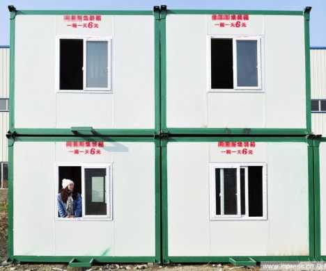 Painted white with dark green trim, Wenjiang cargo container apartments are neat and unobtrusive. In fact, they look a lot like an ordinary block of flats until one gets close enough to read the rental phone number and daily rental cost stenciled on each unit in red paint. Speaking of which, that daily rental cost is 6 yuan, slightly under $1 at current exchange rates. 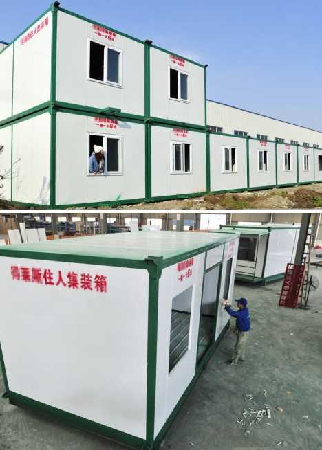 Tenants wanting to pay by the month are charged 180 yuan. You can even buy one outright for a flat 10,000 yuan ($1,540). If one considers that the cargo container apartment units are built to accommodate up to 10 tenants per unit and some are furnished with 5 bunk beds, the economics are even more, shall we say, accommodating! Want More? Click for Great Related Content on WebUrbanist:  Not all steel shipping container architecture is about building a dream home. These clever designs use cargo containers for community and emergency housing. 3 Comments - Click Here to Read More »»  After seeing the success of other shipping container construction projects, schools and hotels are getting in on the money- and time-saving cargotecture method. Click Here to Read More »»  Shipping container homes are the perfect blend of modern architecture and sensible green building. Buy your own used cargo container on sale and start building today! 8 Comments - Click Here to Read More »» مطالب مرتبط با معماری اخرین اخبار و مطالب مرتبط با معماری را از آدرس http://p30city.net/search.php?do=fin...&starteronly=1 مشاهده کنید |
|
#27
|
||||
|
||||
|
معماری 14 (More!) Masters of Incredibly Intricate Paper Art 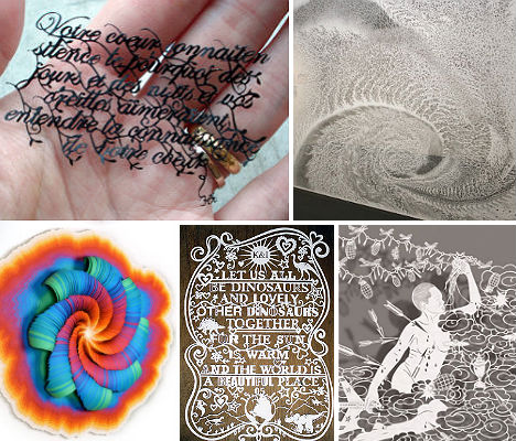 Billowing clouds of cut paper installations that cast dream-like shadows on a gallery wall, delicate paper drawings plastered on gritty urban surfaces, complex layered sculptures of hand-sliced paper and intricately crafted sheets the size of tapestries: paper art in its many forms is elevated to new heights by these 14 (more) masters of the craft. Bovey Lee, Hunter Stabler, Jen Stark and 11 other artists transform an often-disposable material into stunning works of art that will make your jaw drop. See 48 more works by 14 additional artists at WebEcoist. Bovey Lee 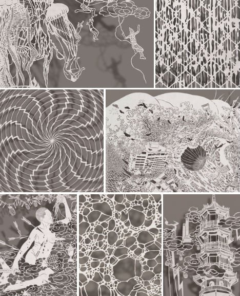 (images via: boveylee.com) China-born, Pittsburgh-based artist Bovey Lee creates what might just be the most intricate paper art of all, hand-slicing the tiniest pieces of paper into amazingly flawless shapes and patterns. “The underlying themes in my paper cutouts are power, sacrifice, and survival,” she told the Pittsburgh Cultural Trust. “Drawing ideas from my cultural identity and gender, headline news, environmental issues, and socio-political commentaries, I painstakingly hand cut each work on a single sheet of paper that depicts layered and dramatic narratives. The deep paradoxes in my works contrast starkly with the airy, fragile laces of the cutouts.” Mia Pearlman 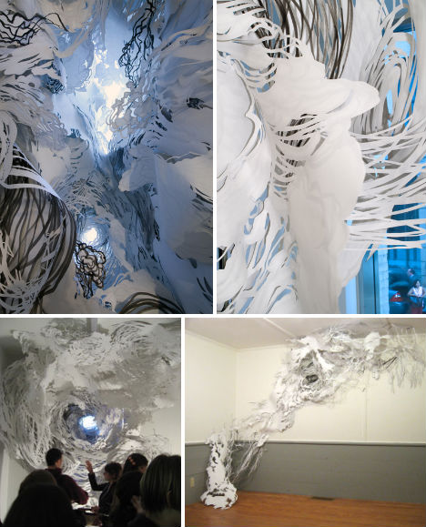 (images via: miapearlman.com) Paper artist Mia Pearlman fills entire rooms with her billowing, cloud-like installations. “My process is very intuitive, based on spontaneous decisions in the moment. I begin by making loose line drawings in India ink on large rolls of paper. Then I cut out selected areas between the lines to make a new drawing in positive and negative space on the reverse. 30-80 of these cut paper pieces form the final installation, which I create on site by trial and error, a 2-3 day dance with chance and control.” Nava Lubelski 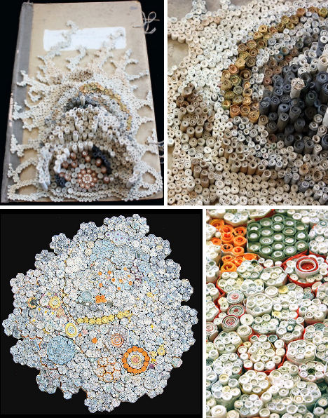 (images via: navalubelski.com) Looking like some kind of organic growth, these rolled paper sculptures by Nava Lubelski are crafted from tax returns, rejection letters and other unwanted papers. Says the artist, “Shredded paper sculptures, such as the Tax Files, reconfigure a mass of paper that has been grouped and saved due to written content, into slabs reminiscent of tree cross-sections where the climate of a given year, and the tree’s overall age are visible in a single slice. Historical information is revealed in the colors of deposit slips, pay stubs, receipts and tax forms. The cellular coils spiral outward, mimicking biological growth, as they are glued together into flat rounds, which suggest lichen, doilies or disease.” Miso 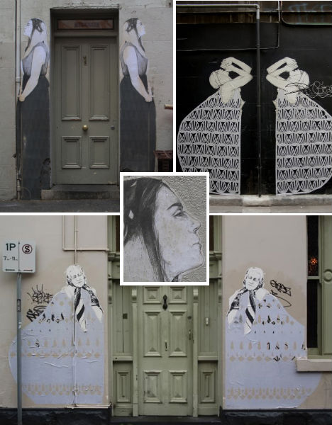 (images via: cityofreubens) The delicate, ephemeral qualities of paper are a stunning contrast to the grit and solidity of urban environments in the hand-drawn street art of Australian artist ‘Miso’ (Stanislava Pinchuk). “Like folk art, it comes to have a very particular, practical function,” Miso says. “It brings us together as makers, viewers and consumers, finding new pieces and exploring the possibilities of our cities.” Hunter Stabler 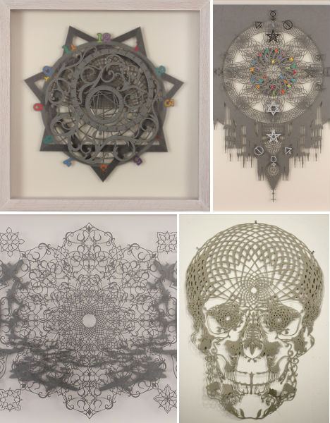 (images via: hunterstabler.com) Philadelphia artist Hunter Stabler renders arcane symbols and imagery in his complex paper cut-outs, often in shades of gray with pops of brights. A current exhibition at the Observatory gallery in Brooklyn, entitled ‘Alchemically Yours’, focusing on the “art of transmutation. Of taking the rough and raw, and rendering it more precious. Rather than accepting the literal “lead into gold” definition, Carl Jung believed that alchemy is a process of individuation, a symbolic and active language which guides one’s personal journey toward the realization of selfhood. An alchemist is a shape-shifter, a mystic chemist.” Pablo Lehmann 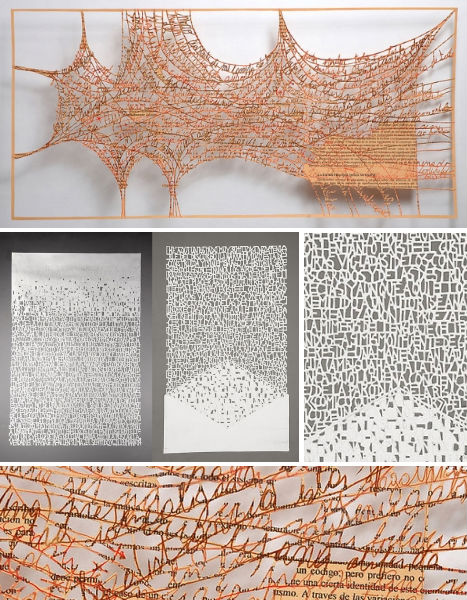 (images via: pablolehmann.com) Pablo Lehmann’s incredible paper creations consist of layered sheets of paper, hand-cut with text and abstract shapes and stacked for a three-dimensional effect. The Buenos Aires, Argentina-based artist has shown his work at galleries in South America. Tomoko Shioyasu 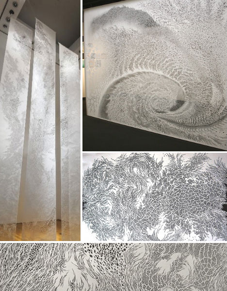 (images via: scaithebathhouse) Swirling vortices of water and wind, along with the complex natural structure of cells, provide inspiration for jaw-dropping, huge cut paper tapestries by Tomoko Shioyasu. Measuring as large as twelve feet high and eight feet wide, Shioyasu’s tapestries are especially breathtaking when displayed in white gallery spaces as the negative space in the paper allows intricate patterns of light to shine through. Lim Siang Ching 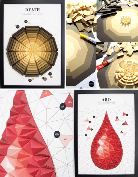 (images via: this is colossal) Infographics come to life in colorful, three-dimensional framed displays by Singapore graphic design student Lim Siang Ching. The artist created these posters as degree projects when graduating from LASALLE College of the Arts. Gjertrud Hals 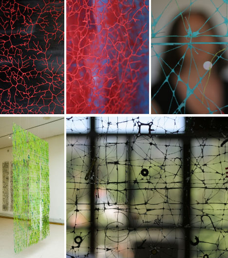 (images via: gjertrud-hals.com) While many other paper artists cut, burn or sculpt their chosen medium into works of art, Gjertrud Hals takes a different tack: spraying paper fibers onto sculptures made of thread or wire. The final result often looks organic in nature, resembling veins, coral or spiderweb. Jen Stark 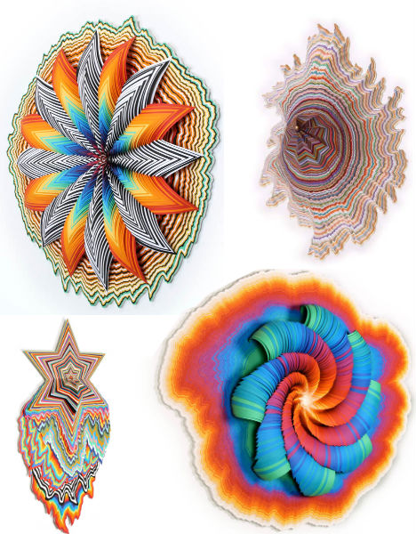 (images via: jenstark.com) “My work is inspired by all sorts of things, from wormholes, to how micro and macro designs relate to each other, and the layers of a plant, to outer space,” says artist Jen Stark, a Miami native who began creating her unusually vibrant brand of kaleidoscopic paper art while studying abroad in France. Stark layers cut pieces of colored construction paper into three-dimensional sculptures that are sometimes so deep, you can reach your hand into them. Aoyama Hina 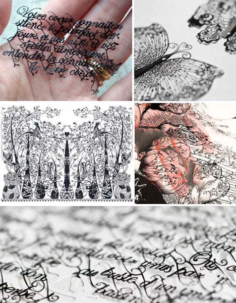 (images via: hinaaoyama) Imagine the focus and steadiness of hand that it must take in order to create such tiny paper cut-outs by hand. Japanese-born, France-based artist Aoyama Hina captures an incredible amount of detail in flowing script and the cells of a butterfly’s wing. Julene Harrison 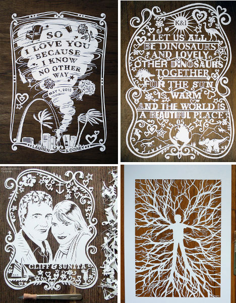 (images via: madebyjulene.com) Want a beautiful paper illustration or portrait of your very own? British paper artist Julene Harrison takes commissions, often producing stunning custom works for weddings and other special occasions. Yulia Brodskaya 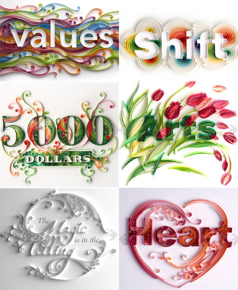 (images via: artyulia.com) Yulia Brodskaya combines typography with papercraft art to create three-dimensional designs that really pop. Brodskaya, a Russian artist living in the UK, sought to bring together her love for the two separate art forms and has done so beautifully, with a style unlike any other. Elod Beregszaszi 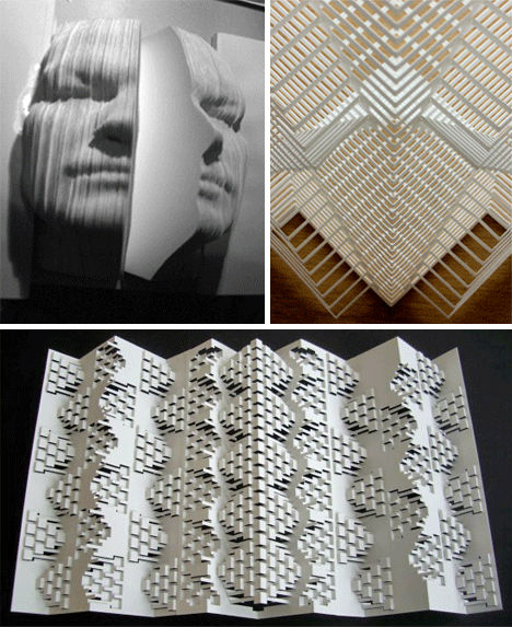 (images via: elod beregszaszi) Buildings, cities, geometric shapes and even human faces spring out of three-dimensional folded and cut paper sculptures by Elod Beregszaszi. From a WebUrbanist profile: “The fragility of Elod’s work makes it that much more appealing. Like sculptures made out of sand, the perfect use of such a delicate material makes the perfect symmetry that much more wonderful to behold. Elod Beregszaszi is able to create labyrinth-like tiers of folded paper that look almost like an imaginary city viewed from above. The level of detail he places into each piece is truly amazing.” Want More? Click for Great Related Content on WebUrbanist:  Elod Beregszaszi is a master of paperwork, but not in the normal sense. He cuts, folds, embosses and sculpts amazing work out of paper. 3 Comments - Click Here to Read More »»  Paper mache is a process used to create art that involves shaping paper and hardening it with an adhesive. Here is some of the most impressive paper mache art: Click Here to Read More »»  These large-scale paper tapestries are more than just two-dimensional cutouts. They are delicate, intricate artworks with a nature-loving flair. 3 Comments - Click Here to Read More »» مطالب مرتبط با معماری اخرین اخبار و مطالب مرتبط با معماری را از آدرس http://p30city.net/search.php?do=fin...&starteronly=1 مشاهده کنید |
|
#28
|
||||
|
||||
|
معماری Hidden Creativity: QR Code Portrait Hides Double Meaning 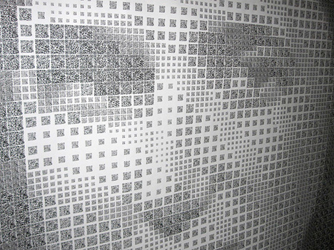 Great art is not only beautiful, but deeply meaningful to both the artist and the viewer. Artist Scott Blake has made a name for himself creating art with bar codes: those simple black-and-white stripey codes you find on nearly everything you buy. Now he is experimenting with the bar code’s younger, hipper cousin, the QR code. 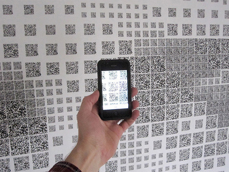 (all images via: Walyou) The QR code (short for quick response) is popping up in the most unusual places these days. It is typically used in advertisements to provide additional information about the product being promoted. Unlike bar codes, no special equipment is needed to extract information from a QR code; they can be read by most smart phones. 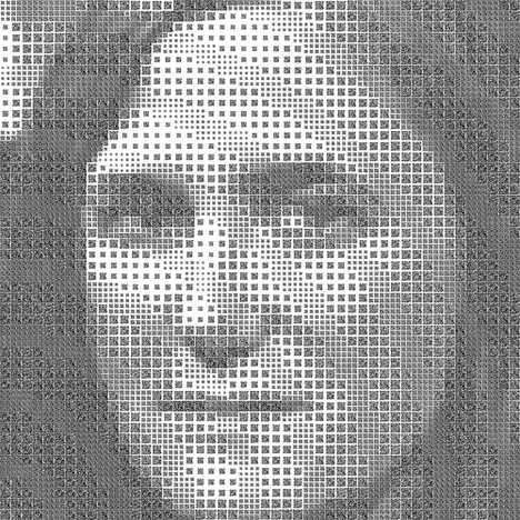 Blake’s QR code portrait depicts Amy Goodman, a journalist and host of the independent news program Democracy Now! The portrait features a staggering 2,304 QR codes, all arranged perfectly according to their balance of light and dark to create a surprisingly detailed portrait of Goodman’s face. 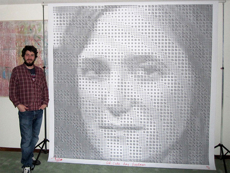 The codes take viewers to Democracy Now! videos that span nine years – an impressive collection of art in its own right. The portrait portrays not only the likeness of the person featured, but her life’s work as well. Want More? Click for Great Related Content on WebUrbanist:  Ephemeral, always changing, portraits are about capturing a person in a precise moment of time. Here are 13 creative portraits and 12 portraiture photographers. Click Here to Read More »»  What do you see when you look at these logos - letters and seemingly random shapes? Take a closer look; hidden symbols and meanings abound. 3 Comments - Click Here to Read More »»  A groundbreaking cost-cutting, energy-saving program in Germany called Dial4Light requires pedestrians to activate street lights using their cell phones. 4 Comments - Click Here to Read More »» مطالب مرتبط با معماری اخرین اخبار و مطالب مرتبط با معماری را از آدرس http://p30city.net/search.php?do=fin...&starteronly=1 مشاهده کنید |
|
#29
|
||||
|
||||
|
معماری Modern Metro: 14 of the World’s Coolest Subway Stations 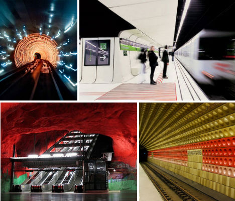 Dark, smelly, filthy and crawling with rats – while this may be an accurate description of many subway stations and tunnels around the world, it definitely doesn’t apply to Barcelona’s Drassanes Station, Stockholm’s Tunnelbana, the Munich U-Bahn or 11 other bold, colorful, modern and just plain beautiful stations. Travelers taking these trains can catch a glimpse of a stunning abandoned station in New York, an ancient river under Athens, a nuclear bunker in North Korea and much more. Kievskaya Station, Moscow, Russia 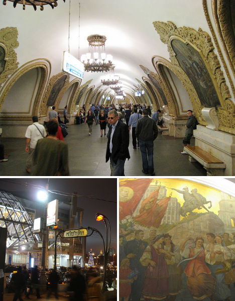 (images via: bernt rostad, reibai) No subway station in the world is quite as elaborate as the ornate Kievskaya, a Moscow Metro station in the Dorogomilovo District. The design, which incorporates marble, decorative chandeliers, gold leafing, scrolled details, mosaics and frescos was chosen in an open competition and built in 1954. The mosaics celebrate the unity between Russia and Ukraine. Drassanes Station, Barcelona, Spain 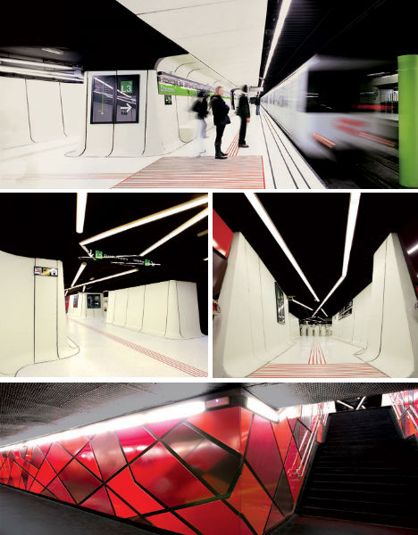 (images via: the cool hunter) Bright and open with a futuristic feel, the new look of Barcelona’s Drassanes Station is dramatically different from the dark, aging 1968 infrastructure. Reinvented by ON-A Arquitectura, the station features lightweight white glass-reinforced concrete coverings that were placed right on top of the old surfaces. Stockholm Tunnelbana, Sweden 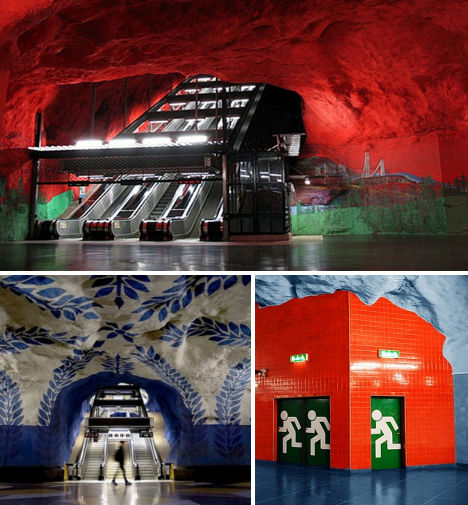 (images via: top elegant homes) Stockholm’s incredible metro tunnels feature stations that make the raw bedrock a bold architectural feature instead of covering it up with artificial surfaces, giving them the feel of a natural system of subterranean caverns. Some of the rock walls and ceilings have been painted with murals, and all 100 stations feature artwork by 140 artists. Munich U-Bahn, Germany 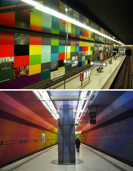 (images via: jaime.silva, mike knell) The U-Bahn in Munich is known for its colorful personality, with rainbow hues painted in many of the tunnels and terminals or applied to the walls as tiles. First built in 1972, the Munich subway system has grown to nearly one hundred stations throughout the city, many of which are designed to modern standards with spacious aisles and decorative lighting. Nuevos Ministerios, Madrid, Spain 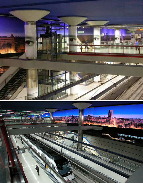 (images via: skyscraper city) The Madrid Metro is mostly notable for two things: massive murals of the city’s skyline that make riders feel as if they’re at an above-ground station, and the giant eyes that stare down ominously from the pillars. Especially paired with a name like ‘Nuevos Ministerios’ (New Ministries), the station has a vaguely dystopian feel. City Hall Station, New York, New York 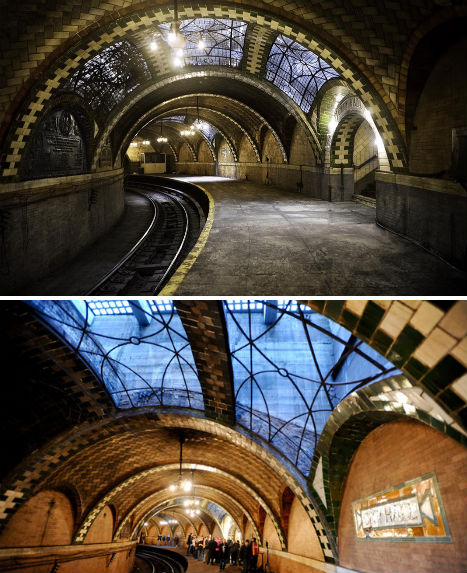 (images via: jalopnik) Passengers willing to take the 6 train all the way past what used to be the last stop in Brooklyn can now get a special treat: a glimpse of the stunning, long-abandoned City Hall station, which has been closed to the public since it shut down in 1945. The train passes through this station on its way back uptown, and while riders used to be forced off at the Brooklyn Bridge stop, they’re currently allowed to stay on. Bilbao Metro, Spain 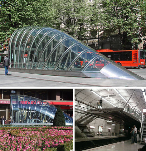 (images via: dalbera, laurenmanning, daquella manera) Designed by esteemed architecture firm Foster + Partners, the Bilbao Metro is is ultramodern yet vaguely organic with glassy, tubular station entrances at street level and lots of steel in the underground stations. Known as ‘Fosteritos’, the glass station entrances have already become an iconic part of the city’s architecture. Dubai Metro Stations 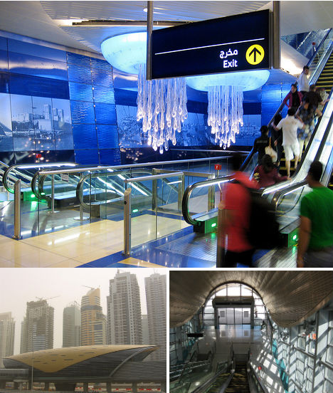 (images via: ~pyb, petjam) Dubai’s 47 railway stations were designed by Aedas of Birmingham to combine both traditional and modern architectural elements. “Their uniquely shell shaped roof, while modern, invokes the heritage of pearl diving – this ancient craft that requires skill and bravery brought early prosperity and is an integral part of Dubai’s history,” says Engineer Abdul Majid Al Khaja, CEO of the Rail Agency at the Dubai Roads and Transport Authority. Iidabashi Station, Tokyo, Japan 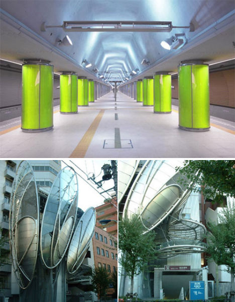 (images via: ventasalud) Completed in 2000, Tokyo’s Iidabashi station is bright, open and modern with pops of bright green in the form of pillars and a metal web which architect Makoto Watanabe imagines as “interweaving, entangling, expanding, pulsating.” The outside of the station, at street level, features swirling, organically shaped metal and glass designs. Toronto Museum Station, Canada 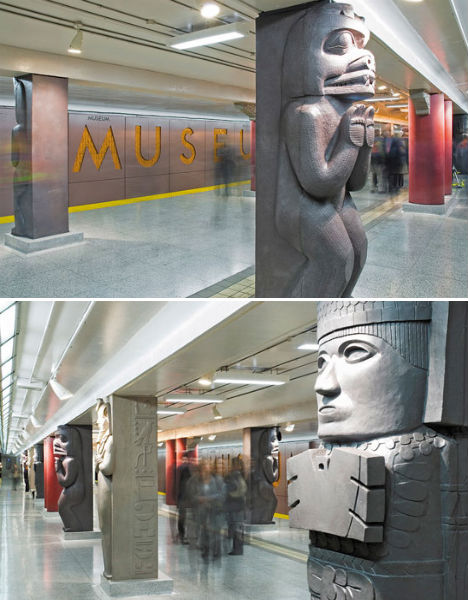 (images via: diamond & schmitt architects) Daniel Libeskind’s addition to the Royal Ontario Museum in Toronto is quite a dazzling sight, so why have an ordinary subway stop just below it? The station was redesigned by Diamond & Schmitt Architects to include columns inspired by artifacts found within the museum. The five column designs represent Canada’s First Nations, Ancient Egypt, Mexico’s Toltec culture, Ancient Chinese culture and Ancient Greece. Line A, Prague, Czech Republic 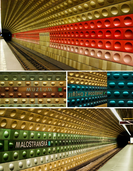 (images via: colourlovers) The tunnels of Prague’s Line A are covered in a colorful patchwork of metallic tiles in flat, convex and concave shapes in hues of gold, silver, green, blue and red; the color scheme differs by station. Pyongyang Subway System, North Korea 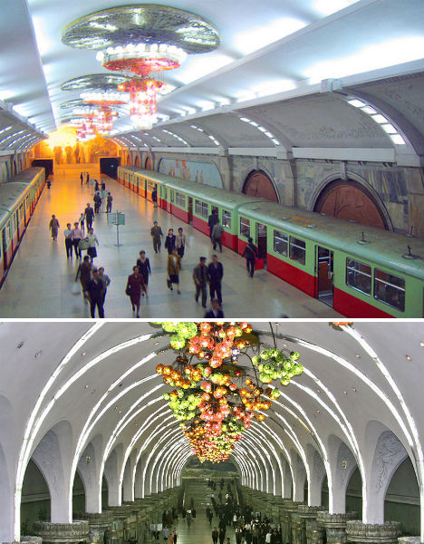 (images via: wikimedia commons, yeowatzup) Would you expect one of the world’s most beautiful subway systems to be located in… North Korea? The deepest metro in the world at 360 feet below surface level, the Pyongyang metro network is full of colorful murals of propaganda. Thanks to its depth, the system doubles as an emergency nuclear bunker, and could keep many of the city’s citizens safe in the event of nuclear war. Iridanos Archaological Site, Athens, Greece 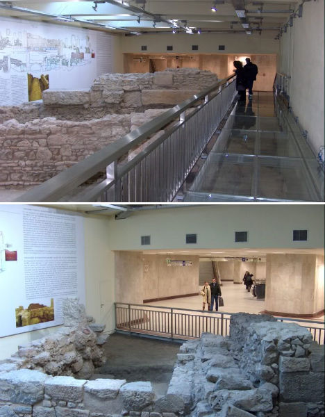 (images via: skyscraper city) In a city as ancient as Athens, it’s easy to imagine coming upon one important archaeological discovery after another if you dig far enough – and that’s exactly what happened when excavators were working on the city’s metro system. The ancient Iridanos River, long lost, was one of those discoveries, found still flowing right where engineers had planned a subway platform. So, this section of the river – still bearing the vaulted construction completed sometime around 200 C.E. – has now become an archaeological display, the largest in any metro station. Visitors to the green line station platform can walk over the exposed river on a glass walkway. Bund Sightseeing Tunnel, Shanghai, China 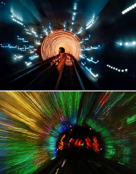 (images via: summer park, .curt) Sure, the Bund Sightseeing Tunnel in Shanghai is a rather cheesy tourist attraction, with what has been described by a Lonely Planet reviewer as “A slow-moving tram, through a comically low-tech tunnel of antiquated 80′s era rope lights, lasers and car dealership ilk inflatables — narrated only by a psychotic stream of random words”. However true that may be, the pictures are still pretty cool to look at, and the tunnel is definitely among the world’s quirkiest and most unusual. Want More? Click for Great Related Content on WebUrbanist:  The age of the railroad may be over, but the marks of these powerful transport systems are evident everywhere you go - as well as abandoned train and subway stations. 10 Comments - Click Here to Read More »»  Beneath NYC's City Hall sits an abandoned wonder: the opulent City Hall Station, which has sat in disuse since 1945. Now passengers can finally ride through. 5 Comments - Click Here to Read More »»  Check out these urban abandonments of the post-modern world. 121 Comments - Click Here to Read More »» مطالب مرتبط با معماری اخرین اخبار و مطالب مرتبط با معماری را از آدرس http://p30city.net/search.php?do=fin...&starteronly=1 مشاهده کنید |
|
#30
|
||||
|
||||
|
معماری Creative Cartography: 15 Artists Transforming Maps 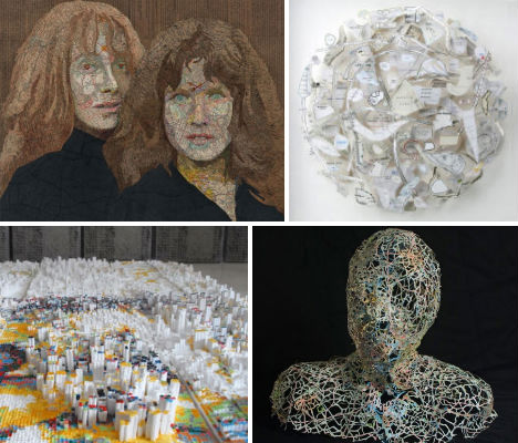 Maps aren’t just two-dimensional pieces of paper depicting the locations and geographic features of the world. They’re the basis for portraits, sculptures and clothing, and are reconstructed or reimagined by these 15 artists in the most curious ways – whether recreated solely with typography, dissected and rearranged or used to illustrate information that can be humorous or disturbing. Map Portraits by Matthew Cusick  (images via: mattcusick.com) Matthew Cusick cuts apart maps to create stunning collages and sculptures, including these portraits. The Dallas, Texas artist collects maps and cuts them apart according to color and shade, pasting them into these compositions on a board backing. But the particular maps chosen also have meaning in reference to the subject: “The people I construct out of maps represent certain ideas and moments in time that resonate deeply with me,” he says. “The maps I choose for each work relate to that person’s timeline and history. I’ll use these maps as a surrogate for paint but also as a way to expand the limits of representational painting. Each map fragment is employed both as a brush stroke and a unit of information. The human form acts as a matrix in which inlaid maps from different places and times coalesce into a narrative.” Head Sculpture by Nikki Rosato  (images via: nikkirosato) Delicately interwoven like veins, the tiny green, blue and red strips of maps used to create these incredible sculptures are molded around a packing tape form to create a three-dimensional shape. Artist Nikki Rosato removes the land masses, leaving nothing but the roads and rivers behind, reinforcing the paper with wire as necessary. Rosato told Wired UK: “Through the removal of the land masses, the places almost become ambiguous since all of the text is lost. Unless someone really knows the roads and highways, it is almost impossible to identify the place.” Census Maps of Dating Keywords 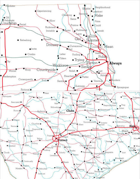 (images via: luke dubois) Touching and, at times, hilarious, these keyword maps by R. Luke Dubois associate each town with the terms most often used by locals to describe themselves and their desired partners on their online dating profiles. Dubois joined 21 dating websites and analyzed the language used in 21 million profiles to come up with the data, which was then displayed on maps. Chicagoans say things like “prankster”, “pizza”, “smoker” and “synagogue” while Central Texans are all about “churches”, “boundaries”, “barbecue” and “Madonna” – the latter presumably referring to the Virgin, not the pop star. The World by Paula Scher 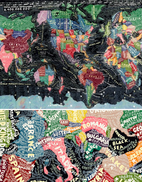 (images via: 20×200.com) The names of countries, cities and geographical features like deserts and mountains make up the hand-painted text-based map entitled ‘The World’ by artist Paula Scher. “The World is a painting about information overload. It depicts the world as swirling information that is always changing, often inaccurate, while somewhat illuminating. It is expressionistic information.” Map Roadways by Matthew Cusick 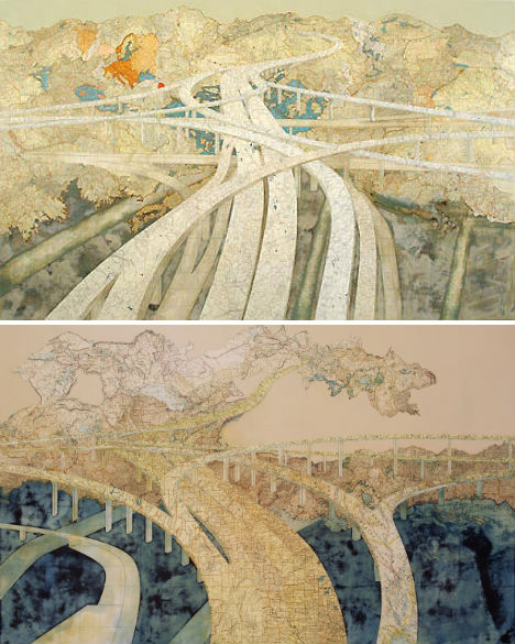 (images via: lisadent.com) Also by Matthew Cusick are these beautiful maps of roadways that “go nowhere”, weaving and curving around the world. “Maps provided so much potential, so many layers. I put away my brushes and decided to see where the maps would take me. I think collage is a medium perfectly suited to the complexities of our time. It speaks to a society that is over-saturated with disparate visual information. It attempts to put order to the clutter and to make something permanent from the waste of the temporary. A collage is also a time capsule; it preserves the ephemera of the past. It reconstitutes things that have been discarded. A collage must rely on a kind of alchemy; it must combine ordinary elements into something extraordinary.” Typographic World Maps 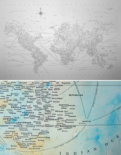 (images via: design ahoy) Nothing but text – and, in some cases, dreamy splashes of watercolor paint – make up these hand-crafted world maps by Chicago-based designer Nancy McCabe. So minimalist, and yet there is so much to see – you’ll find yourself reading the names of cities which pop out with new clarity against their stark background. 3D Maps of New York Architecture 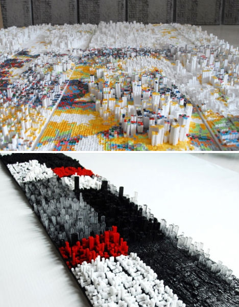 (images via: ramonespantaleon) The First Apple series by Ramón Espantaleón is a tribute to New York, particularly in light of the upcoming 10th anniversary of the 9/11 attacks. Espantaleón recreates scale models of the cities in clay, painstakingly constructing each building at 1/65 scale, before using them to cast silicone molds which can then produce recreations made of epoxy resin and polyurethane. Espantaleón, a Madrid native who lived in New York on the day the World Trade Center fell, places these pixelated city blocks onto representations of the Twin Towers. Maps, Reorganized  (images via: armelle caron) Like meaningless maps for the obsessive compulsive, these works by Armelle Caron take the components that make up a city and lay them out according to size for a more tidy-looking result. The French artist displays the original maps alongside the decontextualized shapes, also providing wooden cut-outs that can be arranged by visitors. Map Clothing by Elisabeth Lecourt 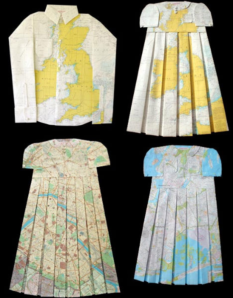 (images via: elisabethlecourt.com) Elisabeth Lecourt of France created this series of children’s clothing called ‘Mapquest’, with vintage styles crafted from folded and cut maps. Typographic Map of Chicago 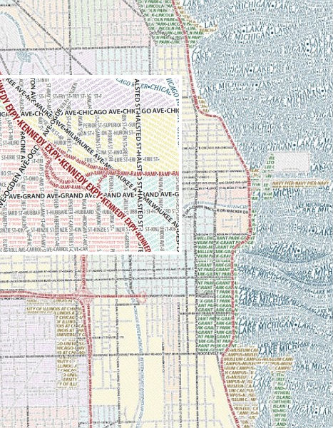 (images via: axis maps) Is it any wonder that some typophiles are so obsessed? Typography, often beautiful and evocative in itself, provides the basis of yet another map, this one of Chicago, created by Axis. Thanks to the colors chosen for various elements, from afar, they look like normal maps, albeit with a bit of artistic flair in the wavy sea. Crime Rates as Topographic Maps 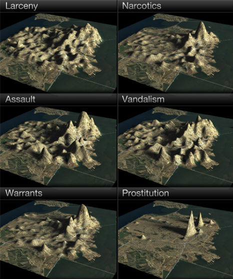 (images via: dougmccune) From WebUrbanist: “Who knew that San Francisco had a mountain called ‘Prostitution Peak’? Such hidden ‘landscape features’ are revealed when the city’s crime statistics are analyzed as a 3D topographic map. Data visualization engineer Doug McCune shows how the city’s notorious hills can shift according to the type of crime, from larceny and vandalism to robbery and assault.” Patterns in Pieces of Maps 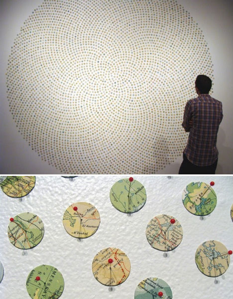 (images via: shannonrankin.com) Maine-based artist Shannon Rankin uses little discs of maps to create installations, collages and drawings “that use the language of maps to explore the connections among geological and biological processes, patterns in nature, geometry and anatomy. Using a variety of distinct styles I intricately cut, score, wrinkle, layer, fold, paint and pin maps to produce revised versions that often become more like the terrains they represent.” Stunning Transit Maps by Zero Per Zero 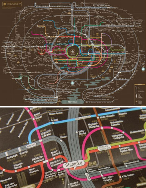 (images via: zeroperzero) This is one transmit map that you’d likely be more than happy to frame and hang on your wall. Seoul graphic designers Zero Per Zero create colorful abstract compositions of the metro systems in Tokyo, Osaka, New York City and other cities around the world. Map Dresses & Money Maps by Susan Stockwell 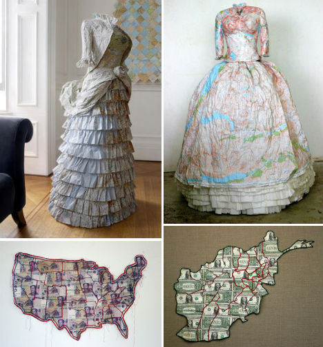 (images via: susanstockwell.co.uk) UK artist Susan Stockwell uses maps to craft stunningly detailed dresses, often with political implications; the dress on the left is ‘Empire Dress’, a Victorian style created with maps of the British Isles, while the right-hand ‘Highland Dress’ depicts a traditional Scottish style made with maps of the Highlands. Stockton also creates ‘money maps’ including ‘America is an Imperial State’, left, made with Chinese yuan, and ‘Afghanistan – A Sorry State’, made with American dollars. Map Collages & Sculptures by Chris Kenny 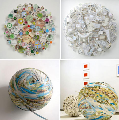 (images via: design boom) Chris Kenny fashions scraps of maps into complex three-dimensional forms, reducing entire continents to strange shapes hung on a wall or turning flat images of the world into globes. Kenny says he replaces “the cartographer’s logic with an absurd imaginative system. The roads float and interact in unlikely combinations that allow one’s mind to ricochet back and forth between disparate locations and associations.” Want More? Click for Great Related Content on WebUrbanist:  A topographic map of San Francisco's crime rates reveals new landscape features including 'Prostitution Peak'. 5 Comments - Click Here to Read More »»  These seven trash-obsessed artists may have had a similar starting point but have managed to create an inspiring variety of art from abandoned refuse. 52 Comments - Click Here to Read More »»  Master paper sculptors cut, fold, glue and otherwise transform sheets of paper in various colors, sizes and textures into complex creations that mimic architecture and more. 39 Comments - Click Here to Read More »» مطالب مرتبط با معماری اخرین اخبار و مطالب مرتبط با معماری را از آدرس http://p30city.net/search.php?do=fin...&starteronly=1 مشاهده کنید |
 |
| کاربران در حال دیدن موضوع: 1 نفر (0 عضو و 1 مهمان) | |
|
|
اکنون ساعت 09:17 PM برپایه ساعت جهانی (GMT - گرینویچ) +3.5 می باشد.


 حالت خطی

