
|
|
#31
|
||||
|
||||
|
معماری Waterfront Wonders: 8 Great Modern Island + Ocean Homes 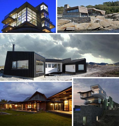 When it comes to waterfront property, the beautiful views demand wide open spaces and most architects take a minimalist approach in order to prevent taking attention away from the stunning natural spaces. While there are ample excellent examples modern home designs these days, it seems these naturally stunning locations demand modernist design techniques more than any other location type. Norwegian Coastal Cabin 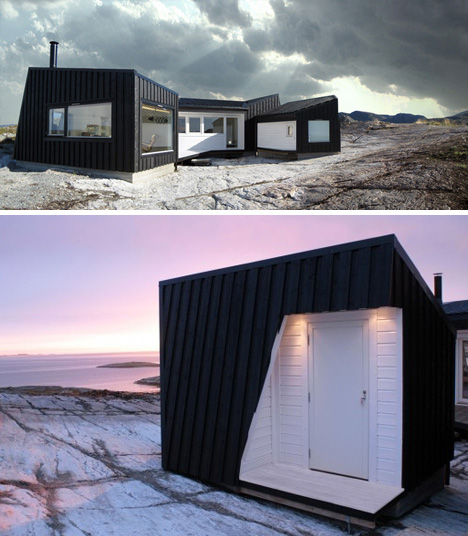 Simple, modern and open in all directions, this one-story coastal cabin, designed by the aptly named Fantastic Norway architecture firm, is a perfect place to relax and enjoy the panoramic views of the Norwegian coastline. The design is not only eye catching, it is also functional, providing a selection of wind-protected alcoves to enable visitors to enjoy spending time outside without risking their comfort. Stealth Stone Summer House 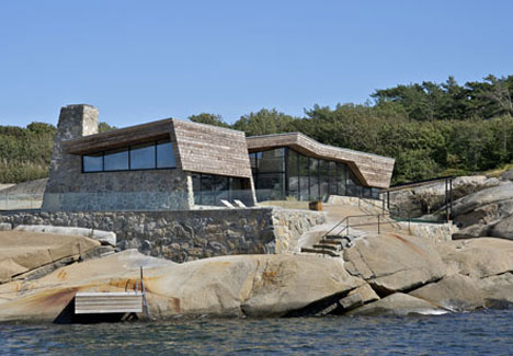 Another Norwegian beauty, this stone home by Jarmund/Vigsnæs was legally required to blend in with its surroundings in order to even get a permit. Fortunately, designers went beyond the basic requirements and created a strikingly stealth home that brilliantly blends stone, wood and glass. Cliffhanger Beach Villa 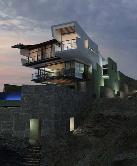 Set just off the shores of Peru, this stunning vacation villa by Longhi Architects blends stone masonry foundations and ultra-modern upper-stories and seems to simultaneously stand out and blend in with the jagged rock formations below. Slaughterhouse Beach Cliff House 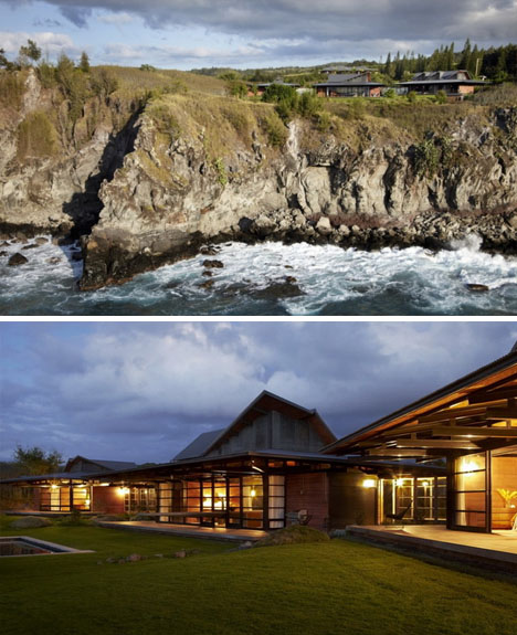 Seamlessly blending Eastern and Western design methods, this Malibu beach home by Olsen Kundig Architects is incredibly open. The stunning design allows residents to enjoy the amazing views of the Pacific without standing out too much on the gorgeous rocky coastline. Home With Over 100 Windows 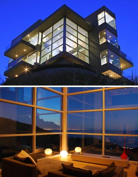 When a plot of land offers views that stretch from Santa Catalina Island to the Santa Monica Bay, the last thing a home needs is too many walls obstructing the scenery. Fortunately, architect Steven Kent understood the value of this scenery and designed this ultramodern home to be as open as possible –with over 100 windows to enjoy the amazing views. Canadian Island Cabin 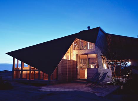 The clever use of angles in this design by Agathom Architects help this cabin appear small from the outside and expansive on the inside. The expansive living room opens up to a library, kitchen, dining room and patio, all of which offer stunning views from massive windows. Zen Lake House 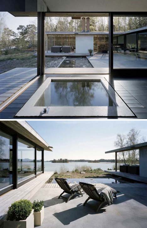 This U-shaped house just outside of Stockholm provides beautiful views of the outside lake from every room. Fire, air, water, and earth are all incorporated into the design by WRB Architects, allowing the residents to relax and feel at peace with their surroundings. Drop Off House 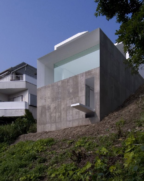 Most waterfront houses are serene places to relax and enjoy nature, but this cliff-top house designed by KA Architects was created for someone with a morbid sense of humor. While the house does have a view of the water, the built-in diving board that leads to nothing but the rocks below. Want More? Click for Great Related Content on WebUrbanist:  Modernism is style - ultramodernism is undefined, but for the purposes of this article is that amazing design approach which brings the future into the present. 25 Comments - Click Here to Read More »»  Urban house boats are the best of both worlds, providing a private getaway with views of the water yet docked just steps from the excitement of the city. 4 Comments - Click Here to Read More »»  This collection spans the extremes of design and brute-force ingenuity: from the obscenely luxurious to the absurdly simple. 55 Comments - Click Here to Read More »» مطالب مرتبط با معماری اخرین اخبار و مطالب مرتبط با معماری را از آدرس http://p30city.net/search.php?do=fin...&starteronly=1 مشاهده کنید |
| جای تبلیغات شما اینجا خالیست با ما تماس بگیرید | |
|
|
|
|
#32
|
||||
|
||||
|
معماری H is For Historic: 2 Incredible 19th Century Alphabets  Every generation has had its own unique brand of art and its own ways of teaching children. These incredible occupational alphabets from the mid-19th century are an amusing intersection of the two. Printed specifically for the purpose of helping children remember the alphabet, these pamphlets are full of lovely art and the type of cultural references that are simply priceless to anyone who enjoys unusual glimpses into American history. A Was an Archer, or a New Amusing Alphabet for Children, 1843  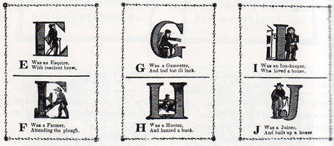  The idea behind these occupational alphabets was to give children familiar words by which to remember the letters of the alphabet. They are, perhaps, not as effective as the teaching aids we employ today – but they certainly make for some interesting reading.   (images via: Ptak Science Books) Most modern parents would not think of teaching their children with examples like “R was a robber, and hung as you can see” or “D was a drunkard, and had a red face.” By the standards of the late 19th century, however, these amusing little couplets were perfectly appropriate for children. Occupational Alphabet, 1850  The second set of occupational alphabet drawings are in color and feature even more intricate woodcut art. Most of the letters include several examples of occupations, giving an unusual glimpse into what life must have been like 150 years ago. 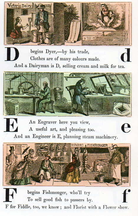 Because these words had to be familiar enough for the children reading the pamphlets to recognize immediately, the occupations featured in the pamphlets had to be well-known household words. How many children today would know what a wharfinger, fishmonger or cooper is? 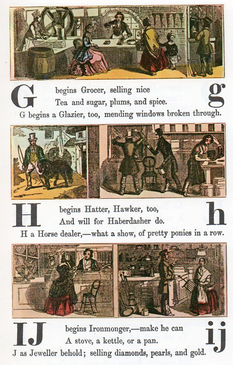 As pointed out at the source of these images, the occupations mentioned in these educational aids highlight just how much the world has changed in this relatively brief amount of time. Several of these jobs simply do not exist any longer.  According to Ptak Science Books, only seven of the 59 professions mentioned here are completely defunct today, with the remainder still functioning in some way – not a bad percentage for professions which were commonplace more than 150 years ago.  The art itself is exceptionally interesting, giving a look into the fashion and work environments of the 19th century. For woodcuts which have been enlarged from their original 5″ height, the detail is stunning.  Much like the educational primers that would follow generations later, these little alphabet learning aids used rhymes and a bit of humor to keep children interested and help them remember the important facts.  It would be interesting to know whether teaching aids like this actually helped children to remember the alphabet or whether they spent most of their time looking at the pictures (like we have).  (images via: Ptak Science Books) Particularly note-worthy is the “Y” in this alphabet, with a young man learning the trade of yeoman to earn his own keep – something which would never be suggested today. Want More? Click for Great Related Content on WebUrbanist:  It's impossible to give names to all of the lettering styles graffiti artists use. But there are a few well-known alphabets that are seen over and over. 7 Comments - Click Here to Read More »» 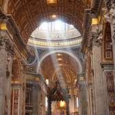 beautiful and historic churchesGuest article contributed by Lauren AxelrodItaly boasts some of the most spectacular cathedrals in the world. These architectural gems are historical treasures that ... Click Here to Read More »»  What is it about lighthouses that captures our attention? Is it the history behind these relics of a less technologically-advanced age? Is it the quaint charm of the towers? 5 Comments - Click Here to Read More »» مطالب مرتبط با معماری اخرین اخبار و مطالب مرتبط با معماری را از آدرس http://p30city.net/search.php?do=fin...&starteronly=1 مشاهده کنید |
|
#33
|
||||
|
||||
|
معماری All Azure: The Monochromatic City of Chefchaoen, Morocco 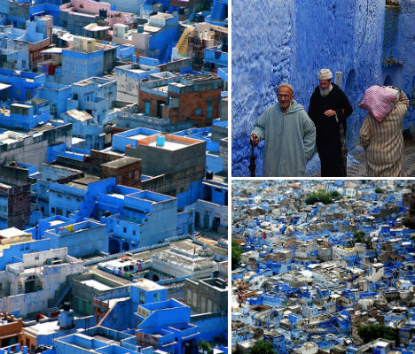 Morocco is renowned for its colors, with its cities awash in vivid shades of red, purple, green and gold. But things are a little different in Chefchaoen, a town in the northwest nestled among the Rif Mountains. Take a stroll through Chefchaoen’s streets and you’ll be hard-pressed to find something that isn’t painted a particular shade of blue. 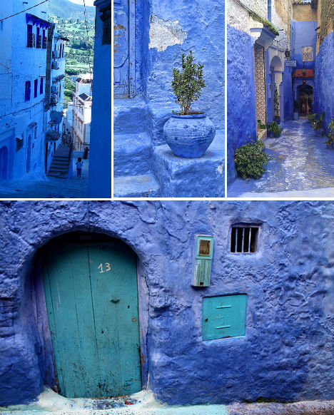 (images via: fishki.net, reibei, hesdes) Chefchaoen, founded in 1471, was once a refuge of Jews and converted Christians of Muslim heritage. They sought refuge in the safety of these mountains after the Spanish Reconquista in medieval times, a period in which Christian kingdoms retook Muslim-controlled areas of the Iberian peninsula. The town was painted the powder-blue of tekhelel, a natural dye made of shellfish. In the bible, Israelites are commanded to use this dye to color one of the threads of their prayer shawl. 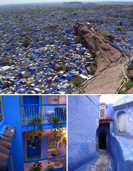 (images via: reibei, shadowplay, yotut, brian tomlinson) Though tekhelel is no longer available and the city’s population of Jews has diminished, the tradition has carried on through the centuries. Blue pigment is sold in pots and bags throughout the city, and residents faithfully refresh the paint on their homes, flower pots, balcony railings, doors and practically everywhere else in the community. Even the interiors of many of these buildings are painted blue. 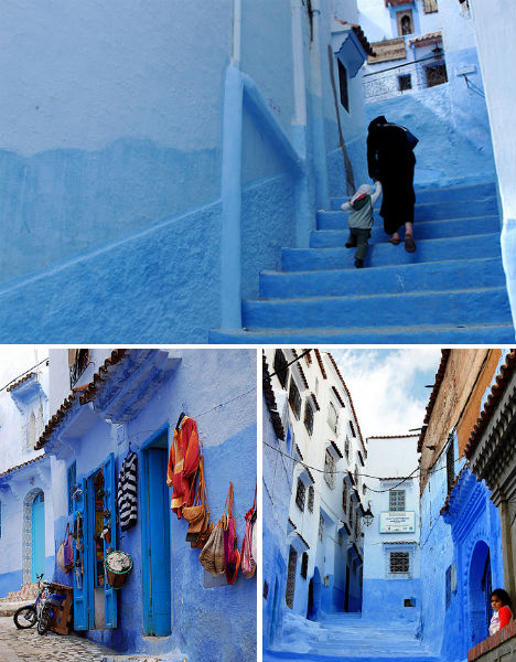 (images via: ana p. bosque, bachmont, dave_b_) The pigments may vary in color now, ranging from periwinkle to aqua, but the effect is no less spectacular, providing a monochromatic stage from which every other color dazzles, particularly the merchandise hung on walls outside of markets and shops. 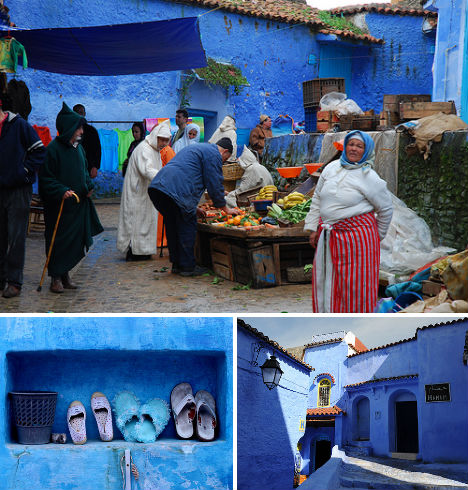 (images via: rhurtubia, mustafa_ennaimi, ana p. bosque) Of course, Chefchaouen is known for more than just its unique paint job. The city offers handicrafts that aren’t available in other areas of Morocco, such as wool garments and blankets, and is also one of the main producers of cannabis in the nation. It is often sold in great abundance at stands alongside fruits and vegetables. On holidays Chefchaouen is filled with tourists, especially the Spanish. Perhaps they’re making up for lost time, as the city was closed to European visitors until 1920. (top images: fishki.net, rhurtubia) Want More? Click for Great Related Content on WebUrbanist:  Variety in color can be amazing, but pushing a single color can be even more. Here are some eyeopening monochromatic shots in red, blue, green, purple, orange, and yellow. 8 Comments - Click Here to Read More »»  Whether a village grows into a city depends on many factors; whether it remains inhabited through centuries, even millennia, of war, natural disasters and environmental degradation is another thing altogether. Following up on our original post, here are ten more ancient, still-inhabited cities that have withstood the test of time. 2 Comments - Click Here to Read More »»  Would it surprise you to learn that a number of houses around the world, from New York to Amsterdam and Brazil to Britain have various claims to being the skinniest house in the world? 70 Comments - Click Here to Read More »» مطالب مرتبط با معماری اخرین اخبار و مطالب مرتبط با معماری را از آدرس http://p30city.net/search.php?do=fin...&starteronly=1 مشاهده کنید |
|
#34
|
||||
|
||||
|
معماری 14 Strange, Stylish & Amazing Hotels of Great Britain 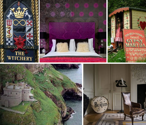 If your mental image of ‘Jolly Old England’ and the rest of the United Kingdom is mostly full of stuffy royals, bland food and cow pastures, you’re missing out on the stunningly colorful, joyfully wacky bigger picture. In addition to its plentiful, richly varied points of interest and cultural traditions, the UK is packed with fun, hip, stylish and bizarre places to stay, from freewheeling gypsy camps to castles that will please fans of a certain boy wizard. These 15 hotels, bed & breakfasts and vacation rentals include glitzy high-fashion boutique hotels, goofy tourist traps and a few hidden gems. Crazy Bear Hotel, Beaconsfield, England (images via: crazybeargroup.co.uk) If over-the-top glamor and luxury is your bag, the Crazy Bear Hotel chain is where you should stay when visiting England. Fur-lined, gold-plated, chandelier-laden rooms are just the beginning; others have leather floors, mirror-tiled ceilings and tall brass bathtubs right beside the bed. Some might say they ride the line between outrageously fun and gaudy, but they’re certainly a unique experience. The Beaconsfield location is unapologetically wild in a very conservative town, located in an unassuming 15th-century building on a 60-acre farm 20 minutes from the town of Oxford and 45 minutes from London. The Pavilion, Hyde Park, London, England 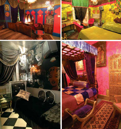 (images via: pavilionhoteluk.com) Describing itself as a “fashion rock n’ roll hotel’, Hyde Park’s Pavilion has no qualms bragging about its many celebrity guests on its website, who have included supermodels like Karen Elson, bands like Duran Duran and Hollywood royalty like Leonardo DiCaprio. Even with its out-there themed rooms like Casablanca Nights and Honky Tonk Afro, the most amazing thing about this chic London hotel is its prices, which start at just under U.S. $100. The hotel is owned by a young brother-and-sister team who dreamed up all 30 rooms and regularly rent them out for high-profile photo shoots. The Witchery by the Castle, Edinburgh, Scotland 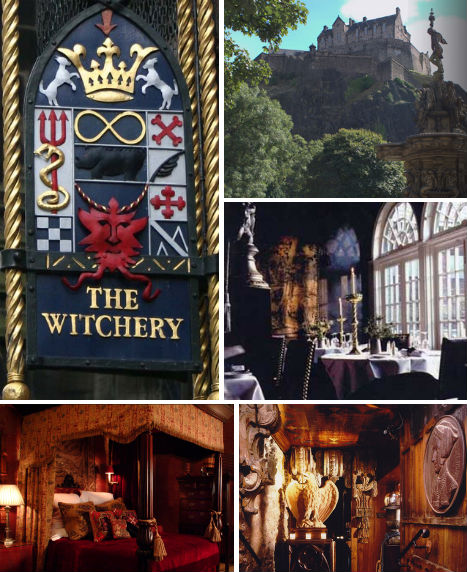 (images via: thewitchery.com) Got visions of Hogwarts dancing in your head? While there are any number of old castles converted to hotels in Great Britain, none have interiors quite as magical as those at the appropriately named ‘Witchery’ in Edinburgh. Popular with celebrities and wildly in demand, The Witchery by the Castle is as well known for its richly decorated, theatrically baroque suites as for its critically acclaimed restaurant. Book far in advance to enjoy one of the hotel’s 8 guest suites which feature ornate drapery, renaissance-style paintings, Victorian baths, fireplaces and even hidden rooms. La Rosa Gypsy Camp, Whitby, England 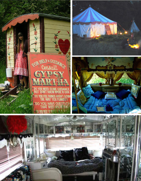 (images via: larosa.co.uk) If you’re a free spirit with a sense of adventure, England’s got you covered with a number of gypsy caravan hotels including ‘La Rosa Campsite Extraordinaire’, where visitors can stay in recycled, reclaimed lodgings like gypsy wagons and circus tents. Paying tribute to the beauty and environmental sensitivity of its setting, the North Yorkshire Moors National Park, the camp uses only candles and fairy lights at night and has limited facilities like composting toilets and showers in a converted byre. “We like to hope that being green does not mean you can’t be comfy, have a laugh or eat chocolate cake,” say the owners on their website. 40 Winks, London, England 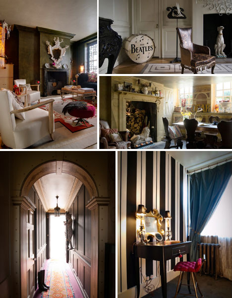 (images via: 40winks.org) Internationally acclaimed interior designer David Carter’s London home has long been a favored site for photo shoots, but Carter still felt as if this space, in a 1717 Queen Anne townhouse, was underutilized. So the designer decided to open two little-used guest rooms to photographers, stylists, art directors, designers, buyers, models and others in the entertainment industry who need an affordable place to crash while working in London. Like a boutique hotel without the staff, 40 Winks is a home away from home. Hotel Fronlas, Cardiff, Wales 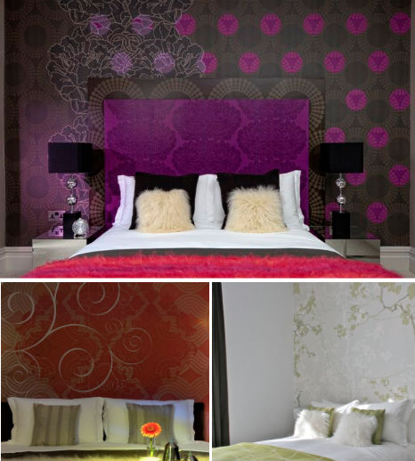 (images via: fronlas.com) Cute and modern, the Hotel Fronlas is located in the Brecon Beacons National Park in Cardiff, Wales. The owners, Eva and Owain Huw, are passionate about sustainability and have crafted their boutique hotel with careful thought for the environment as well as aesthetics and comfort. Powered with 100% green electricity with solar panels that heat up its water, the Fronlas also has organic linens and fresh flowers, and serves local organic cuisine. Aviator Hotel, Farnborough, England 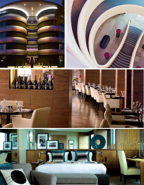 (images via: aviatorfanborough.co.uk) Built in the shape of an airplane propeller, the Aviator Hotel, located at the TAG Farnborough Airport, is not kitsch but rather sleek, elegant and businesslike. The simplicity of the hotel’s design, inspired by the minimalist aesthetics of aviation, is fitting for lodgings that primarily cater to corporate clients. Eschewing the tackiness that can come with a ‘theme’, the Aviator chooses a subtler route with lots of white and old photographs of antique aircraft. Appleton Water Tower, Sandringham, Norfolk, England  (images via: landmark trust) Stay in a historic water tower, the Appleton of Norfolk, which was built in 1877 with the foundation stone laid by the Princess of Wales. You can have its rooms, including the glass-walled terrace at the top, all to yourself, enjoying open fires in the fireplaces. You can even bring your dog. Malmaison Prison Hotel at Oxford Castle, England 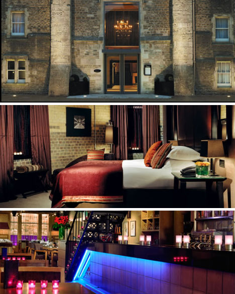 (images via: malmaison.com) For 125 years – as recently as 1996 – guests at the Oxford Castle weren’t there voluntarily. They were prisoners. Today, travelers pay good money to spend the night locked between these walls. The Malmaison Oxford Castle Hotel has transformed what was once a dingy penitentiary to a luxurious boutique hotel full of plush linens and fresh-cut flowers. The hotel has retained the names of various sections including “C Wing”, where prisoners were once punished, “The Governor’s House” and the “Houses of Correction”. Hotel Missoni, Edinburgh, Scotland 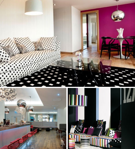 (images via: hotelmissoni.com) The Hotel Missoni is every bit as fashionable as you’d expect from one of Europe’s top design houses, and Missoni’s iconic patterns don’t let you forget for one moment who crafted the interiors. The hotel is located just off the Royal Mile in the Old Town, and the doormen will great you in Missoni-designed kilts. The views of the city from the upper suites are quite a treat. The Old Railway Station, Petworth, West Sus***, England 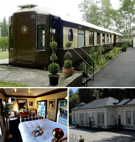 (images via: oldstation.co.uk) Stay in a restored Pullman carriage or a historic railway station at the Old Railway Station Hotel in West Sus***, England. The station house offers more spacious lodgings with vaulted ceilings, while the carriage rooms are a tad tighter but just as charming. CitizenM, Glasgow, Scotland 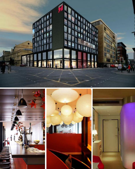 (images via: citizenmglasgow.com) Guests in Glasgow love the affordable luxury of CitizenM, which doesn’t skimp on the design details, but doesn’t cost a fortune, either. The hotel cut costs and made construction easier and more environmentally friendly by prefabricating all guest rooms, which have a futuristic feel. A red, black and white color scheme runs throughout the public areas, and large-scale works of art catch the eye in various rooms. In the spirit of ‘belonging to the locals’, CitizenM placed a large steel grate street-side which bears the record grooves to the song “I Belong to Glasgow’. The Lighthouse, Llandudno, Conwy, Wales 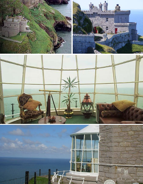 (images via: lighthouse-llandudno, wikimedia commons) Stunningly picturesque, the Lighthouse Hotel in Llandudno offers the kind of scenery for which Wales is famous – old stone structures, emerald grass and craggy cliffs overlooking the sea. The lighthouse was built in 1862 from limestone and massive quantities of Canadian pitch pine, and was in use until 1985. Stay in the Keeper’s Hall, a dramatic nautically-themed room with pine panelling and a captain’s wheel, or the even more beautiful Lamp Room, which the optic once occupied before it was removed. The House in the Clouds, Thorpeness, Suffolk, England 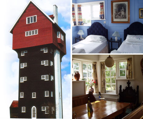 (images via: houseintheclouds.co.uk) It’s the epitome of cozy English Country style – dozens of feet up in the air. The House in the Clouds was once a plain old water tower but was remodeled into a vacation rental with what looks like a conventional farmhouse perched on the top. With 5 bedrooms, 3 baths and a high-ceilinged great room overlooking the Thorpeness Golf Course, this rental is perfect for families and large groups. Want More? Click for Great Related Content on WebUrbanist:  Whether you're looking to rent a bizarrely themed room by the hour or enjoy a relaxing stay at a traditional ryokan, Japan's got an eye-popping hotel for you. 3 Comments - Click Here to Read More »»  A prison is probably the last place on Earth most of us would want to spend the night, right? 39 Comments - Click Here to Read More »»  From the Italian alps all the way down to Sicily, these 15 hotels and resorts offer stylish, modern, fashion-forward lodging options in all price ranges. 3 Comments - Click Here to Read More »» مطالب مرتبط با معماری اخرین اخبار و مطالب مرتبط با معماری را از آدرس http://p30city.net/search.php?do=fin...&starteronly=1 مشاهده کنید |
|
#35
|
||||
|
||||
|
معماری Bank on It: 13 More Sleek & Secure Bank Designs 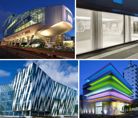 Long designed with bland respectability in mind, banking institutions have rarely been places to find dazzling architecture and interior design. But if you think that’s still the case in the 21st century, you haven’t seen these 13 modern banks, built and unbuilt, from Morocco to Norway. Vivid colors, eye-catching details, the latest in green technology and a sense of accessibility make these bank designs fresh and up-to-date. Sugamo Shinkin Bank, Tokyo, Japan 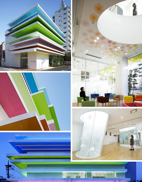 (images via: dezeen) Banks aren’t exactly known for being cheerful, colorful places, but Emmanuelle Moureaux’s design for the Sugamo Shinkin in Tokyo turns the old stodgy stereotype on its head. Staggered horizontal layers of color, illuminated at night, brighten up the facade and the color scheme is continued in smaller doses inside. Three elliptical glass skylights, cut in through the second floor to the lobby, let in lots of natural daylight and also provide fresh air. Raiffeisen Bank, Zurich, Switzerland 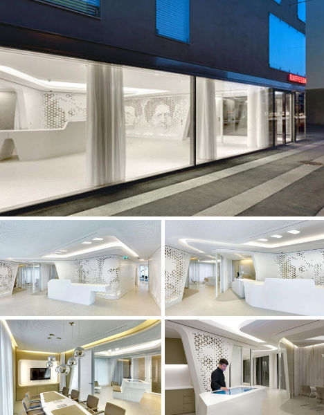 (images via: archiscene.net) You could be forgiven if you walked into the Raiffeisen Bank in Zurich and did a double take, wondering whether you accidentally wandered into a high-end retail store. Minimalist white surfaces, curving forms, mirror ball lighting and perforated images of historical residents from the local area characterize this unusual interior space, designed by NAU cooperative. “Raiffeisen’s flagship branch on Zurich’s Kreuzplatz dissolves traditional barriers between customer and employee, creating a new type of ‘open bank’, a space of encounter,” say the designers. BMCE Bank, Rabat & Casablanca, Morocco 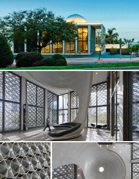 (images via: plusmood.com) Foster + Partners reinterpreted elements of traditional Moroccan architecture to give the BMCE Bank flagship branches in Rabat and Casablanca a fresh yet grounded feel. The first buildings by the firm to be completed in Africa, these banks feature bright, open interiors with stainless steel mesh screens in Islamic geometric patterns for security and shade. Each branch also has an ‘earth tube’: an electricity-free cooling system enabled by an empty pipe that encircles the building underground to draw in cool air from the earth. Dramatic skylit domes swooping down from the ceiling to join up with curving benches provide irresistible focal points. ING House Bank, Amsterdam, The Netherlands 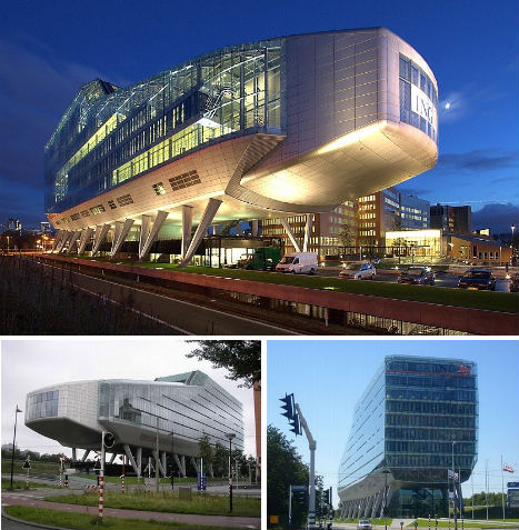 (images via: architypes.net, neeshu.com) When viewing the ING House bank headquarters in Amsterdam, some people see a shoe shape as the architects intended while others imagine some sort of gigantic insect. But the unusual form of this building has made it a popular tourist stop and a favorite subject for architecture photographers. Meyer en van Schooten Architecten built the contoured anodized aluminum and glass structure on sixteen steel legs. Inside is a hall, an auditorium for 250, a lobby, a restaurant, meeting rooms and 160 parking spaces. BLC Headquarters, Beirut, Lebanon 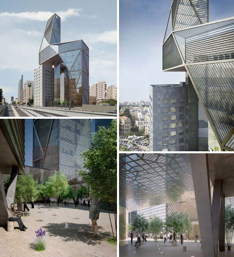 (images via: dezeen) While the mock-ups look incredibly realistic, this redesign of the BLC bank headquarters in Beirut, Lebanon has not actually been built. Architects Atelier Hapsitus submitted this proposal for a design competition and it was one of two finalists. The design remodels the old building and adds a faceted new tower that would connect with the existing one at ground level and cantilever over it at the top. This design preserves the views of the old structure, and also allows it to be removed at a later date. Yapi Kredi Bank Academy, Istanbul, Turkey 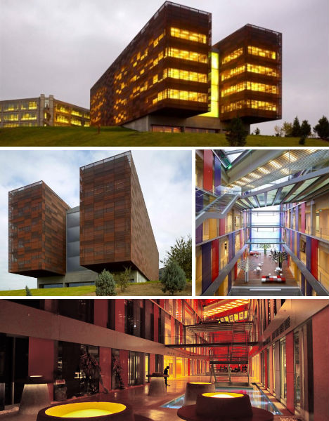 (images via: archdaily) Turkey’s Yapi Kredi Bank comissioned this banking academy from TEGET Architectural Office, who delivered a pair of copper beams that extend horizontally from the existing complex. The design shakes up the scheme of cube-shaped structures at the bank’s headquarters, bringing in color, asymmetry and texture in the form of oxidized copper panels on the facade. The ‘void’ between the two beams is made primarily of glass with suspended platforms and stairs that are open to street level. DnB NOR Headquarters, Oslo, Norway 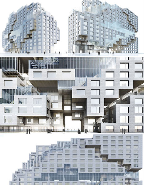 (images via: dezeen) Design firm MVRDV envisions a pixelated, amorphous headquarters building for DnB NOR in Oslo, puncuated by stepped negative space. Diaphanous and pale, the design seems to shimmer, with glass offering both views of the city from inside and a counterpoint to the stone skin which lends solidity to the structure. Construction is currently underway on the building which contains 2,000 flexible work spaces and a panoramic 140-seat meeting space on the top level. Middlefart Savings Bank, Fyn, Denmark 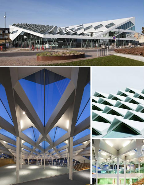 (images via: nikiomahe) Low and angular with 83 prism-like skylights peeking up from its roof, the Middlefart Savings Bank headquarters in Fyn, Denmark reflects the shapes and colors of the ships and sailboats that it looks out upon in the harbor. The roofscape lets in light, defines the geometric design theme of the building and provides a view of the building while also shading the interior from harsh direct sunlight. Saxo Bank Headquarters, Copenhagen, Denmark 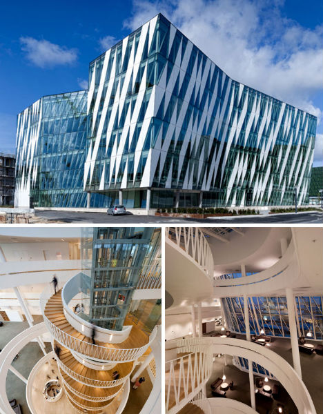 (images via: archdaily) Danish architecture firm 3XN gave Saxo, a Denmark-based online bank, a stunning headquarters featuring a striped glass facade and a spiraling stairway that serves as the structure’s architectural heart. The end walls of the two blocks that make up the building face toward the canal. The interior is transparent and open with a glass-roofed atrium. BBVA Headquarters, Madrid, Spain 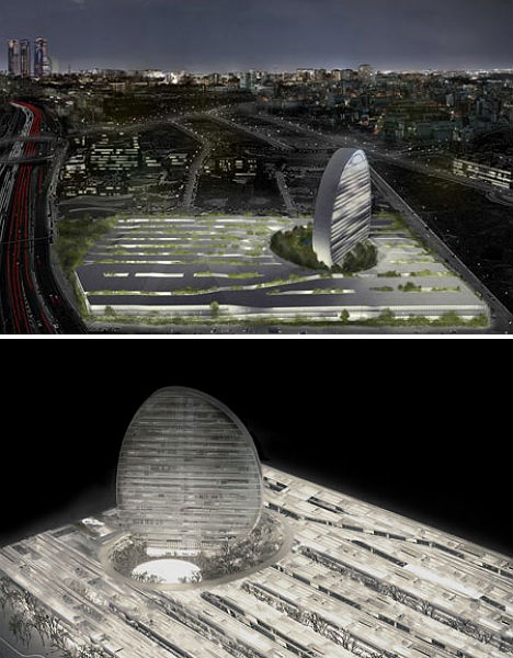 (images via: dezeen) Set for construction on the outskirts of Madrid, the BBVA headquarters will resemble a slice of a sphere set among a new block of offices, commercial buildings and residences. Architects Herzog & de Meuron plan to weave irrigated gardens and alleyways between the three-story buildings “like a carpet” to create a cool, moist microclimate, giving each workspace a “green view”. The disc-shaped tower is ‘cut out’ of the horizontal design, leaving behind an open plaza, and will contain offices with views of the city and the Sierra of Madrid. Bendigo Bank Headquarters, Sydney, Australia 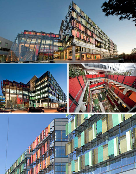 (images via: bvn.com.au) Bendigo Bank’s headquarters in Sydney, Australia juts out dramatically into the street, peppered with colorful performated aluminum sunscreens that give its facade a quirky and fun feel. The exterior of the building was designed by BVN Architects and Gray Puksand to respond to the individual orientation of each facade, and the colors incorporate both the reds of surrounding brick buildings and the greens of a nearby park. With an underfloor air conditioning system, a blackwater treating system and other environmental considerations, the building has been given a 5 star green rating. Deutsche Bank Towers, Frankfurt, Germany 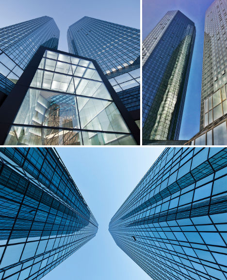 (images via: deutsche bank) The twin towers of Deutsche Bank, which have become an iconic part of the Frankfurt skyline since they were first built in 1983, got a green renovation in recent years, transforming them with a new glass facade that glitters in the sunlight. The changes made to the building enabled the bank to cut down its energy use by half, reduce its water consumption by 70 percent and slash its CO2 emissions by nearly 90 percent. Bank of Choice, Englewood, Colorado 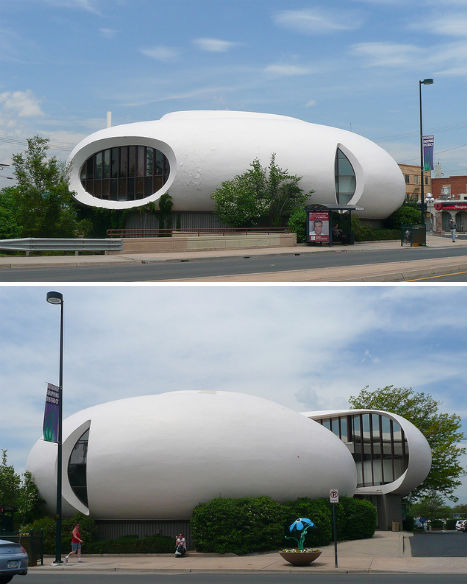 (images via: army_arch) Is that a flying saucer? Perhaps the house from Sleeper got up and walked away in the middle of the night. No, it’s the Bank of Choice headquarters in Englewood Colorado, designed by Charles Deaton in 1965. While far older than most of the buildings on this list, this structure still stands out as daringly modern when most banks have retained staid, institutional looks. Want More? Click for Great Related Content on WebUrbanist:  These 10 cool central bank buildings display their country's character while at the same time stating an impression of stability, power and wealth. 1 Comment - Click Here to Read More »»  The new Het 4e Gymnasium school in Amsterdam, though temporary and modular, is light years away from what we know as 'portable school buildings' in its design. Click Here to Read More »»  Far from a postscript, the signage in these 13 structures serve as integral parts of each design, covering entire facades or standing hundreds of feet tall. Click Here to Read More »» مطالب مرتبط با معماری اخرین اخبار و مطالب مرتبط با معماری را از آدرس http://p30city.net/search.php?do=fin...&starteronly=1 مشاهده کنید |
|
#36
|
||||
|
||||
|
معماری Bridges to Go: 12 Temporary, Movable and Mobile Structures 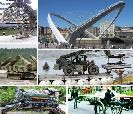 While other bridges just go up and down or stay stationary, these 12 remarkable structures unfurl, tilt, rotate, drop down below the surface of the water and even lay and remove bridges at the push of a button – and then zoom away. These architectural feats include both innovative land-based bridges that move and jaw-dropping mobile military bridge vehicles. M60A1 Armored Vehicle Landing Bridge 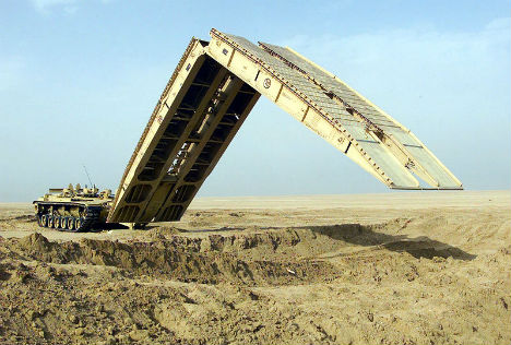 (image via: wikimedia commons) Armed forces advance across uneven terrain, suddenly coming upon a chasm that their vehicles just can’t cross. What to do? Deploy the awesome M60A1, a vehicle-launched mobile bridge that can span nearly 60 feet. This folding portable bridge is transported by a tank and scissors out to its full length with the help of a hydraulic system. Custom LEGO Bridge Vehicle  (images via: gadget review, technabob) A custom LEGO vehicle by Peer Kreuger called the Stilzkin EXT3 Bridge Launcher mimics real military designs like the MTU-72. It first deploys a bridge that it carries on its back, arching it across a chasm; then it crosses the bridge and moves aside so other vehicles can pass. The bridge is then retracted and re-loaded. Rolling Bridge by Thomas Heatherwick 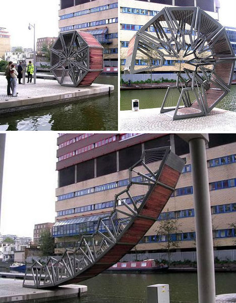 (images via: boredborg) Unfurling gracefully from a wheel-like octagon to a flat, usable bridge, this elegant creation by designer Thomas Heatherwick was installed at London’s Paddington Basin in 2004. The eight hinged sections include hydraulic cylinders concealed in vertical posts; the bridge curls until its two ends join to let boats pass. Hedge Passage: Bruggenhoofd Chabot 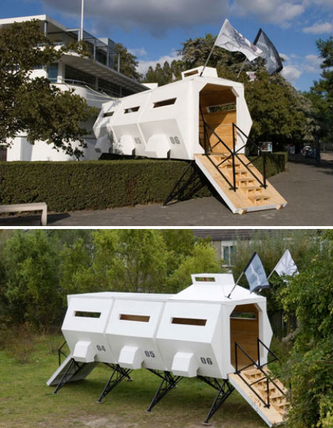 (image via: dezeen) Why do something so simple and boring as cutting a hole through a hedge for a passage, when you could build a temporary portable bridge instead? Bruggenhoofd Chabot was also, unsurprisingly, based on armored military vehicles; it created a shortcut from the street to the garden of the Chabot Museum in Rotterdam. Inflatable Ball Bridge  (images via: jber.af.mil) What’s the military to do when a gap is just too broad to span with a conventional bridge vehicle? Inflate a bunch of balls and top them with sections of road, of course. The Lightweight Modular Causeway System was first tested in 2010 and may be used for earthquake response when other structures are damaged. Portable Bridge Sculpture by Helene Brandt 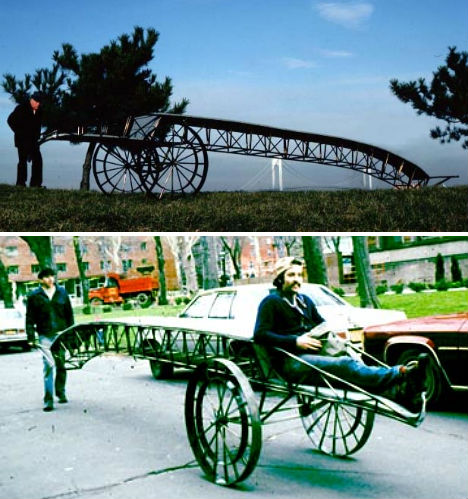 (images via: helenebrandt) Sculptor Helene Brandt produces designs heavily inspired by urban architecture, and bridges in particular. The Portable Bridge, completed in 1983, calls to mind a Victorian version of today’s mobile bridge vehicles, with two rolling wheels and a long extension that can function as a walkway over water. Russian MTU-72 Armored Bridgelayer 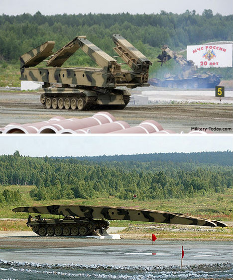 (images via: military today) Trenches and water obstacles won’t stop the MTU-72, an armored bridgelayer introduced by the Soviet Army in 1974. Based on a medium-sized battle tank, this design folds out a horizontal cantilevered bridge, as opposed to a vertical bridge that could easily be spotted by the enemy from far away. It can span a gap of nearly 60 feet and takes just 3 minutes to deploy. Swing Bridge on the River Tyne 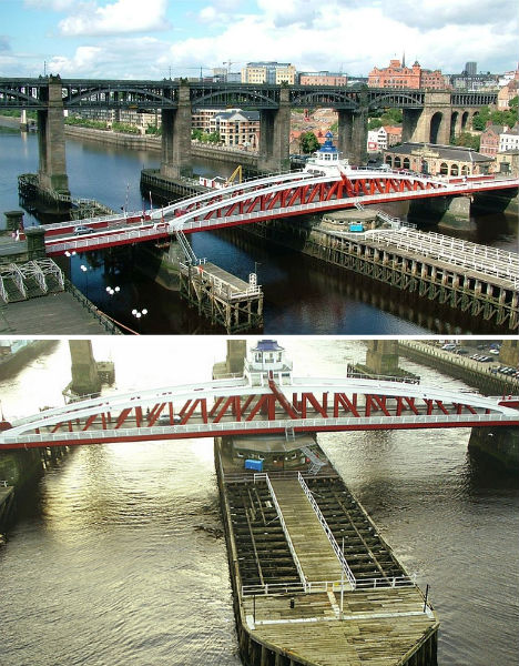 (images via: wikimedia commons, thunderchild7) Rather than pulling up vertically, like most bascule-style drawbridges, the Swing Bridge over the River Tyne in England rotates from its position spanning the river into a vertical position on its own artificial concrete island, allowing boats to pass on either side. There are many similar swing bridges in use throughout the world, including Government Bridge across the Mississippi River and the Pyrmont Bridge of Sydney, Australia. Gateshead Millennium Tilt Bridge 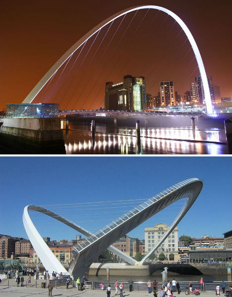 (image via: wikimedia commons) When lowered, the Gateshead Millennium on the River Tyne in England features a curving span for pedestrians and cyclists, supported by cables running from an arch overhead. But when it needs to move aside in order to let ships and boats up to 82 feet tall to pas beneath it, it rotates 40 degrees, taking just about 4.5 minutes to reach its full extension. It’s been nicknamed the “Blinking Eye Bridge” for its appearance during this maneuver. Corinth Canal Submersible Bridge 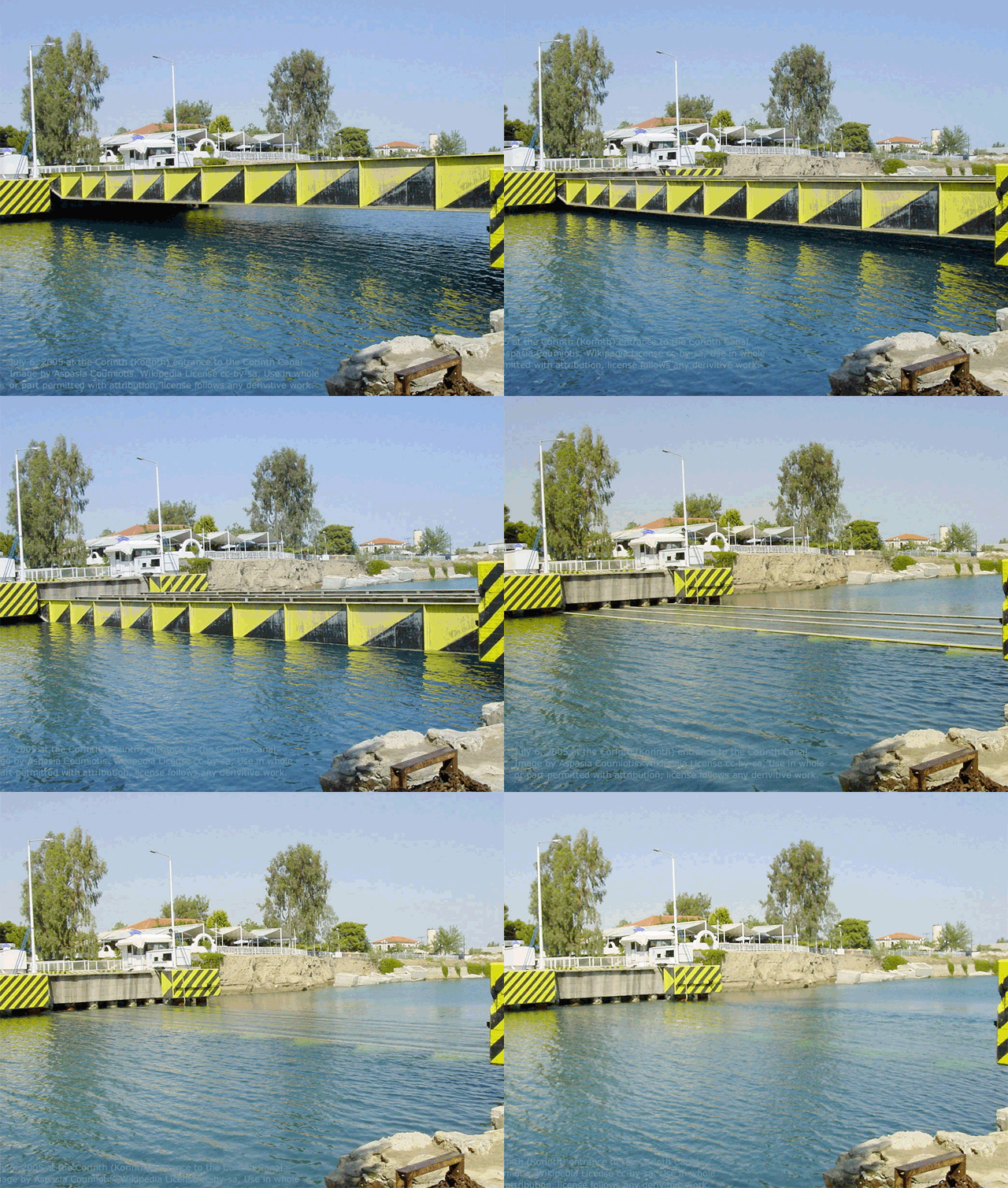 (image via: wikimedia commons) Let’s just say that a really, really, unbelievably tall ship needs to pass through a waterway. So tall, that a traditional drawbridge just wouldn’t cut it. A submersible bridge, like the Corinth and Isthmia Bridges that cross the Corinth Canal in Greece, actually drops down over 26 feet beneath the surface of the water so that boats can pass over rather than under the deck. Armored Vehicle-Launched Bridge  (images via: army-guide, armedforces-int) Insanely long, the LEGUAN Armored Vehicle-Launched Bridge can span up to 85 feet, and multiple units can be used to create even longer tandem bridging. It’s fully automatic with electronic controls and it takes just a single operator to lay the bridges in less than five minutes. With a few pieces of extra equipment, it can even be turned into a ferry. Amphibious Floating Bridge and Ferry System 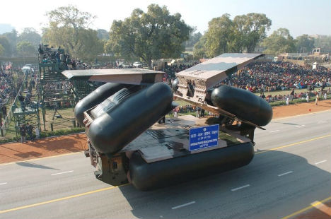 (image via: bharat-rakshak.com) Other military bridgelayers have to deploy their bridges and then cross them with their own vehicles to get to the other side, but what if they could just zoom right into a body of water? This floating bridge developed by the Indian army can travel on land or in water, using massive flotation devices to keep it aloft so that other vehicles can cross. Want More? Click for Great Related Content on WebUrbanist:  Point A to point B via the most dangerous ways like swinging, hanging, and rope bridges, no handrail available on some: 68 of the most bizarre perilous bridges. 6 Comments - Click Here to Read More »»  Spanning the globe with concrete and steel, these 10 span-tastic bridges prove the journey is often more interesting than the destination. 5 Comments - Click Here to Read More »»  Inhabited bridges were once very common all across Europe and other parts of the world. Today, not many remain, but will they make a resurgence in the future? 6 Comments - Click Here to Read More »» مطالب مرتبط با معماری اخرین اخبار و مطالب مرتبط با معماری را از آدرس http://p30city.net/search.php?do=fin...&starteronly=1 مشاهده کنید |
|
#37
|
||||
|
||||
|
معماری Painting with Light: 15 Long-Exposure Light Art Photos 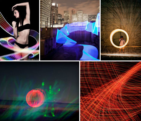 Words, ghostly forms and streaks of ethereal light take shape when photographers move a light source around in a frame while taking a long-exposure image. Variously known as light art, light graffiti, light drawing or light painting, this art form can involve glow sticks, flashlights, small LED lights, illuminated toys, sparking steel wool – even rockets and iPads. Abandoned Garage by Andy Hemingway 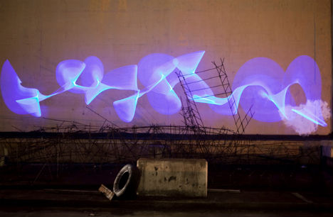 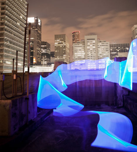 (image via: photographyserved.com) Ribbons of eerie, phosphorescent blue light pour over gritty urban surfaces in this series, captured in an abandoned Houston parking garage by photographer Andy Hemingway. Lily Lighting by Andrew Nourse  (image via: standup) For a series called Shining Light on Cancer, Andrew Nourse took a 30-second exposure of a pink lily, painting streaks of light around it. Green Rocket by Steve Jurvestson 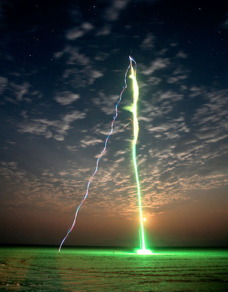 (image via: jurvetson) A glowing night rocket with 24 blinking multicolor LED lights, shot up into the air and photographed in a long exposure, resulted in this highly unusual work by Steve Jurvetson. The photographer says that the image was actually a result of “my high-power rocket suffering a fairly catastrophic failure.” Tagging with Lights by Apai Biszign 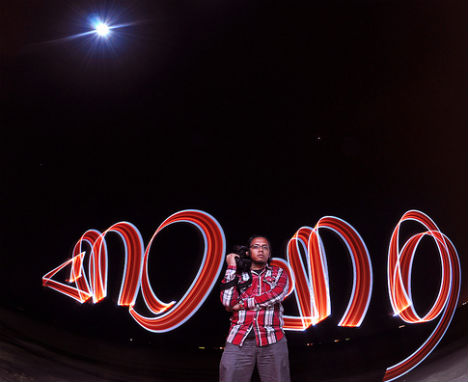 (image via: biszign) No property damage here… light tags are a temporary phenomenon that can only be viewed in a completed long exposure. With a fisheye lens, Malaysian photographer Apai Biszign demonstrates an ‘outline stroke’ from an unusual perspective. Red Orb by DaMongMan 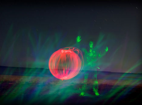 (image via: damongman) This light painting photo demonstrates how objects can be ‘drawn’ into a scene by repeatedly sketching them into the air with a light during the exposure. Blue & Red by Philip Bitnar 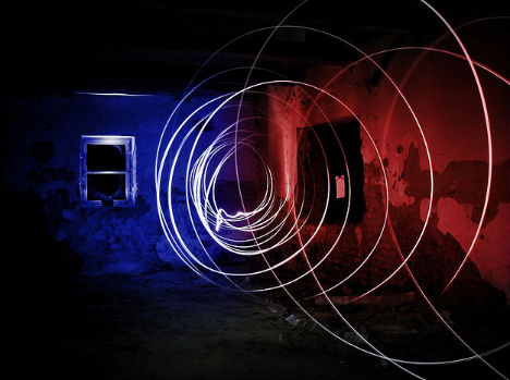 (image via: philip.bitnar) Light painting can produce really cool results even when you’re just learning. Philip Bitnar captured this blue and red image in his very first experiment. Christmas #30 by Kevin Dooley  (image via: kevin dooley) Abstract compositions are Kevin Dooley’s specialty, as he demonstrates in this image named Christmas #30. Such precise lines, resembling a computer-generated image, are the result of a steady and practiced hand. Angel Sunrise by Andrew Nourse  (image via: standupp) Another ordinary object is turned surreal with the use of moving lights in Angel Sunrise, another from Andrew Nourse’s series Shining Light on Cancer. Ala Moana by Kyle Nishioka 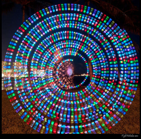 (image via: madmarv) Multi-colored lights on the end of a wand or string can be spun around in ever-growing circles to create an image like this one, by Kyle Nishioka. Light Dressing by Simon Peckham 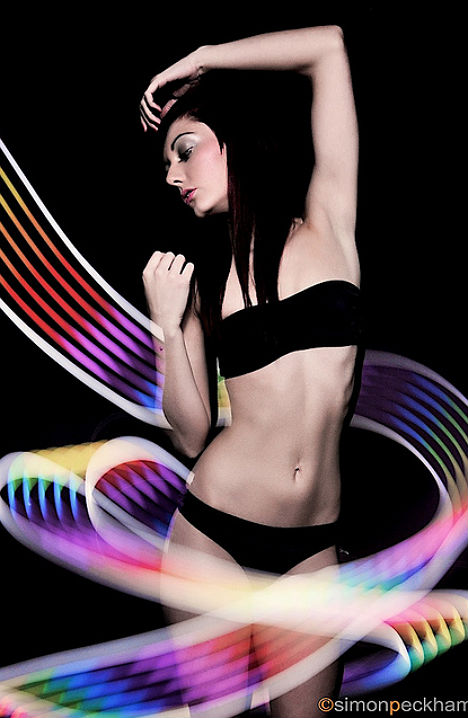 (image via: speckham) An unusual light source created the cool rainbow effect in this image by Simon Peckham: an iPad. As the model stood still, Peckham – dressed in dark clothing and holding the iPad with a brightly colored image on the screen – ran around her during the exposure. Kuro! by Joey 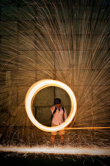 (image via: joo0ey) Another fun (though somewhat dangerous) trick is to burn steel wool and spin it around, which will produce flying sparks. Showing Some Tricks by DaMongMan 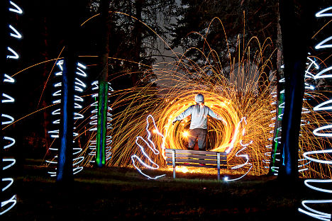 (image via: damongman) Photographer DaMongMan demonstrates some of the different effects that are possible with light painting, all in one photo. If My Thoughts Were Light by Joel Montes de Oca 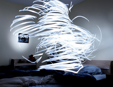 (image via: joelmontes) Joel Montes de Oca sat on a bed holding a flashlight, which he spun around in the air above him, to achieve this effect. Wings by VFS Digital Design 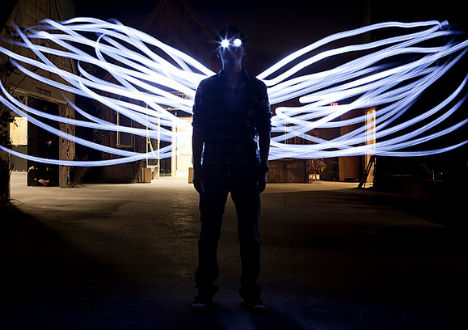 (image via: vas digital design) LED flashlights and a lightsaber turn a solitary man in a dark room into a mysterious winged being. Kapiolani Park by Kyle Nishioka 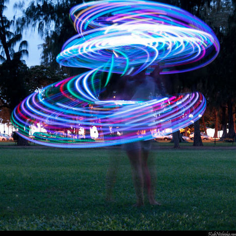 (image via: madmarv) Twilight can be a great time to try light painting, since the scene is light enough to illuminate the background and any figures in the shot, but the moving lights are still highly visible. Want More? Click for Great Related Content on WebUrbanist: 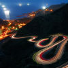 Ordinary landscapes suddenly become mystical and eerie when the camera shutter is left open for a long exposure photo, as in these 18 incredible examples. 8 Comments - Click Here to Read More »»  Light graffiti, also known as light painting, is a kind of leave-no-trace, sustainable and incredibly awesome temporary graffiti if captured right by clever photographers. 87 Comments - Click Here to Read More »» 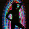 With tons of energy, some fresh ideas and a willingness to play around and be goofy, the photography duo MRI creates graceful portraits of light in motion. 10 Comments - Click Here to Read More »» مطالب مرتبط با معماری اخرین اخبار و مطالب مرتبط با معماری را از آدرس http://p30city.net/search.php?do=fin...&starteronly=1 مشاهده کنید |
|
#38
|
||||
|
||||
|
معماری Buzz Cool: 10 Shockingly Creative Power Strip Concepts  Going unplugged might be good for musicians but for the rest of us, not so much. These 10 shockingly creative electric power strip concepts pick up where bland & boring store-bought outlet bars leave off, and in the process add a cooler buzz to our increasingly plugged-in lives. Movable Power  Movable Power is a furniture-friendly power strip design that works with your home décor instead of the other way around. As designer Jeff Carter puts it, “This power strip allows you to change the strip, not your space.”  Bend it, shape it, any way you want it – with apologies to the 60s group The American Breed, who would be an excellent choice when Movable Power television commercials are made. Carter’s design is certainly flexible enough, though it’s hard to conceive of a furniture layout that would require a power strip formed into an “S” shape… perhaps a crowded college dorm room or a bachelor pad at the Robot Arms. PowerSquid Surge3000 Calamari Edition  Unless you’ve been traumatized by watching the Alien flicks, you’ll love the PowerSquid. A power strip that thinks outside the bar, the flagship model Surge3000 Calamari Edition boasts an innovative design as well as an awesome name… though “Electric Cthulhu” comes a close second.  With an 8-ft long power cord at one end and a half-dozen flexible outlets (2 of which glow neon blue) at the other, the PowerSquid will keep your precious electronic devices safely connected though it might just haunt your dreams in the process. Powramid E-900 Series  You say you’re a Cairo-maniac wanting to add a little pyramid power to your pharaonic pad? Don’t call for mummy; get yourself a few Powramid E-900 series surge protector power strips! Kreative Power designed the E-900 series with 6 widely-spaced outlets, an illuminated ON/OFF switch, a safety switch cover and a low-profile AC plug. The wide, rounded base adds stability – how often does YOUR power bar tip over on its side?   The Powramid E-900 series consists of four models: E-900H, E-900S, E-900L, and the E900S311-C1. The latter is a limited edition model that comes in green or pink as opposed to the usual black or white… hey, they had me at “limited edition”. Multi-Tab Power Strip  Dontcha just hate having to remove one plug from a loaded-up power strip hidden waaay behind the sofa or whatever, and you yank on the cord hoping the plug pops out, and it doesn’t, and you end up yanking the whole bar and causing mass mayhem? Yep, me too, but Korean designer Soon Mo Kang actually went out and addressed the problem instead of whining and moaning. His solution? The Multi-Tab Power Strip. 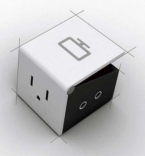 This modular power bar has built-in levers for each module: press the tab and your chosen plug (and ONLY your chosen plug) pops right out. The concept is engineered to be sold one block at a time, allowing you to effectively build your own power bar according to your needs. Is a single-outlet power strip still a power strip, or are we getting too metaphysical? E-Ball Multiplug Connector  If slim, thin & stealthy power bars are your “goal”, then the E-Ball Multiplug Connector from Mashallah Design won’t score any bonus points. On the other hand, it’s easy to get a kick out of this 12-outlet paragon of polygons… but don’t kick it, OK? 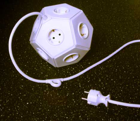 This odd “powerball” may be a winning concept but for the time being, a concept is all it is: Mashallah Design hasn’t cashed in the way they would if the E-Ball Multiplug Connector could be bought at Wal-Mart. Then again, this really isn’t a typical Wal-Mart design, now is it? Swivel Socket Power Strip 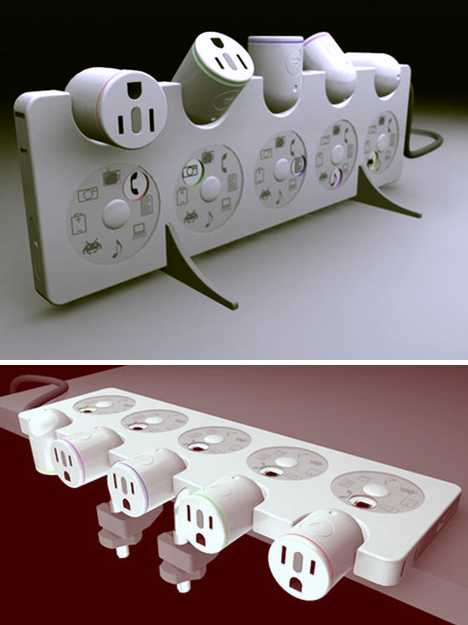 The Swivel Socket Power Strip may have only 5 outlets but so what? This thing looks too good to even use for its intended purpose. As a pure concept and – so far – a one-of-a-kind design and engineering exercise, the Swivel Socket Power Strip seamlessly melds form with function.  Designed by Cyber Demon for a student design competition (he gets my vote!), the bar features individual, turret-like outlets that are color-coded and rotate 180-degrees to help reduce plug crowding. Adding to the overall retro look are dials that rotate and lock in a symbol indicating what type of device is being serviced by each outlet. Pivot Power Flexible Power Strip  Unlike a lot of concept power strip designs, you can actually buy the Pivot Power Flexible Power Strip. With 6 adjustable outlets, any plug fits without horning in on its neighbor – even chunky transformer plugs that usually hog a pair of adjacent outlets. Here’s a quick advertorial video showing off the Pivot Power Power Strip… is that redundant? Quirky\’s Pivot Power, via Quirkydotcom  The Pivot Power Flexible Power Strip is no one-trick pony, either. It’s opposite end terminates in a flathead plug ideal for use behind file cabinets, desks, bookcases and the like. Since most rooms contain furniture, why shouldn’t your power bar be designed to work with reality? ElectroMan Surge Protector  Some guys love their ElectroMan Surge Protector, others, well, maybe “love” isn’t quite the word… not that there’s anything wrong with that. Looking to add some “manpower” to your in-house electric grid? Look no further than this charmingly articulated power distributing dude who comes in black or white… just like us!  ElectroMan may sound like some sort of superhero (and expect Hollywood to conduct a screenplay search any day now) but he’s really a friendly li’l feller. Check out that mild smile and the indicator light positioned right over his heart… awww!  Of course, cute doesn’t cut it with some folks who might wonder how ElectroMan can tolerate constant high voltage streams passing through his body. In the mod above, the modder assumes he can’t. Lego O’Block  The Lego O’Block is from France, which is notable in and of itself – a French high-tech component, sacre bleu! Get past its Gallic charm and you’ve got what appears to be an oversized, radioactive LEGO brick. I don’t know about you, but THAT’s the thing I want to plug all my personal electronics into! Power Strip Svintus 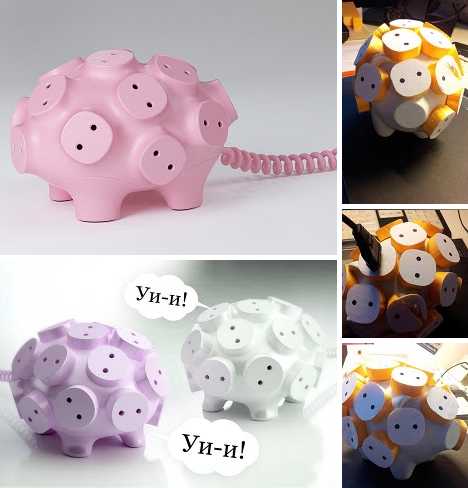 If you’re going to design a radical power strip, why not go hog wild? Russian artist and designer Artemy Lebedev did exactly that with the bizarre 17-snouted Power Strip Svintus. In some dark and disturbing future we may actually have living, breathing power-strip pigs but until that far-off day arrives, content yourself with the Power Strip Svintus. 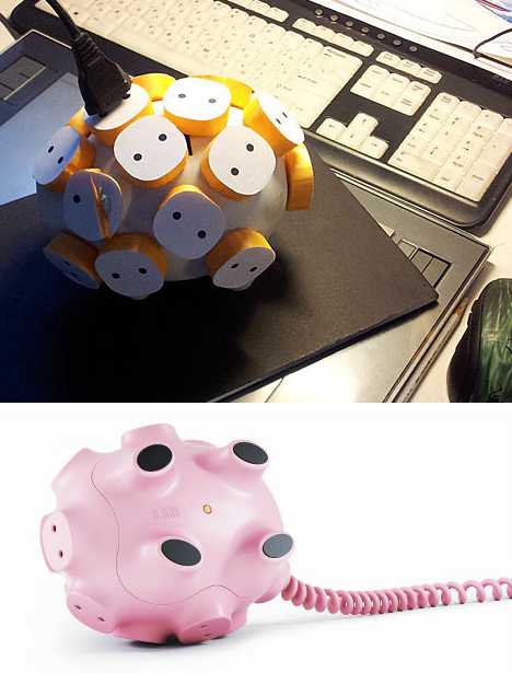 Check out the Art Lebedev website to view a neat image-fest documenting “the making of” Svintus… and be aware that no actual pigs were harmed in the process.  Appearances aside, the Power Strip Svintus is no power hog. I’m not sure what that even means but it had to said anyway. What it IS, is the kind of device that’ll impress your GF (“Oh, it’s sooo cute!”) and your buds (“Dude, is that thing genetically engineered??”) You want it… I know it, you know it, and doubtless the Power Strip Svintus knows it.   You might think power strips and surge protectors (not to mention power strip surge protectors) are basic, blase, utilitarian household appliances writ small, and you’d be wrong. Why put up with dull design when your essential everyday electronics are literally on the line? Why indeed… and as can be seen above, the answer is you no longer have to. Want More? Click for Great Related Content on WebUrbanist:  Cell phone technology and styling continue to progress by leaps and bounds bu that still leaves a lot of wiggle room for creative engineers eager to answer the call for ever odder phones. Here are 15 of the hottest cellphone concepts around. 13 Comments - Click Here to Read More »»  If your days are going by in a blur, it's time for a change. Give the monthly countdown a little extra character with these 12 cool, creative calendar designs. 3 Comments - Click Here to Read More »»  Wax candles went retro when Edison invented the light bulb but that's cool: these 13 hot wicks prove it doesn't cost a fortune to buy a little flame. 3 Comments - Click Here to Read More »» مطالب مرتبط با معماری اخرین اخبار و مطالب مرتبط با معماری را از آدرس http://p30city.net/search.php?do=fin...&starteronly=1 مشاهده کنید |
|
#39
|
||||
|
||||
|
معماری Concrete Islands? An Incredible Vision for Venice 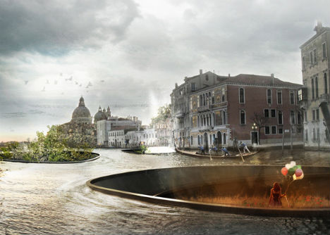 Venice is sinking, and the city of canals is in dire need of solutions that can help it survive. This isn’t one of them. Architecture firm Bam! has envisioned a fantasy future in which residents shrug their shoulders and accept the inevitable, creating bowl-shaped concrete islands that enable them to carry on despite the fact that their beloved historic buildings are slipping below the surface of the water. 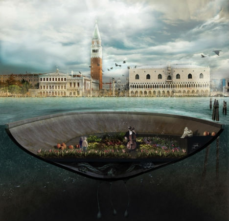 These new artificial islands float freely in the canals, offering space for gardens, art shows, concerts and parties. Seemingly meant to allow Venetians and visitors alike to simply enjoy the changing city despite the onset of deterioration and decay, the islands seek to embrace the water rather than to fight it. 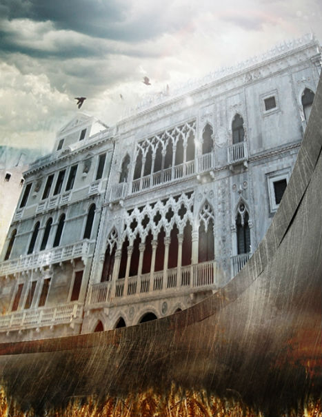 “If, urged by curiosity, you were to go and visit one of those places, it would seem to you as though you are resting in a softened space, far from the frenzy of the city and the shuffling of tourists, far from the souvenir stalls and the cruise ships,” says the design firm. “It would seem to you to be present in a room enveloped by tree-lined walls and looking at the city’s buildings and at the sky – most of all at the sky – as though from a cradle.” 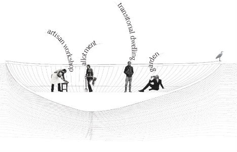 “It’s as though you can see a new part of Venice that lives in its reflection, a sort of third level from which to admire the city from below. But if you look from the paving on the bank, the scenery on the water does not seem to have changed; the new part of Venice is as though hidden in itself.” At least, until the pavement is submerged, and then you’re out of luck. Want More? Click for Great Related Content on WebUrbanist:  Installation art fuses lies at the intersection of art and design, architecture and interiors, and blurs the boundaries between form, function and innovation. 8 Comments - Click Here to Read More »»  What does the future of Australian cities hold? These futuristic concepts envision a radically different tomorrow for Australia and the world. Click Here to Read More »»  From the Italian alps all the way down to Sicily, these 15 hotels and resorts offer stylish, modern, fashion-forward lodging options in all price ranges. 3 Comments - Click Here to Read More »» مطالب مرتبط با معماری اخرین اخبار و مطالب مرتبط با معماری را از آدرس http://p30city.net/search.php?do=fin...&starteronly=1 مشاهده کنید |
|
#40
|
||||
|
||||
|
معماری 18 Examples of Amazing Long-Exposure Photography 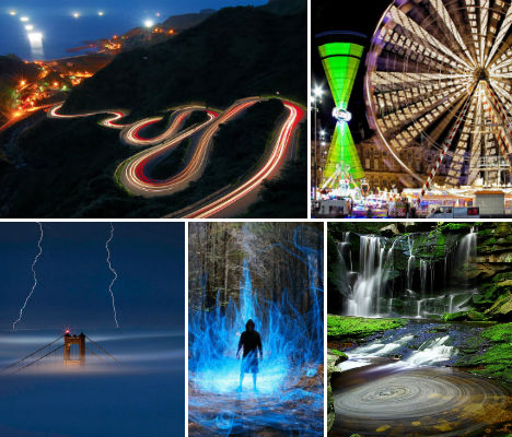 Streaks of light, trailing stars, smoothly swirling water, surreal color gradients and stretched wisps of cloud – all of these effects are possible using a long-duration shutter speed when taking a photograph. Long exposures are created by placing the camera on a tripod and leaving the camera’s shutter open for an extended period of time, which captures the stationary elements of the scene in sharp detail but blurs the elements that move. STATIC by Maxxsmart 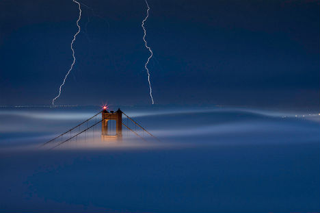 (image via: maxxsmart) San Francisco’s Golden Gate Bridge is nearly swallowed up by incoming fog in this incredible long exposure shot captured by Flickr user ‘maxxsmart’, who says, “Though I had a chance to see about 10 strikes throughout the bay, this is the only image I came away with that featured the bridge, fog, lightning, and the bright glow of the moon. There is no digital trickery here…. What you see is what it was. The long exposure enabled me to capture two strikes, and the moon lit the fog blanket perfectly.” Casa Loma by Paul Bica 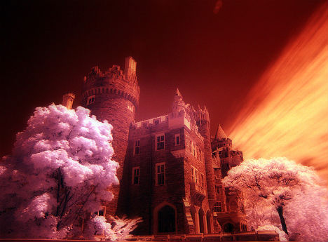 (image via: paul dex) The combination of infrared photography and a long expsure turned Toronto’s Casa Loma into an eerie sight in this daytime shot by Paul Bica. Kundalini Bonfire by Dennis Calvert  (image via: dennis calvert) Incredibly surreal, this long exposure photograph by Dennis Calvert also features a technique known a ‘light painting‘, in which artificial light is moved around in the scene during the exposure. An electrical wire taped to a stick, plus a flashlight, achieved this effect – without the need for any digital trickery. Elakala Waterfalls Swirling Pool 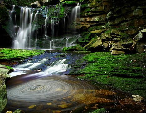 (image via: wikimedia commons) Water is a common subject for long-exposure photos because leaving the shutter open for a few seconds or even a few minutes highlights the water’s movement, giving it a misty quality. This 30-second shot blurred the waterfall in the background and captured an interesting spinning effect in the foreground as debris made lazy circles in a pool. Dune Blazers by Alisdair Miller 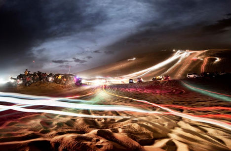 (image via: 1x.com) “This was shot just outside Dubai where people gather at the weekend and race up and down this massive dune named ‘Big Red’”, says photographer Alisdair Miller. Traveling Stars by Dhilung Kirat  (images via: thedreamsky) A long exposure can capture the movement of the stars in the sky, such as in this photograph of Kalinchowk in Nepal. Photographer Dhilung Kirat used light painting to make it seem as if the tower in the foreground is the source of the light. Wheeeeeeeeeeeeeeel! by Guillame Vigoreaux 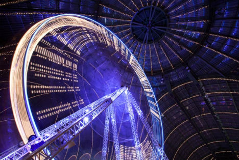 (image via: 1x.com) A ferris wheel at a carnival becomes an abstracted shape in this long exposure photograph by Guillame Vigoreaux. A Haunted Trail by Joshua Debner 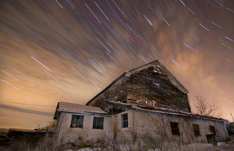 (image via: jdebner) The combination of clouds and stars moving across the sky, placed behind an abandoned home, make this photo by Joshua Debner extra-eerie. “This is around a 30 minute exposure stacked with 1 minute exposures. As you can see it was a little bit of a foggy/cloudy day, but I think it helped make the photo interesting.” You’re My Boy Blue by Geraint Rowland 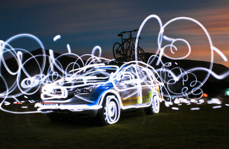 (image via: geezaweeza) Another example of light painting achieves a memorable result with a long exposure and the movement of a flashlight around the scene. Moonlight Shadow by Paul Bica 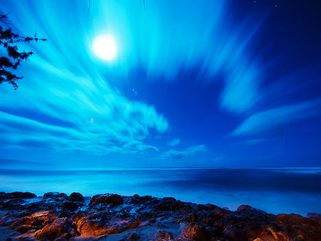 (image via: paul dex) Paul Bica captures wispy-looking clouds as they move across the sky over the North Pacific at Kawailoa Beach in Hawaii. Pigeon Point Lighthouse by Tyler Westcott 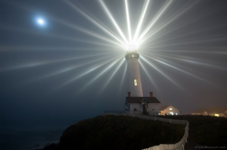 (image via: tylerwestcott.com) The annual lighting of the Pigeon Point Lighthouse near San Francisco, California was augmented by a particularly foggy night. The individual beams of light cast from the lens stand out clearly in this two-minute exposure by Tyler Westcott. Niagara Falls by John Ryan 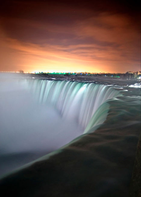 (image via: insight imaging/john ryan) “I am always looking for ways to shoot something different,” says photographer John Ryan, who took this shot of Niagara Falls. “I had seen so many shots of the falls from the same location, and all were pretty much the same. So going out at 2am, and catching the falls with no light, and pushing a 30sec exposure ending with the result.” Fira by Night by Ben Heine 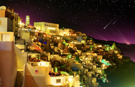 (image via: ben heine) Though slightly digitally altered, this photograph gets most of its ambiance from a long exposure. The city of Fira, which is the capital of the Greek Aegean island Santorini, clings to the volcanic cliffs as stars twinkle in the background. Fun in Amsterdam by Josef Stuefer 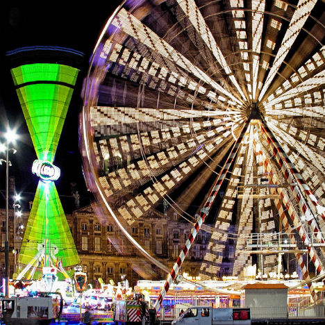 (image via: josef stuefer) Clearly, carnivals – with their many moving, illuminated attractions – are an ideal subject for long-exposure photography. This one turns a ferris wheel in Amsterdam into an abstract starburst. Bursting by Julie_Berlin 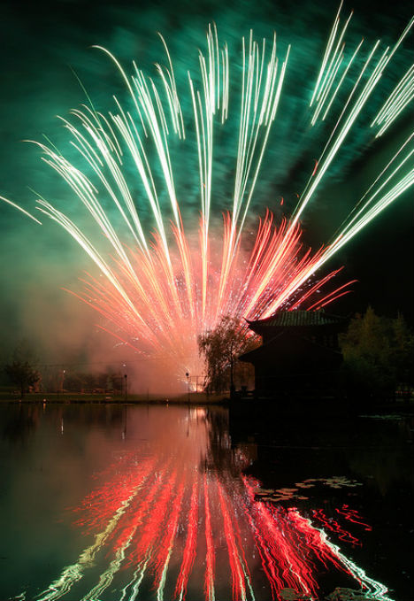 (image via: julie_berlin) Colorful fireworks soaring into the sky become long trails of light in this award-winning photo by Flickr user Julie_Berlin. S-Bend (II) by Te-Wei Liu 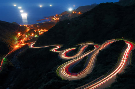 (image via: fjny) Headlights and taillights are drawn out on a serpentine road, captured in Taiwan by Te-Wei Liu. Untitled by Viernest  (image via: ernest) An ordinary road suddenly seems like a futuristic Tron-like landscape when photographed in a long exposure from a moving vehicle. Exploding Christmas Tree by Hartebeest Photography  (image via: hartebeest photography) It takes a moment to realize that this strange image is actually that of lights on a Christmas tree. Want More? Click for Great Related Content on WebUrbanist:  Luminous graffiti, eerie drawings, streaks of light, raining sparks - all of these effects and more are possible by moving a light source around in a scene. 2 Comments - Click Here to Read More »»  Time-lapse and long-exposure photography capture a series of moments rather than a single split second, portraying action and movement. 20 Comments - Click Here to Read More »»  Many modern cameras are now equipped with infrared filters, making more of these breathtaking images available. 5 Comments - Click Here to Read More »» مطالب مرتبط با معماری اخرین اخبار و مطالب مرتبط با معماری را از آدرس http://p30city.net/search.php?do=fin...&starteronly=1 مشاهده کنید |
 |
| کاربران در حال دیدن موضوع: 13 نفر (0 عضو و 13 مهمان) | |
|
|
اکنون ساعت 01:21 PM برپایه ساعت جهانی (GMT - گرینویچ) +3.5 می باشد.


 حالت خطی

