
|
|
#41
|
||||
|
||||
|
معماری Drive-Thru Office: Osaka Japan’s Gate Tower Building  What happens when an irresistible force (the Hanshin Expressway) meets an immovable object (stubborn landowners)? You get the Gate Tower Building in Osaka, Japan, a hybrid highway-***-skyscraper that revamps the exit ramp and redefines telecommuting with a dash of “Lost in Translation.” ”It’s My Way or the Highway”  It’s an office building, it’s a highway ramp, it’s… well, the Gate Tower Building is a little bit of both. The Osaka, Japan landmark sometimes called “The Beehive” looks like some future extrapolation of supersaturated city life but in actuality the building/highway combo was opened nearly 20 years ago in February of 1992. The process which led to this curious urban hybrid dates back almost a decade earlier, to 1983.  The Eighties were good times in Japan. Explosive growth in exports led by cars and consumer electronics left the government flush with funds to spend, and the preferred venue for spending was urban construction projects.  One such project involved the addition of several entry and exit ramps to the Hanshin Expressway, which itself opened in 1962 and has been branching out to serve the Osaka area’s growing population ever since. Though some sections of the Hanshin Expressway were severely damaged in the 1995 Great Hanshin Earthquake, the Gate Tower Building was unaffected.  The ink on the blueprints wasn’t yet dry when a problem surfaced: the small yet crucial slice of downtown land destined to support the Umeda exit ramp was owned (since the 1870s) by a moribund lumber & charcoal firm, and the owners weren’t interested in selling the valuable property rights. Since there was no room to shift the exit ramp, the two sides sat down and began to negotiate… and negotiate… and negotiate some more. Five years later, the issue was finally resolved though neither side really conceded anything. Making Inroads  In 1988, the charcoal company’s last few mouldering buildings had been demolished and the property rights holders’ plans for a new, modern office tower had finally been approved by the Osaka city planning commission.  Building permits previously rejected due to the need to construct the highway ramp got the go-ahead, and construction on the ramp itself began. Both projects had to proceed in sync since both projects would be proceeding on the same plot of land.  And so the Gate Tower Building was born, though on first glance the structure appears not quite whole… in other words, it has a hole: right where floors 5, 6 and 7 should be. It’s unknown whether the original building plans called for the 16-story tower that opened in 1992 or a 13-story building unmarred by the highway ramp but that’s all irrelevant now.  Workers in the Gate Tower Building don’t really notice the Umeda exit ramp as they toil away at the desks, with the possible exception of a slightly longer elevator ride up or down.  The elevators are mounted on the tower’s exterior for practical reasons and the cars (both elevator and vehicular) bypass floors 5 through 7. The nameplates for the omitted floors reads simply “Hanshin Expressway”. Surreal perhaps, but unarguably true nonetheless… and really, you don’t want to get off on one of those floors anyways, amiright? Office Life in the Fast Lane   Suezawa Sangyo Co. Ltd. (the building owners) weren’t the only party to make some small compromises to accommodate the Umeda ramp. The Hanshin Expressway Corporation was required to insulate the building from noise and vibration, a feat that was accomplished in several ways. 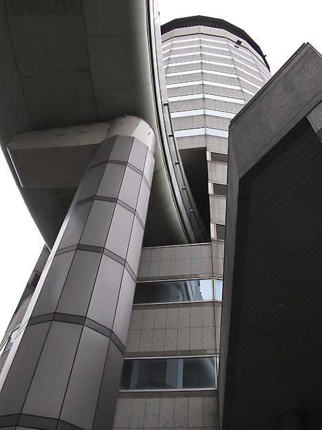 For one thing, the ramp is self-supporting and is designed as a bridge with its weight resting upon pillars. It’s interesting to note the pillars nearest the building (above) nicely complement the tower’s faceted facade. Secondly, the ramp’s “dogleg” bend and about a dozen meters of ramp on either side of the building are wrapped in a sort of “muffler” that, well, muffles the sounds of vehicles. 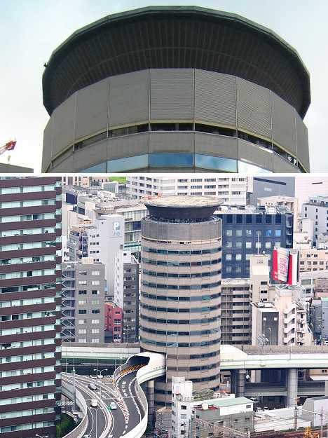 Wonders of 1980s construction aside, we can assume that workers on the Gate Tower Building’s 4th and 8th floors may note the odd shake, rattle & roll once in a while – and they know better than to chalk it up to just another minor earthquake. Those ensconced up on the 16th floor should hardly feel smug, however, as the building features a helipad on its roof.  The Gate Tower Building is a shining example of Japan’s urban engineering skills, determination to solve potentially intractable problems and above all, desire to reach consensus regardless of the time and trouble required to do so. As for the Gate Tower Building itself, it may look super-cool and be a nice place to visit… but would you really want to work there? Want More? Click for Great Related Content on WebUrbanist:  From Bangkok's elephant building and robot tower to an all-wooden skyscraper built by a single man, these 14 towering structures are among the world's weirdest. 9 Comments - Click Here to Read More »»  A 7-story spiraling 'Tower of Babel' in downtown Buenos Aires is made of 30,000 donated books in all languages. 3 Comments - Click Here to Read More »»  Step through the looking glass and into an understated art project that turns a simple passageway into a lighthearted journey back to childhood wonder. Click Here to Read More »» مطالب مرتبط با معماری اخرین اخبار و مطالب مرتبط با معماری را از آدرس http://p30city.net/search.php?do=fin...&starteronly=1 مشاهده کنید |
| جای تبلیغات شما اینجا خالیست با ما تماس بگیرید | |
|
|
|
|
#42
|
||||
|
||||
|
معماری Sensational Skate Park & Urban Climbing Wall in Spain  It’s not just a skate park, it’s an architectural landmark. Factoria Joven (“youth factory”) is a skate park and climbing wall in Merida, Spain, which opened in March 2011. Its bright, modern geometric design was inspired by the construction methods used to create Chinese dragons.  Architects José Selgas and Lucía Cano of SelgasCano Studio took on the challenge of creating an urban gathering space for young people which could be constructed of inexpensive building materials.  Made largely of vivid, lightweight polycarbonate and completed in just 13 months, Factoria Joven has quickly become everything the project collaborators wished for, bustling with athletic activity day and night.  In addition to a large climbing wall and space for biking and skating, Factoria Joven includes a computer lab and dance studio, meeting rooms and spaces for street theater, video, electronic music and graffiti. Want More? Click for Great Related Content on WebUrbanist:  A long-abandoned underground space may soon be turned into a subterranean version of the High Line park, complete with high-tech sunlight harvesting. 4 Comments - Click Here to Read More »»  From America's West Coast to France, skate parks come in all styles and each offers its own unique twist. Here are 10 of the craziest and most interesting! 37 Comments - Click Here to Read More »»  This upcoming public art installation at the Brisbane Airport will put the soothing power of flowing water on display for harried travelers and drivers. Click Here to Read More »» مطالب مرتبط با معماری اخرین اخبار و مطالب مرتبط با معماری را از آدرس http://p30city.net/search.php?do=fin...&starteronly=1 مشاهده کنید |
|
#43
|
||||
|
||||
|
معماری Hey You, Get Onto My Cloud: Bizarre Floating Transport  As far as transportation goes, we have not yet seen any truly innovative changes in our lifetimes. Sure, new types of cars and faster trains pop up every year, but where are the big changes that make us gasp and stare? The Passing Cloud concept might be just that innovation. It is a wanderer’s dream: its course and speed are determined by the winds, and there is no telling where passengers may end up.  (all images via: Dezeen) The concept was dreamed up by architect Tiago Barros and entered in a design competition that called for high speed rail concepts. Needless to say, this design was so far from the specifications that it did not earn a prize – but it is remarkable anyway.  Passengers would board the “cloud” using ladders, then simply relax as the lighter-than-air structure floats to its next destination. There would presumably be some sort of safety rail feature to keep passengers from falling off like human-size raindrops.  The nylon balloon would sport an interior structure of steel, much like an old-time zeppelin. The designer doesn’t explain how the contraption would work with no navigation system or thrusters (other than the wind), but the concept is not meant to be a serious proposal for a future transport system.  It is, rather, a flight of fancy – a whimsical vision of what might be possible in a different world. Nearly everyone has dreamed of floating around on a lazy cloud from time to time. This concept lets us recall those fun daydreams and consider again how wonderful it would feel to simply float around on a gentle breeze. Want More? Click for Great Related Content on WebUrbanist:  Floating like a cloud between the ground and the sky, this ephemeral rooftop hotel was designed to perch atop the Queen Elizabeth Hall in London in 2012. Click Here to Read More »»  If human settlements move off of land and into the water in the future, these artificial islands may become our homes in the wet and salty frontier. 3 Comments - Click Here to Read More »»  This collection spans the extremes of design and brute-force ingenuity: from the obscenely luxurious to the absurdly simple. 57 Comments - Click Here to Read More »» مطالب مرتبط با معماری اخرین اخبار و مطالب مرتبط با معماری را از آدرس http://p30city.net/search.php?do=fin...&starteronly=1 مشاهده کنید |
|
#44
|
||||
|
||||
|
معماری House of the Future: 12 Ultra-Modern Home Designs 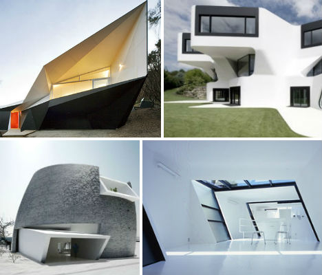 What will our homes look like in the future? Packed with electronic controls and highly efficient gadgets, will they rapidly grow into strange, abstracted structures that bear little resemblance to our current houses? These 12 futuristic house designs from around the world may be indicative of what’s to come, or maybe in a few decades they’ll seem quaintly retro-futuristic, like spaceship houses from the 1950s. Either way, they’re fun to look at. Dupli Casa, Ludwigsburg, Germany 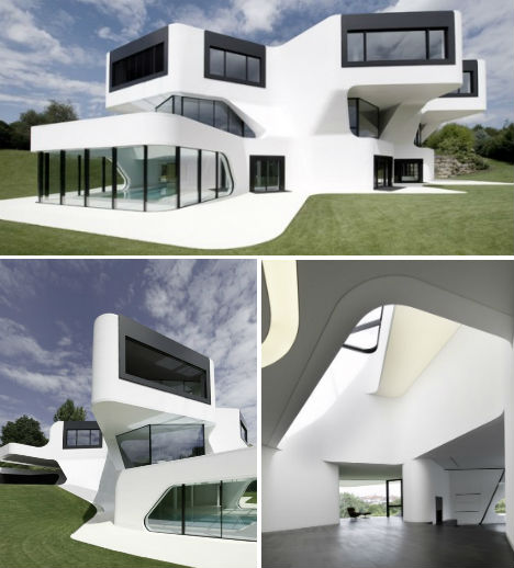 (images via: digsdigs.com) Is this the world’s most futuristic house design? Dupli Casa, designed by J. Mayer H. Architects, is a three-floor vila in Ludwigsburg, Germany with views of David Chipperfield’s Museum of MOdern Literature. Built in 2008, the angular design was based on the footprint of a pre-existing house that was completed in 1984. House F, Frankfurt, Germany  (images via: meixner schulter wendt architekten) Inspired by a spaceship, House F is as geometric as the hillside in which it’s set is round, but somehow, it still achieves architecture firm Meixner Shulter Wendt’s goal of ‘easing itself into the landscape’. Local authorities stipulated a pitched roof, which doesn’t always fit into ultramodern aesthetic values, but the firm found a way to work with this rule, giving the home a hovering appearance with a dark cladded top floor and a glass-walled bottom floor. Starr Residence, Bondi Beach, Australia  (images via: freshome) Rising above the more standard and traditional-styled houses on Australia’s Bondi Beach is the wave-shaped Starr Residence, an almost commercial-looking structure designed by Brian Meyerson Architects. The architects say, “the design of this house at Bondi Beach centers on maximizing space within strict height and bulk controls while taking advantage of available views, light and breezes. Arising from these controls, architectural imagery is developed referring to the cultural history of Bondi and to the sand and sea. A sweeping copper roof evokes various images ranging from surf boat hulls to breaching humpback whales. Stone, plywood and intricately formed concrete give spaces character. These materials are complemented by compelling opposites, such as soft sheer curtains with alternating with planes of solidity and transparency. The house attempts to lyrically connect to its beach-side site.” Skew House, Tokyo, Japan 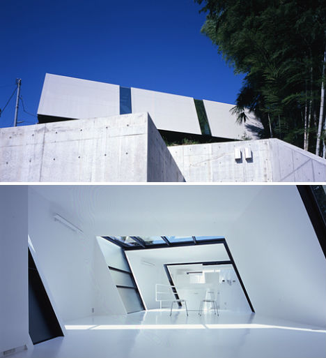 (images via: digsdigs.com) Building on a challenging location can sometimes provoke amazingly creative solutions. Case in point: the ‘Skew House’ in Tokyo, Japan, designed by October Ueda + Nakagawa Architects. A series of large, skewed white blocks, separated by panes of glass, extend over the cliffside above concrete ‘anchoring volumes’. Inside, the effect is as if a rectangular house was pushed slightly off-kilter; the minimalism of the pure white walls adds to the somewhat otherworldly feel. Capital Hill Luxury Villa, Barvikha, Russia  (images via: zaha hadid) Would you expect anything other than an eye-popping, ultra-modern wonder of a house from architect Zaha Hadid? This hillside luxury residence in Barvikha, Russia is made of concrete, steel and glass and features four levels with the master suite elevated high above the trees for a premium view. Like a watchtower, this level is raised nearly 72 feet above the remaining floors on vertical shaft containing an elevator and staircase. Novela, Japan  (images via: digsdigs) Also by October Ueda + Nakagawa Architects, ‘Novela’ is a space-saving cube with large geometric cut-outs in the facade that let in lots of daylight. The clients wanted as much space as possible in the small footprint, as well as a space that’s visually interesting. The result, which includes all-white built-in furniture, certainly looks as if it’s from a different time period altogether than its more subdued neighbors. Moebius House, Sydney, Australia  (images via: tonyowen.com.au) Looking something like a yacht that’s become embedded in the streets of Sydney, Australia, the Moebius House is far from typical. Architects Tony Owen Partners say that the design is an example of ‘liquid architecture’, “whereby projects are designed parametrically using 3-D digital software to respond to environmental issues.” The house features a distinctive roof shape, with one solid white wall extending over the house and then curving under the second floor to create a terrace. Klein Bottle Holiday House, Mornington Peninsula, Australia  (images via: archdaily) Named after the ‘Klein Bottle’ in mathematics, which is a surface with no distinction between the inside and outside, this holiday home an hour from Melbourne features a highly unusual, angular shape that hints at this mathematical inspiration. New technology like CAD allow homes like this to have highly complex designs. The Klein Bottle House is essentially a spiral, but because of its geometry, that’s difficult to see from the exterior. Rooftop Golf Course House, Igualada, Spain  (images via: archdaily.com) This house overlooking a verdant hillside in Spain looks strange enough as it is – but add in a rooftop golf course, and it lands on a list of highly unusual and futuristic houses. ADD+ Arquitectura built this home using a steel tube frame covered in aluminum panels. Seen as a step from the street and hillside above to the garden below, the green of the mini-golf course is a highly artificial but striking element in the landscape. (X) House, Inner Mongolia, China  (images via: trendir) An ultramodern, gleaming house like this is not exactly a sight you’d expect to see in Inner Mongolia, but the (X)House is actually part of the Ordos 100 Project showing off innovative residential designs. The exterior walls are made of black brick, which takes on an interesting patterned look thanks to the elliptical shape of the home. The design, by New York-based architects Multiplicities, takes its name from an X-shape in the interior of the house, which isn’t visible from outside. Bird Island House, Kuala Lumpur, Malaysia  (images via: design boom) Like the world’s most elaborate tent, the Bird Island House for Sentul Park, Kuala Lumpur, Malaysia is covered in a silicone-coated glass fabric which changes transparency throughout the structure to let varying levels of light and views inside. The fabric twists and wraps around the bamboo frame, leaving common areas and passageways open to the breeze while other rooms are enclosed with full walls and glass. Schouten Kempink House, Gelderland, Netherlands  (images via: factor architecture) Half conical concrete, half traditionally shaped thatched roof, this house is definitely an interesting transition from the structures that normally dot the countryside in this little Dutch village. The concrete half shields the home from harsh direct sunlight while the back features glass portions that let in light. Want More? Click for Great Related Content on WebUrbanist:  Dollhouses aren't just for kids, and they don't only come in the frilly Victorian variety. These modern dollhouse designs will please kids and parents alike. 10 Comments - Click Here to Read More »»  Urban house boats are the best of both worlds, providing a private getaway with views of the water yet docked just steps from the excitement of the city. 4 Comments - Click Here to Read More »» 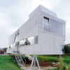 The exterior is a rectangular box made of heavy concrete balanced on stilts, but step inside and you'll see an unexpectedly amorphous all-white interior. 3 Comments - Click Here to Read More »» مطالب مرتبط با معماری اخرین اخبار و مطالب مرتبط با معماری را از آدرس http://p30city.net/search.php?do=fin...&starteronly=1 مشاهده کنید |
|
#45
|
||||
|
||||
|
معماری Enter The Dragon Building: Beijing China’s Pangu Plaza 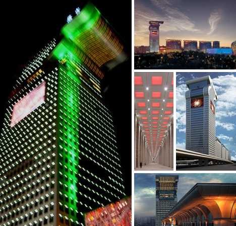 Fire-breathing dragon, Olympic torch, or both? The Pangu Plaza complex is the latest architectural wonder reshaping Beijing China‘s increasingly Dubai-esque skyline, a product of architects eager to make their mark and city planners happily throwing cash their way. Chinese Puzzle 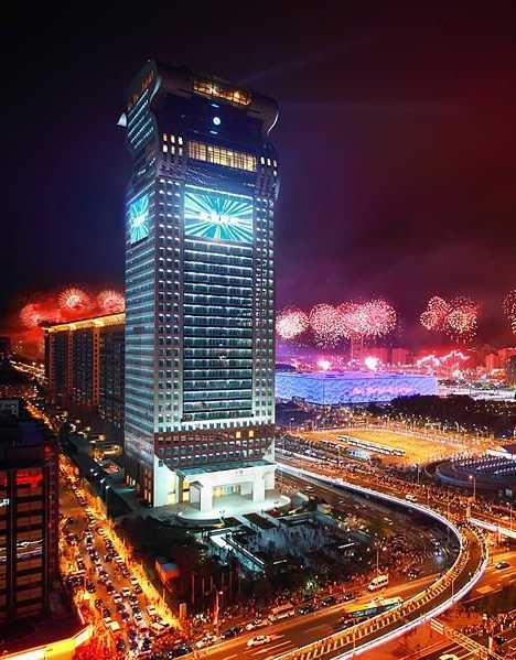 The 2008 Summer Olympic Games in Beijing were, among other things, China’s long-awaited opportunity to welcome the world and show off her astonishing progress. Beijing, in particular, revealed herself as much, much more than the Forbidden City and Tiananmen Square. Dozens of architectural showpieces which sprung up in conjunction with China’s booming economy over the past half-decade have succeeded in transforming the city’s skyline. 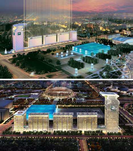 One building, however, remains shrouded in mystery long after construction nets and scaffolding have come down: the Pangu Plaza. It’s certainly visible enough: look out from the National Stadium (casually known as the Bird’s Nest) in the direction of the National Aquatics Center, or the Water Cube, and you’ll spy an odd grouping of buildings festooned with hundreds of small windows, the tallest of which sporting a massive LCD screen. 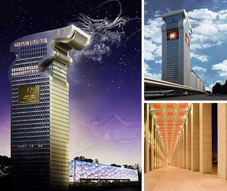 Most observers commenting on the Pangu Plaza assume it was built for the 2008 Olympics along with its more famous neighbors. Not so: it may share their general location in the designated Olympic Zone but much of the complex was incomplete as the Opening Ceremonies commanded the attention of billions worldwide. 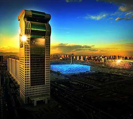 In addition, the tallest building has been likened to an Olympic torch crowned with a windblown, leaping flame. Not so: all 5 towers in the Pangu Plaza are linked lengthwise along their shared first three floors and the so-called “torch” topping the tallest tower is actually meant to represent a dragon’s head. Dragon The Line 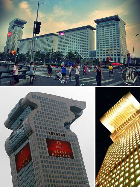 Thus put into context, one can discern the line of buildings forming a traditional Chinese dragon. The spaces between the buildings contribute to the overall visual impression of a dragon’s undulating body. Then again, pick up the entire complex and plunk it into downtown Omaha, Nebraska, and you could believe it was an architectural steam locomotive towing a quartet of boxcars. 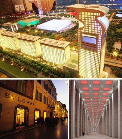 Though each of the 5 component buildings doesn’t really stand out quantitatively or esthetically, the whole of the complex is something greater than the just being sum of the parts. For one thing, some of the buildings have specific functions: the “tail” building is one of the world’s only two 7-star hotels while another building is a self-contained shopping mall. 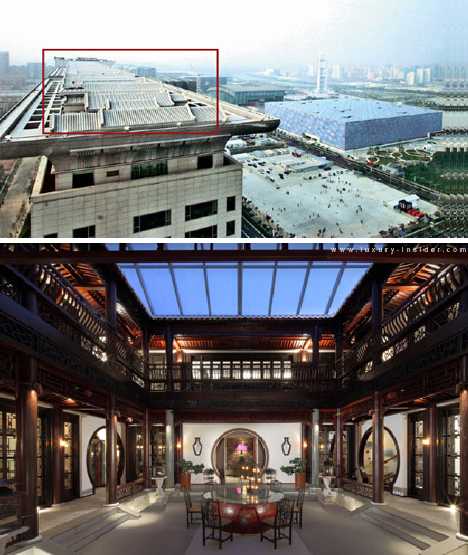 The remainder is comprised of office space, residential apartments priced in the millions of dollars, and secured parking garages. Even the tops of the buildings have been put to use as rooftop Chinese courtyards, equipped with sliding roofs that provide shelter during winter and/or inclement weather. 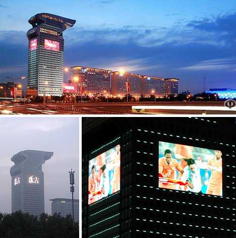 Stats, you want stats? Here we go… from one end to the other, Pangu Plaza stretches the length of seven football fields. The four smaller buildings each stand 23-stories tall but the “dragon’s head” grabs the limelight. It’s 191.65 m (628.77 feet) in height, comprising 39 stories with 5 more stories extending below ground level. 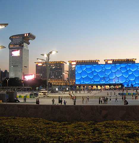 Visitors move through the building via 29 elevators and 6 escalators. Embedded into the glass & white granite walls of the buildings are seven huge LED screens with a total area of 3400 square meters (36,600 sq ft). The largest, 900 square meter (9,688 sq ft) screen happens to be the biggest such screen in China. Peking (Slam) Dunk 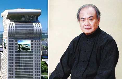 Pangu Plaza was designed by Li Zuyuan (above, right) of C.Y. Lee & Partners, the Taiwan-based architecture firm responsible for Taipei 101 (above, left), the world’s tallest building until surpassed by Dubai’s Burj Khalifa. 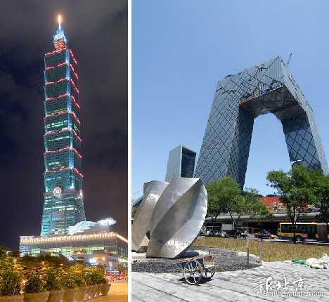 The fact that a Chinese architect was able to win such a significant contract is a hopeful sign for those who feel too much money has been “thrown at” foreign architects who turn a blind eye to Chinese architectural traditions. Indeed, more than a few of Beijing’s skyscrapers look sorely out of place… we’re looking at you, Rem Koolhaas-designed CCTV Headquarters Building (above, right), and it’s not easy. 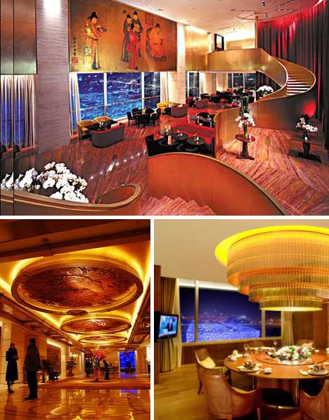 With that said, Pangu Plaza is not without controversy. The complex was originally one of a mixed bag of Olympics-related construction projects approved by Beijing vice-mayor Liu Zhihua. In 2006, the high-living Liu had his wings clipped by a governmental oversight board after being accused of corruption and for leading a “decadent lifestyle.” 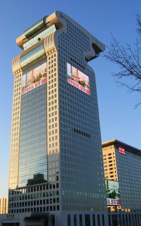 If the old adage of the candy store owner occasionally samples his own wares can be applied, then perhaps Liu Zhihua was seen once too often dining at Pangu Plaza’s $600 per person Japanese restaurant. Try the fugu, Liu. 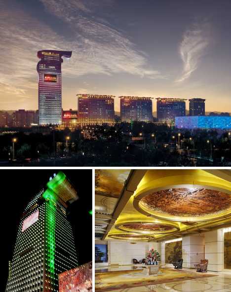 Other rumors concerning Pangu Plaza have made the rounds, most involving big names with even bigger bank accounts. “We have had a lot of very important guests,” stated Cai Xiaomin, a spokeswoman for Beijing Pangu Investment. 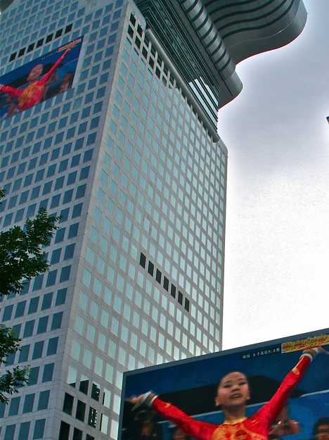 The Chinese developer doesn’t deny they want Pangu Plaza to be a preferred destination for “the elite of the world”, but company reps won’t comment whether Bill Gates paid $800,000 to rent a high-rise courtyard apartment for a year – one that sells outright for $17 million. They do, on the other hand, confirm that Warren Buffett made rental inquiries on one of the courtyard condos and that former American Secretary of State Henry Kissinger stayed in a luxury hotel suite during the Olympics. That’s about as elite as you can get, amiright?   Love it or hate it… there seems to be little middle ground when it comes to judging Pangu Plaza and the curiously ambivalent attitude of the developers only adds to the project’s mystique. Architectural celebration of Chinese culture, overpriced line of refined commieblocks, or a little of both? Whatever one thinks of Pangu Plaza, I think we can all agree that this “Dragon House on Steroids” could have ended up quite differently Want More? Click for Great Related Content on WebUrbanist:  Call it “urban jungle lite.” Keiichiro Sako's neo-Metabolist “BUMPS In Beijing” mixed-use complex brightens up the Chinese capital's slab-sided skyline. 1 Comment - Click Here to Read More »»  Did you know that brick or stone-clad buildings you see today almost invariably hide a steel support structure that does the actual work? 16 Comments - Click Here to Read More »»  The creation of the tallest building in the world has become such a status-seeking quest, cities and countries competing for the title have stopped revealing the planned height of their buildings. 12 Comments - Click Here to Read More »» مطالب مرتبط با معماری اخرین اخبار و مطالب مرتبط با معماری را از آدرس http://p30city.net/search.php?do=fin...&starteronly=1 مشاهده کنید |
|
#46
|
||||
|
||||
|
معماری 17 Creative Letterheads from Celebs & Public Figures  You’ll never receive a letter from Andy Warhol, Ray Charles, Albert Einstein or Harry Houdini, but you can still get a peek at what their letterhead looks like – and the designs can be quite revealing. These 17 letterhead designers from architects, musicians, artists, performers, inventors and other public figures range from the humble and minimalistic to the boastful and colorful. See lots more at Letterheady.com. Frank Lloyd Wright  (image via: architizer) Would you expect anything less from Frank Lloyd Wright? In 1946, this is what you would have seen when receiving a letter from the famous architect. Andy Warhol  (image via: letterheady) Suitably artistic but perhaps more subdued and tasteful than you’d expect, Andy Warhol’s undated stationery gives typography center stage in soothing tones of blue and green. Ray Charles 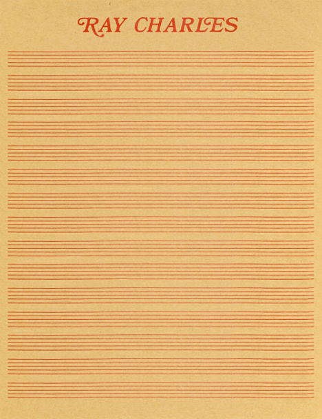 (image via: letterheady) Ray Charles’ musical letterhead is perfection, period. The star was still using this letterhead in 1990. Groucho Marx  (image via: letters of note) Even without the text, there’d be no mistaking this letterhead, dated 1943. Nikola Tesla  (image via: letterheady) Imagine how cool it would have been to open an envelope and find this inside – not just because it’s a letter from Nikola Tesla, but because the letterhead is so awesome. It features Tesla’s inventions including the oscillation transformer, remote-controlled boat, steam and gas turbine and an induction motor. In the center is Wardenclyffe Tower, a concept that was never realized. Albert Einstein  (image via: letterheady) Yep, Einstein didn’t mess around, getting straight to the point with nothing but his name and ‘Caputh bei Potsdam’, which is the German town where Einstein lived from 1929 to 1932. Johnny Cash  (images via: johnny cash store) Johnny Cash – or at least his office – kept the whole ‘bad country boy’ image alive on this letterhead design with a print of a desk, a guitar and a target pierced by three die-cut bullet holes. Bob Kane  (image via: letterheady) Batman creator Bob Kane perfectly captured the 60′s era vibe of the characters with this awesome undated letterhead. Harpo Marx  (image via: letterheady) Groucho’s brother Harpo Marx wasn’t exactly going for humility when he used this humorous letterhead in the 1930s. The letterhead features two images, ‘Mr. Marx at Home’ and ‘Mr. Marx Being Funny’ as well as a quote that says “Just a mass of personal charm.” The sidebar listing “a few tributes to Mr. Marx” barely leaves any room for correspondence. Harry Houdini  (image via: flavorwire) Houdini actually had quite a variety of letterhead, from a simple cameo-style photograph in 1913 to a supremely busy illustrated 1920 version with the tagline ‘World’s Greatest Mystery Man and Escape King.’ But perhaps most interesting is the magician’s quickie letterhead, used when sending a quick telegram. More than making up for the brevity of the message, it says “Please pardon any incivility in this letter. It has been rushed to you under stress of business and written in the dressing room. Therefore all formalities, like Dear Sir, Dear Madame, etc., have been omitted–not to be curt or brusque; but that it is deemed better to let you hear from me in a lettergram of a few words than not at all. Cordially yours, HOUDINI.” Frank Zappa  (image via: letters of note) Sent in 1984 featuring a message about the infamous parental advisory stickers that he so opposed, this letterhead captures a bold graphic typeface spelling out Frank Zappa’s name. The full letter, which can be seen at Letters of Note, ends with the sentence “Don’t bend over for the wives of big brother”, referring to the ‘Washington Wives’ committee responsible for the stickers, including Tipper Gore. Ansel Adams  (image via: icollector) You might expect Ansel Adam’s letterhead to include an image from his photography, but the artist kept things clean and minimal with just his name and a monogram. David Bowie  (image via: hard rock) A lucky fan got a letter from David Bowie in 1974, and now it’s in the seemingly endless Hard Rock collection of celebrity memorabilia. Charles Manson  (image via: ghost tracker d) Correspond with notorious murderer Charles Manson in prison, and you might just get this totally terrifying letterhead in the mail, which features a print of his instantly recognizable eyes, as well as a goat in a crown of thorns and ‘ATWA‘. The latter stands for Air, Trees, Water and Animals and represents Manson’s ‘ecological mandate’. Leonard Cohen  (image via: digital collections) In 1959, singer Leonard Cohen’s letterhead featured nothing but his hand-written surname. Richard Simmons  (image via: charles d’angelo) Richard Simmons’ letterhead, preserved by a fan who received a letter congratulating him on his weight loss, is just about everything you could ever want from the diminutive fitness instructor. Church of Scientology  (image via: warrior.xenu.ca) Is this the ugliest letterhead ever? Maybe it doesn’t take the cake, but the Church of Scientology of California’s 1976 blue monstrosity is definitely a contender, leaving a tiny amorphous spot of white in which to actually type a message. Want More? Click for Great Related Content on WebUrbanist:  An old port in Amsterdam will be transformed into the Alphabet Building, an unusual collection of offices for creative companies with letter-shaped windows. 1 Comment - Click Here to Read More »»  The logo designs that really stand out manage to combine memorable branding with super-simple text & basic graphics that say so much in such a small package. 4 Comments - Click Here to Read More »»  A lot can be said with the font that one chooses for a project. These amazing character sets are far from the usual plain black letters we're all so used to. 2 Comments - Click Here to Read More »» مطالب مرتبط با معماری اخرین اخبار و مطالب مرتبط با معماری را از آدرس http://p30city.net/search.php?do=fin...&starteronly=1 مشاهده کنید |
|
#47
|
||||
|
||||
|
معماری High Anxiety: Rooftop Excavators Tear Down from Up Top  Rooftop excavators? On my multistory highrise building? It’s more likely than you think, especially in China where painting one’s self into a corner is no longer just for painters anymore. The difference here is, the corner in question could be several hundred feet above the ground. Demolition, Man 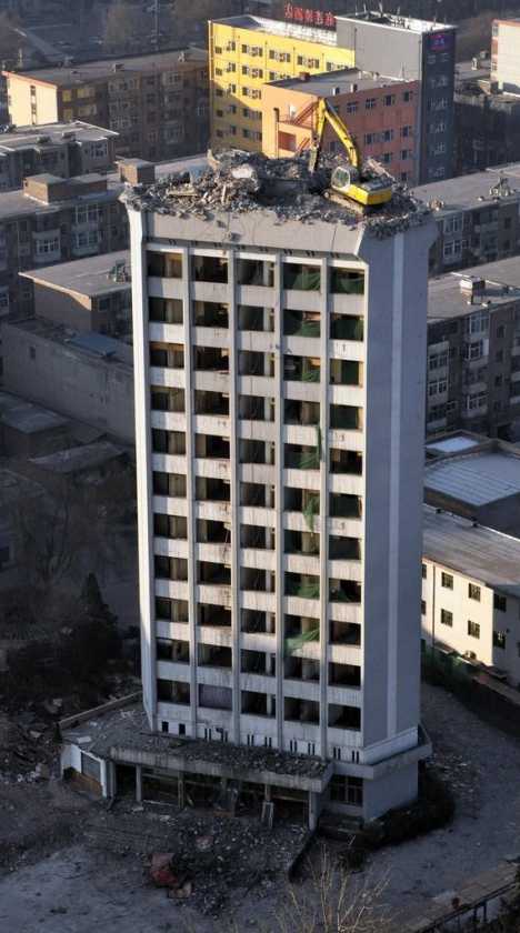 Hydraulic excavators are often used in Chinese demolition projects to quickly bring down roofs. This can be somewhat problematic when the roof – and the building beneath it – just happens to be supporting the multi-ton excavator being used to do the demolition.   Consider also that high-rise roofs aren’t designed to support great concentrations of weight, and the roofs doing the supporting belong to buildings being knocked down because (generally) they’re having trouble staying up. 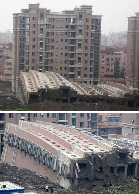 The situation is even more problematic in China, where a combination of lax workplace safety laws and shoddy construction has given rise to a world where buildings are slapped together, sold, condemned and torn down – often within just a few short years. Sometimes the buildings don’t wait for the demolition men: what goes up too quickly, often comes down even quicker. Don’t Claw Us, We’ll Claw You  Here’s a lone excavator hard at work on top of the 12-story Shanxi Science and Technology Hotel in the Chinese city of Taiyuan. The slender, triangular building has a very limited amount of roof space in which the excavator’s driver can manoeuvre, yet manoeuvre he must if the building is going to be eaten away down to ground level.  Click here to watch a short video from CNS News that shows the rooftop excavation project from various angles, including from the roof itself. It’s in Chinese but as they say, a picture’s worth a thousand words! 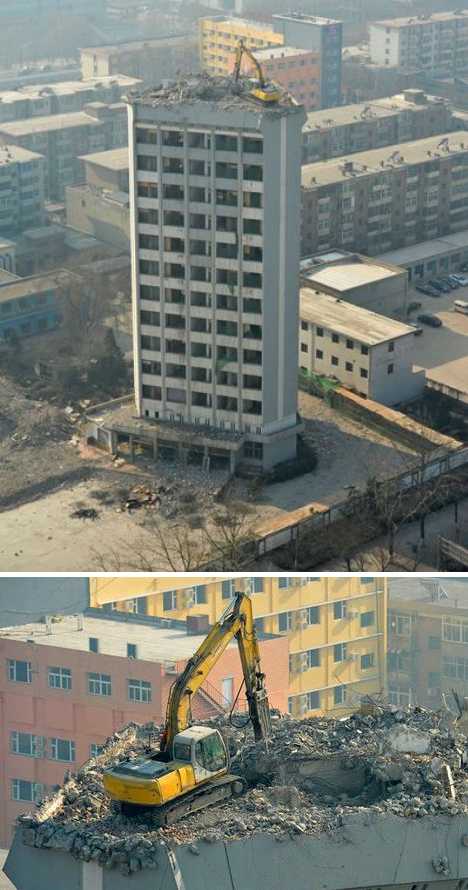 One assumes that the excavator claws a certain amount of material from one side of the roof, and then drives over to the reduced area and does the same to the place he just left, over and over again.  Alternatively, a ground-based crane might just pick up the excavator and plop it down (not too hard!) on another portion of the roof. It’s not rocket science, though working atop an unsteady platform honeycombed with rooms and open areas may still end up with the worker flying through space. Knocked Up, Sold Off, Knocked Down 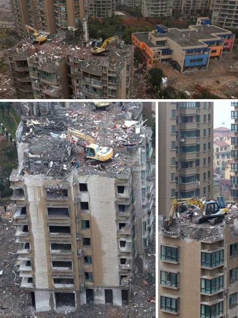 Readers surely must be asking, “why not just dynamite the building such that it collapses in on itself?” Ask any expert, controlled demolition is a precise and delicate operation which, if unsuccessful, cold result in extensive collateral damage to surrounding buildings and nearby construction workers – not to mention TONS of dust to sweep up. Believe it or not, in China at least, demolition via rooftop excavator is the safer, cleaner, and above all cheaper option.  The 18-story residential apartment building depicted here in mid-demolition a few weeks ago was built in the city of Taizhou, located in eastern China’s Zheijiang Province… in January of 2011! Yes indeed, the highrise didn’t even last one full year before the ground beneath it began settling unevenly, eventually causing the building (and several others nearby) to be deemed unsafe. 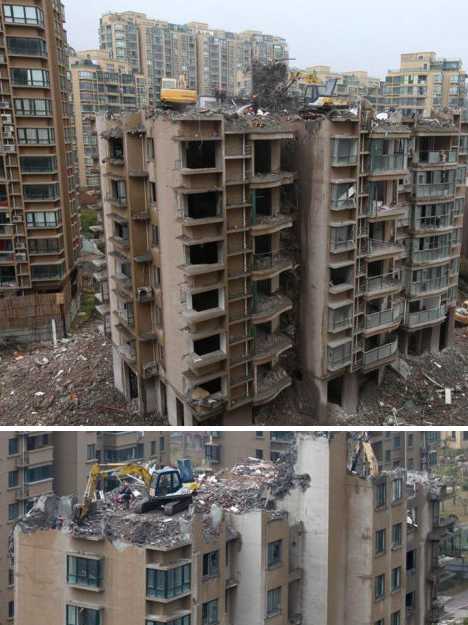 Consider the plight of a Mr. Zhan, who bought a unit on the building’s 16th floor yet had to move out just 17 hours after moving in when a structural support pillar cracked. “I heard loud banging sounds like an explosion,” explained Zhan to reporters from China Daily, “it was really scary. I bought my unit because of the beautiful ocean view. It’s such a pity I can’t live in it.” Hope you’ve got Collapsing Building Insurance, Zhan. Deconstruction Wizards of Oz  Rooftop excavation is not exclusive to China, it seems, as these images from several demolition projects in Australia indicate. The above scene from earlier this year showed demolition underway in central Canberra.  Unlike similar building demolitions in China, however, the Aussies use smaller excavators on lower buildings which are wrapped in protective covers to corral debris. Rooftop Excavators, How Do They Work? 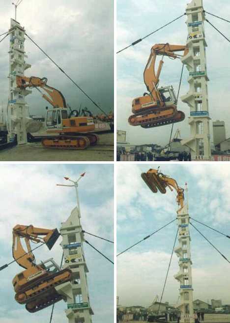 You might be wondering how these huge hydraulic excavators get up to their precarious perches in the first place. Giant helicopters? The service elevator? Disassembled, brought to the roof and reassembled? Maybe each highrise was built with an excavator entombed on the roof in anticipation of its eventual demolition, or perhaps the excavators simply climb up the balconies, floor by floor. 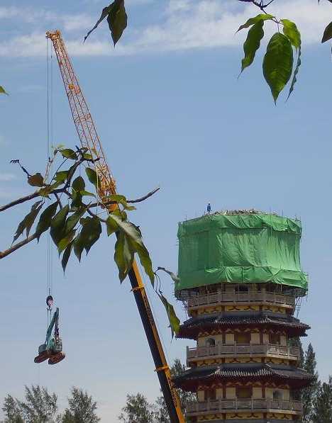 Actually, if the building isn’t too high the excavators can be lifted to the top by much larger, ground-based construction cranes as shown above. The ground-based cranes are designed to lift, not dig, so using them to reduce the heights of condemned buildings is not a viable option. 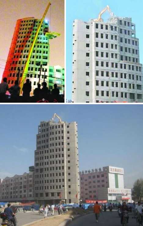 Once in place up on the roof, it’s dig, dig and dig some more… which leads to the next question: where does all the excavated dirt and debris go, especially in a crowded urban environment like that of Datong City in China’s Shanxi province? Either it’s going down the central elevator shaft, or (more likely) dumped over the side.  A word of advice: if you wake up one morning, look out your window and see an excavator of the roof of the neighboring building, be sure to wear your hard hat before walking out your front door. Better yet, call in sick and don’t go out at all lest a rooftop excavator turn you into an ex-person. Want More? Click for Great Related Content on WebUrbanist:  Urban rooftops are often neglected, but some clever homeowners are using them to their full potential: to support extended, unique, sky-high living areas. 11 Comments - Click Here to Read More »»  Gaze at some of the world's most iconic skylines while enjoying a premium ****tail, a tasty canape or a film at these 13 rooftop bars, restaurants and cinemas. 6 Comments - Click Here to Read More »»  Imposing, impressive and often beautiful in their decay, these 12 abandoned towers and vacant complexes are among the tallest in the world. 9 Comments - Click Here to Read More »» مطالب مرتبط با معماری اخرین اخبار و مطالب مرتبط با معماری را از آدرس http://p30city.net/search.php?do=fin...&starteronly=1 مشاهده کنید |
|
#48
|
||||
|
||||
|
معماری The Swings of Things: 15 Daring Swing Set Designs 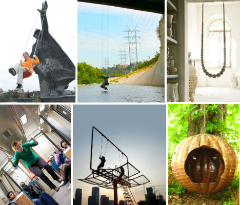 Dangle high up in the sky or from the side of a bridge in swings that have been installed in the most unexpected locations, or enjoy the modern and magical designs of swings that are outside the ordinary. These 15 unusual swing designs range from art installations to awesome products you can purchase for your own home. Sky-High Billboard Swing by Architect Didier Faustino 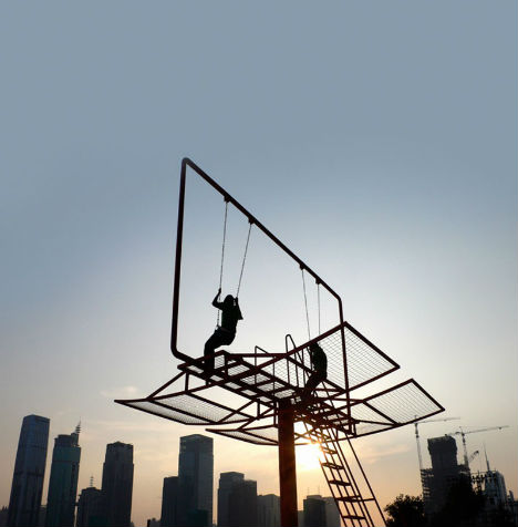 (images via: visual therapy) Who (other than those afraid of heights) would turn down the chance to see the skyline from a billboard-height swing? French-Portuguese architect Didier Faustino converted an advertising billboard into an interactive project for the Shenzhen-Hong Kong Bi-City Biennial of Urbanism and Architecture. Entitled ‘Double Happiness’, the work “responds to the society of materialism where individual desires seem to be prevailing over all. This nomad piece of urban furniture allows the reactivation of different public spaces and enables inhabitants to reappropriate fragments of their city.” Sculptural Swings by Fletcher and Myburgh 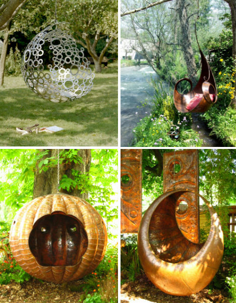 (images via: myburghdesigns) Garden swings don’t get much more magical than this. Artists Fletcher and Myburgh have designed a collection of gorgeous swings made of copper; some have an ornate Art Nouveau look to them while others are strikingly modern. Depending on complexity and weight, the swings run between £2,000 and £19,000. Urban Swing Installation Project by Jeff Waldman  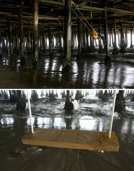 (images via: notcot) Why shouldn’t we enjoy the spaces under piers, beside bridges and beneath industrial remains? Jeff Waldman’s whimsical swing installations reclaim these spaces for the sake of fun, placing swings in unexpected locations. The swings have graced Los Angeles, San Francisco, the Marshall Islands and Panama. Monument Swing by Kamila Szejnochon, Poland 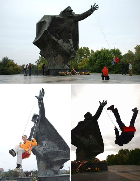 (images via: kamilaszejnoch) The hand of a statue commemorating the Berling Army Soldiers in Warsaw was just begging for an installation like this one. Artist Kamila Szejnochon wanted to “pursue a dialog with memorials that served as community propaganda… to suggest a change in the function of the monuments is an attempt to build a bridge between the present and the past, to add a contemporary layer distinct from their original style and function.” Swings on a Train 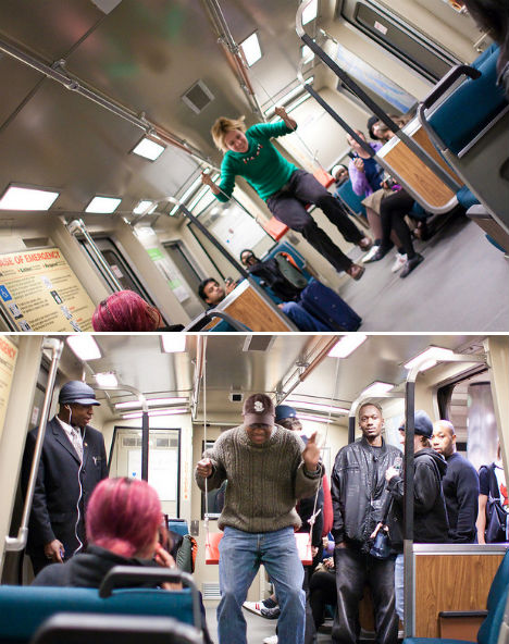 (images via: BART Swings 2009 Flickr) Riding the train got a lot more fun when swings were surreptitiously installed on San Francisco’s BART public transit system. Tied to the handrails, the swings invited riders to play and laugh, and photos were taken to document the event. Swing Necklace by Johanna Richter 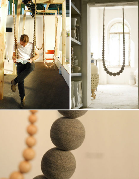 (images via: sleek identity) Just as you adorn your own body with jewelry, you can do the same for your home – but this extra-extra-large necklace serves another purpose, too. Johanna Richter’s Swing Necklace is a handmade swing made of either balls of gray felt or oiled beechwood, and can be hung in doorways or other locations as both decor and entertainment. Floating Swing Sofa by Philippe Nigro 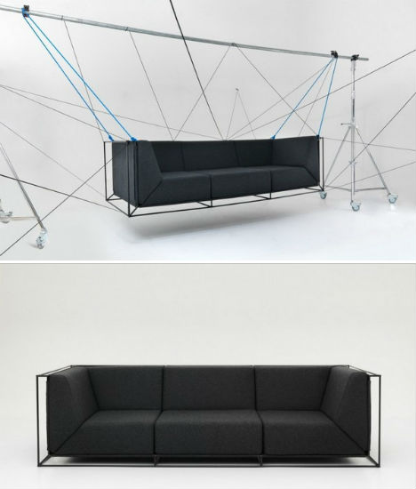 (images via: freshome) Perhaps more of an art piece than a practical piece of furniture, this floating sofa can be suspended from a steel tube from with cables for a spider-web-like effect. It’s hard to say whether the couch actually swings or just hangs from the frame like a hammock; either way, it’s… interesting. Bus Stop Swing 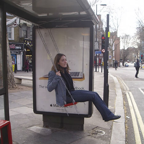 (images via: apartment therapy) Artist Bruno Taylor installed a swing at a bus stop for an industrial design class, taking a video of the various reactions received by bus riders and passersby. “71% of adults used to play on the streets when they were young. 21% of children do so now. Are we designing children and play out of the public realm?” “This project is a study into different ways of bringing play back into public space. It focuses on ways of incorporating incidental play in the public realm by not so much as having separate play equipment that dictates the users but by using existing furniture and architectural elements that indicate playful behaviour for all. It asks us to question the current framework for public space and whether it is sufficient while also giving permission for young people to play in public. Play as you go…” Carefree Dining Swing Set 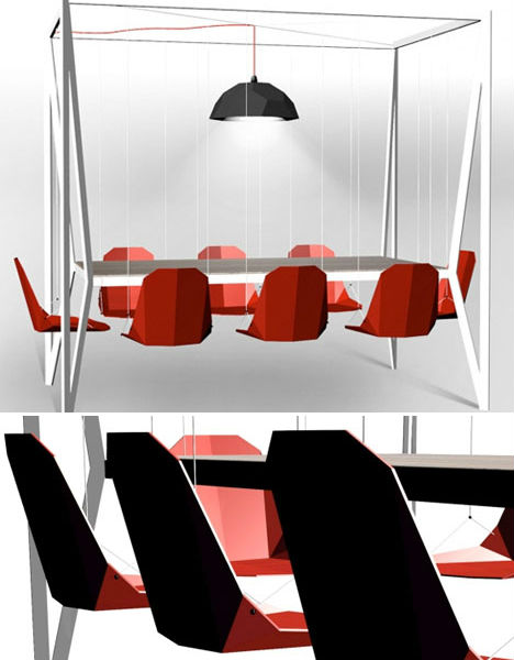 (images via: duffy) Swinging while eating: a good idea, or not? Perhaps it wouldn’t make for ideal digestion, and it could result in quite a mess, but this dining set is definitely an eye-catcher. Designed by Duffy, the dining swing set features a frame that hovers over the table, serving as a support for eight dangling chairs in shades of black, red or white. VisionDivision 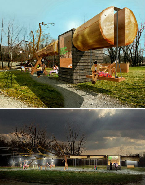 (images via: inhabitat) Design firm Visiondivision created an unusual concession stand and swing set made from a single giant tree for the Indianapolis Museum of Art’s 100 Acres Park. Called Chopstick, the project turns a whole tree on its side, stripping it of its bark and using it as a frame for a concession kiosk, children’s swings and a bench swing for adults. Tempting Swinging Beds 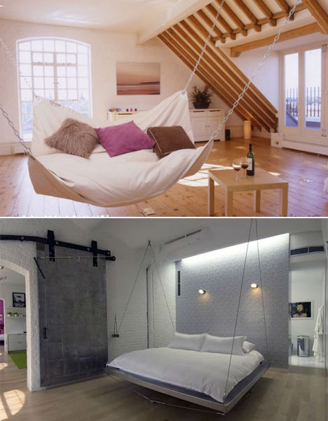 (images via: lebeanock, bernstein architecture) Be warned – if you put a swinging bed in your house, you might just never get out of it. ‘Le Beanock’ is half hammock, half bean bag, and probably one of the most comfortable things you’d ever have the pleasure of experiencing. Bernstein Architecture, meanwhile, offers a whole range of suspended furniture, including beds hanging from cables. Want More? Click for Great Related Content on WebUrbanist:  If you want something comfortable and conventional you might want to look elsewhere. If you are looking for bold and creative furniture designs you are in the right place. 27 Comments - Click Here to Read More »»  The two types of typical outdoor space: the tiny space that’s so cramped it’s nearly unusable, and the surprisingly large space that just begs for designed furniture. 15 Comments - Click Here to Read More »»  The garden, for many of us, is an extension of the home. It’s where we can get back to nature, dig our hands in and locate some of our strangest furnitures and furniture designs. 9 Comments - Click Here to Read More »» مطالب مرتبط با معماری اخرین اخبار و مطالب مرتبط با معماری را از آدرس http://p30city.net/search.php?do=fin...&starteronly=1 مشاهده کنید |
|
#49
|
||||
|
||||
|
معماری Automata: Art Object Powered by 1,000 Gears  At the winding of a handle and the flick of a switch, gears begin to move inside a mysterious faceted wooden object. Then, as the panels are opened to reveal what’s inside, a solitary figure can be seen, hunched inside a spinning circle. This is the work of sculptor Levi van Veluw, demonstrating the strange beauty of Automata.  The Amsterdam-based artist is known for photography, sculpture and installations that explore the human form. In a series called Veneer, the artist created three interior spaces inspired by his childhood bedroom and covered them with over 30,000 wooden blocks, balls and slats. Other projects have seen live human models covered in moss and human hair.  “The images that I make consist of often unlogical combinations of materials, patterns, colours, forms, with my head as the only constant factor,” says van Veluw in his artist statement. “Each element is consciously chosen so as to affect a pre-determined transformation. By playing with the value of the each material and by using them for a purpose that was not originally intended for them, I construct within the image, in a very small way, a different perspective on the world.”  “In most cases it is my head that is the carrier of these transformations and combinations. The expressionless, and almost universal face, allows the viewer to project himself onto the work. Because the works have really existed and have not been digitally manipulated, each image contains a short history of a performance.” Want More? Click for Great Related Content on WebUrbanist:  Subject and medium are perfectly paired in this series of portraits. Famous musicians are recreated in the unraveled tape formerly hidden in cassette cases. 1 Comment - Click Here to Read More »»  Patricia Piccinini is an artist who likes to make people feel uncomfortable. Prepare to enter an intriguing world full of some incredibly realistic artistry. 2 Comments - Click Here to Read More »»  Artist Gwon Osang forms hundreds of photographs around mannequins to create bizarre three-dimensional photo sculptures. 3 Comments - Click Here to Read More »» مطالب مرتبط با معماری اخرین اخبار و مطالب مرتبط با معماری را از آدرس http://p30city.net/search.php?do=fin...&starteronly=1 مشاهده کنید |
|
#50
|
||||
|
||||
|
معماری Glow-in-the-Dark Home Furniture Lights Up Nights  During the day, these 14 furniture and home decor items like lounge chairs, sideboards, bathroom countertops, tiles and wallpaper look fairly ordinary (though beautifully designed). But when the lights go out, they reveal their versatility, lighting up with built-in LED lights or glowing from within. Full Moon Sideboard 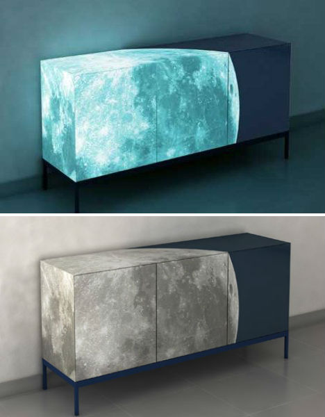 (images via: yanko design) Not only does this gorgeous sideboard feature a stunning digital image of the moon over three-quarters of its surfaces, but it was also treated with glow-in-the-dark paint and ecologically friendly dark blue paint to create a heavenly effect at night. The sideboard was designed by Sotirios Papadopaulos for ENNEZERO and displayed in Milan in 2008. Bright Woods with Embedded Glow-in-the-Dark Stripes 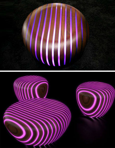 (images via: gruppo avanzini) Rounded wooden furniture that can act as ottomans, stools or coffee tables, ‘Bright Woods‘ from Gruppo Avanzini includes stripes of various types of wood in between glow-in-the-dark resin. LED Light Pots for the Garden 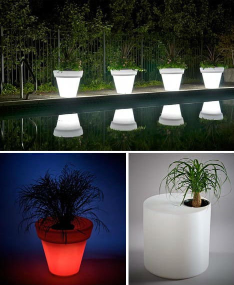 (images via: rotoluxe) Why install extra lighting in your garden when your potted plants could glow? These pot lights from Rotoluxe come in various shapes and sizes including printed varieties, and include lighting elements that shine from within their transparent bodies. Transparent Glowing Bathroom Counters 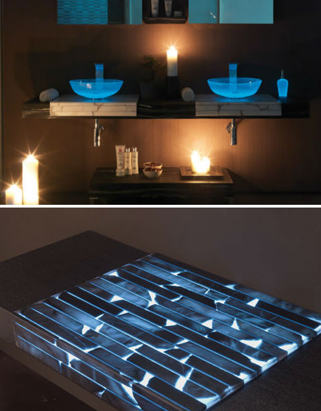 (images via: mastro fiore) The soft illumination given off by these glowing countertops makes night lights in the bathroom a thing of the past. Italian company Masto Fiore hand-crafts these beautiful countertops from natural alabaster stone with integrated illumination. Pair them with translucent glass sink vessels and you’ve got quite a magical effect. Light-Emitting Wallpaper 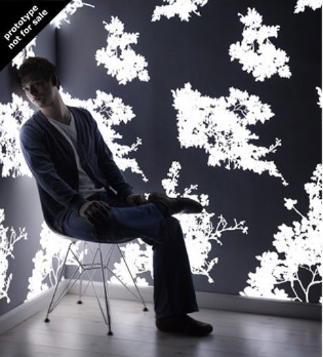 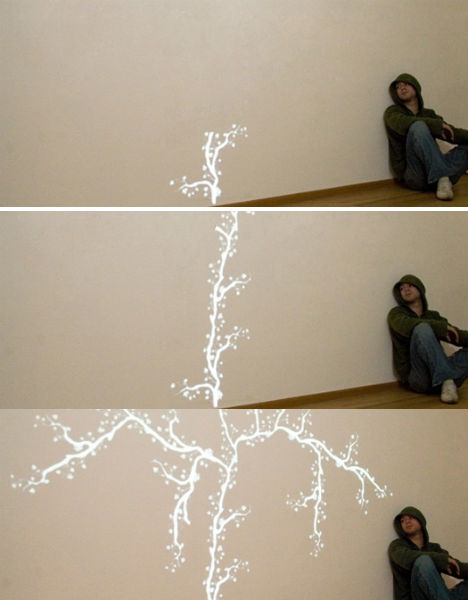 (images via: jonas samson) It’s wallpaper that lights up! Designed by Jonas Samson, this light-emitting wallpaper is unfortunately just a prototype and not for sale, but it’s an intriguing concept. Lounge that Glows at Night 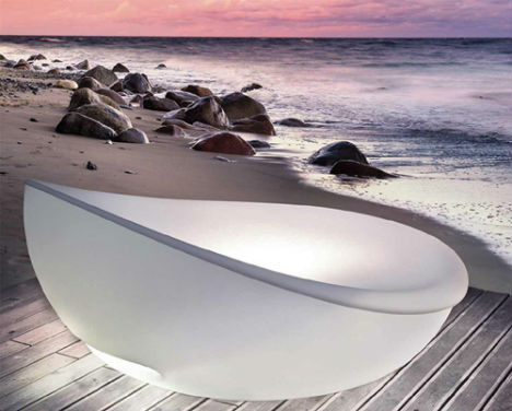 (images via: solpuri) By day, the Lagoon daybed by Solpuri is a comfortable and very chic place to relax, accommodating two and offering a removable shade. By night, the translucent base of the lounger lights up from inside. Glowing Textiles by Kathy Schicker 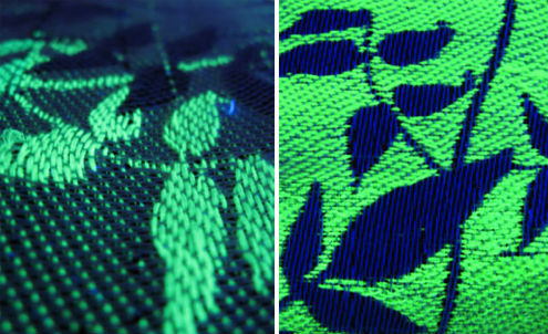 (images via: kathy schicker) Designer Kathy Schicker calls our attention to something we never realized that we needed: glow-in-the-dark textiles. Offering a range of prints, Schicker’s collection looks like ordinary fabric during the day but starts to glow when the lights go out. Light-Up Outdoor Bar 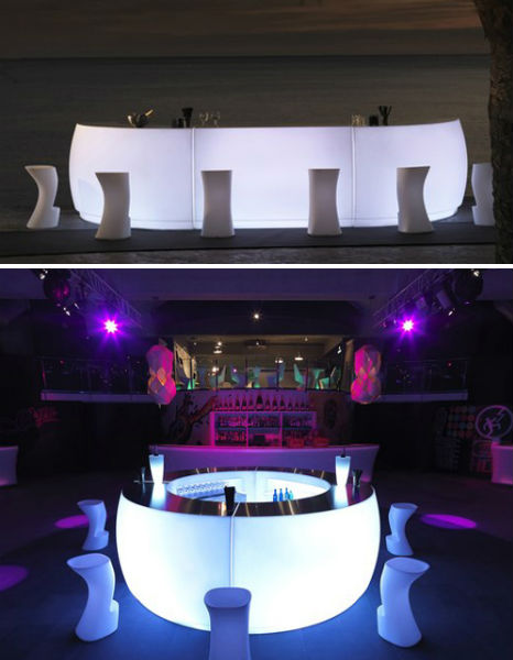 (images via: vondom) Furniture maker Vondom offers up yet another futuristic glow-in-the-dark offering in the form of a lighted outdoor bar. The Fiesta bar comes in curved and straight sections so you can adjust it to the size and shape you want, and is fitted with LED lights in your choice of colors. Gumball Modern Garden Furniture 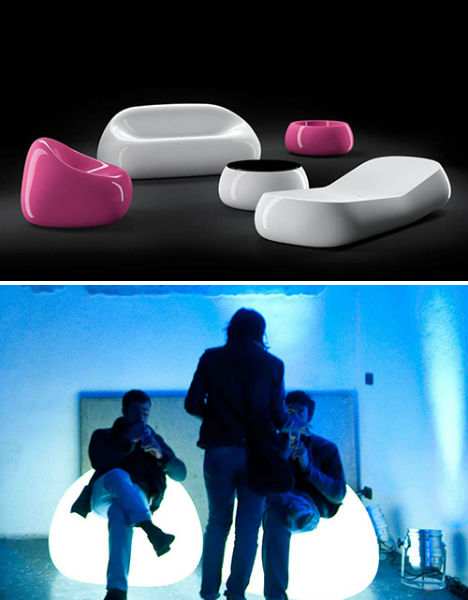 (images via: plust) The unusual rounded shapes of this garden collection by Plust are enough to make it stand out, living up to its name ‘Gumball’ with candy-bright colors. But what sets this collection apart even more is – you guessed it – the capability to glow in the dark. Via Lattea Furniture by Meritalia 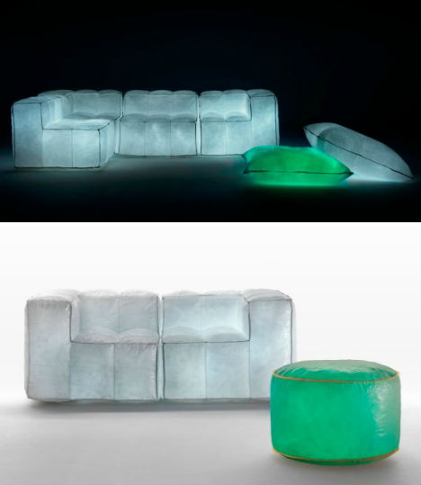 (images via: meritalia) Inhabitat likened this unusual furniture line to ‘ a collection of homemade marshmallows’, and it’s easy to see why. The chairs and couches of the Via Lattea collection, designed by Mario Bellini for Meritalia, are made of steel mesh covered with recycled fiber sacks that were once used to transport grain, stones and sugar. The sacs are filled with air and include LED lights Lucedentro Glowing Tiles  (images via: lucedentro) An Italian company specializing in photoluminescence has produced these incredible glowing tiles, which can be used to create a bathtub as pictured, an artistic mosaic or even to cover entire surfaces like floors and wall tiles. When the lights go out, the photoluminescence materials glow in a range of colors. Ergonomic Lounge Chair Lantern 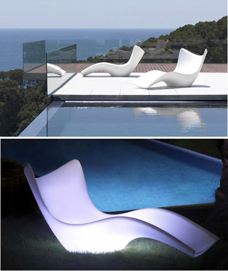 (image via: vondom) Who doesn’t love a good dual-purpose piece of furniture? Vondom offers another modern outdoor lounge chair that is beautiful enough during the day, but turns into a lantern of sorts when the sun sets. The materials used to make it are 100% recyclable, and they can withstand extreme weather conditions, making it a durable and eco-friendly choice. Vondom Pillow Patio Furniture 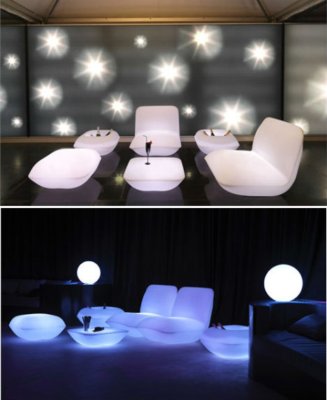 (images via: vondom) Patio furniture doesn’t get much more inviting – in a space-age sort of way – than this. Shaped like comfy pillows, this collection designed by Stefano Giovannoni for Vondom is made of the same material as the lantern/lounge chair and comes in a range of shapes including bucket-like side tables that make perfect coolers. Floating Sphere Lights for Indoors or Out 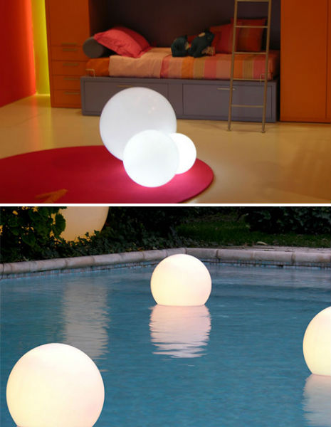 (images via: slide design) Throw them in the pool, toss them on the lawn or just position them through your house. The Aqua Globo by Slide Design looks equally cool indoors and out, providing visual interest and a soft glow. Want More? Click for Great Related Content on WebUrbanist:  These 10 off the wall night lights do more than just banish the darkness for young (and old) sleepers who wouldn't dream of going to bed blindly. 3 Comments - Click Here to Read More »»  These interiors show the many ways black can be incorporated into a home or office, from dramatic matte rooms to bold accent walls. 2 Comments - Click Here to Read More »»  When you think of interesting design in the home, the kitchen typically isn’t the first room that springs to mind. It is the heart of the home and requires core furnitures and great designs. 11 Comments - Click Here to Read More »» مطالب مرتبط با معماری اخرین اخبار و مطالب مرتبط با معماری را از آدرس http://p30city.net/search.php?do=fin...&starteronly=1 مشاهده کنید |
 |
| کاربران در حال دیدن موضوع: 1 نفر (0 عضو و 1 مهمان) | |
|
|
اکنون ساعت 04:39 AM برپایه ساعت جهانی (GMT - گرینویچ) +3.5 می باشد.


 حالت خطی

