
|
|
#61
|
||||
|
||||
|
معماری Good Clean Fun: Interactive Games Tidy Urban Spaces 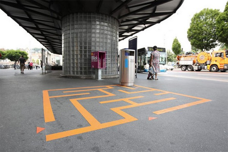 It doesn’t matter where you go in the world: it seems like litter is always an unwelcome part of the scenery. The Swiss city of Lucerne decided to do something about their litter problem by enticing residents and visitors to have fun while throwing their rubbish away. The initiative is called “Lucerne Shines,” and in the many years since it was implemented the city has seen an exceptional response. 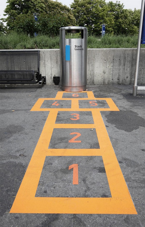 (all images via: Freshome) The project saw 16 public trash bins converted to public game stations. You won’t find any fancy touch-screen games, though – these games are all about cleaning up your mess and leaving the city a little prettier than you found it. From short mazes to free-throw lines to hopscotch, the initiative appeals to everyone who likes to have a little unexpected fun in the middle of an otherwise-ordinary day.  The project is a follow-up to a more general city cleanup initiative. The original effort saw a huge reduction in the amount of waste on city streets, but Lucerne was still spending an astonishing amount of money on litter cleanup every year. The city then had the brilliant idea to use fun as an incentive…and suddenly, the citizens of Lucerne just couldn’t wait to pop their trash into the waiting receptacles. Want More? Click for Great Related Content on WebUrbanist:  A huge inflatable red ball travels around the world, showing up in cities like Toronto and Abu Dhabi, squeezed into entryways and hovering above the street. 2 Comments - Click Here to Read More »»  Have you ever wondered why so much public space seems to go to waste? Even apparently 'natural' green areas are carefully cultivated, requiring time, energy and water. 68 Comments - Click Here to Read More »»  Performance art at its best is when the performers, their environment and the audience all interact. This amazing urban dance project accomplishes that and more. 7 Comments - Click Here to Read More »» مطالب مرتبط با معماری اخرین اخبار و مطالب مرتبط با معماری را از آدرس http://p30city.net/search.php?do=fin...&starteronly=1 مشاهده کنید |
| جای تبلیغات شما اینجا خالیست با ما تماس بگیرید | |
|
|
|
|
#62
|
||||
|
||||
|
معماری Sea Food: 14 Floating Restaurants Around the World 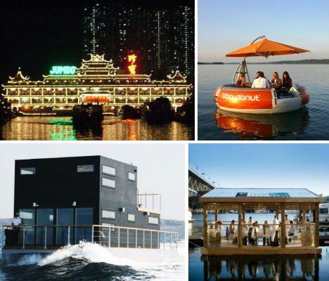 From massive illuminated Chinese restaurants to cute little BBQ tables for ten, these 14 floating restaurants make smart use of available space and turn the dining experience into something of an adventure on the sea. Jumbo Floating Restaurant, Hong Kong 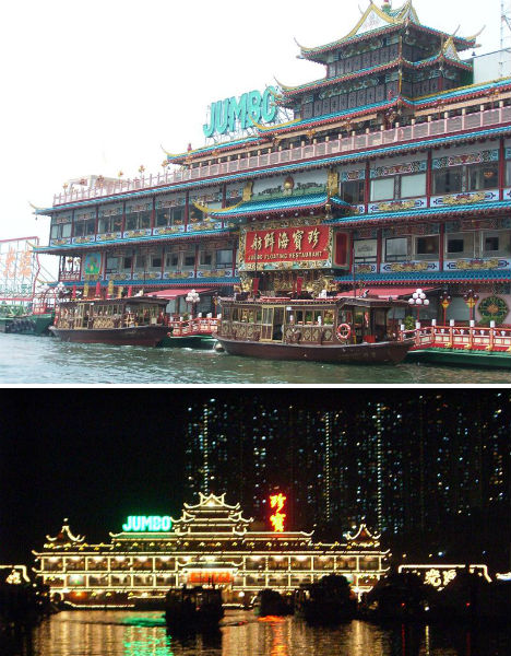 (images via: wikimedia commons) One of Hong Kong’s biggest attractions, the Jumbo Kingdom Floating Restaurant sites within the city’s Aberdeen Harbour and has hosted the likes of Queen Elizabeth II and John Wayne. Though it began as a relatively humble floating restaurant in the ’70s, a 2003 renovation basically turned it into a theme park with sightseeing, shopping and cultural attractions. BBQ Donut’s Floating Restaurant Tables, Germany  (images via: bbq-donut.de) Germany’s BBQ Donut restaurant is definitely one-of-a-kind. First of all, its floating tables, which have seating for ten, make smart use of water space and are quite a novelty draw. At the center of each of these tables is a BBQ that turns into a picnic table. Each floating pod has its own built-in sound system and even silent electric propulsion so it can cruise around. The Salt & Sill Restaurant & Hotel, Sweden 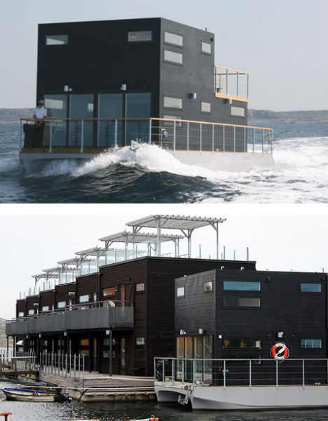 (images via: salt to sill) The Salt & Sill is a minimalist 23-room barge that also serves as a top-notch seafood restaurant specializing in herring and fresh local produce. All 23 rooms have their own outdoor seating areas, but the hotel’s sole suite has an extra-enticing benefit: a private roof-top jacuzzi. The hotel’s location on the lake, by the way, is not a gimmick: the adjacent land simply didn’t have any room. Sea Palace, Amsterdam 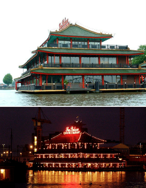 (images via: jylcat, hotel belga) The ornate Sea Palace is Europe’s first floating Chinese restaurant, and is located near Central Station in Amsterdam. Its pagoda-style exterior is definitely not a sight you would expect to see in Amsterdam, but floating Chinese restaurants like Sea Palace are actually not uncommon in Europe. Nusa Penida Island Floating Restaurant, Indonesia  (images via: nusaisland.wordpress.com) Just off the small island of Nusa Penida, which is itself located near Indonesia’s Bali Island, is this cool-looking floating restaurant. The massive pontoon restaurant can be found just off Toya Pakeh beach. Restaurants of Cat Ba Bay, Vietnam  (images via: phil_marion) Vietnam’s Cat Ba Bay is home to several floating restaurants, which make for an interesting sight as they bob in the water alongside floating homes and fishing boats. Most of them are, of course, seafood restaurants. Veli Lake Floating Restaurant, Trivandrum 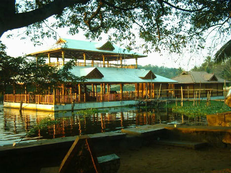 (images via: skyscraper city) This pretty floating restaurant can be found in Veli Lake in Trivandrum, India. The restaurant is connected to the mainland by a floating bridge. Rustar Dhow Floating Restaurant, Dubai 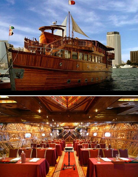 (images via: rustardowboat.com) Rustar Dhow is the world’s largest floating restaurant that actually cruises around instead of just staying in one place. It’s located in – of course – Dubai, where everything is bigger and more ornate than it is everywhere else in the world. The Rustar Dhow can carry up to 400 passengers at a time. William Thornton Floating Bar & Restaurant, Norman Island  (images via: gogobot) Anchored out in the water off Norman Island in the British Virgin Islands, ‘The Willy T’ is only accessible by boat. This floating bar and restaurant is known locally as one of the wildest ‘party barges’ in the area. It’s been in operation since 1985 and offers both lunch and dinner. Petit Verdot at the Riviera on Vaal, South Africa 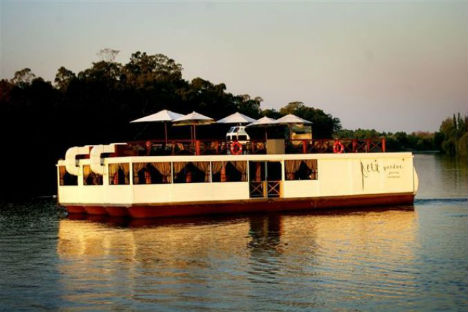 (images via: safari now) The Petit Vardo floating restaurant is located adjacent to the Riviera on Vaal Hotel, which is in the Vaal River about 45 minutes from Johannesburg in South Africa. The barge is topped with an exposed dining deck, and the whole thing is illuminated at night like a giant floating lantern. India’s Kettuvallam  (images via: noo) In the Indian state of Kerala, beautiful houseboats with thatched roofs are a common sight floating on the water. Many of these luxury houseboats are open to tourists, who can come onboard and relax while enjoying a freshly cooked meal from the boat’s kitchen. Tattershall Castle, London  (images via: wikimedia commons) Moored in the River Thames in London, the PS Tatterhsall Castle is a former passenger and goods ferry built in 1934. During World War II, it was the first civil vessel to carry radar, but by 1973 the ship had run its course and was retired from service. Since 1981, it has been a popular bar and restaurant. The Plastic Dining Room, Vancouver 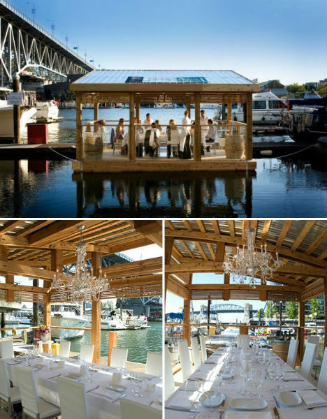 (images via: inhabitat) This lovely little floating dining room made by the School of Fish Foundation is held aloft by 1,672 plastic bottles. Made of reclaimed pinewood, the dining room serves an elegant six-course sustainable seafood menu catered by C Restaurant. Cincinnati’s Waterfront, the Restaurant That Floated Away  (images via: eater) Have you been wondering this whole time whether the docked floating restaurants ever escape from their moorings? It has, in fact, happened. Waterfront, a floating restaurant near Cincinnati, broke free in March of 2011 with 83 diners on board. The diners had to be rescued using “a makeshift gangplank of ladders and ropes” while the restaurant was saved from floating too far downriver by tugboats. Unfortunately, the accident caused a lot of damage and the restaurant has not been re-opened. Want More? Click for Great Related Content on WebUrbanist:  These mobile and temporary pop-up restaurants, cafes and bars won't stay in your area long enough for you to get bored with them, so enjoy them while you can. 4 Comments - Click Here to Read More »»  This collection spans the extremes of design and brute-force ingenuity: from the obscenely luxurious to the absurdly simple. 59 Comments - Click Here to Read More »»  From the United States to the United Arab Emirates, from Sweden to the South Pacific, here are six hotels that are perfectly designed for the nautically inclined. 26 Comments - Click Here to Read More »» مطالب مرتبط با معماری اخرین اخبار و مطالب مرتبط با معماری را از آدرس http://p30city.net/search.php?do=fin...&starteronly=1 مشاهده کنید |
|
#63
|
||||
|
||||
ویرایش توسط مهدی : 02-06-2012 در ساعت 12:07 AM |
|
#64
|
||||
|
||||
|
معماری 18 Award-Winning Tree Houses, Hotels & Schools 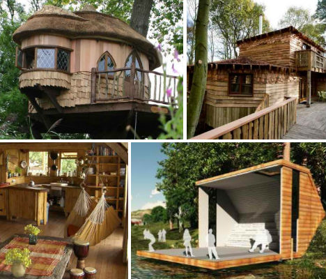 Luxurious and eco-friendly, Blue Forest‘s imaginative and playful tree houses, lodges and educational facilities seem to be designed to bring out every adult’s wide-eyed inner child. Blue Forest has designed many incredible structures that celebrate the warmth, coziness and sustainability of wood, honoring the material itself and of course, its source. Check out these 18 eye-catching, envy-inducing buildings made by the UK-based company. Amberley Castle   Blue Forest’s best-known treehouse is located on the grounds of the Amberley Castle Country Hotel in Scotland. It’s used as a recreational getaway space for hotel guests, and also as a multi-purpose venue for corporate entertainment, meals, weddings and private parties. RotatED School Concept  This intriguing concept design is a prefabricated, hand-crafted eco classroom that can be set onto a foundation on any of its six sides for a multitude of purposes including gallery space, nature observation and educational lectures. Tongole Wilderness Lodge  Located on the Nkhotakota Wildlife Reserve in Malawi, the Tongole Wilderness Lodge overlooks a river in one of the country’s last ‘truly unspoiled’ wildlife areas. Offered as an eco-friendly place to stay in the region, the open-air lodge was built from local materials including clay, rock, wood and thatch. Eco Perch  From its diminutive-looking exterior, you would never guess that this Eco Perch vacation rental can sleep four people. Inside are a full-sized bed, bunks for children, a kitchen with a dining area and a full bathroom with shower. Based on Blue Forest’s treehouses, the unit is elevated from the ground. It can be delivered, assembled and ready for decoration with five days. Cleveley Mere Tree House Hotel  This may just be one of the most luxurious treehouse vacation rentals in the UK. The contemporary lakeside treehouse for getaway spot Cleveley Mere can sleep up to six, with two bedrooms, a sun deck, floor-to-ceiling windows and a rope bridge. Treehouse Study Center  One of Blue Forest’s educational facilities, the Treehouse Study Center teaches children about nature and the woods in the center of New Forest National Park in Hampshire. It includes two treehouse classrooms, ground-based buildings containing other facilities, canopy walkways, a rope bridge, solar-powered lighting, a water catchment system and biomass energy. Tarifa Eco Lodge  The organic shape and natural materials of the Tarifa Eco Lodge make it ideal for a nature-oriented getaway. Located in the hills of Andalucia on the Spanish Costa de la Luz, the Tarifa Ecolodge overlooks the Straits of Gibraltar, with views of Africa. It gets its power and hot water from solar panels and has its own water catchment and purification system. Treetop Holiday  The round Treetop Holiday tree house of Sus***, near the spa town of Royal Tunbridge Wells, is an eco-lodge in the countryside with views of farmland. To access it, you must cross a nearly 80-foot-long rope bridge over a scenic pond. Longridge Training Center  Charming in its organic simplicity, the Longridge Training Center offers water sports and land-based activities for young people. Blue Forest gave this building, which includes kitchens, meeting rooms, a training hall and more, a full range of eco-friendly features like rainwater harvesting, a heat loss recovery system and lots of sustainably sourced wood. Feltonfleet Treehouse School  Off-kilter windows give this cute treehouse school in Cobham lots of cheer and personality, adding to the uniqueness of the space. The Feltonfleet Preparatory School added the treehouse as a sustainable way for the school to extend its teaching space. Center Parcs Treehouses  A stunning juxtaposition of rustic and contemporary style, these treehouses for the Center Parcs Sherwood Forest each have four double bedrooms with en-suite bathrooms, open living spaces, kitchens and secondary treehouse ‘entertainment pods’ with home theaters and pool tables. As with all of Blue Forest’s projects, the treehouses are eco-friendly, with lake-source heat pumps, low-energy lighting and grey water recycling. Enchanted Forest  Built along a small river in the Hertordshire countryside, Enchanted Forest is a two-story fantasy play structure for kids. It features a large main room and open turret with a ladder leading up through a ‘secret’ trap door to a hideaway upstairs, and even has a wood-burning stove. Adventure Playground  This sprawling treehouse has a main ‘tower’ and several different decks that form a sprawling fantasy play area for kids, incorporating a central trampoline, swings and slides. Woodland Haven  Quirky and fun, Woodland Haven was built around a central tree as an outdoor play area for children and includes a secret trap door, cargo net, fireman’s pole, monkey bars, swings, a slide and even a basket and pulley to lift items up to the treehouse. A swing bridge attaches it to a deck across the yard. Fairfield Eco Classroom  Looking like nothing more than a stack of logs, this structure is actually a small and efficient pre-fabricated classroom. The Fairfield Eco-Classroom is raised nearly 7 feet from the ground and covered in a log facade, which was even applied to the window shutters to complete the illusion when they’re closed. Treetops  Built about 14 feet off the ground at the edge of a forest in Cumbria, Northwest England, the fittingly named ‘Treetops’ is a rustic treehouse with a secondary drinks deck for adults, connected with a swinging rope bridge. Benenden School  Ringed in copper, this round school building is made of sustainably harvested timber and constructed to blend into its woodland environment. The Benenden School eco classroom is the first building in the UK to process harvested rainwater from its sedum roof into hot and cold drinking water using only solar power. Rainforest Encounter – Eden Project  Blue Forest has designed a nearly 500-foot canopy walkway for rainforest education resource The Eden Project in Cornwall. ‘Rainforest Encounter’ will be built within the Rainforest Biome at the center, taking visitors on a journey through the treetops nearly 40 feet above the ground. Want More? Click for Great Related Content on WebUrbanist:  Tree houses aren't just for kids anymore. Here are 15 of the coolest tree houses in the world, from a 6,000 sq ft tree house to a suspended 'nest' tree house. 32 Comments - Click Here to Read More »»  Architect Steven Holl designs forward-thinking, sustainable structures that are carefully tailored to their surroundings. 3 Comments - Click Here to Read More »»  After seeing the success of other shipping container construction projects, schools and hotels are getting in on the money- and time-saving cargotecture method. 1 Comment - Click Here to Read More »» مطالب مرتبط با معماری اخرین اخبار و مطالب مرتبط با معماری را از آدرس http://p30city.net/search.php?do=fin...&starteronly=1 مشاهده کنید |
|
#65
|
||||
|
||||
|
معماری Lifebook: Single Device that Combines Every Gadget  One of the marks of our modern culture is the proliferation of gadgets most of us carry around. From digital cameras to cell phones to tablet computers to laptops to MP3 players, we have our hands full just trying to keep track of all of them. This excellent concept could go a long way toward streamlining our technology while still keeping us as connected as always.  (all images via: YankoDesign) One of the problems with having too many different pieces of technology is the fact that hardware and functions are often repeated between the devices. Your digital camera and cellular phone both take pictures; your tablet and MP3 player both play videos; your phone and laptop both store your data. The Lifebook concept could solve several of our modern first-world gadget problems.  According to designer Prashant Chandra, combining all of our gadgets would make life simpler and allow all of our technology to share resources. Rather than having the same bits of data stored on multiple devices, Lifebook would let each device form part of an overall super-gadget. It’s sort of like Voltron – but instead of being composed of vehicles, it’s made up of a tablet, a camera, a phone/music player and a laptop.  The laptop serves as the base for all of the devices. There is no physical keyboard; rather, a touch keypad appears whenever the tablet is plugged into the laptop base. The phone/music player is fully integrated into the laptop as well, and all of the devices share memory and data as soon as they are plugged in.  In addition to streamlining the process of storing and transferring data between devices, the Lifebook concept would allow users to charge all of their devices in one place without that huge, ugly tangle of cords we all hate. Although the Lifebook is still in the concept stage at the moment, it is not hard to imagine it becoming an indispensable piece of technology in the foreseeable future. Want More? Click for Great Related Content on WebUrbanist:  From cybernetic contact lenses to contraptions that shoot you up to rooftops in seconds, these 15 futuristic gadgets would make even Batman jealous. 3 Comments - Click Here to Read More »»  Retro gadgets are turned into meticulously arranged art in Todd McLellan's series of deconstructed devices. 2 Comments - Click Here to Read More »»  The blind can now navigate, read, create art and solve puzzles much more easily with incredible gadgets and technology using sound, vibrations and texture. 5 Comments - Click Here to Read More »» مطالب مرتبط با معماری اخرین اخبار و مطالب مرتبط با معماری را از آدرس http://p30city.net/search.php?do=fin...&starteronly=1 مشاهده کنید |
|
#66
|
||||
|
||||
|
معماری Wild Child? Chaotic Museum Art Created by Kids  It’s a parent’s nightmare: a stark, modern living space so clean it practically sparkles that, after the intervention of 1,000 children, ends up looks like the world’s largest finger painting. This awesome installation by artist Yayoi Kusama at the Queensland Gallery of Modern Art in Brisbane, Australia let kids go wild with stickers over a period of two weeks, resulting in brightly colored chaos.   Kusama painted every surface in the room white, down to the smallest accessories, until the room was so bright it was practically blinding. The room was then offered up to kids as a massive canvas for tens of thousands of round colored stickers.   Entitled ‘The Obliteration Room‘, the project will be up as part of Kusama’s exhibit Look Now, See Forever until March 12th. See more jaw-dropping art installations like this at This Is Colossal. Want More? Click for Great Related Content on WebUrbanist:  While much of it can be boring, some designers are putting the fun back into kids’ furnitures. These pieces are a delight not only for kids, but for their hip parents, too. 13 Comments - Click Here to Read More »»  Someday, a few of these wild and wacky hotel designs may become reality - likely in Dubai - but most of these futuristic hotel concepts will remain fantasies. 4 Comments - Click Here to Read More »»  Flooring doesn't have to be boring, as illustrated by these 15 strange and innovative designs including intelligent carpeting and wood puzzle pieces. 14 Comments - Click Here to Read More »» مطالب مرتبط با معماری اخرین اخبار و مطالب مرتبط با معماری را از آدرس http://p30city.net/search.php?do=fin...&starteronly=1 مشاهده کنید |
|
#67
|
||||
|
||||
|
معماری Refuge of Refuse: The Trashiest City on Earth  Most of us view trash as something that should remain unseen, whisked away in the most sanitary manner possible so that we don’t have to think about it too much. But outside Cairo is an entire city brimming with it. It towers into the air. It’s stacked on sidewalks and rooftops. But it’s not just a dumping ground: it’s an active, bustling city.  Garbage City, as it’s known, has long been the ultimate destination of all of Cairo’s trash. Here, a community of people called the Zabbaleen view trash as a way of life. As depicted in the documentary Garbage Dreams, the Zabbaleen scratch out a living by carting away the trash from Cairo’s streets and then sorting through it, recycling 80% of it and feeding the remaining organic matter to pigs, which provided meat and fertilizer. But as Cairo’s population grows, so does the trash – and since authorities removed the pigs in 2009 due to swine flu, the trash is getting harder to manage.  Egyptian officials have made attempts to modernize the nation’s trash collection system, but the private companies they contract are unable to deal with the constant flow in the highly efficient manner of the Zabbaleen. As the Zabbaleen speak out to raise awareness of their plight, collecting funds to purchase lands for recycling schools, others – like Mekano Architects – imagine solutions that could work for all involved.  Mekano Architects envisions a way to recycle the trash into a vertical city called Seeds of Life, a skyscraper consisting of towering ‘wind stalks’ that support stacked modular homes. The organic garbage would be used to harvest biogas, and other waste could be turned into building materials. The tubes that support the structures would actually collect wind energy, and also distribute water and electricity throughout the development. Want More? Click for Great Related Content on WebUrbanist:
مطالب مرتبط با معماری اخرین اخبار و مطالب مرتبط با معماری را از آدرس http://p30city.net/search.php?do=fin...&starteronly=1 مشاهده کنید ویرایش توسط مهدی : 02-15-2012 در ساعت 04:14 PM |
|
#68
|
||||
|
||||
|
معماری Zen-Like Artist Creates Intricate Pencil Tip Carvings 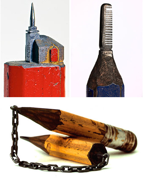 Our world has become so fast-paced these days. Most of the daily activities we used to engage in now have shortened versions, abbreviations of their former selves that save us time but disconnect us from the actual activities. One artist is getting back to a slower type of life by engaging in one of the most painstaking, slowest types of art he could find: miniature pencil carvings. 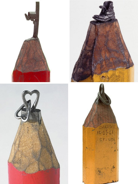 (images via: The Modern Artist) Dalton Ghetti is a carpenter by trade, but he has loved carving since he was a small child. He began with tree bark and experimented with plenty of materials before finally settling on pencils. The graphite is easy to work with since it has no grain, but it allows for a large measure of interest for the artist due to its small size and delicate nature.  (images via: The Modern Artist) Ghetti’s intricate carvings can take him weeks, months or even years to complete. But the artist is not worried about how many moments of his life that he spends sharpening pencils. These moments are almost like meditation for the man who takes life a little more slowly than the rest of us. 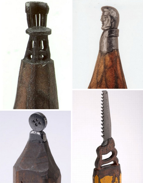 (images via: The Modern Artist) The tiny and detailed carvings are created without the benefit of a magnifying glass. Ghetti uses sewing needles, razor blades and No. 2 or carpenter’s pencils to slowly carve out intricate shapes and scenes. 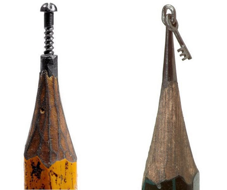 (images via: The Modern Artist) Originally from Brazil but now residing in Connecticut, Dalton Ghetti uses his training as an architect and carpenter to inform his artistic process. While he does sometimes slip up and break a pencil, even these “failures” are beautiful to look at. 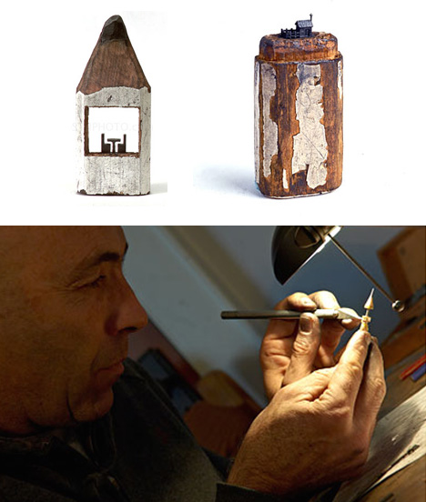 (images via: Dalton M. Ghetti) Although there is plenty of interest in Ghetti’s carvings, he does not sell his pencil art. Fans do have a chance to own a bit of his work as he sells posters and postcards of his completed pieces, but don’t expect him to autograph your poster with the pen you have in your pocket; he is so dedicated to his material that he insists on signing his name in pencil. Want More? Click for Great Related Content on WebUrbanist:  Artist Franc Grom spends months poking thousands and thousands of carefully controlled holes into a single eggshell, producing incredibly intricate works of art. 7 Comments - Click Here to Read More »»  Cutting, scoring, folding and gluing, these 14 masters of paper art transform their delicate medium into collages, sculptures, illustrations and installations. 4 Comments - Click Here to Read More »»  The Signtologist's niche in the art world is one of those "so simple I wish I had thought of it" ideas - he paints portraits on street signs. 8 Comments - Click Here to Read More »» مطالب مرتبط با معماری اخرین اخبار و مطالب مرتبط با معماری را از آدرس http://p30city.net/search.php?do=fin...&starteronly=1 مشاهده کنید |
|
#69
|
||||
|
||||
ویرایش توسط مهدی : 02-17-2012 در ساعت 11:21 AM دلیل: حذف لینک - ویرایش |
|
#70
|
||||
|
||||
|
معماری Pretty Pointy: 15 Cool Concept Toothpick Holders  You can pick your friends and you can pick your teeth, but you can’t pick your friends’ teeth… until now, thanks coinci-dentally to 15 cool concept toothpick holders sweet enough to make anyone smile! Designed to display your wee wooden weapons to best advantage, these wholesome (mainly) holders add a dash of designer chic to any kitchen, bar, cafe or chicken wing restaurant. Caatinga/Cactooph Cactus Toothpick Holder  A toothpick holder that looks like a cactus is almost too obvious yet somehow nobody thought of this before – not counting ancient desert tribes who no doubt employed actual cactus spines around the pueblo firepit after roasting, serving and dining on Gila Monster… they can be sorta tough, y’know? The spiny splinter server above goes under the retail name “Cactooph”, which is a might too cutesy for our ears but then, toothpicks shouldn’t be used in one’s ears anyway.  A similar, yellower variation on the Cactooph is the Caatinga Toothpick Holder, conceived by Brazilian designer Naissa Zeh and named after the Caatinga eco-region in Brazil’s arid northeast. It’s manufactured from waste pine scraps sourced from furniture factories and the paints & varnishes are water-based and environmentally friendly – it may be yellow but it’s also green, is what we mean. Dom-Dom Condom Toothpick Tube  The Dom-Dom Toothpick Tube from OOU! brings together two things that were made for each other: condoms and sharp pointed objects… wait, what? According to the fine print on the product page, this cheeky toothpick holder was made in mainland China, the world’s most populous country. No connection, of course.  The Dom-Dom Toothpick Tube is made from non-toxic, food grade plastic, which is nice. It also, again according to the company website, features “Lifelike modelling Inner Tibet unexpected tallies extremely the functionality, does smiles does not forget practical. The color change has increased taste bud’s fantasy.” Sounds good, put us down for a dozen! Pick Pocket Toothpick Holder  The Pick Pocket Toothpick Holder from Chetan Sorab of Epicenter Design encourages users to pick your pocket to “steal your pick”, though it seems all parties concerned will end up disappointed by that particular action. Even so, the concept has a certain appeal: a pocket for your toothpicks that you can keep in your pocket. Sure beats poking holes in your pants (or possibly worse) every time you pocket a pick.  Peter Piper picked a peck of pickled peppers, but when Peter Piper polished off the peppers and probed his pocket to pick up a pick, his pre-poked pockets proved pick-less! Now thanks to the Pick Pocket Toothpick Holder, Peter Piper’s picks in his pockets remain fixed, so picking specks of pickled peppers is a quick & simple trick. Voodoo Doll Toothpick Holder  Off to do that voodoo that you do so well? If you’re doing it over lunch or dinner, be sure to bring along your Voodoo Doll Toothpick Holder. Not only will you have something handy to excise that piece of chive clinging so obviously to your right bicuspid, you can enjoy the anxious squirming of your dining partner as you casually toy with the toothpicks and make him or her an offer they can’t refuse.  The Voodoo Doll Toothpick Holder comes in your choice of colors, allowing to you freak out those of most any race or creed. Especially Creed, that guy’s just too creepy to share an office with. Toothpickup Toothpick Holder  The 4.5” long by 2” wide Toothpickup Toothpick Holder takes the concept of “pickup sticks” to the next level. Designed to ape the appearance of a classic early Fifties pickup truck, this white porcelain wonder actually rolls on its 4 rubber tires allowing for special deliveries to all points of the dinner table. Molar Toothpick Holder  Flippin’ toothpicks, how do they work? With the Molar Toothpick Holder, one look is all even a junior juggalo needs to put 2 and 2 together. Can’t handle the tooth? No need to try, the Molar Toothpick Holder has got the chops to handle YOU!  The 4” by 4” by 4” Molar Toothpick Holder is surely a dentists dream. Designed by Chaiyut Plypetch of Panik-Design, the oversized chomper is made from translucent silicon rubber in your choice of white, amber or ice blue (but really, white just seems right). It can hold up to 40 toothpicks in its central cavity. Uh oh, did we say “cavity”? Pick-Ur-Pine Toothpick Holder  When Rafael Morgan set out to design a stylish and practical toothpick holder, he likely did so with fire in his eye and a steely determination to change the way people looked at toothpick holders. We can definitely state he succeeded on all accounts, which is why dubbing this animalistic toothpick-holding concept the “Pick-Ur-Pine” seems somewhat of a letdown.  Not to take anything away from the clean look and undeniable class of this holder, but the name Pick-Ur-Pine, well, just seems to take away from the clean look and undeniable class of this holder. Woody Allen once described a character who, upon reading the word “Lobstermato” (a tomato stuffed with lobster) on a restaurant menu, “wished he could scratch the face of the man who conceived it.” Lord only knows what would have occurred had a Pick-Ur-Pine been on the table. Mohawk Toothpick Holder  The Mohawk Toothpick Holder comes to us by way of Bangalore, India… not the Indians you were thinking of, hmm? Credit Pankaj Upadhyay with this punked-out design, and be sure to look for it next time you make reservations (ahem) for dinner, maybe at that New Delhi downtown. Shark Tooth Tooth Pick Holder  Looks like our old pal Chetan Sorab is no one trick pony… more like a two trick Great White Shark! And this latest toothpick holder is a treat indeed: the Shark Tooth Tooth Pick Holder! Sorab, who works at Epicenter Design, needed no help from the Department of Redundancy Department when he brought the Shark Tooth Tooth Pick Holder from concept to conference table. That’s his story and he’s sticking to it.  The Shark Tooth Tooth Pick Holder doesn’t just sit there like most garden (or ocean) variety toothpick holders. The holder features two-part construction with the top swiveling 180 degrees to cover the toothpicks when they’re not required. Good thinking, Chetan, nobody wants to stick a dusty toothpick in their, er, Jaws. Hocus Poke Us Death-Defying Toothpick Holder  The Hocus Poke Us (groan) Death-Defying Toothpick Holder represents not only the next generation of toothpick holders, it goes one better by improving on the humble toothpick itself. We guess it had to… poking ordinary wooden toothpicks into a miniature replica magician’s body box can’t hold a candle to doing the same thing with tiny little swords!  The twists just keep on coming with the Hocus Poke Us Death-Defying Toothpick Holder: the toothpicks are plastic but the holder is wood! The lovely lady immobilized within the box can’t comment, unfortunately, as she’s involved in a high-stakes game of poke her. Screamer Gene Wooden Toothpick Holder  There’s not much we can say about the Screamer Gene Wooden Toothpick Holder because, well, there’s not much to be said, really. Roughly carved from wood and painted in bright, primary colors, ol’ Screamer Gene is a throwback to rougher, more primal times when men were men and women were wishing the toothpick holders weren’t quite so scary looking.  The Etsy seller who displayed the Screamer Gene Wooden Toothpick Holder at their website didn’t show it stuffed with toothpicks, which is kind of odd because it’s assumed that’s the cornerstone of its frontier saloon existence. Then again, doesn’t it look eerie enough without looking like an unfortunate victim of multiple sword-swallowing syndrome? Smiling Animal Party Pickers  When you need a toothpick really REALLY badly, you’ll do just about anything to get one – including pulling a splendid splinter right out of some non-human critters crazily grinning mouth. Wonder of wonders, you can now do this without any desperation whatsover.  You supply the picks, they’ll provide the goofy perforated grin within which you get to stick ‘em now, remove for use later. Choose from shark, pig, dachshund, cat, hippo and frog… yes, we know frogs don’t have teeth but if you want to use the real thing, good luck and mind the warts. Personalized Silver-Plated Toothpick Holder  Snooty is as snooty does, and the Personalized Silver-Plated Toothpick Holder from Harriet Carter is about as snooty (snotty?) as it gets. According to the copy at the product page, the “Order of the 3 initials should be: First, Middle, Last.” Geez Louise, er, Harriet, you’d think someone smart enough to reach the stratospheric level of professional achievement needed to own a personalized silver-plated toothpick holder would know the proper order of their initials. This is REALLY gonna confuse Ignace I Ibercrombie the III. Alessi Officina Toothpick Holder  This timeless (OK, it was designed in 1991 by Andrea Branzi) toothpick holder simply exudes class… and also toothpicks. Crafted with care from polished steel and aged varnished pear-wood, this rather large (it’s 6” tall) toothpick holder takes pride of place on any majestic dining table.  Reminiscent of those old-time coin banks that had cats, dogs, monkeys or whatever grabbing your penny, the Alessi Officina Toothpick Holder features a graceful ballerina who daintily grasps one toothpick at a time, thus keeping the stored toothpicks “hygienically untouched by human hands”. Of course, you still have to grab the toothpick with your own mangy mitts in order to actually use it. Eww. Tiki Toothpick Holder  Last but not least, a little toothpick holder history. Once a staple of late 1950s Polynesian restaurants and bars, Tiki Toothpick Holders have seemingly scattered to the four winds, ending up on knickknack shelves at flea markets and secondhand stores. The few survivors harken back to a time when “Made In Japan” meant what “Made In China” means today.  Tiki Toothpick Holders were once sold in supermarkets and came pre-filled with toothpicks. Time passed and the cool sculpted ceramic holders morphed from kooky tiki faces to bland rum barrels to light, thin, plastic holders completely devoid of class and character. Turn one upside down… can you guess what it says?   Well, hopefully this rundown gave you plenty of food of thought and a number of design ideas to chew on. Of course, you’ve come to the right place if all that chewing has left you up the proverbial creek without a toothbrush. We know the next best thing! Want More? Click for Great Related Content on WebUrbanist:  The ash heap of tech history is littered with flubs, flops and FUBAR fiascos designed to fly high but destined to fail. Every so often, though, a diamond emerges from the dung heap and everything changes. Here are 15 of the coolest, craziest computer concepts you'll see today! 12 Comments - Click Here to Read More »»  Any artist knows, a new material can mean new aesthetic possibilities and unique material-dependent expressions. 10 Comments - Click Here to Read More »»  These 10 creative power strip concepts pick up where bland & boring store-bought outlet bars leave off, adding a cooler buzz to increasingly plugged-in lives. 3 Comments - Click Here to Read More »» مطالب مرتبط با معماری اخرین اخبار و مطالب مرتبط با معماری را از آدرس http://p30city.net/search.php?do=fin...&starteronly=1 مشاهده کنید |
 |
| کاربران در حال دیدن موضوع: 1 نفر (0 عضو و 1 مهمان) | |
|
|
اکنون ساعت 05:29 AM برپایه ساعت جهانی (GMT - گرینویچ) +3.5 می باشد.


 حالت خطی

