
|
|
#71
|
||||
|
||||
|
معماری Lay of the Land: 13 Topographic Works of Art & Design  Capturing every dip, curve and peak of the surface shape of the land, topography can be highly symbolic of a love for the earth in general, for a specific city or simply for the beauty of the lines themselves. These 13 works of art and design, from hand-drawn topography on entire gallery walls to decorative relief maps of San Francisco, celebrate this field of science in a highly engaging, visual way. Alphabet Topography by Synoptic Office  (images via: this is colossal) Yale graduates Caspar Lam and YuJune Park of Synoptic Office created this incredible topographic map of the alphabet, which gives the most-used letters like ‘A’ and ‘T’ the most vertical prominence. Letters that are used less often, like ‘X’, are nearly flat. YuJune told This is Colossal, “I modelled the letters individually in Rhino and exported sections of each letter to AutoCad and based this alphabet on word frequency as defined by the University of Cambridge Computer Laboratory, which interestingly enough, is almost identical to word frequency as defined by old linotype machines.” Topographic Installations by Heike Weber  (images via: triangulation) An entire room suddenly becomes a strange, abstracted landscape with the topographic renderings of artist Heike Weber. This is no regular-sized drawing that was blown up and adhered to the surfaces; Weber hand-drew the lines onto acrylic floor and wall surfaces. He has spent untold hours covering thousands of square feet over his career. Topography Necklace by Melissa Borrell  (images via: melissa borrell etsy) Looking like it was cut from a topographic map, this necklace by Melissa Borrell conforms to the shape of the wearer’s body, with flexible lines that ‘map the shapes that they follow’. It’s made of oxidized silver, white gold vermeil or 18K yellow gold vermeil. Topographical Key Series by Daniel Bejar  (images via: daniel bejar) Entitled ‘The Visual Topography of a Generation Gap’, this piece by artist Daniel Bejar creates an odd sort of landscape of keys. Says Bejar, “A copy was made from my original apartment key, then a copy was made from that copy. This process was repeated until the original keys information was destroyed, resulting in the topography of a generation.” Crime Rates as Topographic Maps  (images via: doug mccune) Who knew that San Francisco had a mountain called ‘Prostitution Peak’? Such hidden ‘landscape features’ are revealed when the city’s crime statistics are analyzed as a 3D topographic map. Data visualization engineer Doug McCune shows how the city’s notorious hills can shift according to the type of crime, from larceny and vandalism to robbery and assault. (Read more) Topography Wine by Rob Schellenberg  (images via: design you trust) The topographic illustrations on this concept for wine labels by designer Rob Schellenberg were not simply chosen for their beauty, or due to an appreciation of topography on the part of the artist. They actually represent the regions of Italy where specific types of wine are grown and bottled. Topography Cards by Crafterall  (images via: crafterall etsy) Spread the topography love with a set of four hand-cut cards by Crafterall. The Etsy seller cuts layers of craft paper in soft shades of teal, layering them into landscapes. Additional colors are available in the Crafterall shop. Isotrope Design Topography Tables  (images via: design milk) Sisters MIcol and Sael Bartolucci of Isotrope Design craft highly unusual tables and other functional art pieces, insider by landscapes and topography. ‘Geo’, top, is layered pine inside an acrylic case; ‘Alpi’ is made of acrylic and birch. Topography Studs by Mociun  (images via: mociun) Wear topographic imagery in a slightly more subtle way with the ‘Topography Studs’ by Mociun. These tiny earrings are hand-made of sterling silver in New York City. Topography Bowl by Kyouei Design  (images via: kyoui-itd.co.jp) The Topography Plate by Kyouei Design is actually shaped like a mountain range, making it a bit more literal than most topographic designs. Says designer Kouichi Okamoto, “The bottom of a lake appears when you eat the soup. When you use it as a salad dish, it becomes a forest. You can create a landscape on your very own table.” Tile Relief Map of San Francisco  (images via: san francisco terrain) The terrain of San Francisco is turned into an art piece in the form of a white gypsum relief tile in a black wood frame. Made in San Francisco, the tile is a subtle and visually interesting homage to the city. Arctic Circle T-Shirt by Anand Design  (image via: anand design) The rapidly changing topography of the Arctic Circle is frozen in time on this series of t-shirts, maps and other products by Sixpack France. Photo Topography by Carlos Garaicoa  (images via: factum-arte) The hidden topography of architectural photos is revealed in these highly detailed works by Carlos Garaicoa. For the series ‘Photo-topography’, Garaicoa converts black and white images into relief topographies by routing the dimensions of the photo into blocks of polystyrene. Want More? Click for Great Related Content on WebUrbanist: 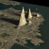 A topographic map of San Francisco's crime rates reveals new landscape features including 'Prostitution Peak'. 7 Comments - Click Here to Read More »»  Green art and design - from transforming green boxes to rotating dome homes, creative eco-art to exotic eco-landscapes and tree houses to tree sculptures. 9 Comments - Click Here to Read More »»  Natural, versatile, environmentally-friendly cork is mainly used for stoppers on wine and champagne bottles but its unique properties also lend a unique character to artistic endeavors. These 25 examples show how creative minds have beautified the world with cork - drinking is optional. 6 Comments - Click Here to Read More »» مطالب مرتبط با معماری اخرین اخبار و مطالب مرتبط با معماری را از آدرس http://p30city.net/search.php?do=fin...&starteronly=1 مشاهده کنید |
| جای تبلیغات شما اینجا خالیست با ما تماس بگیرید | |
|
|
|
|
#72
|
||||
|
||||
ویرایش توسط مهدی : 02-22-2012 در ساعت 03:37 PM دلیل: حذف لینک - ویرایش |
|
#73
|
||||
|
||||
ویرایش توسط مهدی : 02-24-2012 در ساعت 01:59 AM |
|
#74
|
||||
|
||||
|
معماری Ultimate Modular Sofa Fits in Endless Configurations  The idea of multi-functional furniture doesn’t have to stop with our sofa beds and ottoman coffee tables. This unusual sofa is convertible in so many ways that it almost seems exclusive to call it a sofa. It goes from a traditional sofa configuration to a bevy of other shapes with little effort to make a big impact on the style and comfort of a room.  (all images via: Svenik) Designed by the Zuiver creative team from Holland, the convertible sofa lets each sitter customize his or her own ideal seating experience. Need some head support? A place to prop your feet? A way to comfortably stretch out your legs? Even if the person sitting next to you wants a totally different experience, you can have exactly what you want.  The secret to the furniture’s flexibility is the cushions, footrests and headrests which can be adjusted to a number of positions to suit the users. Folding each modular cushion up or down invents a whole new shape with different points of support.   Lovers who wish to sit closer to one another can unfold the seats and the central armrest module to create a cozy snuggling nest. More casual acquaintances can keep their distance in a number of ways. Overnight guests would find the completely-unfolded shape spacious enough for a night or two of visiting.  While the grey version is absolutely gorgeous, the designers have also created a multi-colored prototype that further highlights the modular nature of the sofa. A small loveseat sized piece is also part of the suite, but the loss of size greatly detracts from the impressive functionality of the design. Want More? Click for Great Related Content on WebUrbanist:  Everything from cozy chairs and strange figures to suspended hangers and adjustable modules. 36 Comments - Click Here to Read More »» 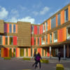 The new Het 4e Gymnasium school in Amsterdam, though temporary and modular, is light years away from what we know as 'portable school buildings' in its design. 1 Comment - Click Here to Read More »»  If you or a book-lover you know are stuck on how to redecorate your urban dwelling and store your favorite volumes here are twenty unusually clever shelving solutions. 108 Comments - Click Here to Read More »» مطالب مرتبط با معماری اخرین اخبار و مطالب مرتبط با معماری را از آدرس http://p30city.net/search.php?do=fin...&starteronly=1 مشاهده کنید |
|
#75
|
||||
|
||||
|
معماری Space Warps: 15 Buildings that Bend, Wrap & Curve 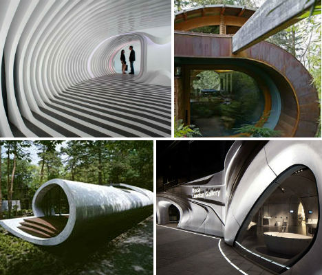 Folding onto themselves like ribbon and snaking along the grass, these 15 structures have barely a straight line in sight. From interiors that resemble honeycombs and cocoons to shell-shaped residences and water-inspired gallery spaces, organic shapes trump the geometric, with overall effects that range from earthy and hobbit-like to sleek and futuristic. Red Town Office by Taranta Creations  (images via: dezeen) The Shanghai office of Chinese architecture firm Taranta Creations is anything but ordinary, with an organic staircase swooping down from the ceiling. Painted a bold red inside with a curved exterior, the staircase almost makes it seem as if the second floor is drooping down into the first. Other unusual features in the office include desk recesses in the floor painted in the same bloody shade. Roca London Gallery by Zaha Hadid  (images via: dezeen) Aside from a few pillars and the floor, there may not be a single flat surface anywhere in this gallery space, designed by Zaha Hadid. Roca London has the feel of a synthetic cave, curving and wrapping around itself with bulbous shapes poking down from the ceiling and out of the walls. The space is a show room for the bathroom brand Roca’s fixtures, and its design draws inspiration from the round forms of basins and the fluids they contain. Centre Pomidou-Metz by Shigeru Ban  (images via: evolo) Among the most notable amorphous structures built in recent years is the French Centre Pompidou-Metz, the sister museum to the Pompidou in Paris. Renowned Japanese architect Shigeru Ban gave it a flowing, latticed roof inspired by the shape of a Chinese hat. The latticework is covered in fiberglass and teflon to create a tent-like effect that glows like a lantern at night. Glocal Design Station by Row Studio Mix  (images via: daily tonic) Creating a soft, rounded interior from a conventional straight-walled structure, the Mexican architectural and design practice Row Studio gave the temporary display for Glocal Design magazine’s Habitat Expo 2011 a vibrant feel that’s brimming with vitality. The interior is made up of a grid of interconnected MDF panels that warp and flow along the ceiling and walls. Lucien Pellat Finet Interior by Kengo Kuma  (images via: sofia rodrigues) A very similar concept is explored by architect Kengo Kuma in this Tokyo store for fashion deigned Lucien Pellat-Finet. Plywood was crafted into a honeycomb-like structure that not only transforms the feel of the space, but also creates built-in shelving. Zebar by 3gatti  (images via: daily tonic) Inspired by 3D modeling, the design of this Shanghai music bar by 3gatti is smooth, clean and lacquered yet still organic, calling to mind a great cavern lined with ribs. Each of the plasterboard slices that make up the columns that flow along the curving ceilings and walls was painstakingly hand-cut, in stark contrast to the usual digital computer-based manufacturing that would normally be used for such a project. The architect calls it “a caved space formed from of a digital Boolean subtraction of hundreds of slices from an amorphic blob.” Shell House by Senosiain Arquitectos   (images via: senosiain arquitectos) Few natural objects evoke images in our minds of such perfect, beautiful curves and swirls as do sea shells. This highly unusual, sculptural home by Senosiain Arquitectos looks like it might have come from some monstrous deep-sea creature, its front wall made up of colorful stained glass. Inside, the home features a living room, kitchen, bathroom and upper bedroom, punctuated by round windows and skylights that highlight the curving surfaces and organic textures of the walls. Shell Villa by ARTechnic  (images via: artechnic.jp) Another residence takes its shell inspiration in a slightly more abstracted, modernized way. The Shell Villa by ARTechnic is at once organic and futuristic, a raised home with a swirling encapsulated design that seems to be made of one giant piece of concrete. The line of the roof continues in a ribbon-like slice to encircle a tree at the center of the residence. Wilkinson Residence by Robert Harvey Oshatz   (images via: oshatz.com) This dreamy forest home blends seamlessly into its environment with the main level of the house raised above the sloping lot to the level of the tree canopy. The curved lines of this residence reflect the owner’s love of music. Says the architect, “This house evades the mechanics of the camera; it is difficult to capture the way the interior space flows seamlessly through to the exterior. One must actually stroll through the house to grasp its complexities and its connection to the exterior. One example is a natural wood ceiling, floating on curved laminated wood beams, passing through a generous glass wall which wraps around the main living room.” Round Hotel Rooms Made of Concrete Pipes  (images via: dci) Few living spaces go so far as to even eliminate the flat surface of the floor, but when you’re building little hotel pods into concrete pipes, there’s just no way around it. The Tubo Hotel in Mexico consists of stacked, reclaimed pipes that have been fitted with beds for low-cost, high-kitsch-factor lodging. Designed by T3arc Architecture, the hotel has 20 rooms with panoramic views of the Sierra del Tepozteco. Fennell Residence by Robert Harvey Oshatz   (images via: oshatz.com) Another home by the organic curve-loving architect Robert Harvey Oshatz is the Fenell Residence in Portland, Oregon which is actually a floating house that takes its visual cues from the river on which it sits. The home evokes the tides, with the main section of the roof arching over the home like a wave. Inside, the theme of water continues with white walls that call sails to mind, and wood-lined alcoves that feel a bit like the interior of a ship. Curving Villa on Sarasota Bay  (images via: totems architecture) This villa on the Sarasota Bay in Florida pays tribute to the adjacent sea in a very similar way to Oshatz’ Fennell Residence. Set on the Gulf of Mexico, the one-bedroom home by TOTeMS Architecture is characterized by a wave-like curving roof design that looms over the main rectilinear portion of the structure. Curving Office Building by Gerd Priebe  (images via: archdoc) Joining the blocky shapes of the rest of this medical complex in Heidenau, Germany with the natural world outside, this curving addition by architecture firm Gerd Priebeis a narrow volume that flows along the grass like a snake. The bulk of its walls are made of glass, giving the offices inside an enlivening view of the grounds. Museo Soumaya  (images via: dezeen) Looking like an anvil covered with reptile skin, the Museo Soumaya of Mexico City certainly makes a strong statement. FREE Fernando Romero Enterprise designed the towering museum, which features a windowless facade made of hexagonal aluminum tiles. It’s made of 28 steel columns of varying shapes and sizes. The Nautilus Project Restaurant  (images via: freshome) Fittingly called the Nautilus Project, this Singapore restaurant by Design Spirits looks ordinary on the outside but becomes an almost cocoon-like space once you step through the door. A round central chamber contains the kitchen, and throughout the dining room are small semi-private spaces made of curved wooden latticework. Want More? Click for Great Related Content on WebUrbanist: 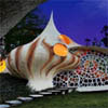 Custom homes come in all shapes and sizes, but few stand out so much as these unique examples of residential architecture. They are, however, anything but cheap. 11 Comments - Click Here to Read More »» 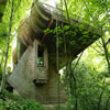 Wonderful photos of a WOWSA home in a forest canopy. Created by architect Robert Oshatz, this cool treehouse could turn even the Swiss Family Robinson green with envy. 7 Comments - Click Here to Read More »» 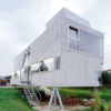 The exterior is a rectangular box made of heavy concrete balanced on stilts, but step inside and you'll see an unexpectedly amorphous all-white interior. 4 Comments - Click Here to Read More »» مطالب مرتبط با معماری اخرین اخبار و مطالب مرتبط با معماری را از آدرس http://p30city.net/search.php?do=fin...&starteronly=1 مشاهده کنید |
| کاربران زیر از معماری به خاطر پست مفیدش تشکر کرده اند : | ||
|
#76
|
||||
|
||||
|
معماری Moments in Time: Tiny Figures Balanced on Watch Hands 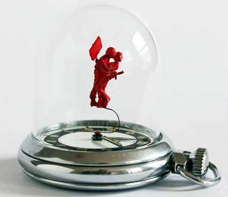 Tiny colored figures balance delicately on the hands of watches are the latest imaginative creations from surrealist designer Dominic Cox, who is also known for his hooks made of hardened unwashed paintbrushes and a hilarious nose stylus for one-handed smart phone use. Commissioned by Dezeen, the ‘Moments in Time‘ series tackles themes like protest and surveillance. 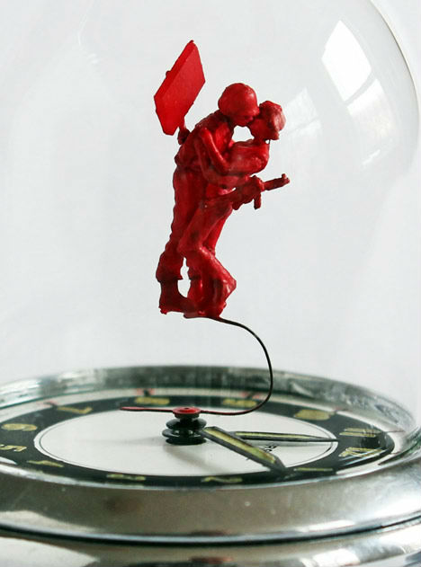 Painted in shades of red and gray and protected by glass domes, the scenes include recreations of the infamous UC Davis protest in which peaceful students were pepper-sprayed by a bored-looking cop. Says the artist, “I find it disturbing when people in positions of power abuse it and lose any sense of humanity. I was shocked to see the footage of the pepper spraying of people sitting in a peaceful protest at UC Davis. I felt a need to capture this incident in time.” 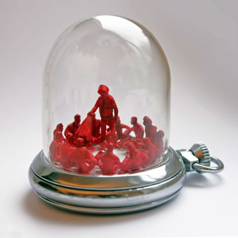  In another scene, a protester and a police officer embrace in a kiss, and a third features CCTV cameras watching over three oblivious photographers. Seven of Wilcox’s miniature works are currently on display at London’s Phillips de Pury gallery. 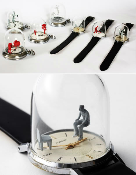 See many more of these watch works, as well as a video interview with Dominic Wilcox, at Dezeen. Want More? Click for Great Related Content on WebUrbanist:  These famous recreations - and impressive originals - hide a tiny secret: they are composed of thousands of other minuscule works of art. 3 Comments - Click Here to Read More »»  In the West, bigger is better, but there's a growing movement against this mentality, and more artists are shrinking their skills to a smaller stage. 1 Comment - Click Here to Read More »»  Modern technology and raw talent come together in the stunning and often surreal digital illustrations of these 15 noteworthy artists. 13 Comments - Click Here to Read More »» مطالب مرتبط با معماری اخرین اخبار و مطالب مرتبط با معماری را از آدرس http://p30city.net/search.php?do=fin...&starteronly=1 مشاهده کنید |
|
#77
|
||||
|
||||
|
معماری Modern Castles: 7 Cool Converted Watertower Houses  Water towers have been a common sight in cities, towns and villages all across the world since at least the Industrial Revolution. As certain towers fall out of use for one reason or another, they are often left standing thanks to their historical significance. But why leave these fascinating structures empty and languishing? These majestic homes were all once functional water towers but have since been converted into the type of home most of us can only dream about. Essen-Bredeney, Germany  (images via: Madako, Frank Vincentz) The aging water tower in the German town of Essen had seen better days, having sat unused for decades. But because it was an historic building, it was protected from demolition. German architectural firm Madako took control of the situation and in 2002 converted the gorgeous old structure into an eight-story multi-use building consisting of an office on the ground floor, a conference room on the top floor and three apartments in between. Each apartment consists of two stories and they are all connected by an elegant outdoor staircase. The integrity of the original building was kept intact so that, aside from the apartment windows, the large structure still looks the same as it always did watching over the town. Chateau D’Eau, Steenokkerzeel, Belgium  (images via: Bham Design Studio) This water tower was built in the Belgian countryside between 1938 and 1941, enjoying continuous use until the early 1990s. After a period of disuse, the Royal commission for the preservation of historic sites granted special recognition of this stunning building and ordered it to remain standing. In 2008, Bham Design Studio acquired the project and began renovating the water tower into a fantastic single-family home. The exterior was restored to its original elegance while the interior was given a one-of-a-kind modern makeover that honors the building’s history but moves it firmly into the present day. Among the home’s highlights: a 4.5 meter tall shower and a breathtaking panoramic rooftop deck. Braaschaat Water Tower, Antwerp, Belgium  (images via: Dornob) It takes a special kind of person to look at a basic, barren water tower and say “That is my dream home.” There was nothing particularly attractive or intriguing about this water tower just outside of Antwerp when it started out – it was little more than a big metal can on top of spindly legs. But when Jo Crepain architecture firm got hold of it, a truly magical transformation took place. The first floor was encased in a solid surrounding and four additional levels were created by enclosing the legs in translucent casings. The result is a marvelous meeting of modern and historic, industrial and homespun. Lymm Water Tower House, Cheshire, England  (images via: Archithings) In what is perhaps the most opulent transformation on this list, the Lymm Water Tower does not attempt to disguise itself as an aged structure. Instead, it envelopes the 130-year-old brick water tower in a stunning modern concrete ring. This is a risky approach for any architect since attempting to combine two vastly different structures in this way often results in disastrously unattractive buildings. This home, however, is spot-on. The smooth stone exterior and floor to ceiling windows only serve to enhance the regal water tower that sits within the newer structure’s embrace. Jaegersborg Water Tower, Gentofte, Denmark  (image via: Seier + Seier) Like so many other unused water towers, this one just outside of Copenhagen had become something of an eyesore in the otherwise lovely landscape. In 2004, Dorte Mandrup Architects won a competition for the most promising project to adapt and reuse the existing building. The firm used the space beneath the large water basin to create a complex of 40 new student apartments. Gigantic windows, communal balconies and spectacular views all make this building a sought-after and attractive part of its surroundings rather than an eyesore to be tolerated. Huntington Beach Water Tower, California  (image via: John VanderHaagen) This fine example of a water tower was built in the 19th century to provide to provide water for steam engines. It operated all the way until 1974, and in the 80s it was converted to a home by removing the tank, converting it at ground level and then lifting it back up into place. It has served as a family home at times since then, but mostly it has been an opulent vacation rental. Visitors travel up four stories on the elevator to reach the three-story living space, then get to enjoy unprecedented views of several beaches, the San Bernadino Mountains and the surrounding cities. House in the Clouds, Suffolk, England  (images via: Dornob) When the town water tower was built in Thorpeness, Suffolk, in 1923, it was called an eyesore and ordered to be disguised. Some clever soul decided to make it look like a house on top of a tower, and the town lived with the charmingly quirky water tower until it had outlived its usefulness. The only logical thing to do, then, was to make it into an actual house…70 feet in the air. Its five bedrooms and three bathrooms make it fit for a family, but the family must be awfully fit to climb and descend its 78 stairs every day. Want More? Click for Great Related Content on WebUrbanist:  A symbol of war and fear, disused bunkers are transformed into modern buildings with positive uses. These 15 recycled bomb shelters are now homes, hotels & more. 4 Comments - Click Here to Read More »»  Billboards, fire towers, pig barns and factories are converted into stunning modern homes that preserve the history of the original structures. 8 Comments - Click Here to Read More »»  The European Union may appear on the surface to be a unified body but underneath each member country retains a unique and complex history. 79 Comments - Click Here to Read More »» مطالب مرتبط با معماری اخرین اخبار و مطالب مرتبط با معماری را از آدرس http://p30city.net/search.php?do=fin...&starteronly=1 مشاهده کنید |
|
#78
|
||||
|
||||
|
معماری Architecture Gone Wild: Surrealist Designs by Victor Enrich  Buildings twist and bend onto themselves in ways that seem to defy physics. Some have sprouted massive slides, or bear facades that roll up like the top of a tin can. Others have unsupported staircases that float out into the sky. You may have guessed already that these buildings aren’t real – they’re the fantasy creations of architectural designer Victor Enrich.  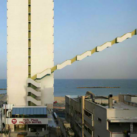 Calling to mind the surrealist architectural collage of Filip Dujardin, Enrich’s designs are so realistic at first glance, they prompt a quick double-take. Enrich travels the world and takes photographs of cities, manipulating them digitally to produce these strange images.  The Barcelona-born designer says he’s been interested in maps and urban forms since childhood, inspired by toys like Legos. When traveling, Enrich looks for scenes that inspire shocking shifts, whether those changes would be possible in the real world or not.   “A combination of photography and 3D architectural visualization is used. Once the object is chosen, it is shot from a point easy to recognize by users, not pretending to achieve the greatest picture ever, but instead, a picture that anybody could do. The shot is the basis to produce a replica of the building by using very detailed photogrammetric techniques that end with the creation of a three-dimensional model that fits almost perfectly into the picture.” Want More? Click for Great Related Content on WebUrbanist:  Someday, a few of these wild and wacky hotel designs may become reality - likely in Dubai - but most of these futuristic hotel concepts will remain fantasies. 5 Comments - Click Here to Read More »»  Why carry around a boring old purse or wallet when you could have a decapitated head handbag, a functioning NES gaming purse or a space-age metal card holder? 2 Comments - Click Here to Read More »»  Our buildings are the covers our enterprises - and ourselves - are judged by. These 136 brilliant buildings show, in so many ways, that when it comes to architecture skyscrapers reflect our soaring imaginations. 14 Comments - Click Here to Read More »» مطالب مرتبط با معماری اخرین اخبار و مطالب مرتبط با معماری را از آدرس http://p30city.net/search.php?do=fin...&starteronly=1 مشاهده کنید |
|
#79
|
||||
|
||||
|
معماری Haunted House? The Abandoned Mansion of Steve Jobs  The life of late Apple magnate Steve Jobs was unquestionably full of interesting twists and turns. One of the lesser-known battles fought by Jobs was that of Jackling Mansion, a home that polarized the town of Woodside, California and became one of the area’s most intriguing abandoned places. An Historic Home  (all images via: Jonathan Haeber) The Jackling House was built in 1925 as a residence for copper mining baron Daniel Cowan Jackling and his family. Famed Californian architect George Washington Smith designed and built the stunning 17,000 square foot home in the popular (for the area and the time) Spanish Colonial Revival style. Inside, a massive pipe organ provided a fascinating focal point. Steve’s Role  Steve Jobs bought the breathtaking property in 1984 and lived there for about a decade. The home was then rented out for a number of years until 2000, at which time Jobs stopped maintaining it and the building began to fall into disrepair. This once-magnificent home began to crumble and eventually became one of the most opulent abandonments in the country.  But Jobs didn’t intend to abandon the place altogether. He had a plan to demolish the original Jackling mansion and build a more modest family home in its place. In 2004 he received permission from Woodside to move forward with his plan…but the town’s other residents had another idea. Upholding Heritage  A citizen group of preservationists called Uphold Our Heritage was quickly formed in order to block the demolition of the building. They filed lawsuits against the town of Woodside and against Jobs personally, stating that both parties had failed to recognize the historic value of the home and would be doing the town a disservice by tearing it down.  The legal battle that ensued was epic. From 2004 to 2011, Jobs and his lawyer returned to court time after time to gain the necessary demolition permits. The two sides struggled seemingly endlessly, with the preservationists insisting that the home was an important piece of history and Jobs insisting that it would take more money to salvage the mansion than it would to simply tear it down and build a new home. The End of the Battle  Whichever side of this argument makes more sense to you, the reality is that Jobs eventually won the fight. He was granted the permits necessary to demolish the Jackling House in 2011 and the house was torn down just months before his death.  Thankfully for those of us who love exploring the depths of abandoned places, photographer Jonathan Haeber was able to capture these incredible photos before the building was gone forever.  Haeber arrived at the mansion sometime around 2007 to find the gate open and the property unlocked. He ventured inside to produce some of the last-ever images of this breathtaking and majestic home.  Although the paint was peeling, the plaster was crumbling and the elements had begun to reclaim the building, it was not hard to see the past splendor of the place.  In a very real way, the neglect suffered by this beautiful mansion only served to increase and highlight its best features. The world lost a truly elegant piece of architecture when the Jackling House was demolished. Want More? Click for Great Related Content on WebUrbanist:  Not all well-known houses are famous because of their stunning architecture. Some houses receive attention because of the alleged paranormal activity that goes on there. 9 Comments - Click Here to Read More »»  With as many comforts as a modern home, house boat design has become something beautiful and breathtaking. It makes one wish their house could float. 3 Comments - Click Here to Read More »»  Have you ever wished you could build a Lego house big enough to walk into? UK TV presenter James May and a team of volunteers and builders are doing just that. 5 Comments - Click Here to Read More »» مطالب مرتبط با معماری اخرین اخبار و مطالب مرتبط با معماری را از آدرس http://p30city.net/search.php?do=fin...&starteronly=1 مشاهده کنید |
|
#80
|
||||
|
||||
|
معماری Doctored Designs: 6 Minimalist Mental Disorder Posters  Raising awareness of mental illnesses is an important part of erasing the stigma attached to those disorders. Graphic designer Patrick Smith created these minimalist posters that perfectly illustrate a number of mental disorders in flawless style.  Mental illness is no laughing matter, and Smith doesn’t present these disorders in jest. Rather, he is presenting them in terms that are easy to interpret visually. His intention when creating these posters was to offer them as part of a mental health awareness program.  The posters came about as a personal challenge for Smith after he read descriptions of many different mental disorders. The designer wanted to see if he could create attractive, informative and minimalist graphics that would explain each condition. Given the striking results, it seems that he was quite successful. Want More? Click for Great Related Content on WebUrbanist:  Graphic designer Matt Owen sums up classic films like A Clockwork Orange, Big and The Breakfast Club with minimal imagery for movie posters that really pop. 3 Comments - Click Here to Read More »»  A group of diverse graphic designers answer the question "what is graphic design?" the best way they know how: through graphic design. 5 Comments - Click Here to Read More »»  Fans with a ton of enthusiasm and even more photoshop skill have taken their favorite film posters to a new level. 5 Comments - Click Here to Read More »» مطالب مرتبط با معماری اخرین اخبار و مطالب مرتبط با معماری را از آدرس http://p30city.net/search.php?do=fin...&starteronly=1 مشاهده کنید |
 |
| کاربران در حال دیدن موضوع: 1 نفر (0 عضو و 1 مهمان) | |
|
|
اکنون ساعت 08:17 PM برپایه ساعت جهانی (GMT - گرینویچ) +3.5 می باشد.




 حالت خطی

