|
|
|||||||
| آموزش طراحی (صفحات وب و انیمیشن) در اين تالار آموزش و مقالات مربوط طراحی صفحات وب CSS و ... و نیز انيميشن و طراحي موضوعات مختلف با نرم افزارهاي گوناگون قرار داده خواهد شد براي مثال آموزش فتوشاپ يا 3ds |
 |
|
|
ابزارهای موضوع | نحوه نمایش |
|
#1
|
||||
|
||||
|
What Color Is Your Money? Showcase of Bank Websites Worldwide [IMG]************************************************************ **********************[/IMG] [IMG]************************************************************ ***********************8[/IMG] [IMG]************************************************************ ***********************9[/IMG] [IMG]************************************************************ ***********************10[/IMG] Having lived and worked in various countries during the past 15 years, I have accumulated quite a few different bank accounts. On any given day, some of us may actually need to log on to at least three bank websites. And while one wouldn’t normally turn to a bank website for inspiration, it is actually surprising how the world of money is quite useful for considering the different ways large amounts of critical information can be packaged. Developers and designers of bank websites have the ultimate of job tasks to fulfill in planning a bank’s website information architecture. Of utmost importance is security and functionality. Then comes the entire suite of corporate marketing communication must-haves such as strategy, usability, portability, accessibility and highly likely multilingual services are a major consideration among the deliverables. Banking is a highly competitive industry where the website needs to make existing clients feel safe with their financial transactions (client retention) as well as entice new customers (client acquisition). The client base is normally extremely diverse. At any given time a bank needs to please large international multi-million dollar stakeholders at the same time as individuals who live from month to month on minimum wages. Client demand on bank websites is therefore assuming a broad range of wealth and responsibility. Author’s Note: “These days, it is barely imaginable how one would manage finances without the convenience of online banking services. To put this appreciation of online banking in perspective, and to give away a little idea of my age, I can actually remember physically visiting my small country town bank in Australia, little passport-sized bank book in one hand and an envelope with cash in the other. I happily walked out with the money safely deposited, a new hand-written savings total in my bank book, all stamped, dated and hand-signed by the banker. In between visits I kept my savings in a plastic kangaroo!”What Color Is Your Money? With the high-end security, seamless functionality specifications and corporate branding then being absolute priority, designers and developers around the world are producing some really pleasing-to-the-eye bank websites. For simplicity, we have collated the showcase by color:
Besides the color breakdown, when perusing through the bank websites there are some interesting design elements worth noticing. Remember that bank websites are generally based on very complex sitemaps that must address thousands of customers (individuals and businesses), security and legal issues, service offerings, marketing and international relations. What we noticed in researching this article was:
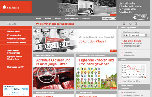
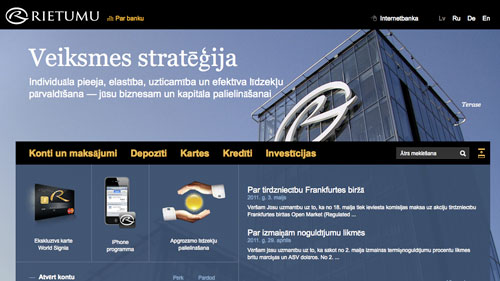
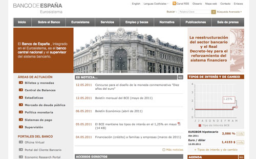
Shades of Red On putting this article together and sifting through hundreds of bank websites, red (and blue, see below) is a dominant color choice for banks. Red is one of the three primary colors (red, blue and yellow) and because it is the color of blood and raging fire, it is commonly associated with the following traits: courage, strength, power, energy, determination, passion, action and it has strong visibility (ie stop signs and danger signs are red). Strong shades of red often suggest vigor and leadership while lighter hues tending to pinks suggest a more passive and fresh approach. Sparkasse, Germany  Sainsbury’s Bank, United Kingdom   Citigroup, USA  Absa Bank, South Africa  Helm Bank, Panamá  Credit Suisse, Switzerland  HSBC, United Kingdom / International  NAB, Australia   Alfa Bank, Russia  Citizens Equity First Credit Union, United States  Canadian Imperial Bank of Commerce, Canada  Westpac Bank, Australia  Afriland First Bank, Cameroon  Santander, Brazil  CIM Banque Geneve, Switzerland   Banca di Roma, Italy  Shades of Blue Blue is the classic corporate color of choice. Blue is associated with depth and stability, trust, loyalty, wisdom, confidence, intelligence, knowledge, power, integrity and seriousness. However, customers have over the years developed a love or hate relationship with their financial service firms. It is perhaps needless to mention here the financial crisis of 2008 where large financial institutions collapsed, banks were bailed out of seriously deep trouble by national governments and stock markets crashed all around the world. Building trust and loyalty takes somewhat more than the perfect shade of blue. Here are a selection of bank websites from around the world whose main online color is set around blue. We have included purple websites here as it expresses the stability of blue and the energy of red. Purple is associated with royalty and luxury. Dark blue tends more toward representing knowledge, power, integrity, and seriousness while a lighter blue hedges toward offering understanding and gentleness. Rietumu Banka, Latvia  Banco de Chile, Chile  Bank of New Zealand   VTB Bank, Russia  Qatar National Bank, Qatar  Banca Etruria Group, Italy  Royal Bank Canada  Siam Commercial Bank, Thailand  BancoSol, Bolivia  Chase, USA  China Construction Bank, China  Banque Populaire, France  Deutsche Bank, Germany   Natixis, France  Valiant, Switzerland  CSOB, Slovakia   CapitalOne, USA  ANZ, Australia and New Zealand   Standard Bank, South Africa  Bank of Hawaii, USA  Barclays, England   Emirates NBD, United Arab Emirates  Hungarian Development Bank, Hungary  Delta Community Credit Union, United States  Shades of Yellow Like red, yellow has an energetic influence and an alarm effect. It is also associated with joy, happiness, honor, loyalty and intellect. It is warming (directly associated to the sun) and stimulates a cheerful ease while at the same time is considered fresh and zingy. Used too liberally though, yellow can be disturbing and get in the way of content on a website. Used sparingly, it can be inviting and assuring. Orange has also been included in this group as it combines the energy of red and happiness of yellow. Orange is the color of enthusiasm, fascination, happiness, creativity, determination, attraction, success, encouragement and stimulation. Some also associate orange with endurance. Guaranty Trust Bank, Nigeria   Kookmin Bank, Korea  ING DiBa, Germany   Commonwealth Bank Australia   Bank of Ayudhya, Thailand  Attijariwafa Bank, Morocco  Commerzbank, Germany  Bankinter, Spain  Falkenbergs Sparbank, Sweden  Banco do Brasil  Pireaus Bank, Egypt  Shades of Green As we move down our color comparison list of financial websites, there becomes fewer examples to find for greens and grays. We actually discovered, however, that quite a few banks in African countries and other developing lands use green shades for bank websites. Green is the color for growth, nature and healing. It is also directly symbolic of money (and greed and jealousy). Nedbank, South Africa   SBERBANK, Russia  Magyar Nemzeti Bank, Hungary  Appenzeller Kantonalbank, Switzerland  Banco Azteca, Panamá  Banca Nazionale del Lavoro S.p.A., Italy  Islamic Bank of Thailand  First National Bank, South Africa  Kenya Commercial Bank  Israel Discount Bank  Crédit Agricole, France   Shades of Gray & Brown Black and white are not colors on the ‘Color Wheel‘. They are defined as ‘neutral’ colors. Shades of gray (and brown for this article) are generally neutral colors which tend not to assume a strong or specific emotional association – except for general neutrality. While black on its own can symbolize morbidity, death or mystery, it is also a clear expression of power and clarity. White is also a statement of purity and clean cut lines. Shades of brown communicate earthiness and wholesomeness. We discovered a few financial websites that use predominantly shades of grays and browns, but not many. Macquarie Group, Australia   Bank of England, United Kingdom  Rand Merchant Bank, South Africa  Central Bank of Libya  Banco de España, Spain  SKB Banka, Slovenia  Central Bank of Bahrain  What Color Is Your Money? This article is in no way an exhaustive collection of bank websites of the world. These are some of the better designed and constructed works. If you can suggest any more that should be added to this showcase, please add them in the comments below. And next time you are visiting your own bank’s website, instead of just going to your online account to see how rich or poor you are, have a further look around the site and see how well it has been put together. Check out the sitemap and consider the structure that has been employed to make the site cohesive. Make a note to see if the ‘business customer’ pages are designed differently to the ‘individual customer’ pages. Partial Bibliography — USA Banks, All banks and Finance, Banking and Rates — Central Bank websites — A Look into Color Theory in Web Design (rb) نکات طراحی صفحات وب افکت های زیبا تکنیک های طراحی صفحات اینترنتی جدیدترین کد ها - منو های زیبای css |
| جای تبلیغات شما اینجا خالیست با ما تماس بگیرید | |
|
|
|
 |
| کاربران در حال دیدن موضوع: 1 نفر (0 عضو و 1 مهمان) | |
|
|
اکنون ساعت 10:13 PM برپایه ساعت جهانی (GMT - گرینویچ) +3.5 می باشد.


 حالت خطی

